
How to Evaluate Logo Design: Recognition, Adaptability, Distinctiveness, and Extension
In a Logo presentation, the most common feedback is, "This one feels more substantial," or, "That one looks more like an internet company." These reactions can be expressed, but without shared standards, the decision is easily controlled by personal preferences and the mood of the day.
A Logo does not need to explain the entire brand, but it must remain consistently recognizable in real contexts and relate appropriately to both the competitive environment and brand direction.
01 Is It Easy to Recognize and Remember?
After a brief view, can users describe its basic form? Does the graphic retain a clear silhouette against complex backgrounds and across media? More intricate detail does not make a Logo more premium.
Memorability does not require users to explain the design concept; it means they can recognize the mark.

02 Is It Relevant to the Brand Direction?
Relevance does not require depicting an object from the industry. It means the form, type, proportions, and tone align with the brand positioning. A children's brand and an industrial equipment company express themselves differently even if both use wordmarks.
Do not reject every abstract design simply because it does not reveal the industry literally.
03 Is It Distinctive Enough?
Visually compare the concept with direct competitors, common industry symbols, and existing trademarks. Gradients, split letters, and orbit graphics are widespread in technology; without a distinctive rule, they quickly become generic.
Distinctiveness should not be manufactured by sacrificing readability.

04 Does It Still Work at Small Sizes and in Monochrome?
Test an app icon, website favicon, social avatar, document footer, print, and embroidery. A monochrome version reveals whether the structure depends on special effects.
Large gradient mockups in a presentation cannot replace these tests.
05 Are the Wordmark and Chinese-English Combinations Clear?
Address letter spacing, strokes, name length, and relationships among languages. Chinese and English do not always need equal alignment; establish the combination around actual hierarchy and contexts of use.
A difficult-to-read brand name creates ongoing communication costs.
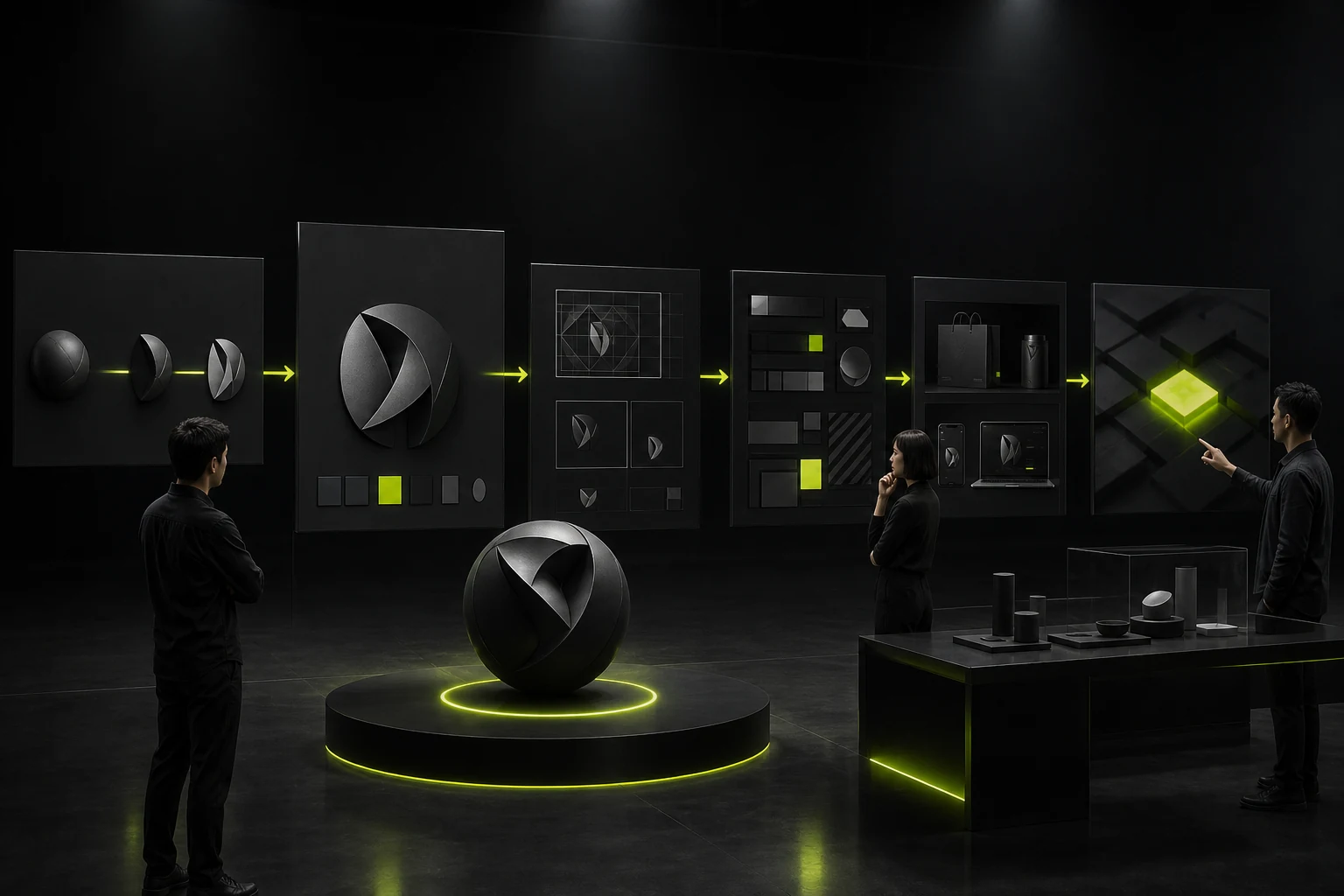
06 Can It Extend into a Visual System?
A Logo may generate graphic, grid, motion, or layout principles, but it should not be forcibly broken into meaningless decoration. More importantly, it must work with color, typography, and imagery over time.
A good Logo does not need endless variations. It needs to look like the same brand across different contexts.
Logo Evaluation Matrix
Dimension | Review Method | Risk Signal |
|---|---|---|
Recognition | Brief viewing, silhouette, and occlusion tests | Too much detail or dependence on color |
Relevance | Alignment with positioning, tone, and customers | Following only industry trends |
Distinctiveness | Competitive comparison and preliminary search | Direct combination of common symbols |
Adaptability | Small sizes, monochrome, and dark and light backgrounds | Works only in presentation mockups |
Readability | Wordmark, language, and abbreviation tests | The name is difficult to identify |
Extension | Validation with the visual system and applications | The Logo is disconnected from other design elements |
Frequently Asked Questions
Must a Logo's Meaning Be Obvious at First Glance?
No. Recognition and long-term use matter more than solving a puzzle immediately. Meaning should feel natural, not forced.
Is the Concept I Like Always the Best One?
Personal preference is one input. Validate the concept against brand objectives, users, and real applications as well.
Is a Black-and-White Test Necessary?
Yes. It tests whether structure and hierarchy depend on color and special effects.
How Can Plagiarism Be Identified?
Competitive comparisons, image searches, and professional trademark searches are required. Visual similarity alone is not necessarily a legal conclusion.
Can a Logo Be Changed After Approval?
Details can be refined within the agreed revision rounds. Reversing the direction usually affects cost and schedule.
Service | View |
|---|---|
Related Services | |
Design Case Studies | |
Project Inquiry |
 Link copied