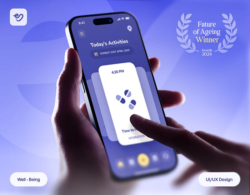
This elder care app design uses pale purple, white and yellow, with reminder cards depicting breakfast and water as direct objects. Record overviews and maps have separate pages rather than merging all tasks into a vague score. Gentle color creates warmth; nearby times, tasks and specific actions supply practical value.
Key takeaways
- Tableware, glasses and short phrases make reminder objects concrete; time formats need consistency.
- Overview, logs and maps have separate tasks; ratio definitions and location states need words.
Tableware and a glass give tasks concrete forms
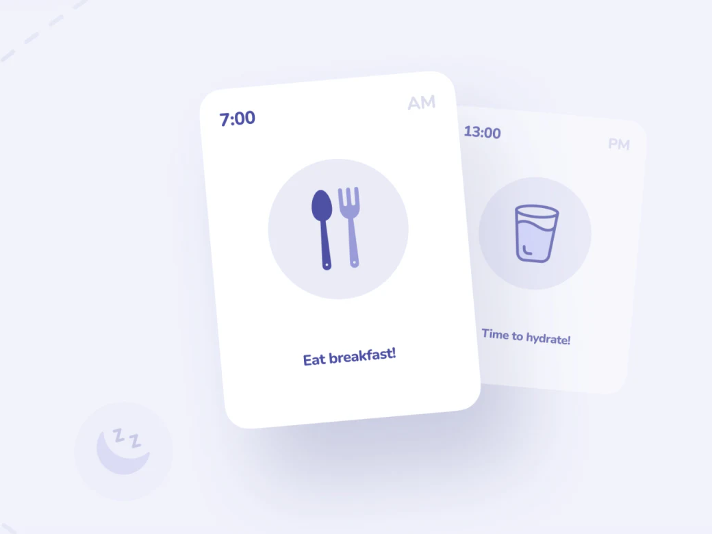
The breakfast card has time above a large tableware icon and Eat breakfast below; the following water card repeats the structure with a glass and short phrase. White cards contrast gently with pale-purple circles. Image and word explain the task without memorizing abstract symbols.
Layered cards suggest front and back, but an actual page should make later tasks discoverable. Done, skipped and remind later need distinct states, without treating swiping away as execution. JVDS cares about reviewing action records beyond an attractive disappearing card.
One card says 7:00 AM and another 13:00 PM, mixing time systems. Pale AM/PM text could also gain contrast. Straightforward tasks need equally unambiguous times.
Overview and log pair summaries with lookup
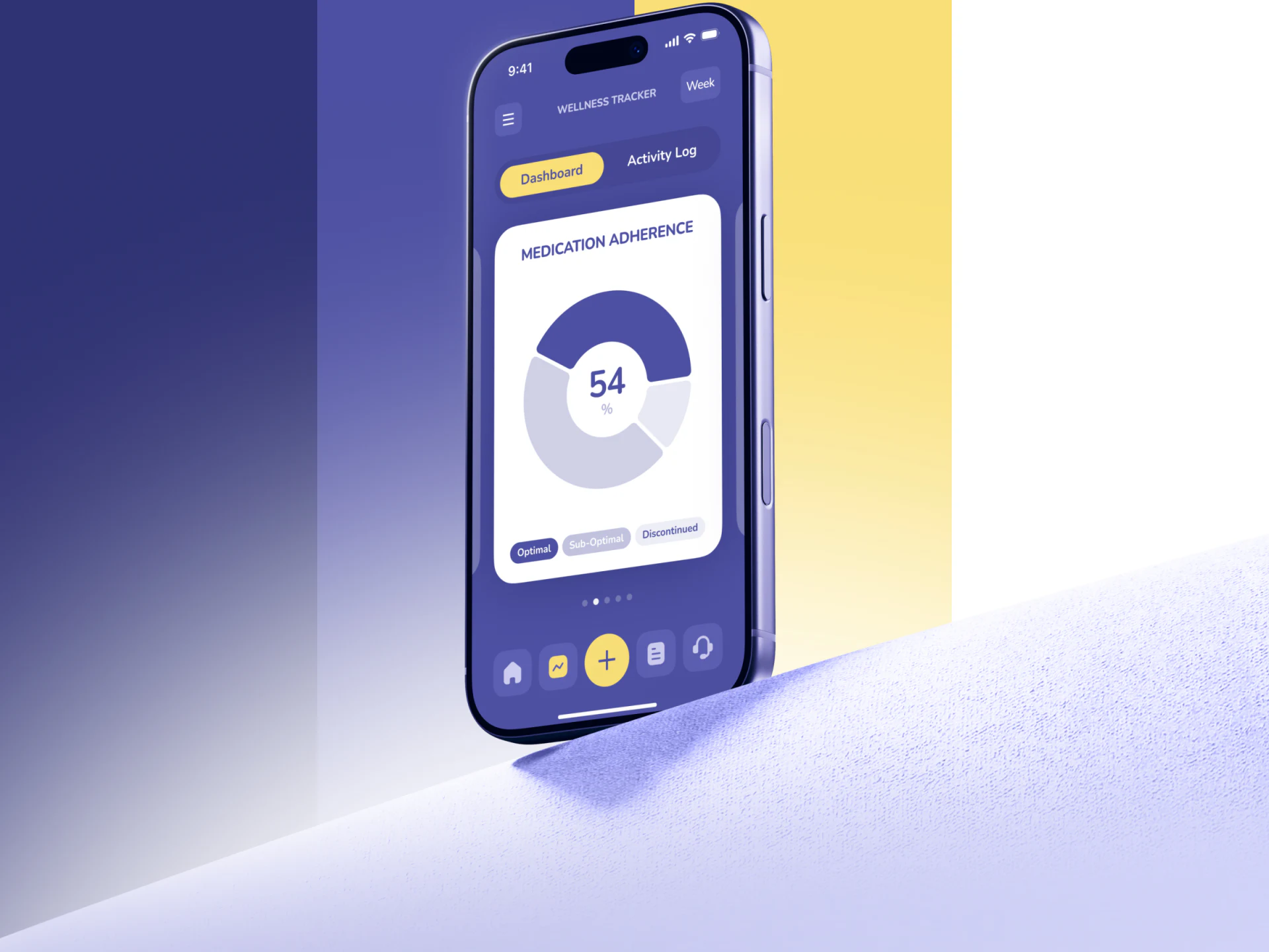
The purple record page shows Week beside Dashboard and Activity Log, highlighting Dashboard yellow. A central white Medication Adherence card holds a ring and legend; the yellow bottom plus differs from ordinary navigation.
Overview shows scope; logs verify entries. Neither replaces the other. Percentages need calculation scope, missing records and current week boundaries to be understood. Name record statistics separately from health assessments, retaining missing entries in scope explanations.
The plus is prominent but should specify what it adds. Review entry wording with the current card’s subject before choosing a menu or direct form. Color indicates priority; words explain the operation’s object.
Map color changes need a readable explanation
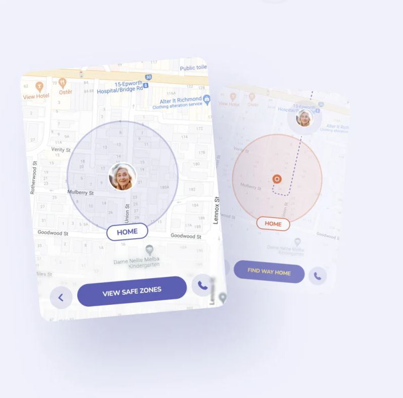
Two maps show purple and orange circles, with an avatar inside one and outside the other beside a dashed line. HOME and bottom buttons remain, naming viewing an area and finding home as different actions. Spatial relationships are direct.
Color alone cannot establish whether circles mean range or selection, dashed lines mean route or relationship, or where update time appears. The phone icon also needs a contact. JVDS would place current object, destination and location update near the map to establish checks before acting.
These interface suggestions do not establish accurate positioning or safe routes. Unavailable information needs an explicit state and understandable next step. Gentle maps suit lightweight presentation, but key explanations still need prominence.
Frequently asked questions
What should remain after completing a care reminder?
Task and time should be reviewable, distinguishing done from skipped. A disappearing card does not establish execution.
Design review checklist
- Use one 12- or 24-hour system and check suffix contrast.
- Make map range, update time and phone contact independently understandable.
Turn daily reminders into explicit actions
If your care or lifestyle app needs organized reminders, records and location assistance, bring task and role scope to discuss the interface.
JVDS provides UI/UX design and website design and development. We can work through page content, interface structure and implementation needs together.
 Link copied