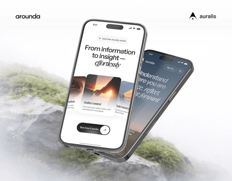
Auralis’s AI product website replaces familiar machine imagery with grass, sky, and a person. Plain and italic type combine, while work cards spread like a fan, giving the technical introduction a calm character. The next task is making this atmosphere work with specific capability explanations.
The sky leaves a natural opening for text
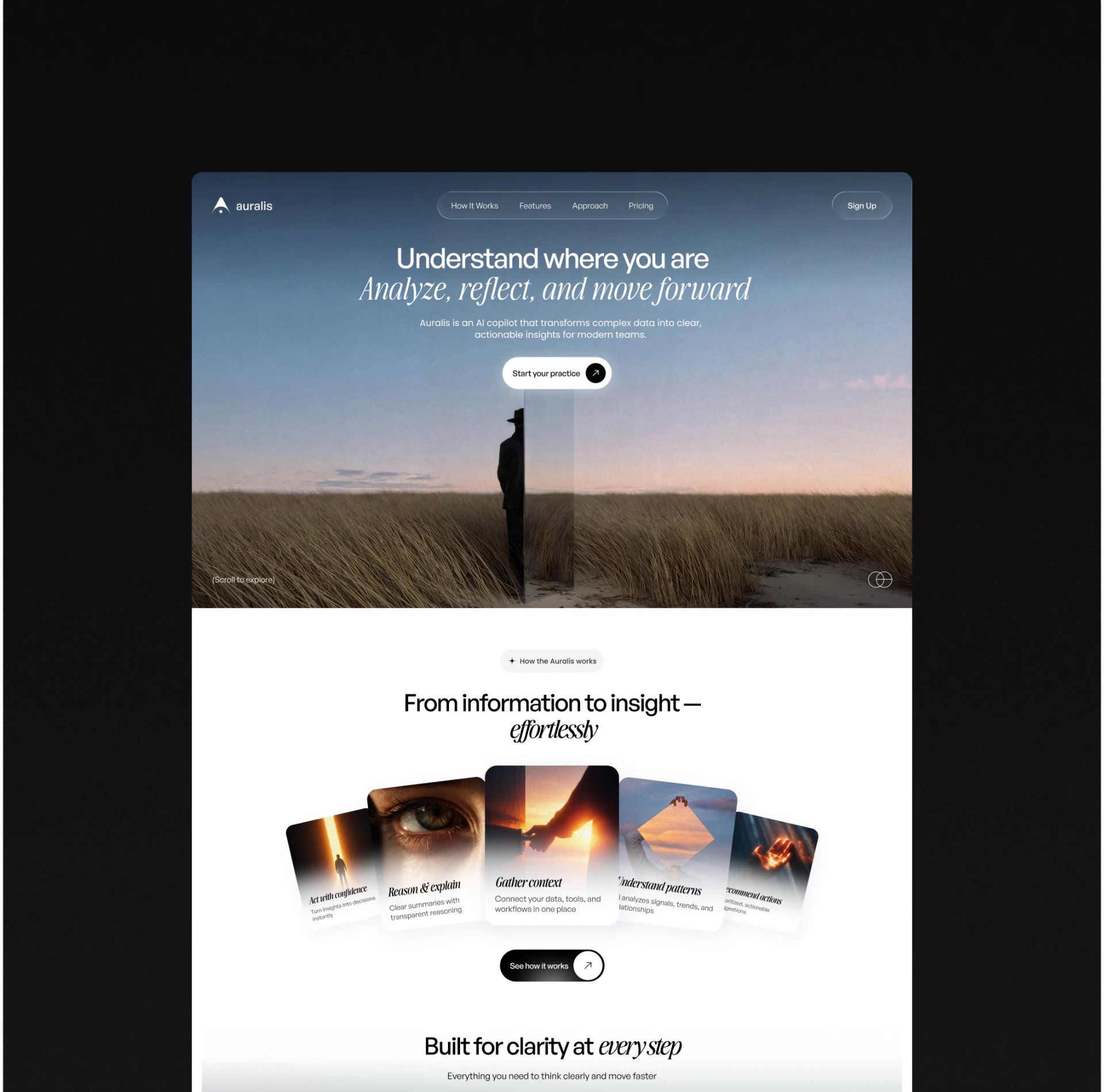
A person stands in the center of a field, with a low horizon and the heading and buttons in the sky. Different content above and below means text does not cross complex grass; the photograph itself provides reading space.
The first heading line uses simple letterforms, followed by serif italics. Weight and shape change like a shift in tone, expressing analysis and reflection without exaggerated symbols. White text against blue-gray sky also sits more steadily than text over the dark figure.
How It Works, Features, Approach, and Pricing share a rounded navigation bar, while Sign Up sits separately on the right. Exploring content and beginning use have distinct places, suitable for products visitors need to understand first. Readers can choose how much time to invest.
Fan-like cards make the center visible first
Five work cards form an arc below the hero, with Gather context upright in the center and increasing tilt toward either side. Eyes, hands, and light maintain the gentle atmosphere. White gradients at the card bottoms keep text off dark photographic areas.
JVDS likes the text areas in this composition. Each card has a short title followed by one or two explanatory lines, letting image impact coexist with explanation. Abstract images alone make technical capabilities difficult to distinguish.
A fan is not inherently a sequence. If cards explain a process from materials to results, numbers, arrows, or a clear starting point could help. If they represent parallel capabilities, copy should say so. A prominent central card does not mean readers know to start there.
A three-column grid stabilizes content and reveals title differences
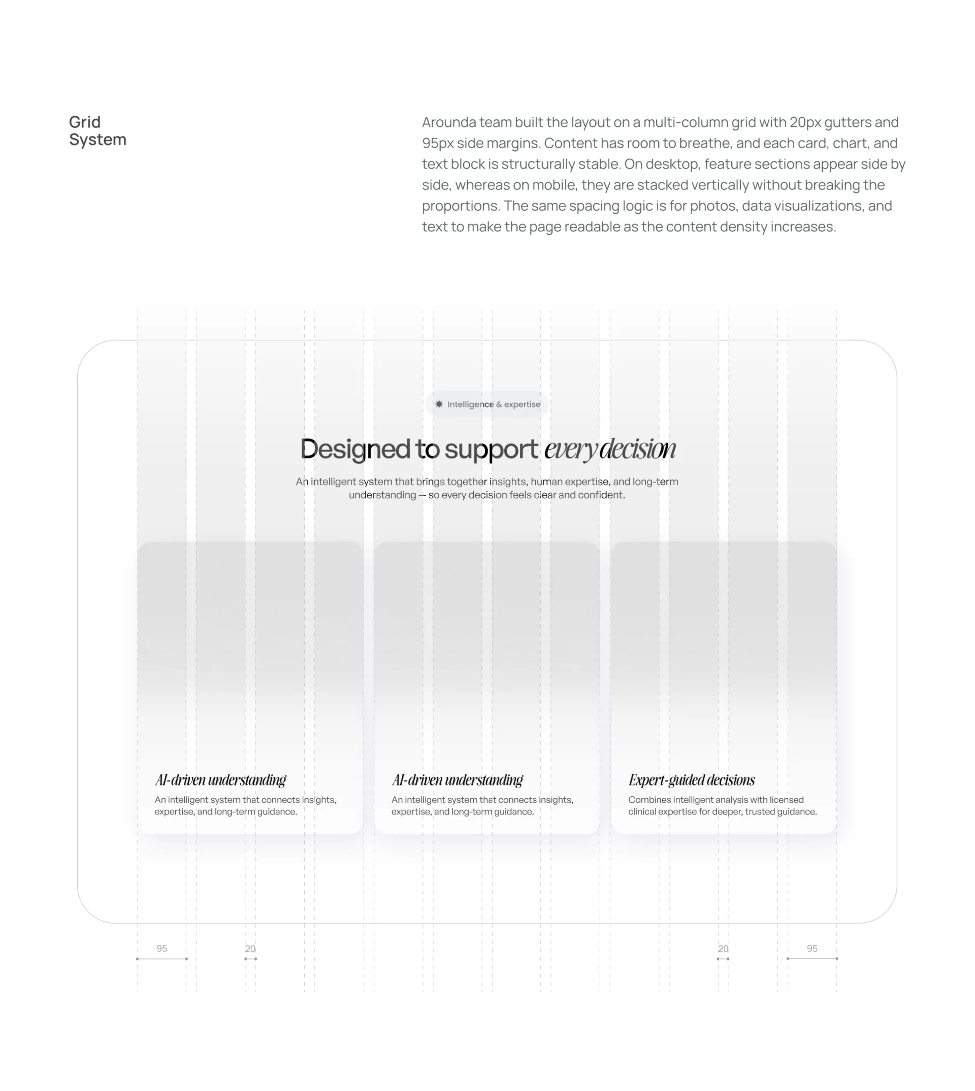
A centered feature heading sits above three cards, with bottom text on a shared baseline. Margins, gaps, and widths have a clear structure, and whitespace keeps cards from crowding. The grid supplies reliable alignment as content grows.
The first two cards repeat AI-driven understanding; the third highlights Expert-guided decisions. The layout works as a demonstration, but final content needs more distinct tasks. A specific example for input, result explanation, and human involvement could make differences come from content.
Serif italics recur in feature headings, while body text remains simple. Limited emphasis supports reading better than decorative type throughout. Headings carry the brand tone, and explanations answer specific questions.
Mobile plans retain nature, with conditions closer to choices
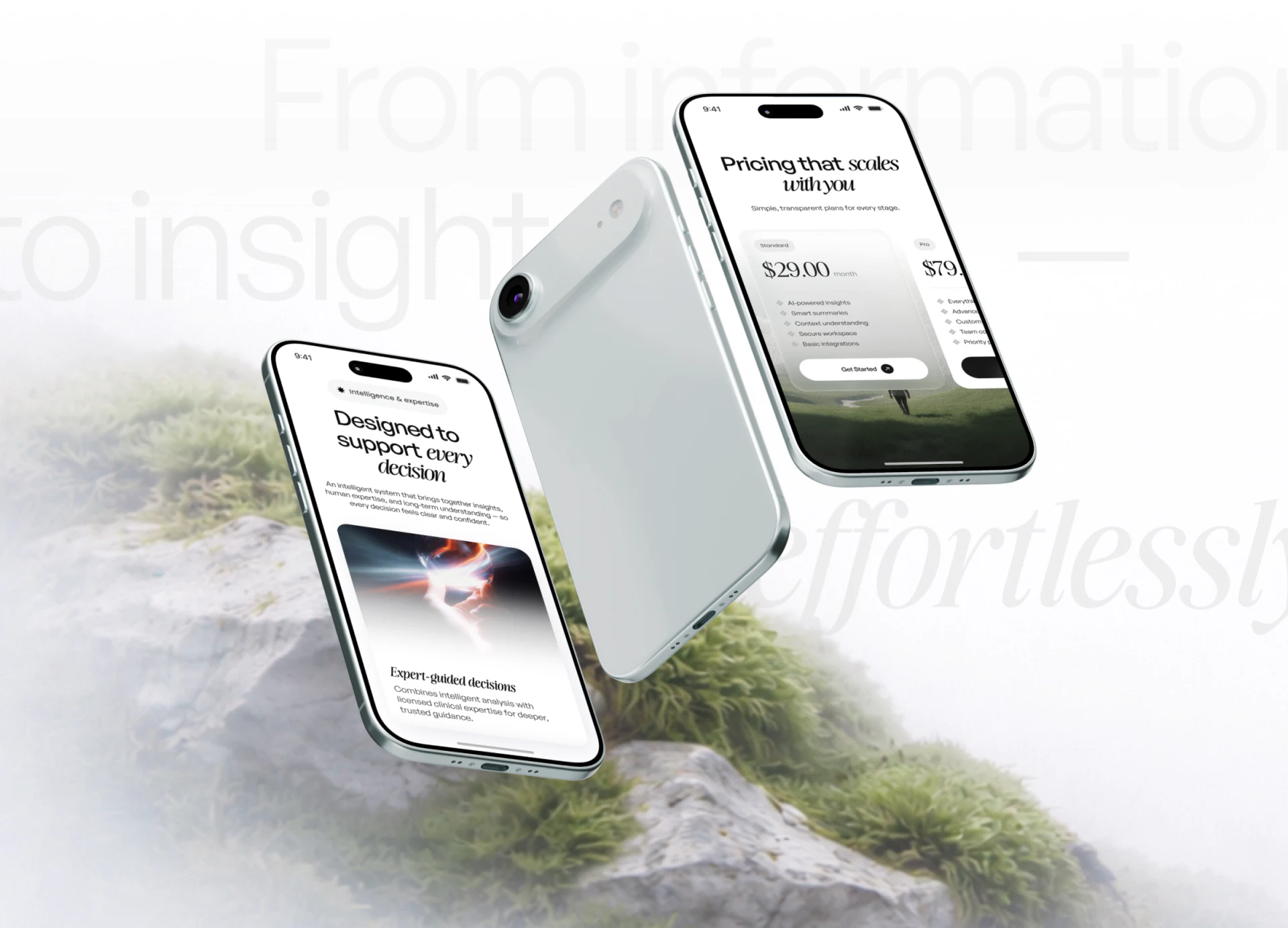
The mobile feature page stays white with vertically arranged images and descriptions. Standard and Pro sit side by side on the plan page, each containing price, a list, and Get Started. Nature imagery remains below, maintaining the hero’s atmosphere.
Large prices, small billing-period text, and lists create a hierarchy. Readers identify plan and cost before inclusions. If expert guidance is a service, its participation method and scope should be near the card explanation for checking before choice.
Plan cards extend horizontally, so narrow-screen review should check discoverability of the next card and clarity of the current choice. The images show layouts and example wording; actual prices and service policies depend on product materials.
To borrow this approach, choose one input material and one output example and place them in the existing cards. Natural visuals create an approachable entry, while concrete examples explain what further reading will provide.
Give an AI product a clearer introduction website
If your product needs to explain inputs, results, and human collaboration, organize content around one complete example. JVDS Design Studio provides UI/UX design, website design, and development services to present brand visuals alongside product mechanisms.
 Link copied