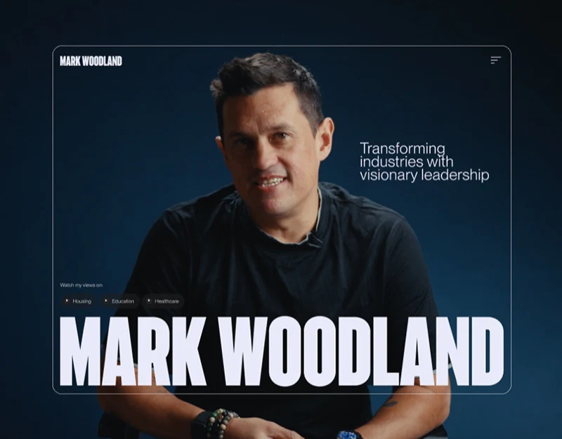
Mark Woodland’s website establishes a distinct identity with dark blue backgrounds, portrait imagery, and large condensed type. Its more practical arrangement separates introduction, topics, experience, and media types. Visitors can choose what interests them before deciding how much background to read.
Key takeaways
- Portrait imagery establishes identity; topic entries provide reasons to enter content.
- Topics, experience, and media formats are organized separately for visits of different depth.
The portrait hero gives viewing a direction
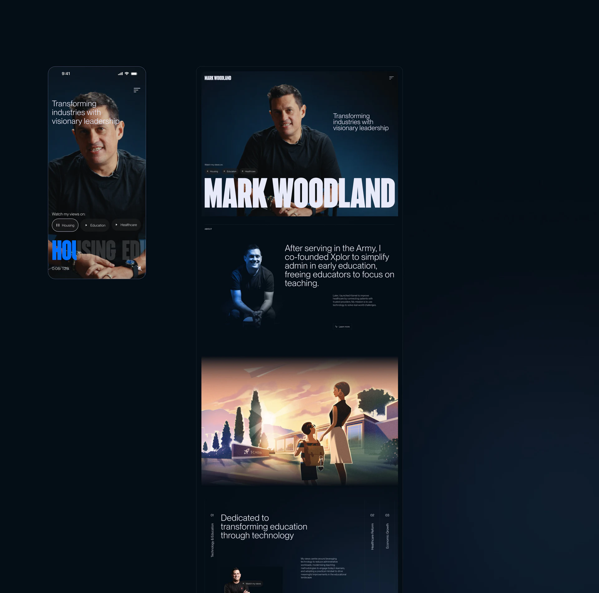
A central portrait and prominent white name establish the hero. Topic entries stay close to the person, with the current topic continuing into the video area in blue. An abstract personal image gains specific subjects, so visitors need not read a full biography before entering content.
The mobile interface retains topic buttons and playback state, showing more than a single video cover. Topic name, paused state, and progress should remain visible, helping returning visitors recognize the segment. The image does not establish whether switching topics controls playback.
Introduction text and educational illustrations below change the rhythm. Photographs identify the person; illustrations express the topics. Illustrations are visual expression, while claims about scale and experience require independent verification rather than confidence derived from a compelling layout.
Experience suits a timeline of events
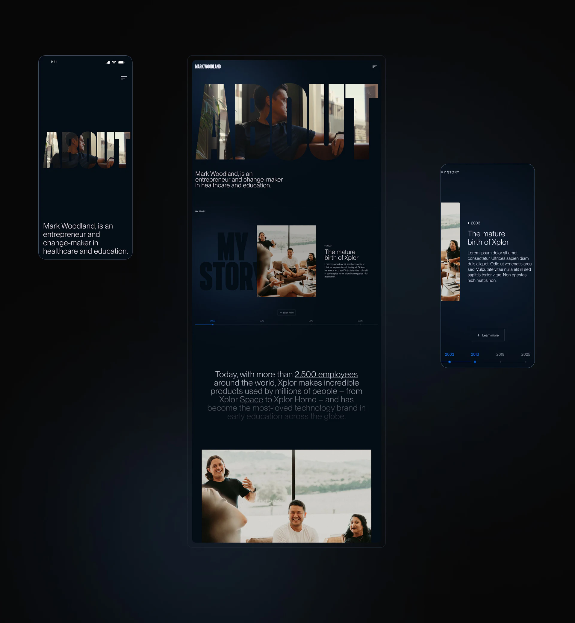
About embeds a photograph in large letterforms, continuing the site’s personal character. My Story then uses photographs, event headings, and year markers along the bottom, moving from image-building into searchable background. Nodes with summaries suit visits focused on a particular period.
The current year must correspond to the current event. If blue markers express clickability, visited state, and selection, shape, labels, or position should distinguish them. Photographs and summaries should also update together after a change.
Some body text in these review images is placeholder layout. Production content should establish event names, years, and summaries before judging length and space. A biography is not better simply for being shorter; this page should help locate the experience a reader needs.
Topics and media formats form different layers
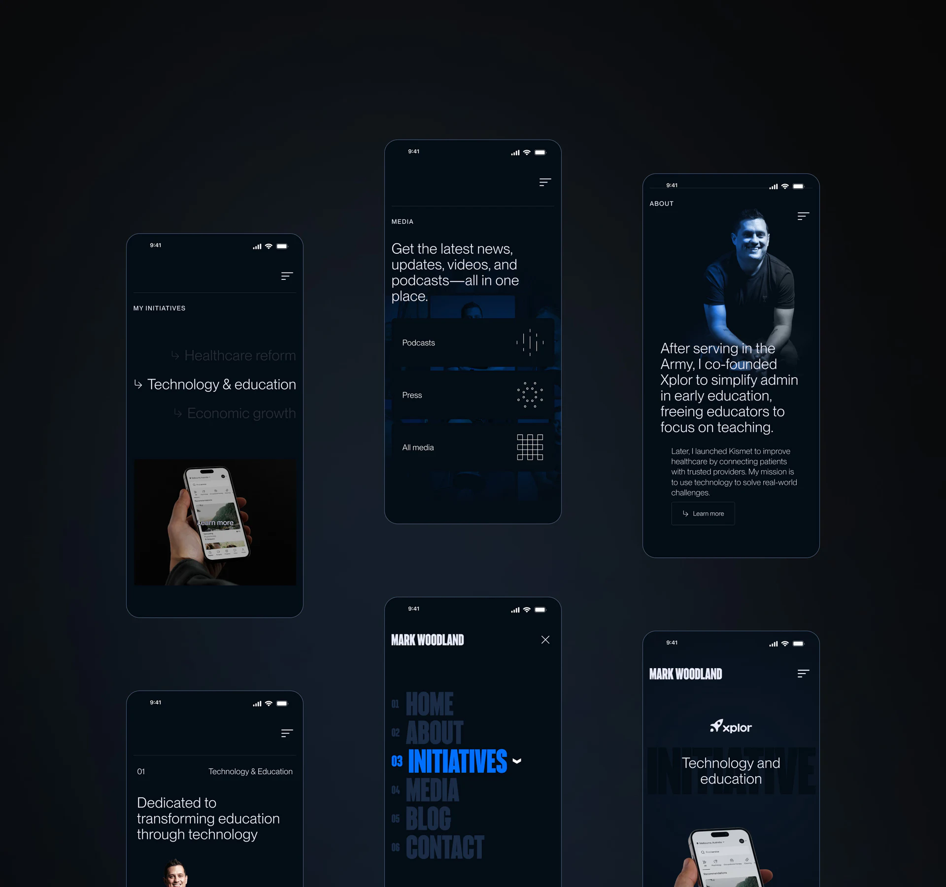
My Initiatives includes healthcare, technology education, and the economy, while Media distinguishes Podcasts, Press, and All media. One answers what the person addresses; the other answers how to read it. They suit separate sections.
The expanded menu uses condensed capitals, with blue marking the current item as on the homepage. Unselected items are dark against the deep background and need readability checks, so available sections do not resemble disabled options.
Retaining related topics when moving into Media could make cross-section searching smoother. Podcasts could include duration; reports could include dates and headings. Fields should follow content types rather than only changing covers, which is easier to maintain than loading every category into the primary menu.
Frequently asked questions
Should a personal homepage begin with the full biography?
An identity summary and main topics can come first, with experience in a searchable section. Visitors have different purposes; topic entries reduce compulsory reading from the beginning.
Why classify media by format?
Podcasts, reports, and video have different reading conditions. Format categories help people choose, while topics can offer another filter connecting related content.
Design review checklist
- Make topic name and playback state confirmable together.
- Match the current timeline year to its event.
- Keep unselected text readable in dark menus.
Organize entries into a personal website
When a personal brand has varied experience and media material, first establish relationships between topics and content types, then plan the homepage and mobile navigation.
JVDS Design Studio provides UI/UX design, website design, and development services, helping organize page content, interface structure, and implementation needs.
 Link copied