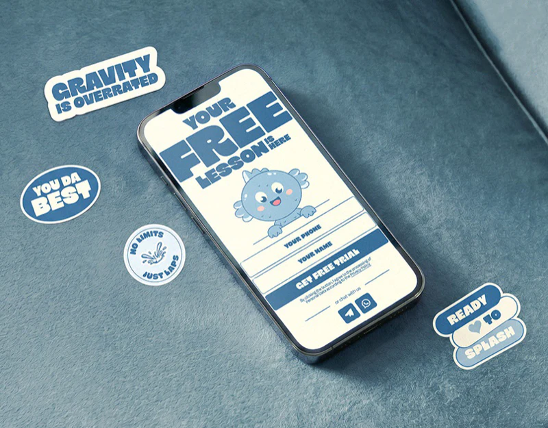
SOI’s children’s course website design resembles a set of ocean-themed posters. Cream supports bold blue type, with anchors, hats, and small sea characters beside photographs. Different sections remain recognizably one brand. Specific graphics create warmth, while course information and booking need a steadier hierarchy.
Key takeaways
- Bold blue type on cream establishes a distinct identity, while hand-drawn arrows indicate browsing direction.
- Characters emerge at photograph edges, adding interest without covering the main people.
- Photographs, per-class prices, and booking entries sit together, with room for enrollment conditions nearby.
Ocean elements support actual entries
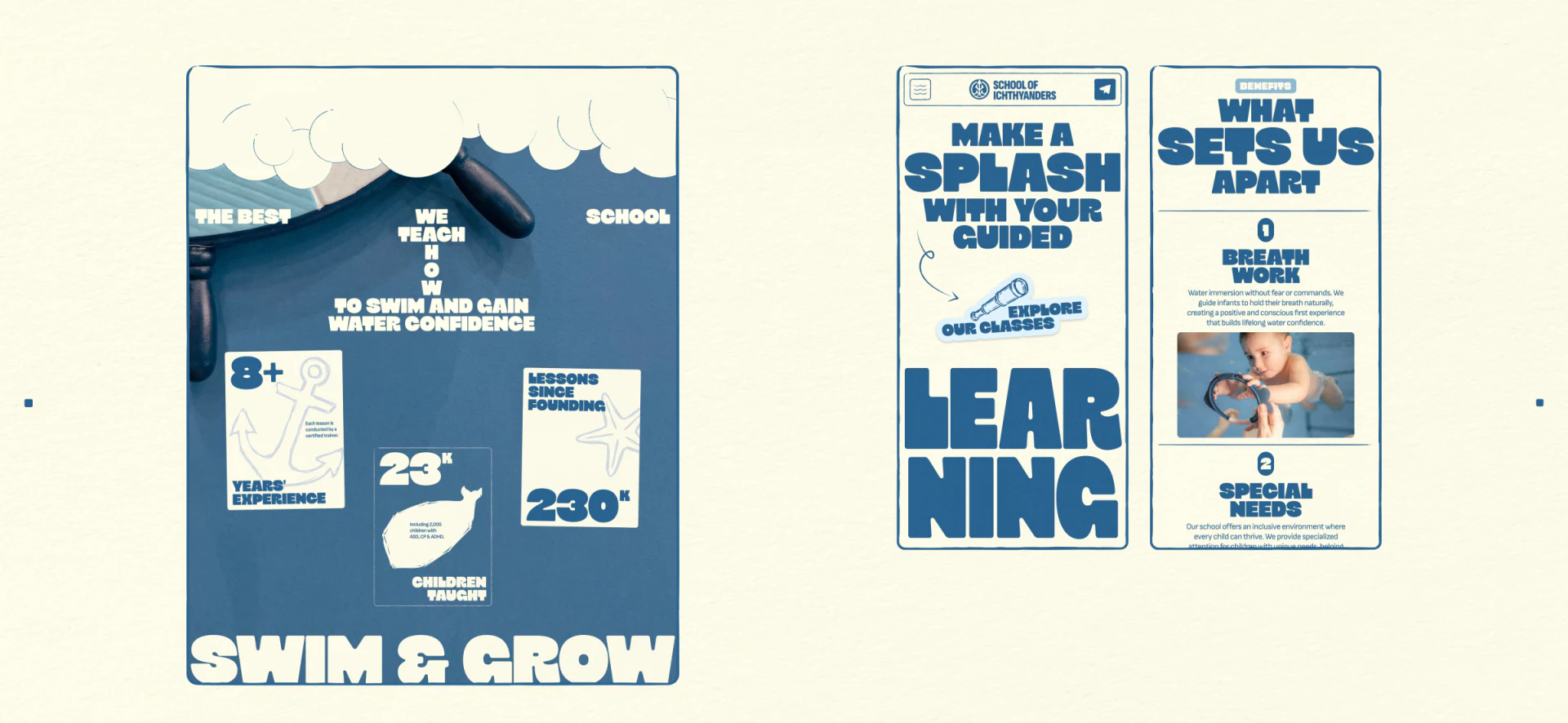
A hand-drawn hat sits beside Explore Our Classes, with a curved arrow pointing from the heading toward the entry. Graphics help explain the next step rather than only decorating the footer. Repeated blue and cream give the website, posters, and mobile pages a shared outline.
What Sets Us Apart on the right introduces feature headings, short explanations, and children’s photographs. Heavy type locates content, photographs show activity scenes, and ordinary small text supplies detail. These scales are easier to read together than exaggerated headings throughout the page.
LEARNING is split across two lines, suiting a poster mood, while task names should ideally remain intact. JVDS would use this style for guidance and brand headings, with ages, locations, and times in stable layouts. Clear conditions need not reduce playfulness, and parents should not have to piece letters together before finding information.
People make the brand story concrete
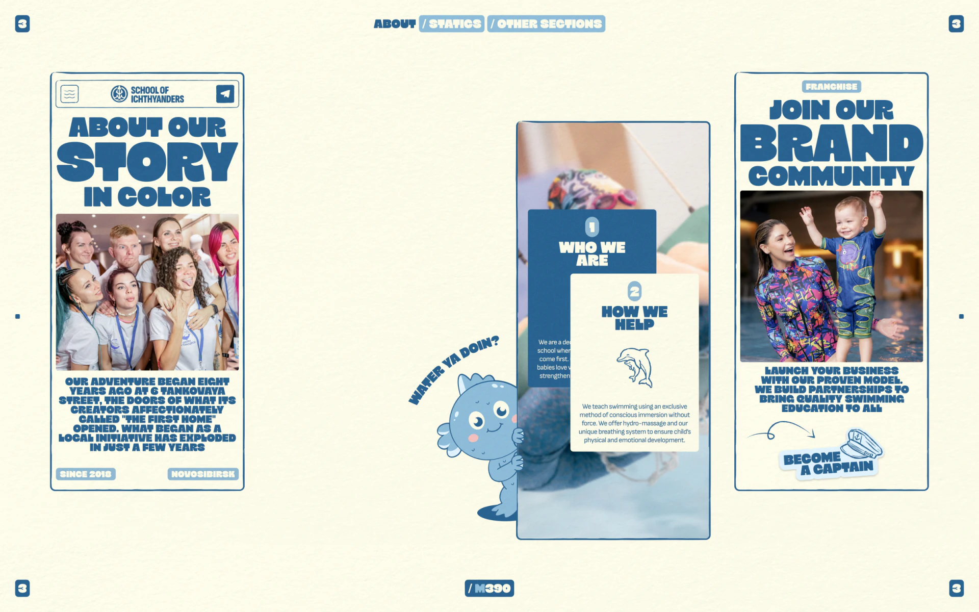
Our Story centers a team photograph beneath a large heading and above a passage in heavy type. People appear before the story, creating an impression without a long institutional introduction. Small date and location labels below remain individually recognizable.
Who We Are and How We Help cards overlap a course photograph in the center. A small character peeks from the left, its blue cheeks and outline connecting with the border without covering the central people. Franchise on the right uses a teacher-and-child photograph and Become a Captain to address partnership. The visuals remain similar while the audience changes.
A comparable course website can retain this brand language while separating enrollment and partnership recruitment in navigation. Parents want to know where children learn and with whom; partners want terms of cooperation. Distinct text entries are more direct than making everyone follow the same story.
Booking fields should explain what follows
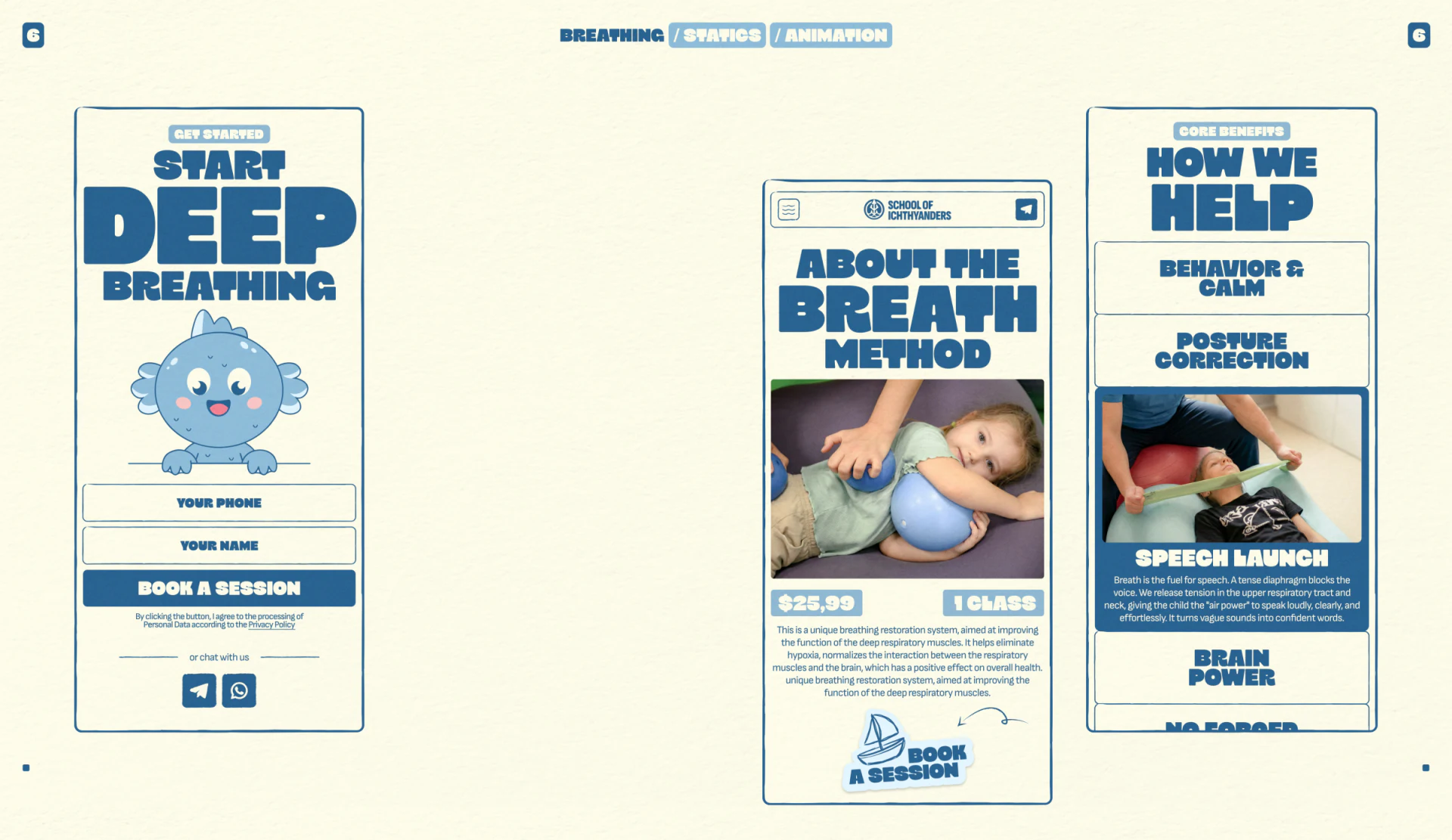
The booking page retains a large character, but name and phone each have separate borders, followed by a solid blue Book a Session button. The character sits above the fields, leaving inputs easy to find. Chat channels below offer another starting point. Personality and writing areas have clear boundaries.
Course details place a photograph, per-class price, and 1 Class label near introduction and booking. This proximity works well. Age, duration, location, and available times could sit near the price so the course unit and eligibility can be understood together.
The two-field form does not show time selection. Its button could clarify whether submission requests contact or begins a confirmed booking. Course-outcome copy needs appropriate specialist review; this commentary only examines hierarchy and placement. Heavy headings suit browsing, while expanded explanations need readable type and paragraphs for conditions rather than slogans alone.
Frequently asked questions
Where should characters appear on a children’s course website?
Near entries or photograph edges can add warmth while avoiding key text and people. SOI’s characters beside introduction cards and above forms offer useful positioning references.
What information should appear before course booking?
Show applicable ages, format, location, time, and the fee unit first. If the form only collects contact information, the button and result should explain subsequent confirmation.
Design review checklist
- Read course entries to check that decoration has not split short phrases into unrecognizable fragments.
- Look for age, time, location, and course units near the price.
- Distinguish parent enrollment from brand partnership entries.
Carry a children’s brand into enrollment pages
Playful characters can extend throughout a website, while course conditions and forms need design attention together. JVDS provides UI/UX design, website design, and development services; bring course information, brand assets, or current pages for discussion.
JVDS Design Studio provides UI/UX design, website design, and development services, helping organize interfaces, content, and development needs.
 Link copied