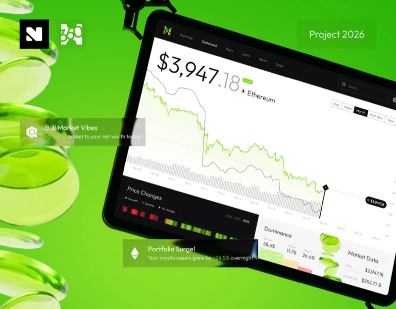
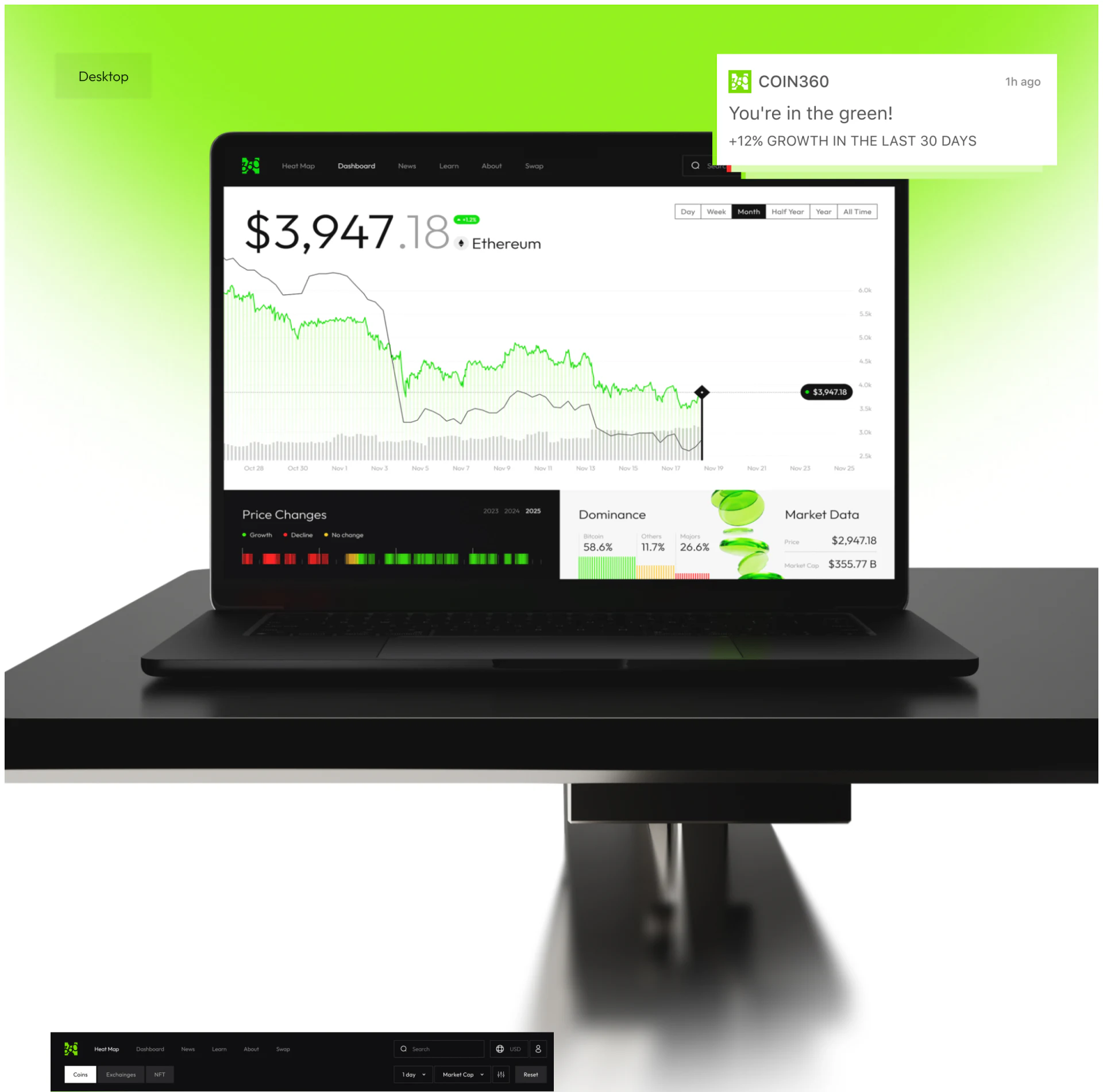
Coin360’s market dashboard catches attention with a large price, then unfolds time through a wide curve. Monthly controls stay beside the chart, while annual strips have their own area. Keeping scope findable while reading a trend is the useful arrangement here.
Large price and current period stay above the main chart
The asset name sits close to a large price, with a dark integer portion, lighter decimals, and a small green change label. The number has strong visual weight without displacing the object name to another module.
Controls at the upper right run from Day to All Time, with Month on black. The visible row lets readers identify the selection without opening a menu. This suits dashboards used to switch scope repeatedly, making it harder to lose track of the curve’s time range.
The wide chart runs gray and green lines along dates. A vertical line and price overlay locate the selected point. A price label near the observation is easier to associate with a date than a separate numeric card in a corner.
JVDS values the proximity of object, scope, and reading. An actual product should also clearly label multiple curves and state update time. The line forms can be analyzed from the image, but current prices, accuracy, and update speed cannot be established.
Annual color strips offer another overview on black
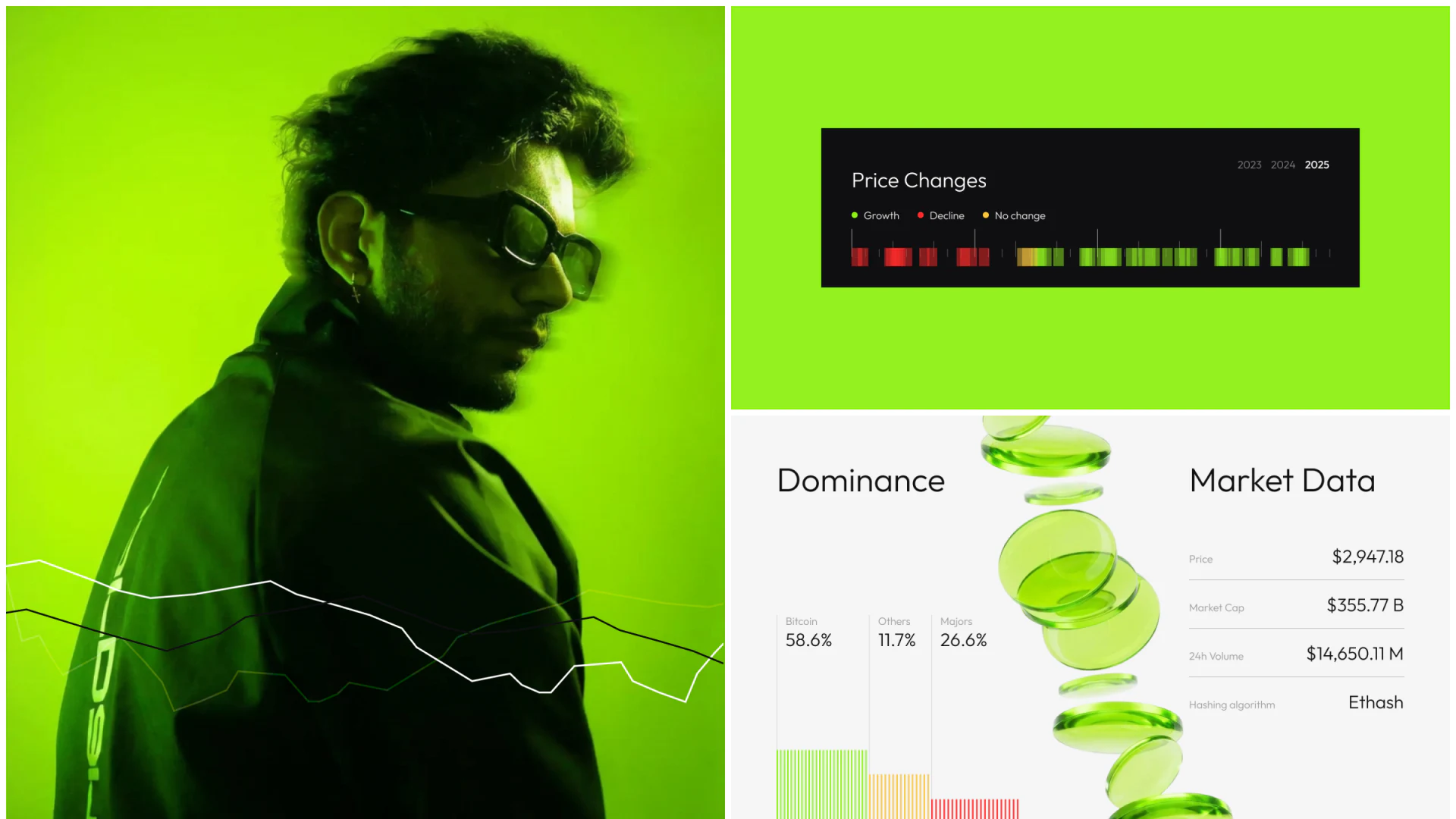
Price Changes uses short red, green, and yellow strips, with Growth, Decline, and No change legends and a separate year at the upper right. Many changes fit into a shallow area, offering a different viewing scale from the main continuous curve.
Text legends matter because color is not the only explanation. Bright green is also part of the brand; assuming every green area means growth would mix decoration with status. The legend supplies a specific context for the strips.
Annual strips alongside a monthly chart require separate time definitions. An interaction could show a selected item’s date, change, and comparison baseline; whether it affects the main chart should be demonstrated in a prototype. The current image shows only the layout.
Market fields return to a list for checking
Dominance and Market Data sit below. The former uses proportions and stripes for an overview; the latter lists Price, Market Cap, 24h Volume, and other fields. Trends, composition, and fields are not forced into one graphic, preserving their different purposes.
Fine dividers separate rows, with values aligned right for stable name-to-value pairing. A green three-dimensional graphic nearby supplies brand atmosphere; fields supply specific explanations. Reducing decoration further would not disrupt the list’s reading order.
One inconsistency needs checking: the large main-chart price differs from Price in Market Data. Even at the example stage, clarify whether they concern different objects or times; if they should agree, synchronize them. This is a content issue within the image, not something to solve through more color or larger type.
Mobile retains periods and separates viewing from input
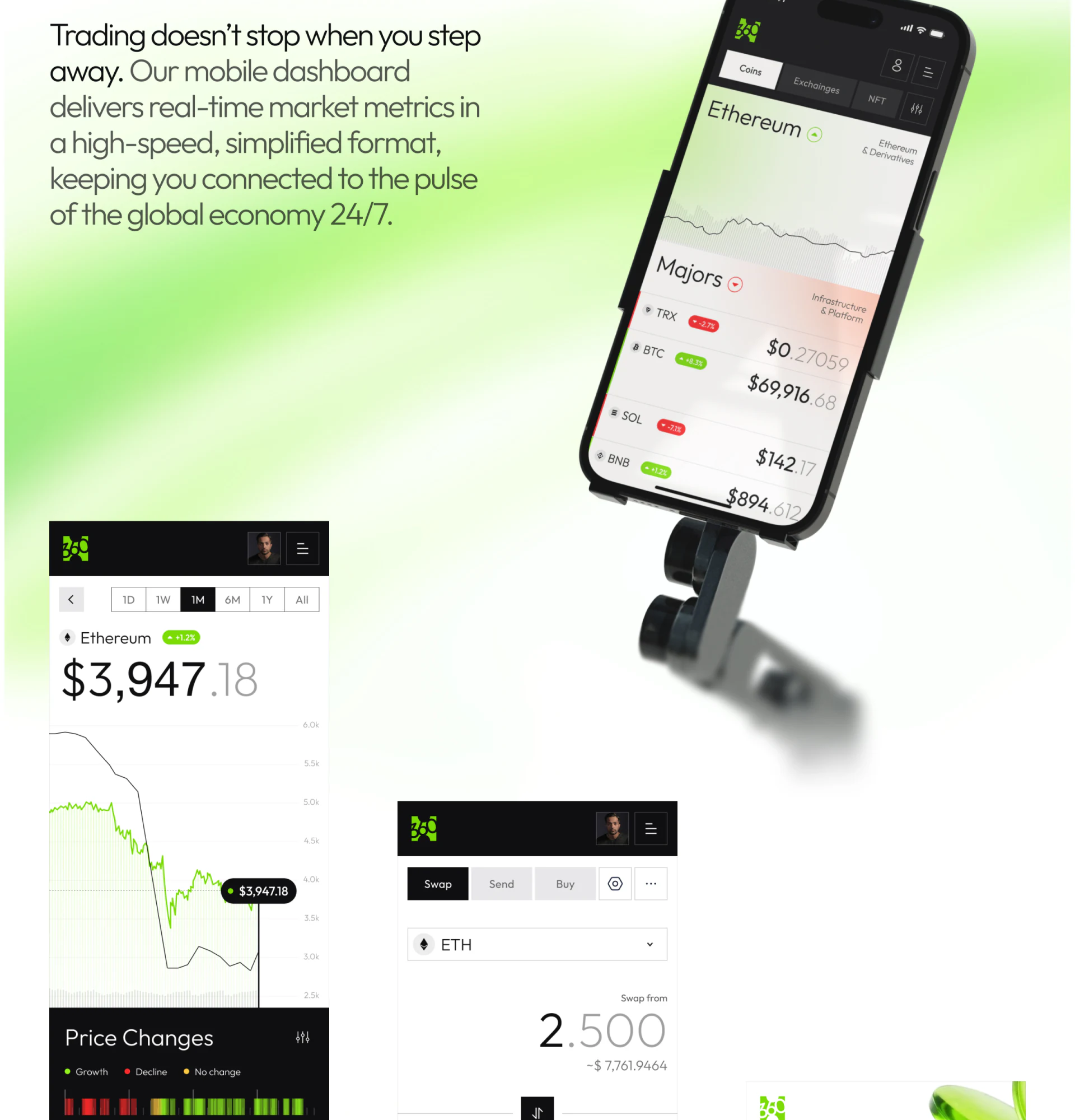
Mobile keeps 1D, 1W, 1M, and other options above the price, with the current choice on black and the asset name still adjacent. The wide curve becomes narrow without changing the basic reading sequence.
The list organizes names, prices, and red or green change labels in rows. A separate input page distinguishes Swap, Send, and Buy, with separate areas for source-asset selection and amount. Browsing information and entering actions are visually separated.
This is a useful planning reference for data tools: clarify what users are observing, then reconfirm the object on the action page. Actual fees, networks, expected results, and confirmation feedback need full prototypes and supporting material. The article makes no transaction judgments from static examples.
Try long asset names, different currencies, and more digits to check whether large numbers stay connected to units. Also confirm that returning to the main chart restores a readable period. These specific correspondences create a sense of reliability.
Make scope and actions clearer in data products
Dashboards, market tools, and other data-heavy products can put object, time, and reading on one path first. JVDS Design Studio provides UI/UX design, website design, and development services for layered data interfaces and supporting product websites.
 Link copied