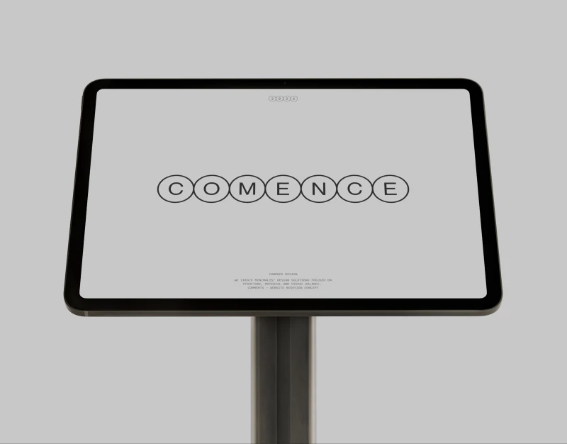
Comence’s portfolio gives material close-ups generous space, letting white pages, fine lines, and circular arrows recede. Material portfolio design can use this restraint to emphasize surfaces and structure, while retaining names, categories, and explanations so viewers remember more than an attractive texture.
Large images emphasize materials but need stable identities
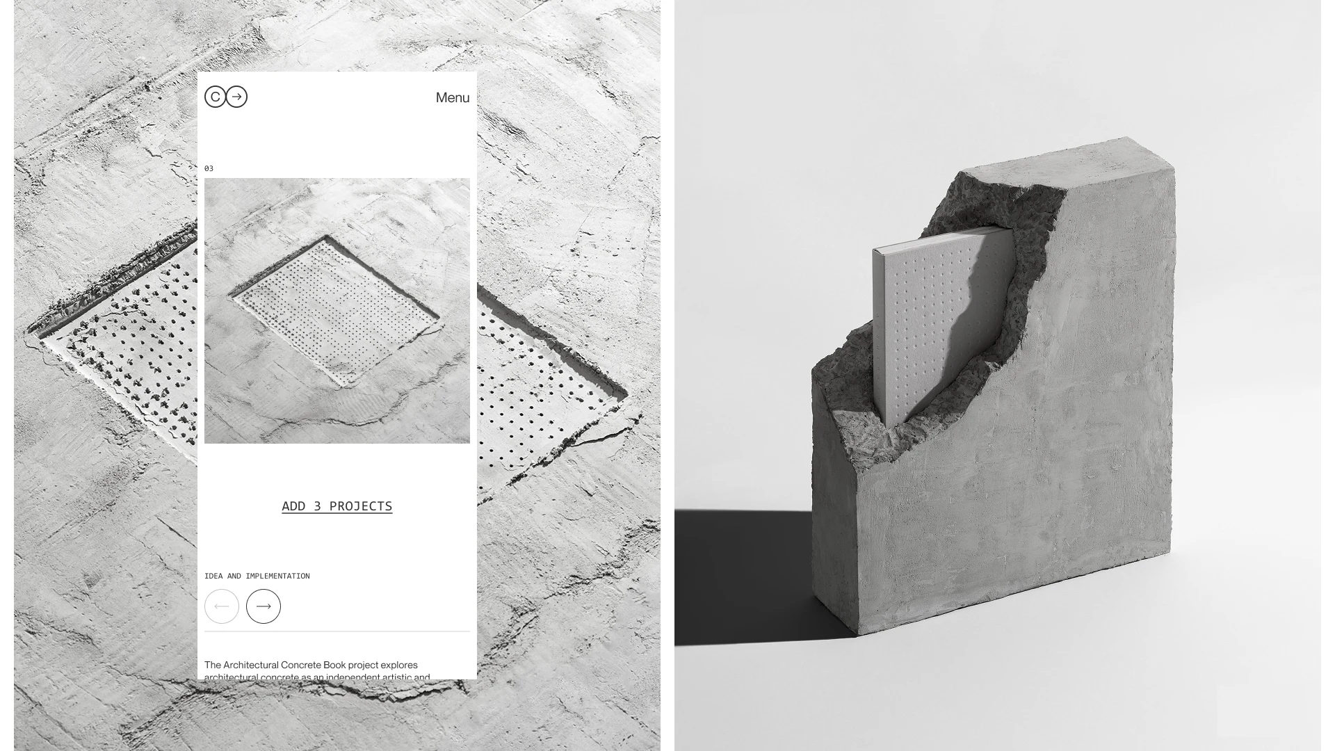
Concrete texture fills the background, with white mobile pages layered on the left showing another close-up. A three-dimensional concrete form with an inset panel on the right contrasts surface texture with physical structure. Black, white, and gray keep the focus narrow, and menus and numbers do not compete with the material.
The number 03 and circular previous/next arrows offer limited browsing cues, with explanations beginning below. When gallery works change, a stable name and category beside the image would help readers find the object again. ADD 3 PROJECTS also needs its actual action clarified: load more or add to a collection? A precise verb explains the next step better than an underline.
Project fields turn visual impressions into comparison criteria
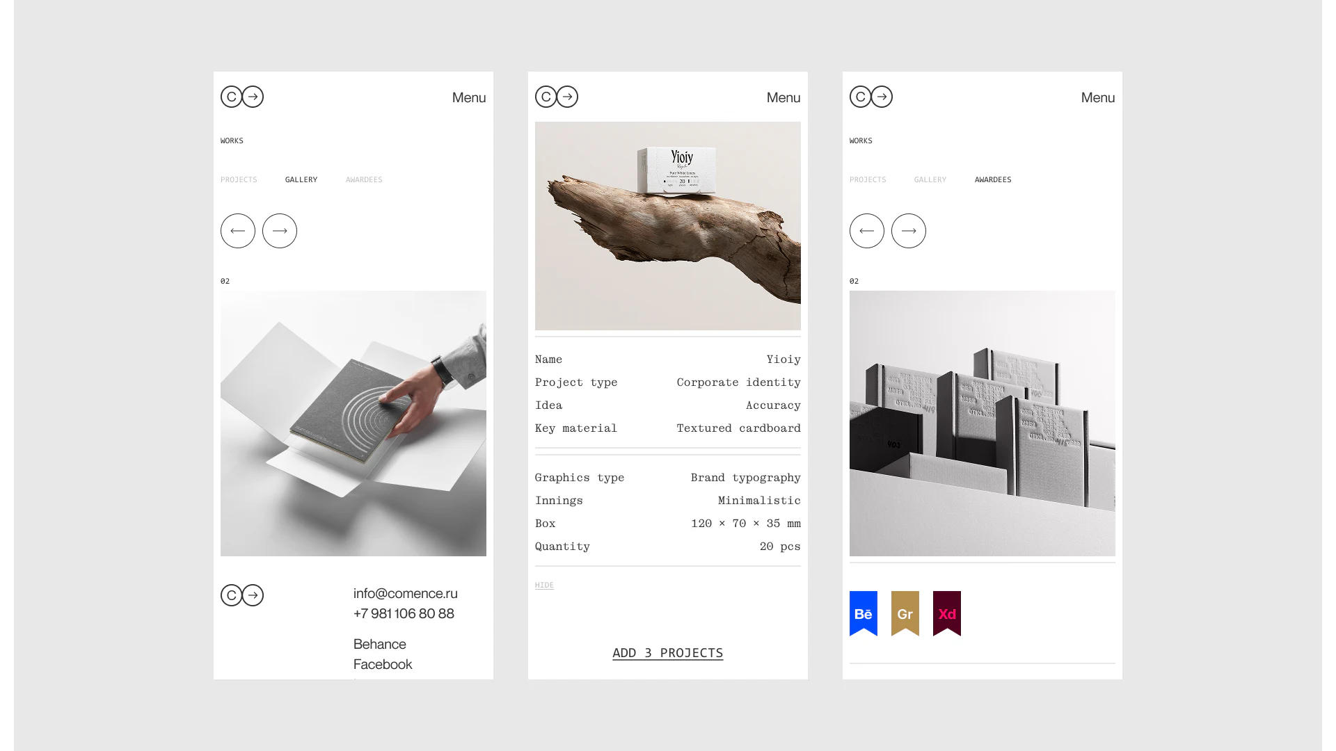
Below a packaging image, Name, Project type, Idea, and Key material align before graphic type, style, dimensions, and quantity. Labels and values occupy separate columns, with fine horizontal lines dividing groups. The quiet layout provides a project outline. Gallery and award sections also show selected states, suggesting different ways to browse the same collection.
Textured cardboard, brand letterforms, and specific dimensions explain materials and design methods in the image. JVDS prefers attributes chosen for the current work: material, book, and branding projects may use different fields while sharing reading rules. Filling identical attributes merely for formal alignment can dilute important content.
Labels such as Idea and Innings could use more direct names or short explanations. Concision includes removing the need to guess what a word means for a particular work, not just reducing word count.
Expanded descriptions and related work serve different depths
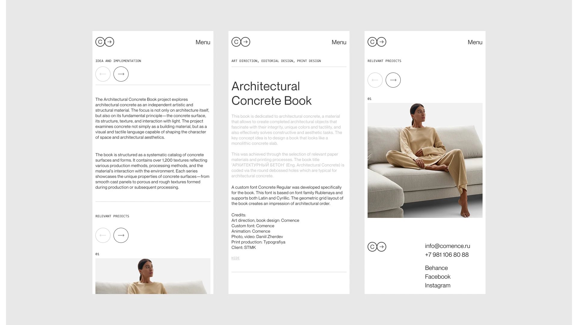
Architectural Concrete Book first lists service categories and its title, then introduces concept and production in paragraphs with Credits and HIDE retained. Idea and implementation continues the material explanation, while Relevant projects restores numbered images and arrows. Identity, deeper explanation, and onward browsing appear gradually, giving viewing and reasoning separate rhythms.
Some concept paragraphs are very pale gray and recede farther than later descriptions. If these are intended as readable body text, they need greater legibility so expanded content does not still look like background text. Collapsing it should also return to the original work position, keeping deep reading from interrupting browsing.
Related projects can state why they are related—material, service category, or design method—and retain project names. Readers moving from the concrete book to another work would then understand the connection. Whitespace can give identity, explanation, and relationships clear places as well as emphasizing images.
Support both viewing and understanding in a portfolio
If your material, branding, or design portfolio needs to organize large images, specifications, and concepts, define each work’s identity and relationships before arranging layered reading.
JVDS Design Studio provides UI/UX design, website design, and development services for portfolios, project details, and gallery browsing pages.
 Link copied