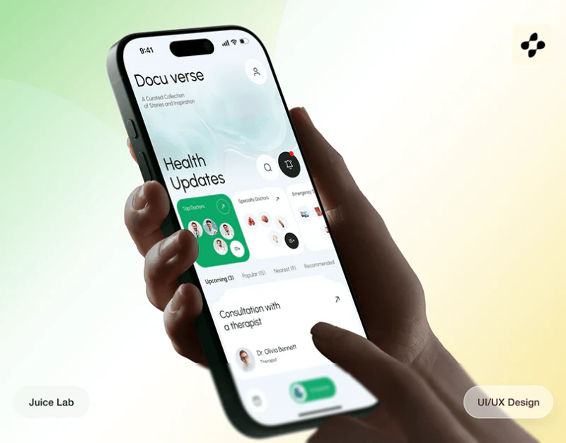
DocuVerse puts a map, professional profiles and schedules in white cards, using green to emphasize selection and booking. Avatars offer recognition cues, while service cards and fees add specific conditions. Health service booking design needs location, person, service and time to keep pointing to the same choice.
Key takeaways
- The map and text card jointly preserve the identity of the selected service.
- Schedule summaries and different data cards should each state their subject and scope.
Map cards add the specific service
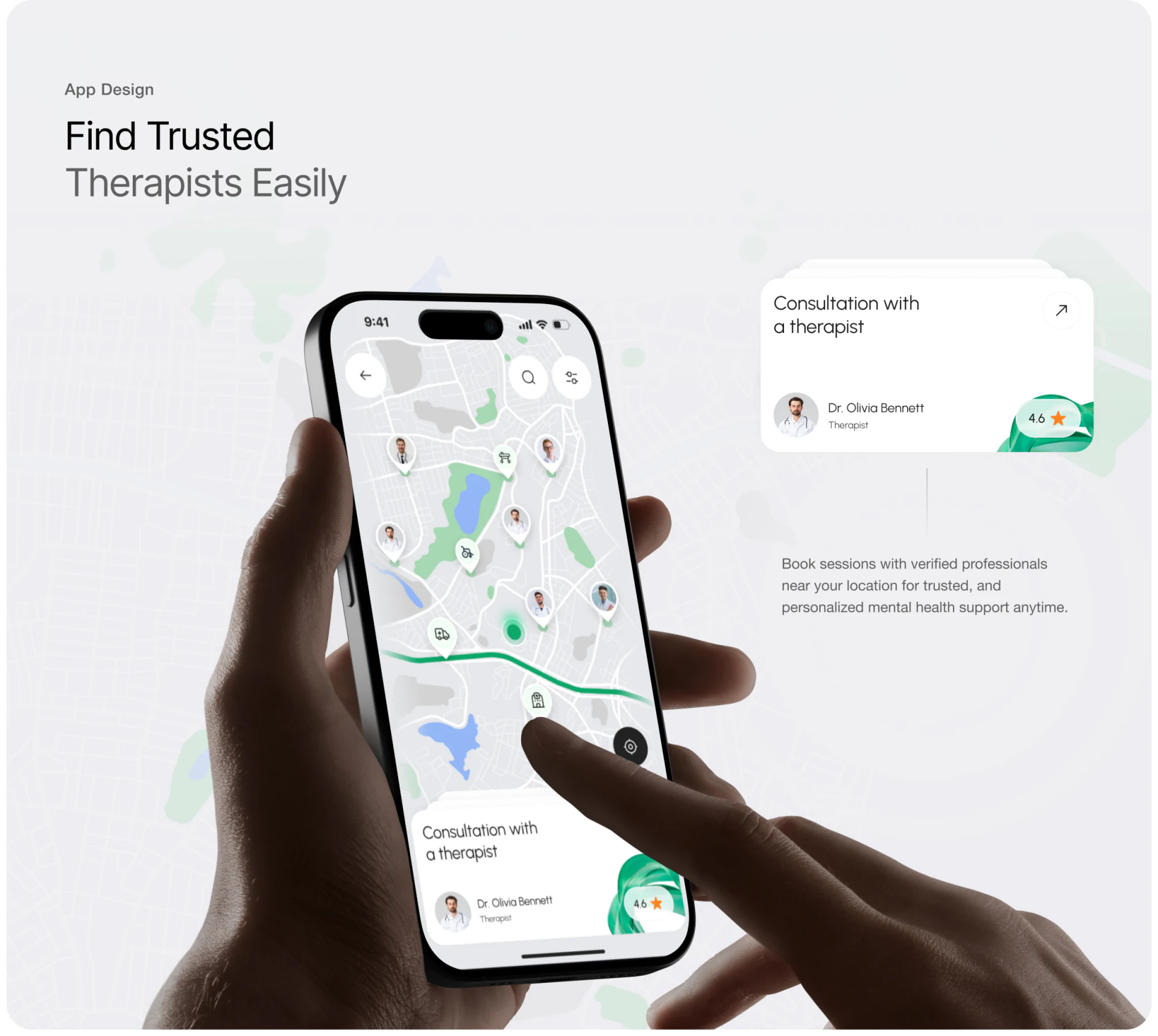
Avatars and other icons mark locations on the map, with search and filters at the top. Bottom cards list consultation type, name and rating. The map shows spatial distribution; the card explains the selected object, giving each a clear role.
The selected marker and card should update together, repeating a name or location. An avatar helps identify a person but cannot explain their professional scope; a rating also needs a source and associated service. JVDS prefers cards that preserve a textual identity, so the current choice remains identifiable after map zooming.
Location search should retain manual entry, since positioning is one search condition. After selection, location and service identity should travel into the details together, avoiding a fresh guess about whether the profile is the item just selected.
The schedule gathers conditions before booking
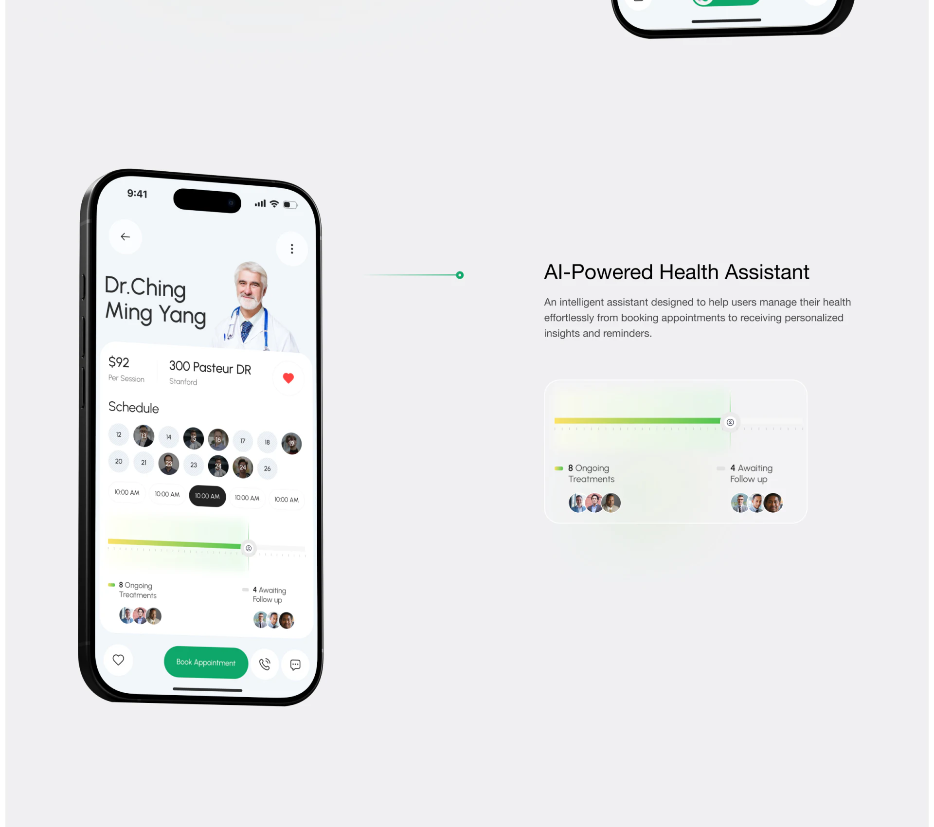
The profile places the name, per-session fee and address before Schedule, with Book Appointment below the schedule and separate phone and message actions beside it. This order supports understanding the provider, choosing a time and then continuing.
The avatar, pale date fields and black time slots differ visually and should explain availability, selection and unavailability distinctly. Full month and year, the time reference and service duration should sit near the selection area, enabling users to describe a specific appointment.
The pre-submission summary should include service, professional, date and time, location and fee. A call or message means communication rather than an established appointment; the booking result needs an explicit status and a way to modify it.
Consistent cards still serve different tasks
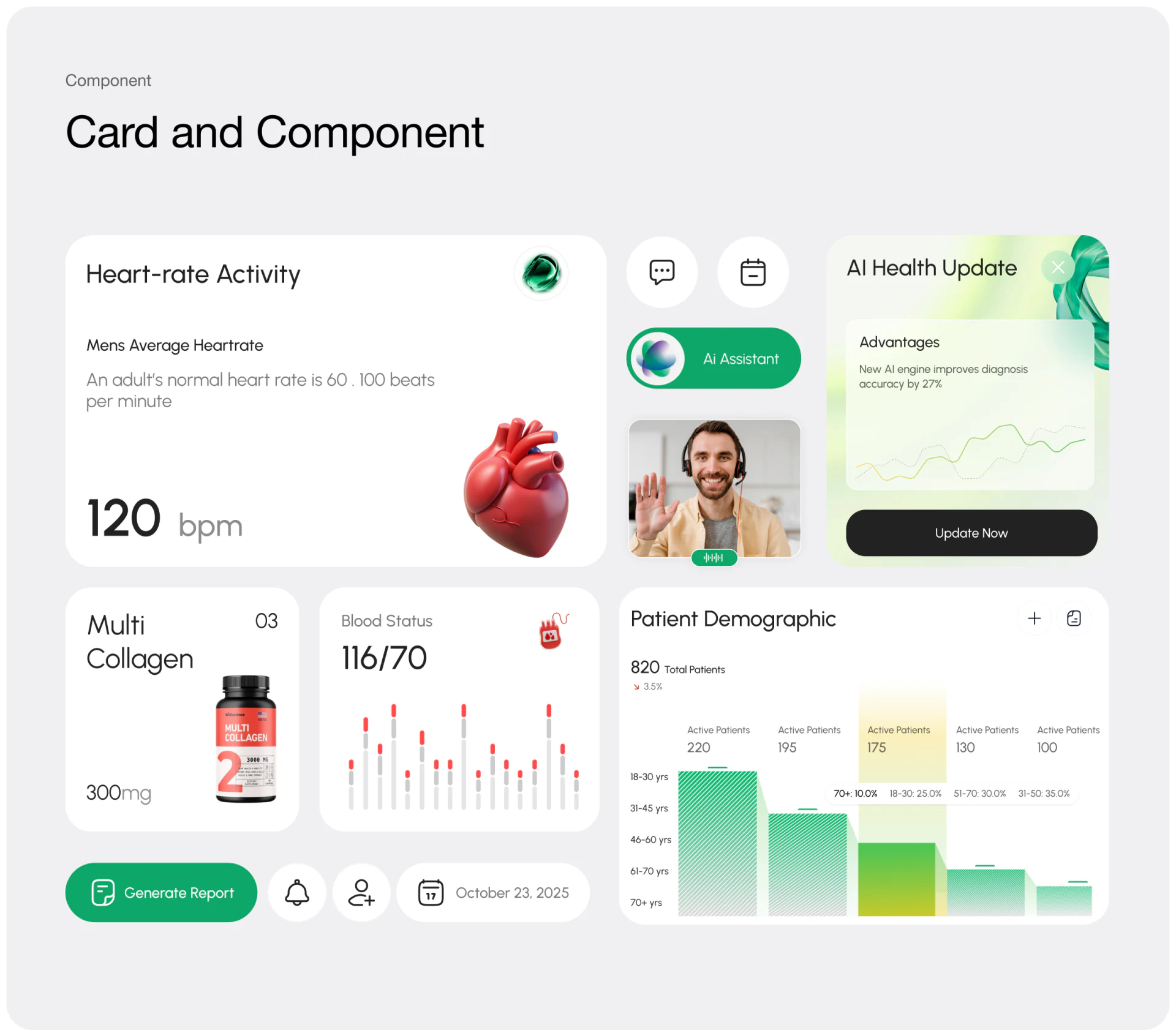
The component board shows heart-rate and blood-pressure-style numbers, population statistics, reports and an AI update entry. Rounded white cards, green emphasis and small dimensional icons share a family resemblance. Common spacing and typography can organize this component language.
Personal readings need a subject, source and time; population statistics need a scope; product updates are system actions. Actual pages should group cards by task rather than pile every component into a generic home page because their shapes match.
A report entry can first specify whose content it generates and for which period. Brand color supplies visual consistency, while titles and fields explain each card’s purpose. One component system can then serve different contexts without confusing the information.
Frequently asked questions
Is a map avatar enough to confirm a service?
Service type, name and location are also needed, with the card retaining identity after selection. Professional scope and ratings need appropriate explanations.
What belongs in a booking confirmation summary?
Service, professional, full date and time, location, fee and the person the appointment is for. After submission, state its current status.
Design review checklist
- Match the selected map item to the card below.
- Give time selections a full date and explicit status.
- Separate data, report and update tasks clearly.
Align checks between search and booking
A health service platform can first align fields across map cards, details and booking summaries, then arrange data cards and report entries.
JVDS provides UI/UX design and website design and development. We can work through page content, interface structure and implementation needs together.
 Link copied