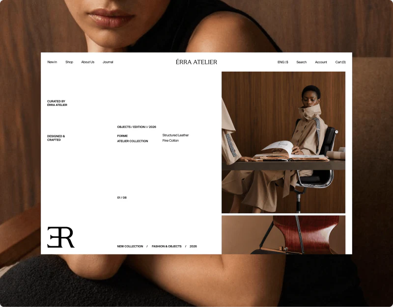
ÉRRA ATELIER’s fashion ecommerce design readily leaves space. A large portrait sits beside a much smaller accessory image, while product grids and details use quiet pale backgrounds. The space does more than set a mood: photographs, text, and options have boundaries, allowing readers to see the outfit before studying one garment’s silhouette and conditions.
Key takeaways
- Editorial photographs of different sizes create rhythm while shop navigation remains clear.
- Consistent pale product images support silhouette comparison; lifestyle photographs provide another scale of viewing.
- Details use a large scene and separate option panel to explain texture and specifications.
The homepage gives photographs different sizes
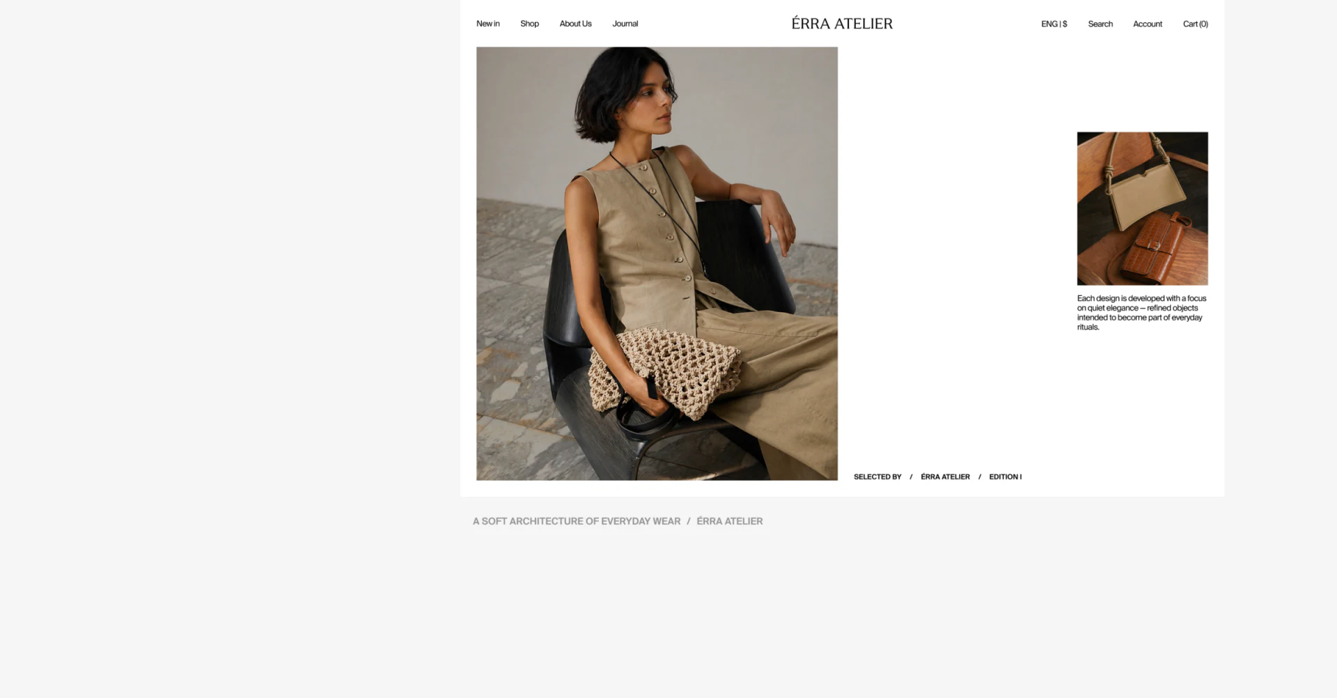
The portrait on the left nearly fills the content area’s height. Beige clothing, a woven bag, and stone surroundings work together. The smaller accessory image on the right has only a short explanation below and broad white space around it. Unequal scale gives the main image priority, leaving the smaller one as a detail to discover.
New In, Shop, About Us, and Journal remain at the upper left, the brand name is centered, and search, account, and cart are on the right. The composition resembles a magazine spread without hiding basic shopping paths. JVDS appreciates this balance: visuals can be quiet while finding products and the cart remains direct.
Shared backgrounds make silhouettes comparable
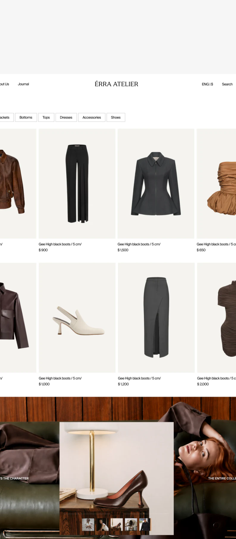
Jackets, trousers, tops, dresses, and shoes occupy similar pale rectangles rather than separate complex settings. Silhouette, length, and color are therefore easier to compare across the grid. Categories sit above, without several marketing banners before browsing begins.
Lifestyle content below returns to people, footwear, and interiors. Product images answer “what does this item look like?” while outfit photography shows proportions and atmosphere when worn. Combining them suits fashion, but purchasable items need accurate links; props in a photograph cannot automatically be treated as products for sale.
The list has a specific content issue: a boot model’s name repeats beneath different garments. Check each product name, then its price and matching detail page. A tidy grid cannot provide stable identities for search, saved items, or order lookup when names are wrong.
A chair can help show a dress’s texture
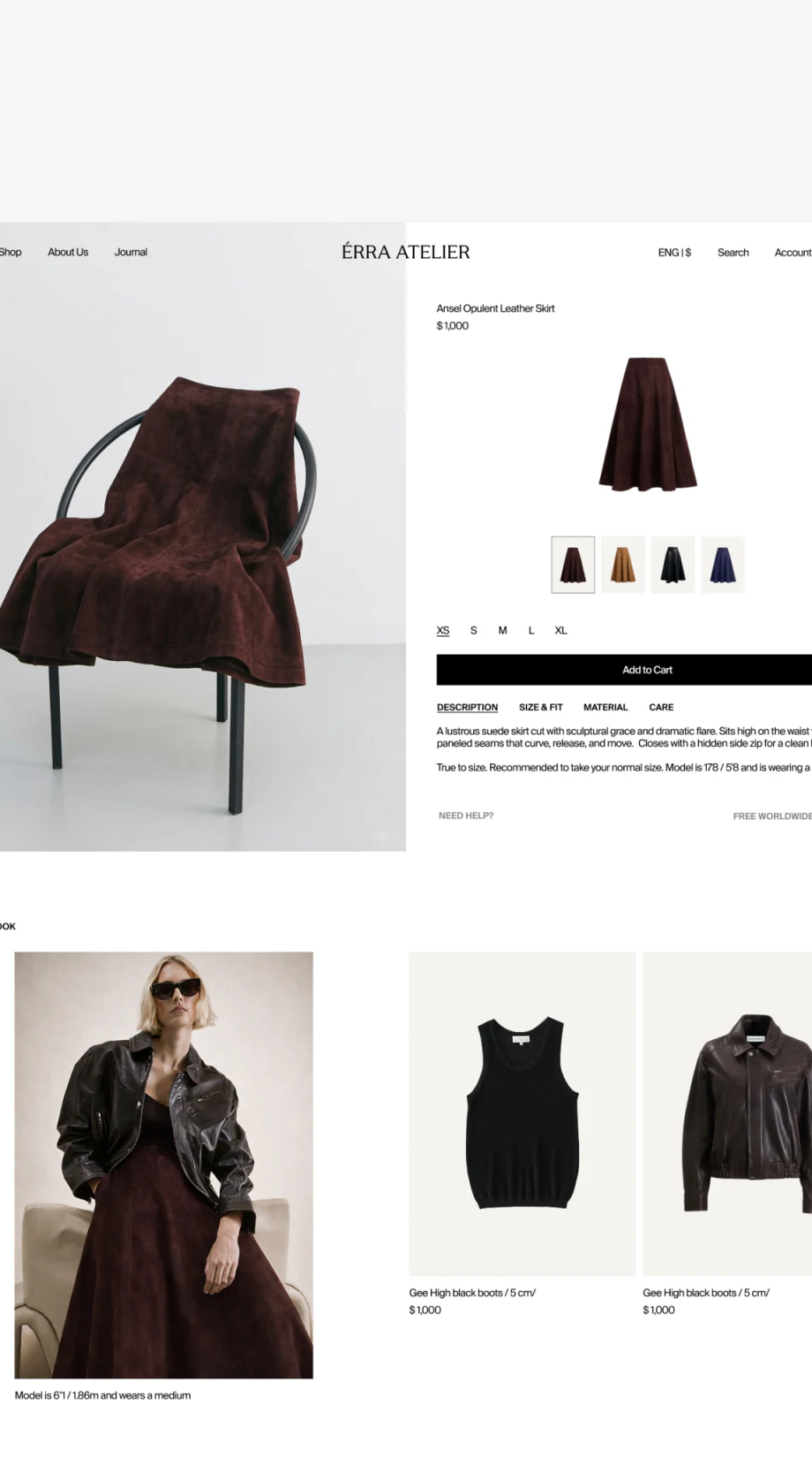
The large detail image drapes a dark brown dress over a black chair, giving its shape and folds the frame. Beside it, a white selection area starts with name, price, and a standalone front image, then four color thumbnails. The scene does not carry all information, and the purchasing panel does not repeat the entire scene.
Color thumbnails are more concrete than plain dots because each version’s appearance is visible. The first has a fine border, XS is underlined, and a black Add to Cart bar follows. Color, size, and adding to cart sit close vertically for checking in one area—a useful arrangement for clothing details.
Name the selected combination accurately
The panel could repeat color name and size near the button, so dark brown, black, and dark blue do not depend only on thumbnail recognition. Description, Size & Fit, Material, and Care organize long-page content by topic. Previously chosen color and size should remain visible when opening information.
The title and material description are not fully aligned, and styling cards below reuse repeated names. Refinement should first align the main product, materials, and recommended objects, then explain their styling relationship. Editorial photographs expand imagination; accurate information determines whether it resolves to one definite product.
Frequently asked questions
Why does fashion ecommerce need both product and outfit photographs?
Product images help identify silhouette and versions; outfits show proportions and style. Both can be used, provided names and links for saleable products are clear.
Design review checklist
- Check that shop navigation remains findable beside editorial photographs.
- Match every list photograph to its product name.
- Describe the selected color and size in words before adding to cart.
Need a clearer visual rhythm for a fashion website?
If you have outfit photography and also need useful product lists and details, we can organize the roles of images, selection information, and page hierarchy. JVDS provides UI/UX design, website design, and development services; bring your product information for discussion.
JVDS Design Studio can work with you to organize content, interfaces, and development needs.
 Link copied