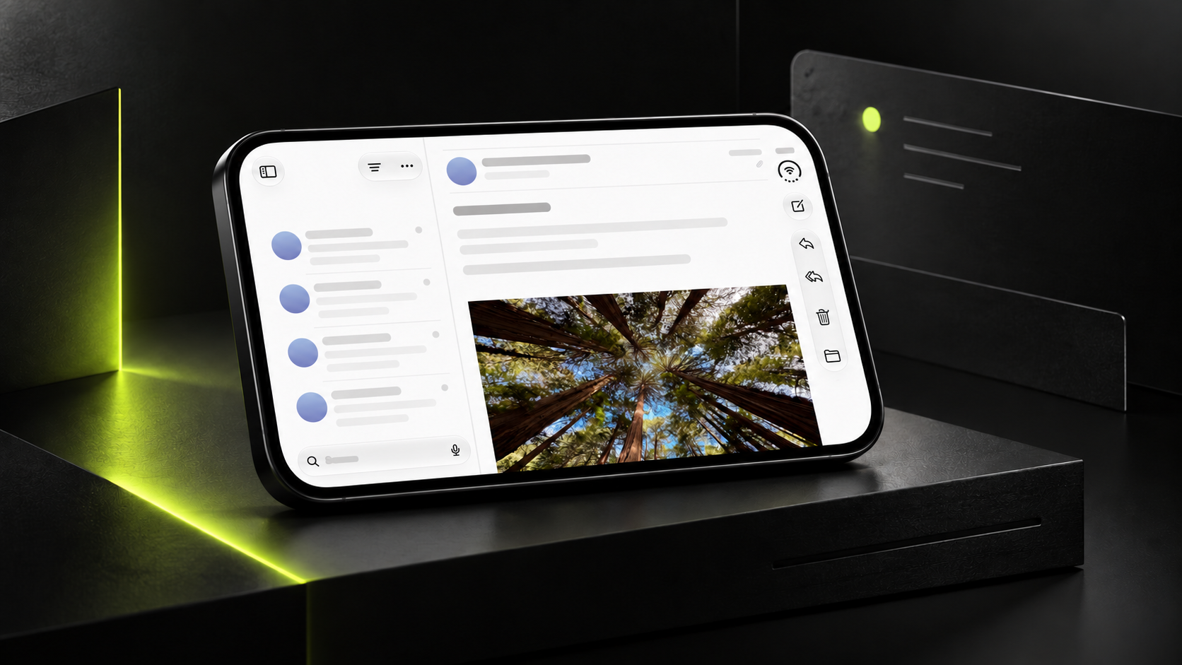
Frendr’s brand presentation develops F into rounded frames, then an early-access page. Yellow-green gradients, large serif headings, and varied thumbnails communicate a community direction. Shared outer frames organize work while internal color and composition remain distinct.
Key takeaways
- Rounded frames create shared structure while work retains individual character.
- Early access should explain application methods and subsequent results.
The mark becomes a content container
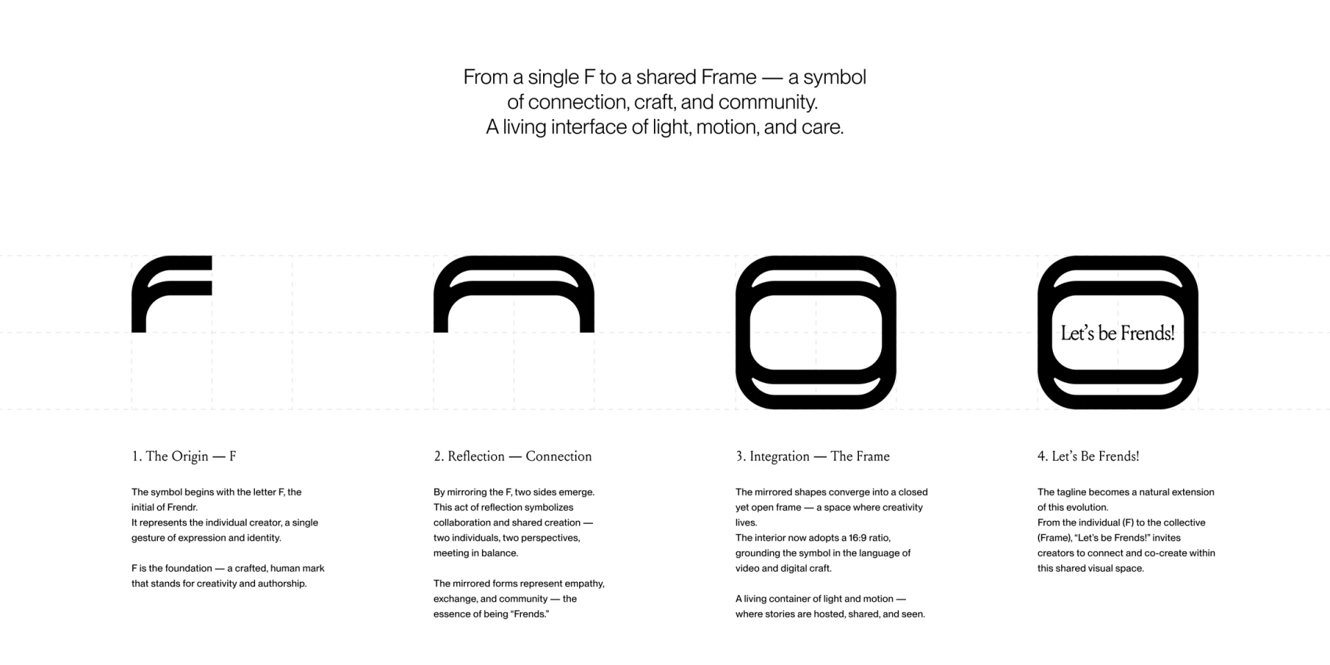
The symbol sequence shows F, mirrored combinations, closed frame, and a phrase version, with clear shape relationships. Branding provides boundaries around content rather than only a separate logo, suiting video or portfolio presentations.
Marks and ordinary frames need different uses. One rounded silhouette can identify the brand, divide sections, or preview video; without scope, decoration may appear clickable. Proportions, space, and minimum size should be defined for each purpose.
JVDS prefers repeated structures supporting content while the brand name has a fixed recognition position. Frames can then extend across many works without adding a large logo every time.
Works keep differences; the entry explains the stage
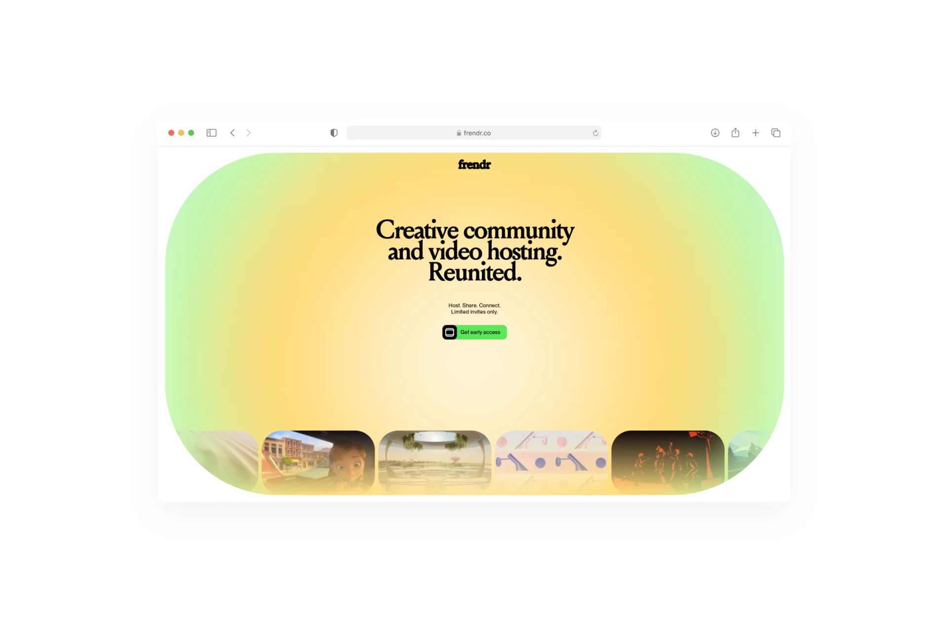
The early-access page uses a large rounded yellow-green gradient around heading and button, with portraits, scenes, abstract forms, and performances along its lower edge. The whole is coherent while works retain individual content, especially appropriate for creators.
Unity can reside in frames, gaps, and control positions without heavy gradients over every image. Differences are part of the platform content: branding conveys character and works provide examples.
Limited invites only and Get early access identify an early stage, but submission and results need explanation. Nearby text could name required material, whether an invitation wait follows, and how status is communicated, aligning expectations with the actual phase.
Type divides expression from reading
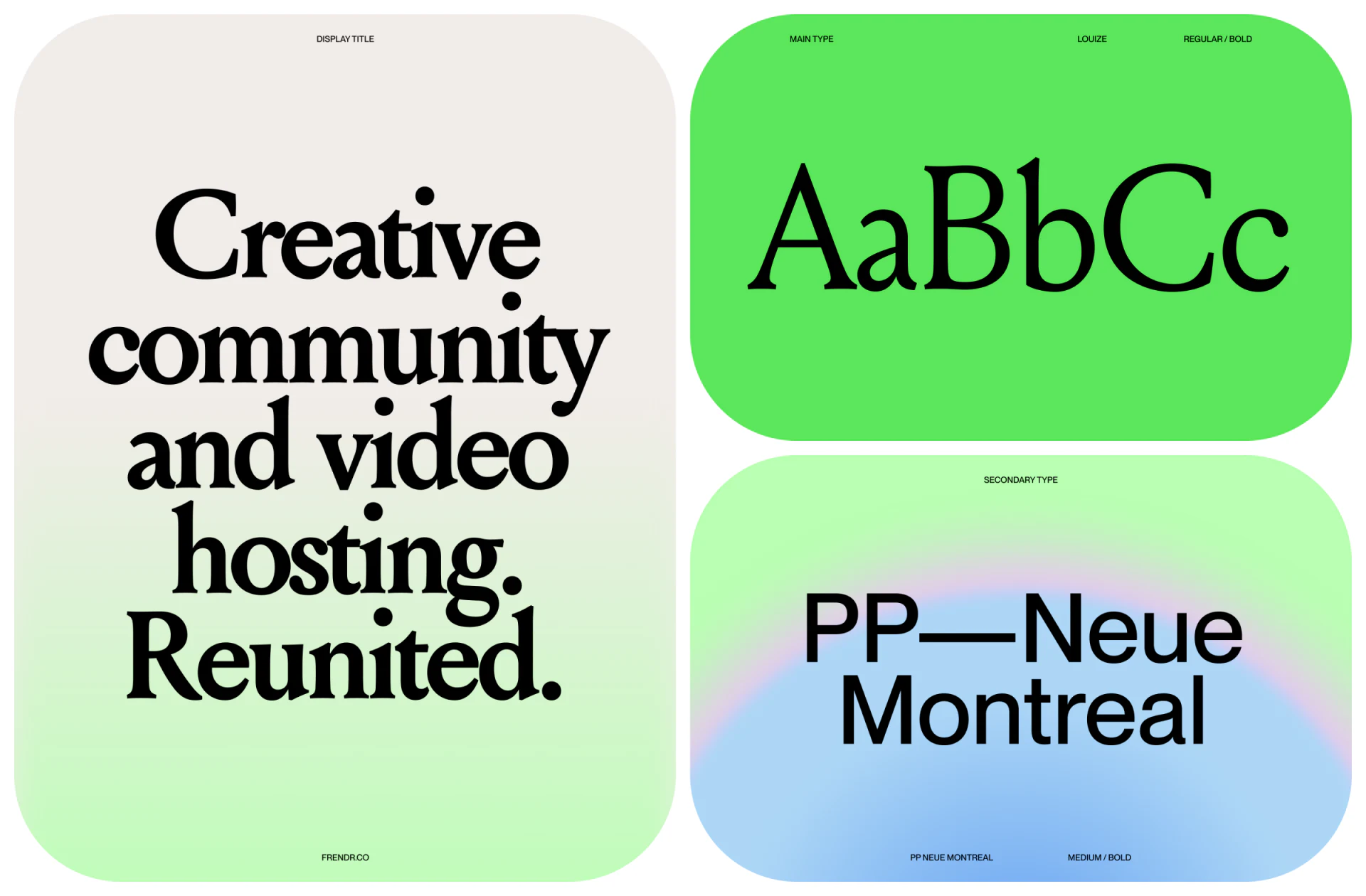
Louize shows high-contrast serif forms while PP Neue Montreal is a simpler support face. Large headings offer an editorial feel, with explanations and actions steadier. This creates more hierarchy than enlarging everything.
Heading breaks should follow meaning and space. Other languages should not copy English line counts, and small application buttons need full names. Type specimens set a direction; final content determines actual layout.
Gradients shift slowly across regions and suit brand backgrounds. Explanation contrast needs independent checks, especially over the brightest areas. Rich color should not make application conditions harder to understand.
Frequently asked questions
Should community thumbnails all share a palette?
Common borders, spacing, and labels can establish order. Differences convey information; strong overlays can reduce recognition.
What should accompany an early-access button?
Required material, invitation conditions, and result notification, followed by submission-success and waiting states.
Design review checklist
- Distinguish logos, content frames, and clickable previews.
- Keep the original work composition readable.
- Make conditions and submission results predictable.
Connect community branding with joining
Creator platforms can begin with work presentations and early applications, establishing containers, content rules, and subsequent states.
JVDS Design Studio provides UI/UX design, website design, and development services, helping organize page content, interface structure, and implementation needs.
 Link copied