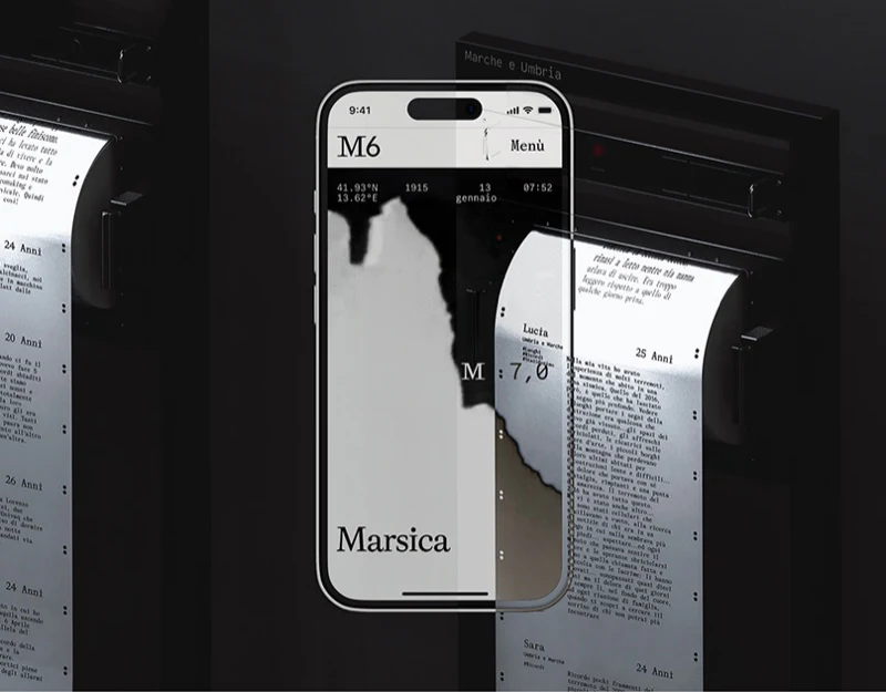
M6 extends personal narratives from maps to exhibition paper rolls. The website supplies location and filtering, while paper offers continuous reading; both share the order of name, age, region and body. In digital archive exhibition design, these simple fields form a valuable connection: media can change while readers still recognize the memory they are reading.
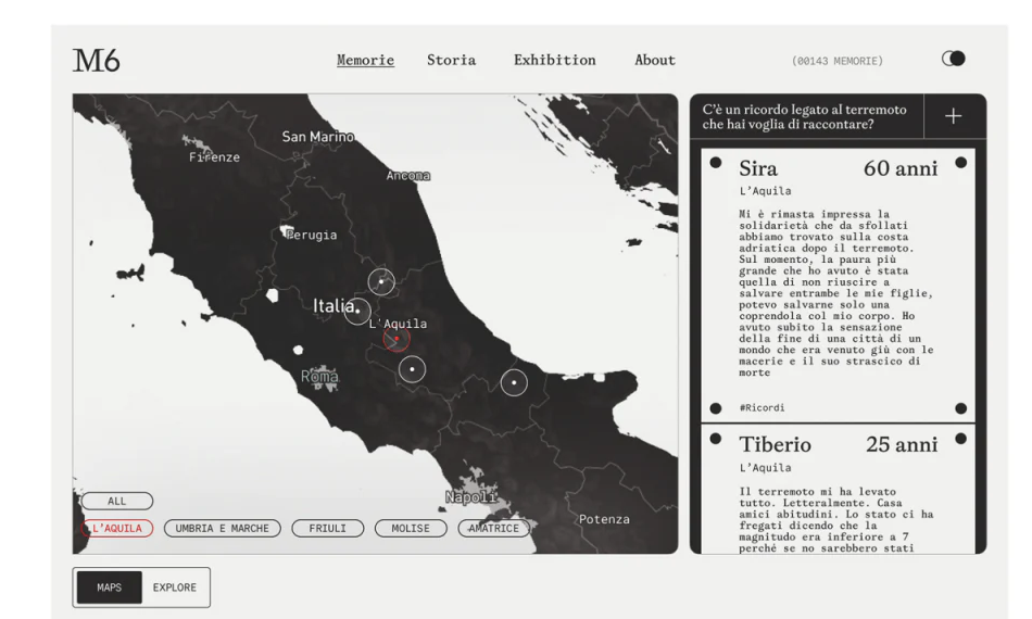
The map locates; cards allow a complete read
Italian regions and circular markers occupy the website’s left, with regional buttons below. Narrative cards on the right begin with name, age and place before a longer body. The map need not carry the full text, and text is not scattered geographically, preserving each medium’s reading strengths.
A red-outlined button and map focus show the current region while other areas remain black and white. One vivid accent makes the selection easy to find in a complex map. Name and color together are clearer than coloring a region alone. Maps and Explore outside the map retain room for changing browsing modes.
A question and plus at upper right introduce contribution beside existing narratives. Visitors can see the kind of content a submission might become before participating. A form preview should retain these card fields, connecting public content, editing and final presentation.
Paper rolls continue the cards’ reading order
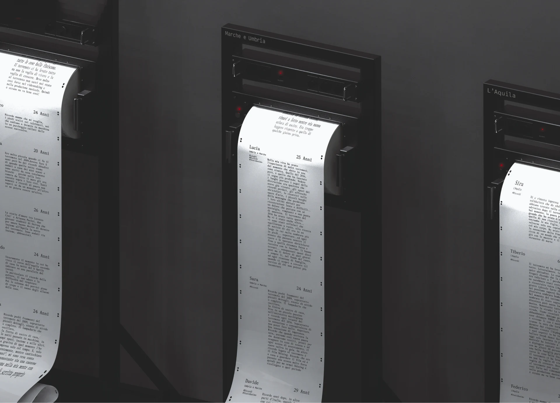
The exhibition places regions above dark devices, with white paper extending downward. Name and age share a line, followed by region and narrative; edge dots echo website markers. A passage once bounded by a screen extends on paper according to content length.
The archive is not reduced to a poster headline. Paragraphs remain, and varying roll lengths give narratives different reading durations. For exhibitions centered on personal experience, completeness is part of expression; photographs and names cannot substitute for it.
JVDS sees cross-media display as preserving lookup cues alongside style. The paper currently relies mainly on name and region; record identifiers or short search instructions would help visitors return to the website more reliably than memorizing passages. Type also needs real viewing-distance checks: legible website text may not suit standing readers.
The installation diagram explains spatial relationships
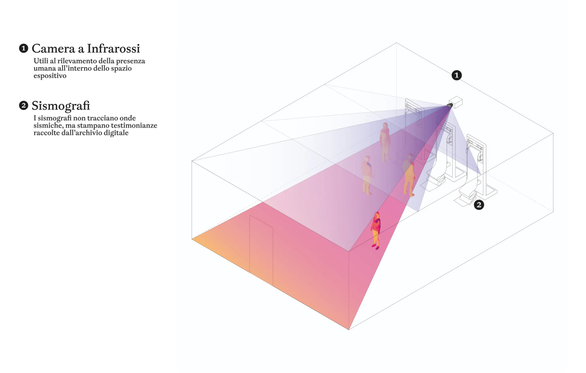
Numbers 1 and 2 identify an infrared camera and paper-roll device, with a translucent sector covering people in the room. Devices, detection area and visitors share one spatial scale, explaining where interaction happens rather than merely claiming it exists.
Left-hand text distinguishes responsibilities: cameras concern presence, while other devices print archived narratives. This helps curatorial teams discuss placement and feedback, but the diagram does not establish an operating installation. Entry responses, simultaneous viewers and printing waits still need actual environmental planning.
M6 suggests structuring content before adapting it to media. Place, person and narrative link website and paper; the spatial diagram adds viewers’ positions. Extending record identity, versions and feedback could make the exhibition another archive reading entry rather than a visit ending on site.
Maintain archive connections across media
Cultural archives, memorial exhibitions and participatory projects can organize record fields before mapping relationships between maps, reading cards and physical displays.
JVDS provides UI/UX design and website design and development, helping design digital archive websites, content navigation and cross-media information structures.
 Link copied