This sports community app design establishes clear levels through black cards and yellow actions. Onboarding retains help near heart-rate input, team pages separate creating and joining, and activity details group scores apart from original records. The pages are lively while preserving explanations beside important choices.
Key takeaways
- Help stays near inputs, while creating and joining have distinct starting points.
- Activity details separate scoring from original records; sharing scope should still be explained before joining.
Help stays beneath the first input
Resting Heart Rate uses a black background, centered heading and short explanation, a BPM input below, and several help entries further down. A note says the value can later be changed in the profile, with yellow Continue at the bottom. Read the field, learn how to find the value, then proceed: the sequence is complete.
Help is grouped into questions rather than one long explanation. For first-time entry, visible methods and an edit-later note offer more support than a bare number field. JVDS values their proximity: explanations should appear where they are needed.
This concerns input design, not health interpretation. Range hints and heart-rate examples belong to the design draft. A real product needs appropriate professional content checks, plus empty-value, formatting-error, and edit-feedback states.

Creating and joining have separate starting cards
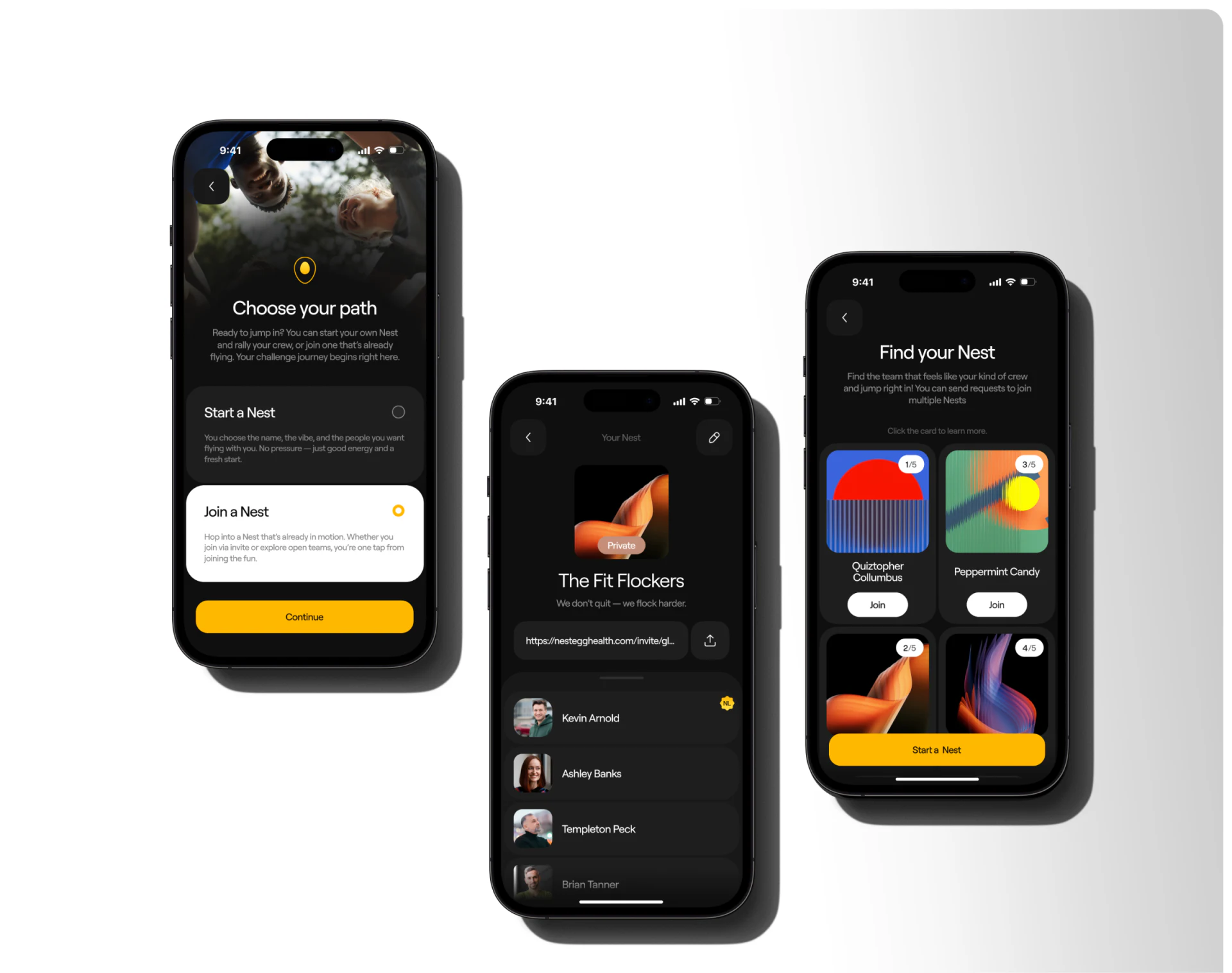
Choose your path makes Start a Nest and Join a Nest separate cards, with the join option white and marked in yellow. An existing team page shows cover, name, members, and invitation. Discovery uses colored covers and Join. Each of these three stages has its own structure.
This suits invitation-based communities. People with an existing team can join, while initiators can create without guessing where a shared button leads. Member counts add context in discovery, but full, pending, and joined states need to differ.
Private appears on the team cover without fully explaining visibility. JVDS suggests a short sharing-scope explanation before joining, with a place to adjust it later. A label can suggest the team’s nature but cannot explain who sees heart rate, activity details, or scores alone. Confirmation is not shown.
Scores and records have separate regions
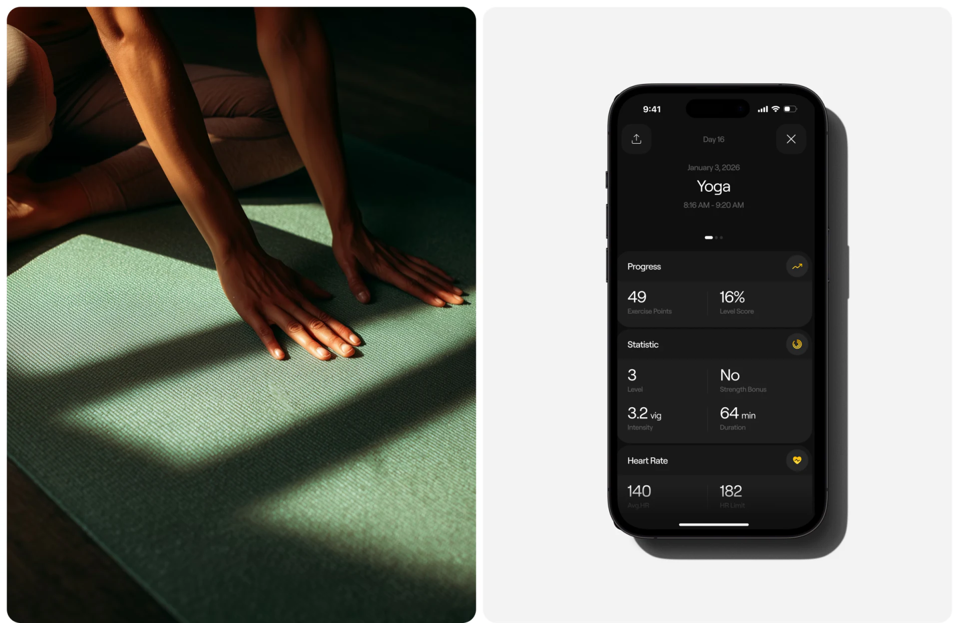
Yoga details start with date, activity name, and time, then Progress with Exercise Points beside Level Score. Statistic below introduces level, duration, intensity, and Heart Rate. The background stays dark, with small yellow icons near groups.
Grouping prevents computed values and original records from becoming interchangeable large numbers. Readers can see product scores and continue into the activity itself. Percentages and points need short explanations or rule entries; equal type size does not make them the same kind of result.
A further walkthrough could edit an activity and check which results change and whether visibility remains consistent. JVDS sees clear action emphasis in the black-yellow visuals; further work is better directed toward joining confirmation and scoring explanations, whose actual behavior the images cannot establish.
Frequently asked questions
Does Private sufficiently explain team sharing?
No. It should identify which records are visible to which members, and where the scope can later be changed.
Design review checklist
- List the specific shared fields before joining.
- Provide a short explanation or rule entry for points and percentages.
Explain exercise records and team choices
If an exercise, habit, or community app needs clearer onboarding help, team joining, and activity details, begin the discussion with fields and sharing relationships.
JVDS Design Studio provides UI/UX design, website design, and development services, helping organize page content, interface structure, and implementation needs.
 Link copied