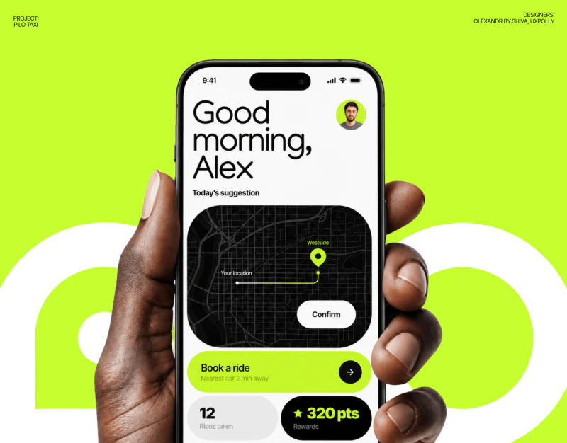
Pilo’s autonomous ride app uses black, white and bright green for clear hierarchy: destination input sits in a white drawer, journey time in a lower card, and arrival brings distance and cost together. The interface is simple; its useful detail is how place, state and action wording work together.
Key takeaways
- A white drawer separates address entry from the dark map; destination and time lead during the journey.
- Arrival groups trip details, while optional amounts and completion need a clear relationship.
A quiet input area sits below the map
A dark map sits above a white drawer containing Where to, start, destination and familiar places. Office, Home and Airport use small rounded blocks, while bright-green Continue is prominent. The map gives spatial cues and the drawer supports entry without either obscuring all of the other.
An adjacent voice page centers Listening, with a blurred green-black circle as a visual focus. Wording still explains the current action. Voice and text coexist rather than voice replacing text entirely, showing the relationship between input routes.
JVDS would check for an editable address after listening. Similar place names and entrances require textual and map confirmation. Only Listening is shown; subsequent recognition, editing and confirmation cannot be assumed.

Arrival estimates precede vehicle values

Heading to TechHub appears at the top with the destination green. Vehicle and road imagery occupy the middle. The lower white card gives estimated time and route before a black inner card presents vehicle values. Scale and background prioritize passenger time.
Start and destination wording identifies the route more specifically than a progress scale alone. Separate comfort and trip-summary components suggest a language for brief status information, but cannot replace complete-page explanations.
Further work could prioritize short wording and onward actions for changed estimates or vehicle pauses. Charger under a percentage is not intuitive; clarify its data type, unit and name first. Bright values still need an explanation of what they mean.
Arrival groups the summary but needs payment semantics
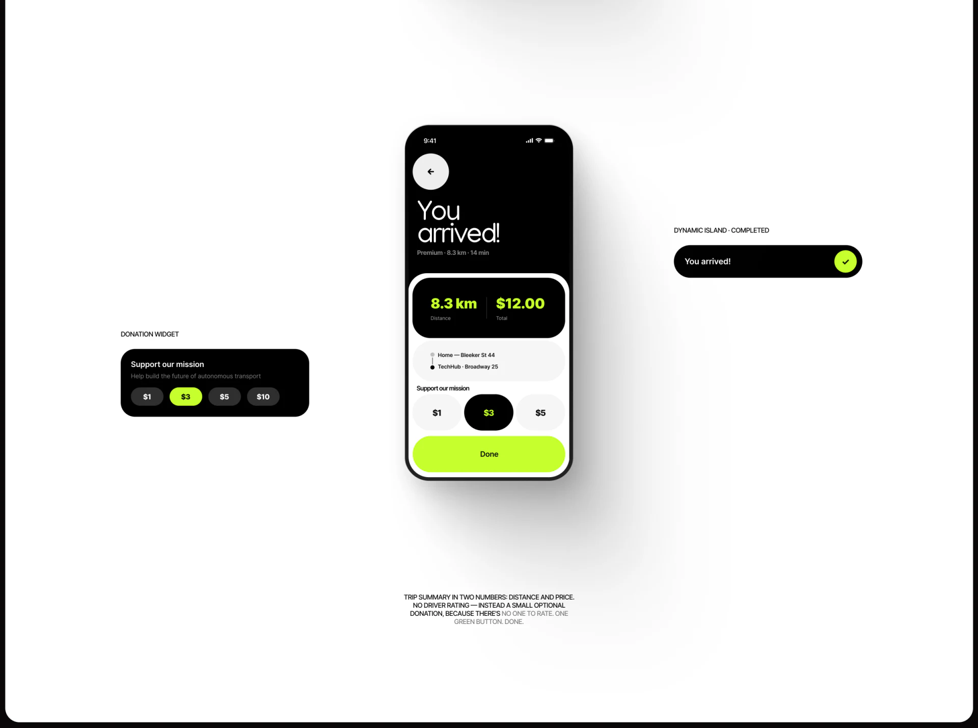
You arrived sits above a black summary with green distance and total, repeated start/destination and Support our mission amounts. Done uses the same bright green as departure, making completion easy to find.
Repeating route, distance and cost helps review after arrival without relying on memory. Optional support on the same page needs explanation: can it be deselected, and does the button cause an extra payment? State that before action.
These are current interface suggestions. Selected amounts are sample states, not proof of charging logic. JVDS favors specific completion wording so a minimal page still explains where this order ends.
Frequently asked questions
Should trip states show vehicle data?
It can supplement destination, estimated time and current state, which should lead. Unfamiliar fields need names and units.
Design review checklist
- Check that recognized destinations can be reviewed and edited.
- Clarify the action relationship between Done and support amounts.
Make travel states easier to understand
Travel, navigation or smart-device apps organizing state pages and confirmation can bring common states and exception branches to discuss.
JVDS Design Studio provides UI/UX design, website design and development, helping organize page content, interface structure and implementation requirements.
 Link copied