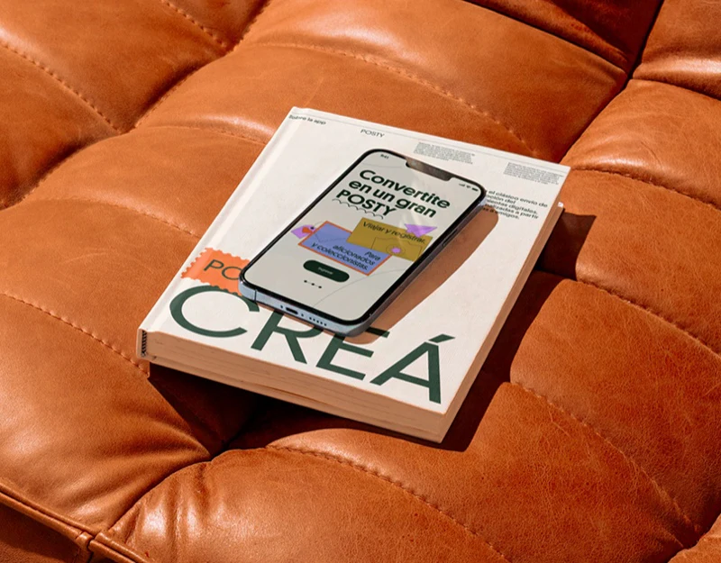
POSTY organizes travel postcards through dark green, orange, purple and yellow, with maps, stamps and large type sustaining a lively character. Its flowchart separates creation and sending, indicating that recipients and time can be chosen after a work is finished. The design moves beyond making an attractive card toward sending it clearly.
Key takeaways
- Place exploration and direct creation can provide different starting points.
- Finished work, contact selection and sending status need separate confirmation.
Place exploration complements direct creation
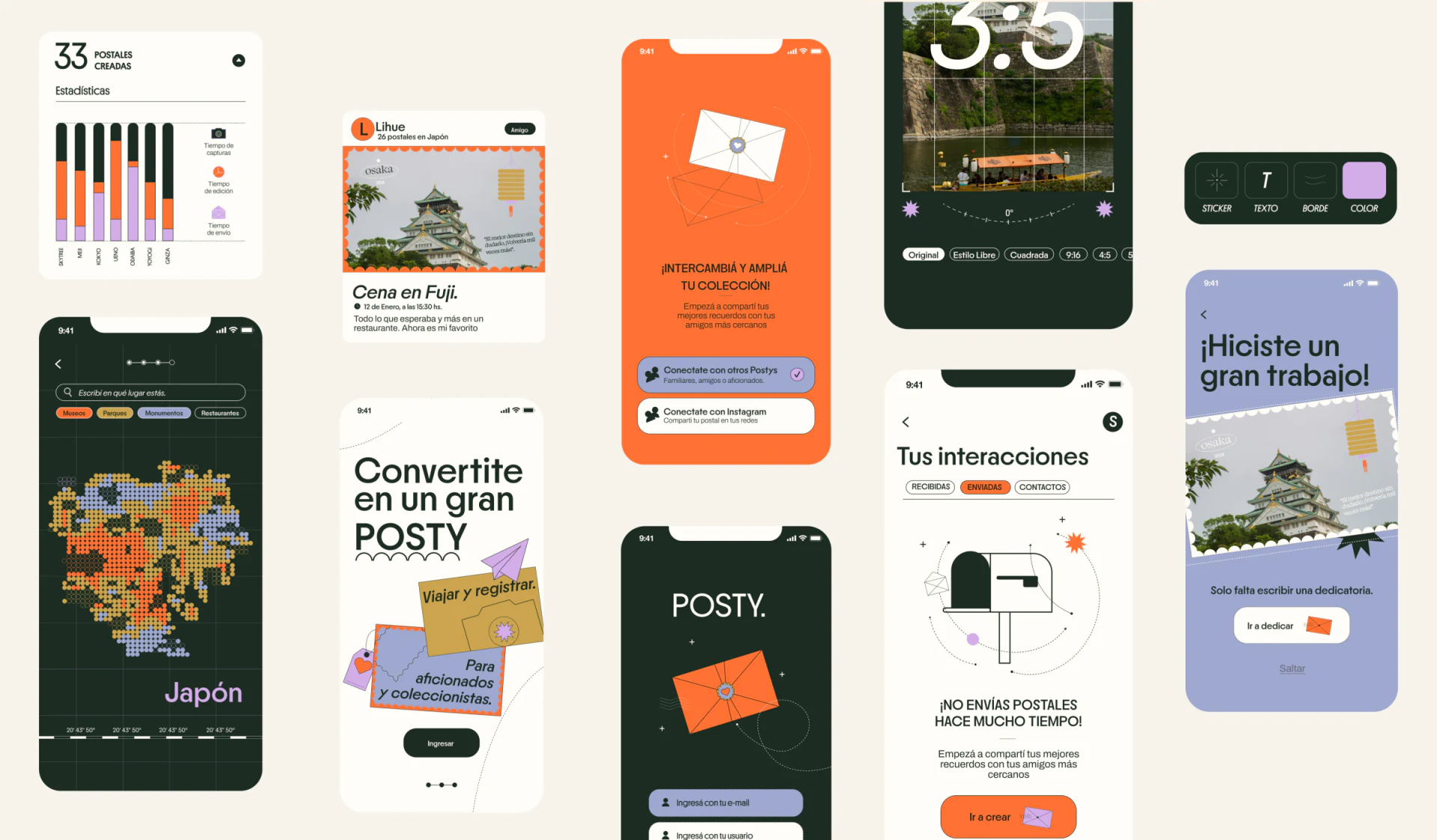
Search and categories remain above a dotted map of Japan, with colored points echoing the other pages. It suits discovering content through travel locations; people who already have photos can create directly. Both beginnings support recording.
Selected map positions need names and legends, since colored points alone cannot identify categories. Retain manual place entry without location permission and avoid making creation dependent on positioning, allowing records during or after travel.
The purple completion page encourages with praise and invites a next step. JVDS would add saved, not yet sent beside emotional copy so people can pause confidently without assuming that leaving loses their work.
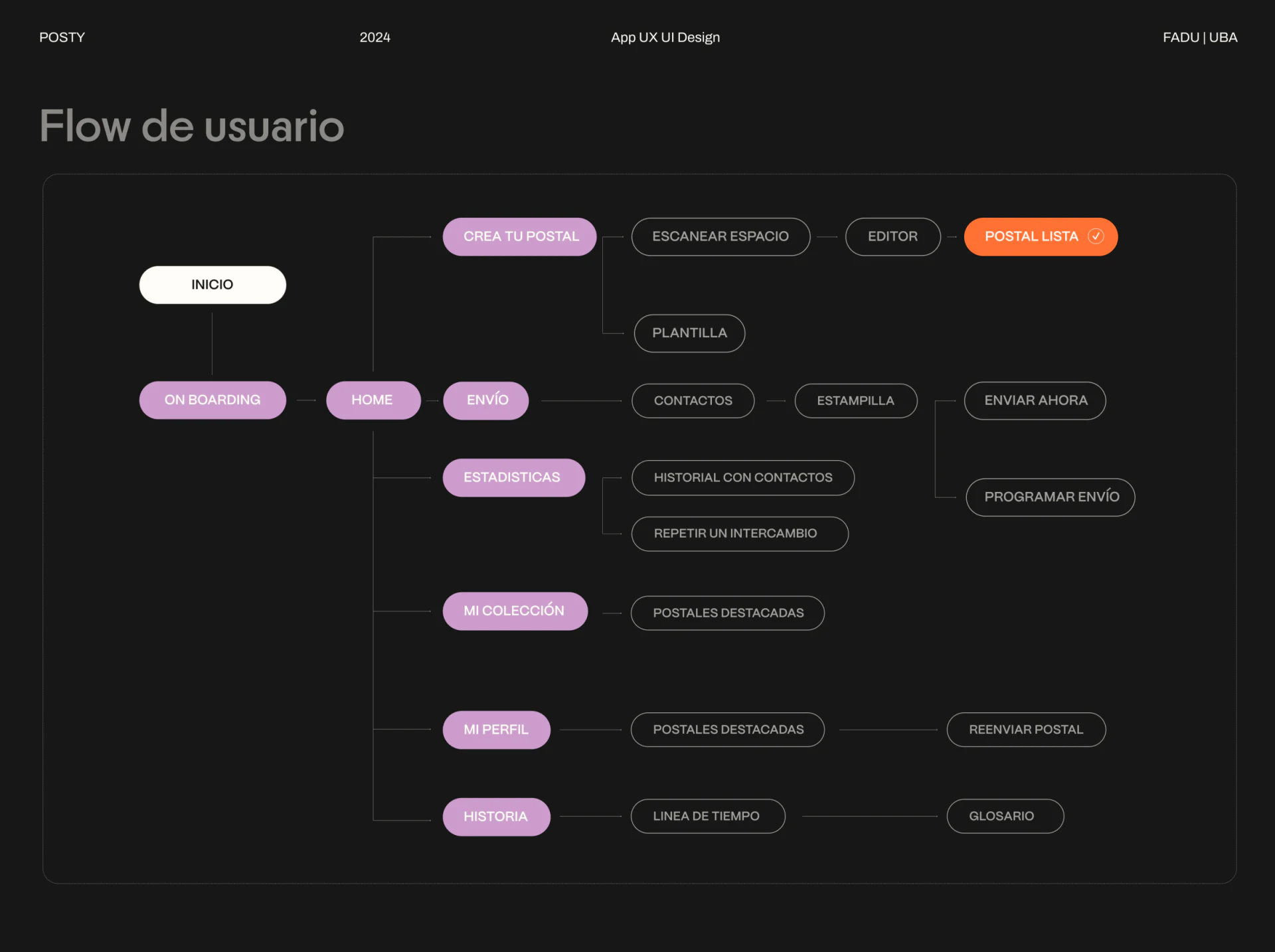
The flow separates the work from relationship decisions
Creation starts with scanning or templates, continues to Editor and Postal lista; sending passes through Contacts and Estampilla before immediate or scheduled sending. These paths distinguish content completion from relationship choices, supporting making a card first and deciding recipients later.
Finished but unsent, scheduled and sent need different states. Drafts retain the edit position, while pre-send confirmation repeats work, message, recipient and time. One completion button should not carry both saving and sending.
Scheduled sends need date, time and timezone, with changes explaining whether the schedule has changed. Creation can feel light, while recipient and timing decisions need concrete fields rather than one success animation explaining all results.
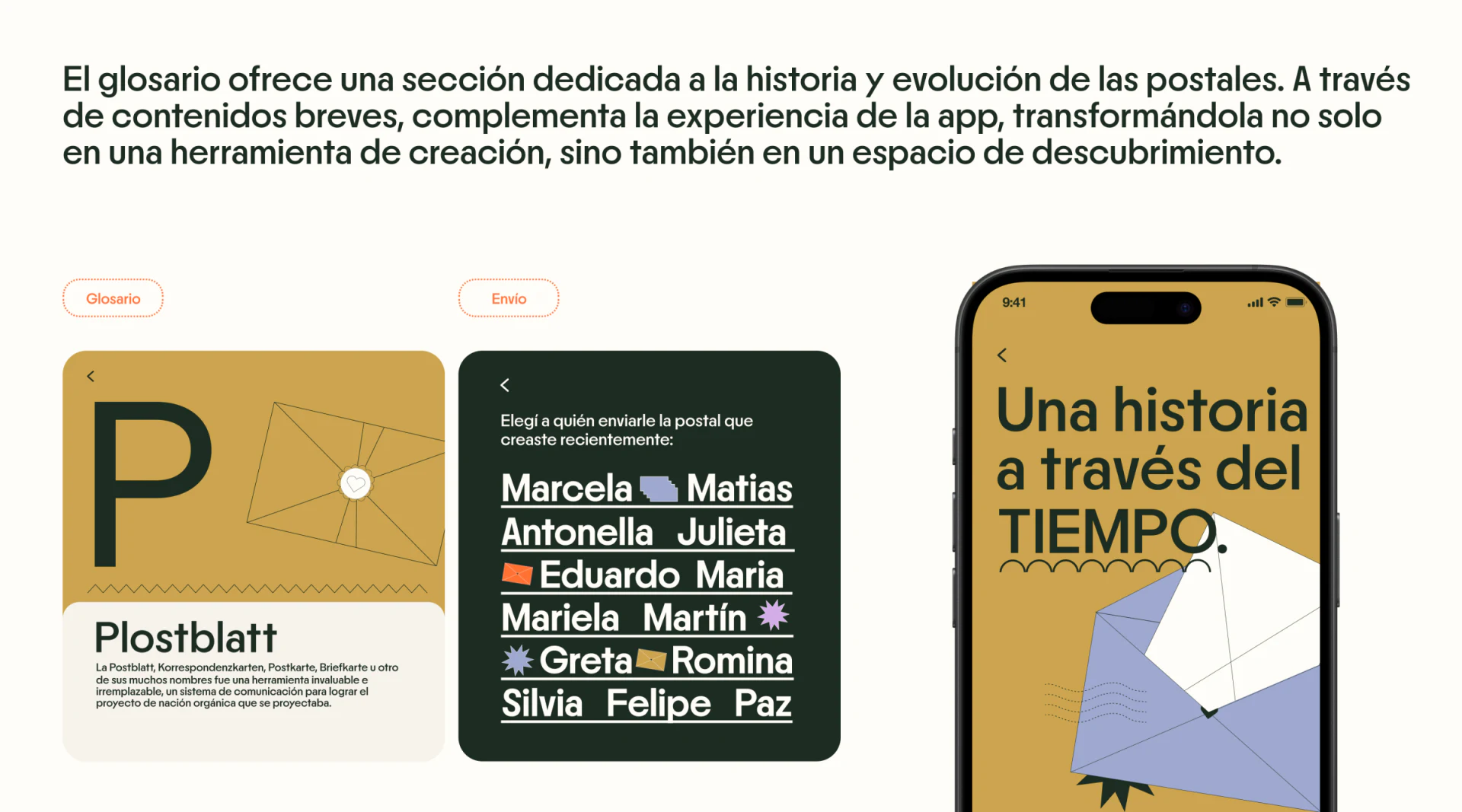
Contacts and historical content serve different purposes
Dark-green contact cards use large names, underlines and envelope symbols as a designed list, while yellow history pages use letters, stamps and time-related topics for cultural content. Both retain the brand language with different reading tasks.
Contact selection needs explicit feedback, with avatars or notes distinguishing identical names. Decorative lines and envelopes cannot be the only selection cues; larger lists also need search and recent contacts.
History suits free reading rather than a mandatory sending step. After sending, received, outgoing and pending lists should retain their respective statuses, giving creation, communication and exploration clear exits.
Frequently asked questions
Should finishing an edit send it immediately?
Finished work can be saved first, followed by message, recipient and timing choices. Separate confirmation also supports pausing.
How can a lively contact list stay usable?
Names need clear identities and selection feedback, with extra cues for identical names. Decoration cannot replace selection states.
Design review checklist
- Give locations names and legends.
- State whether completion means saved or sent.
- Confirm recipient and full time before sending.
Connect postcard creation and sending
Travel recording products can align draft, finished and sending states before arranging place exploration, contacts and scheduling.
JVDS provides UI/UX design and website design and development. We can work through page content, interface structure and implementation needs together.
 Link copied