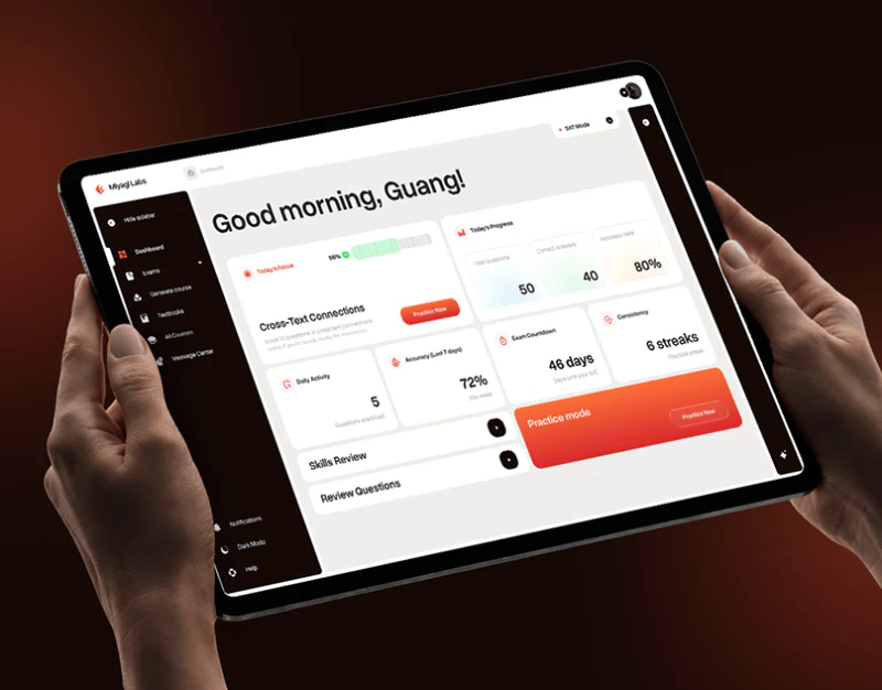
Miyagi organizes practice through white task areas, dark navigation, and orange buttons. The home goes beyond scores to introduce today’s topic; the practice center separates modes from conditions. This learning dashboard is best understood through what to practice now and what that practice will produce.
Key takeaways
- Daily tasks give direction first; statistics add learning background.
- Modes, buttons, and filtered results should describe the same practice session.
Today’s topic is closer to action than a total score
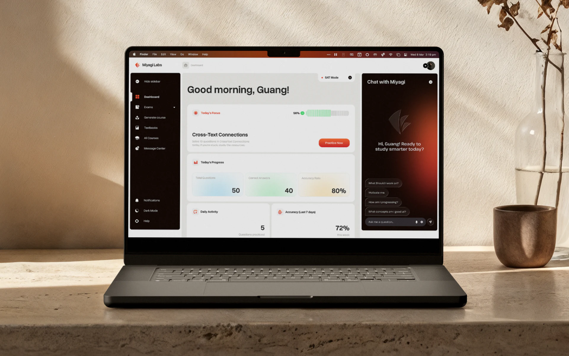
Beneath the greeting, the home places Cross-Text Connections beside a practice button. Statistics below add learning context. Students see something to begin before reviewing recent records, aligning reading order with action.
Topic recommendations should identify whether they come from a plan, mistakes, or another basis, then update after completion. JVDS prefers an explainable next step before statistics: numbers add background, while a clear task helps allocate current time.
Mode cards share form but distinguish outcomes
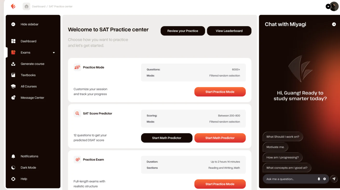
Practice Mode, SAT Score Predictor, and Practice Exam use the same white cards, with question count, scope, and estimated time on the right and buttons near result explanations. Fixed fields support comparison, while names identify different purposes.
Prediction, short practice, and full simulation do not offer the same feedback, so buttons need to match modes. Two predictor entries both say Start Math Predictor, while the exam button says Start Practice Mode. Correct these labels before further visual refinement.
The numbers only illustrate information structure. Subsequent headings, subjects, and results should retain the same mode name, with choices preserved on return, avoiding entries that look different but lead to the same task.
Dependency explanations clarify filtering
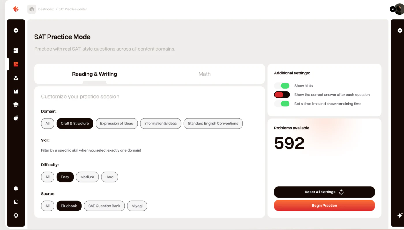
Settings begin with Reading & Writing and Math, then group Domain, Difficulty, and Source. Skill explains that one domain must be chosen first, making dependency clearer than a silently disabled control. Timed practice, answer feedback, and question count sit separately on the right.
The prominent 592 needs to update with current conditions. No-result states should retain the combination and identify adjustable fields; resetting should show restored results. Reset All Settings and Begin Practice are vertically adjacent and already differ in color, but reset still needs its own feedback.
A subject, scope, and feedback summary could appear before starting. More settings do not necessarily make a better tool; users need to understand how each changes this practice session.
An assistant should leave room for the question
The assistant uses a dark gradient and suggested questions above the input, easing the first inquiry. A student photograph outside the interface illustrates context without taking space from the actual practice workspace.
An assistant during practice should open as needed and preserve the current question. Timed or simulation modes need clear help limits, distinguishing progress inquiries, concept explanations, and direct answers. Its approachable visuals should agree with the current learning rules.

Frequently asked questions
Must a learning home show many statistics?
Statistics should support the next action. Show today’s topic and recommendation basis first, then relevant recent records, so users are not left with scores but no way to begin.
Why explain unavailable practice filters?
When domains and skills depend on each other, explanations help users adjust conditions. Current question counts and no-result feedback are also needed.
Design review checklist
- Align mode names, entries, and result types.
- Update question counts after filter changes.
- Keep the assistant from obscuring questions and align help with the mode.
Organize learning tasks and practice conditions
A learning product can first align daily tasks, modes, and setting summaries, then design score feedback and assistant entries.
JVDS Design Studio provides UI/UX design, website design, and development services, helping organize page content, interface structure, and implementation needs.
 Link copied