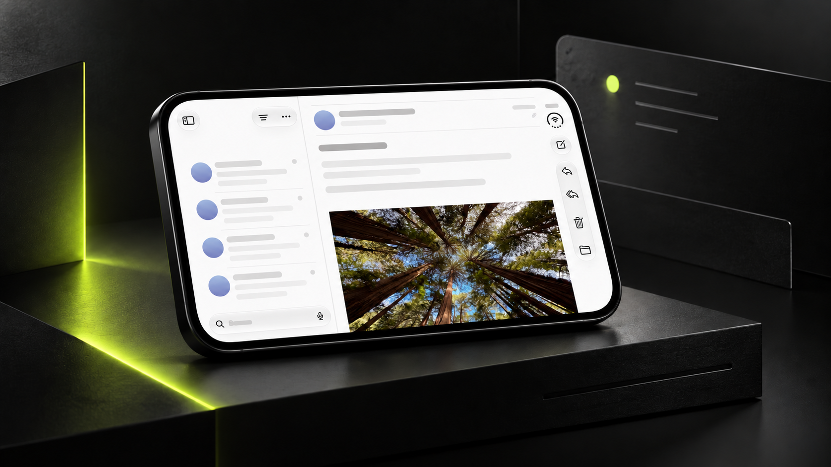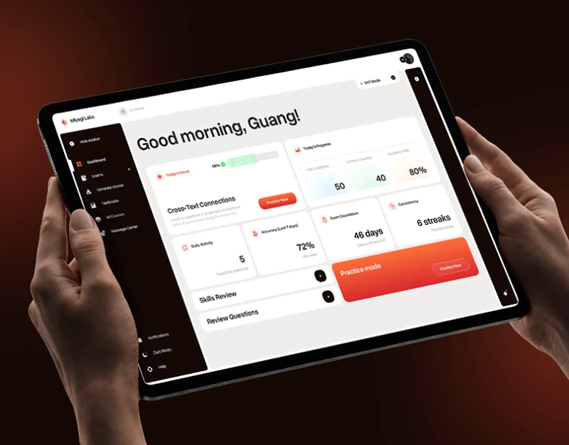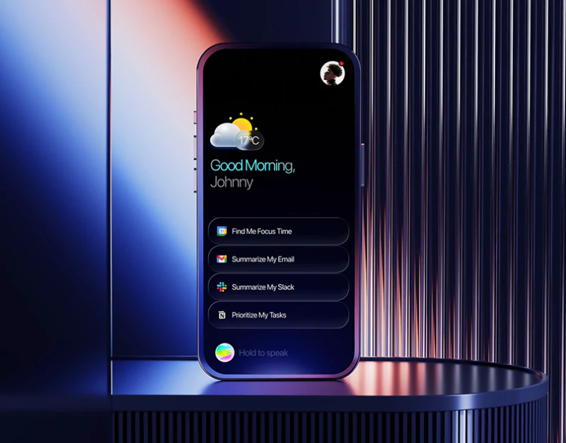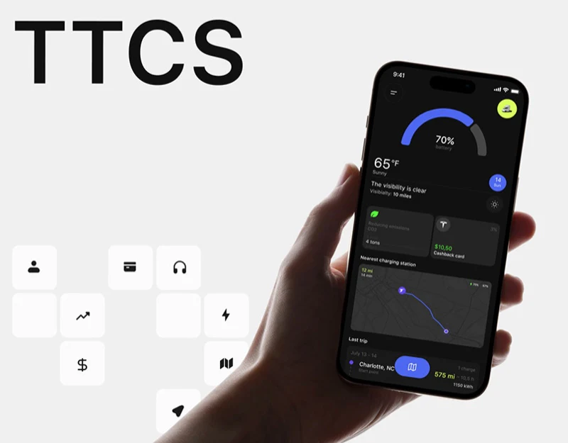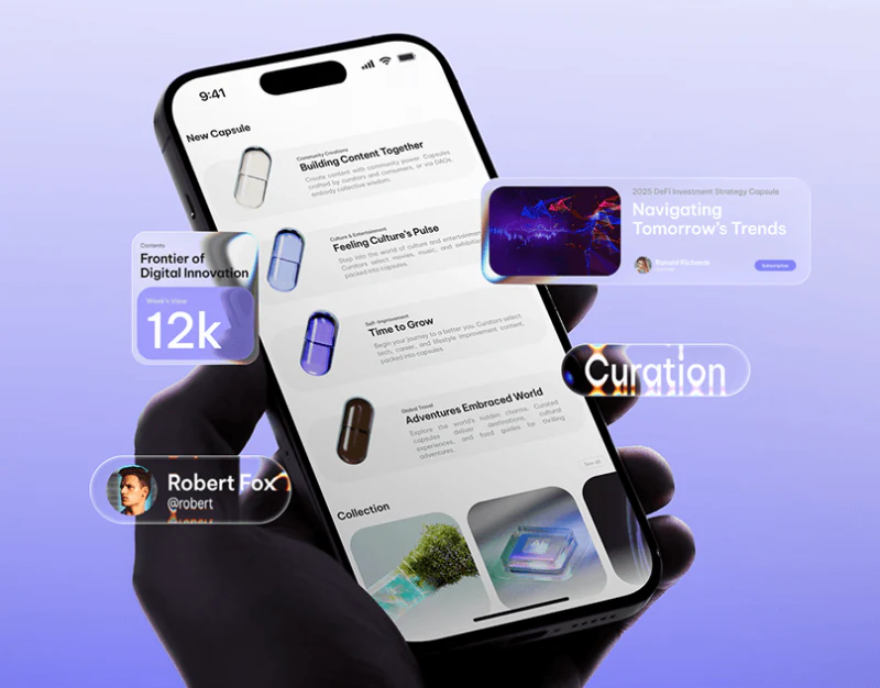
Qupid uses capsules throughout its content platform: silver-white, blue-purple, and brown materials appear beside categories against pale-purple gradients. They make the packaging memorable. Category names, titles, and descriptions make it readable. Images attract and distinguish; words explain, and their relationship matters more than three-dimensional finish alone.
Key takeaways
- Capsules retain one outline and vary material and color across categories, while words explain their contents.
- Cover cards, Collection thumbnails, and category lists serve theme presentation, browsing, and explanation respectively.
- Concept illustrations continue metallic and purple visuals, while functions still need concrete actions and rules.
One outline makes categories feel related
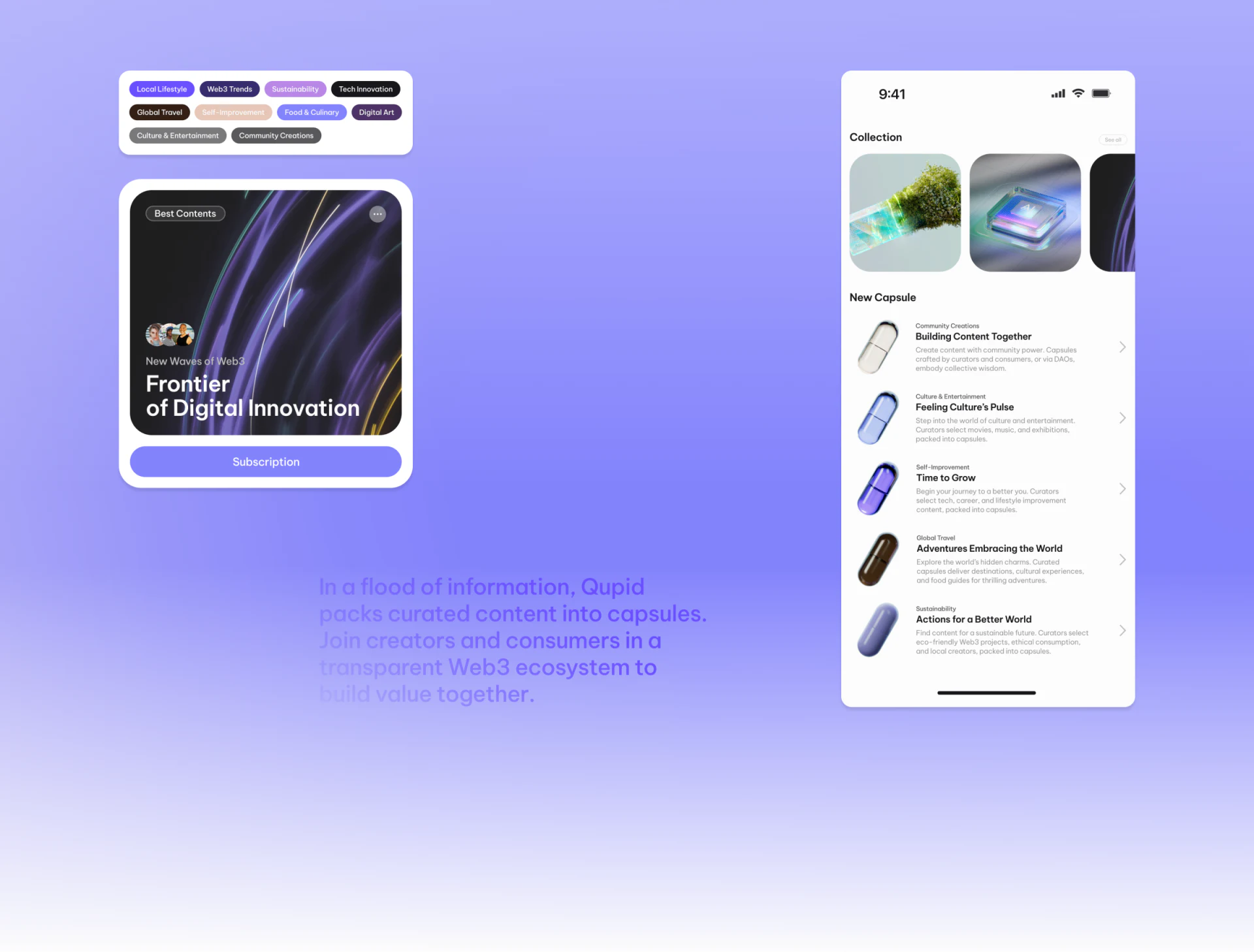
New Capsule on the handheld phone uses pale-gray rows. Community Creations has a silver-white capsule, Culture & Entertainment pale blue, and self-improvement and travel purple and brown. Shared shape gives them a system identity, with material differences adding another cue.
Each capsule has a small category name, bolder title, and description beside it, including Building Content Together and Time to Grow. Category identifies the topic, the title offers a more expressive direction, and the description adds scope. This prevents color-only guesses while allowing abstract imagery.
Floating content cards, author portraits, and a 12k data card suggest content, creators, and viewing feedback gathered around the platform. They enrich the presentation at a different scale from the phone’s actual list. Evaluate each row at use size: can descriptions be read and titles distinguished quickly?
Browsing and subscriptions use different densities
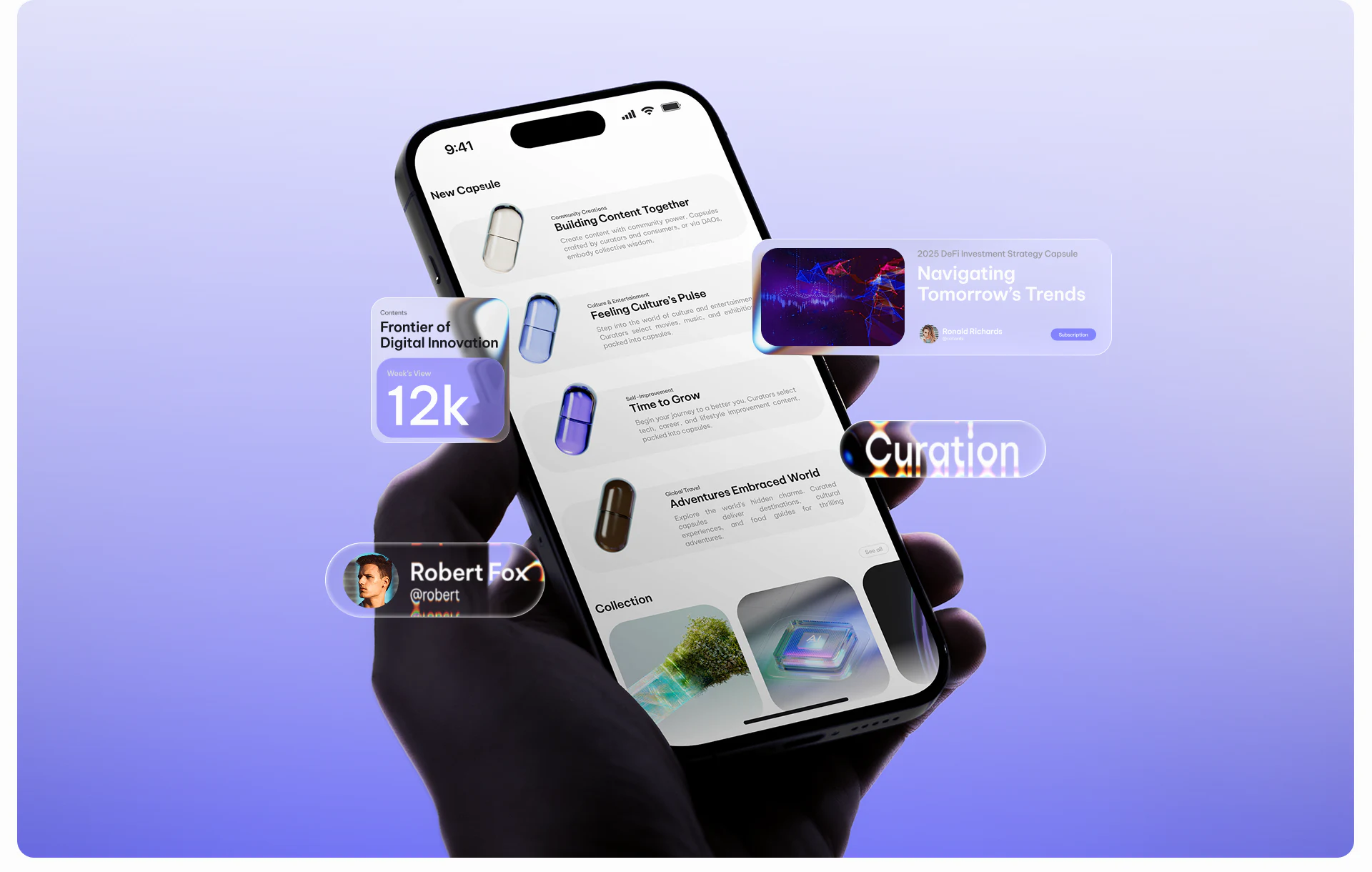
The component display places topic tags, a subscription card, and a mobile list together. Small upper-left tags cover travel, digital art, and other themes. A dark abstract cover below holds Frontier of Digital Innovation, with an author portrait above and Subscription spanning the bottom. Cover and title build interest, while the button separates action from imagery.
The phone first shows horizontal Collection thumbnails, then a New Capsule text list. A partially visible next thumbnail suggests more, while row arrows invite deeper viewing. This can move from visual topics into category descriptions, but each area should identify whether it represents an article, collection, or entry so similar imagery does not imply one level.
The subscription button is clear, yet included content, payment, and updates are not shown. A real product should explain these near the choice. Capsule can remain a brand term, with a plain-language first-use explanation connecting the metaphor to content organization.
Materials and composition unify concept images
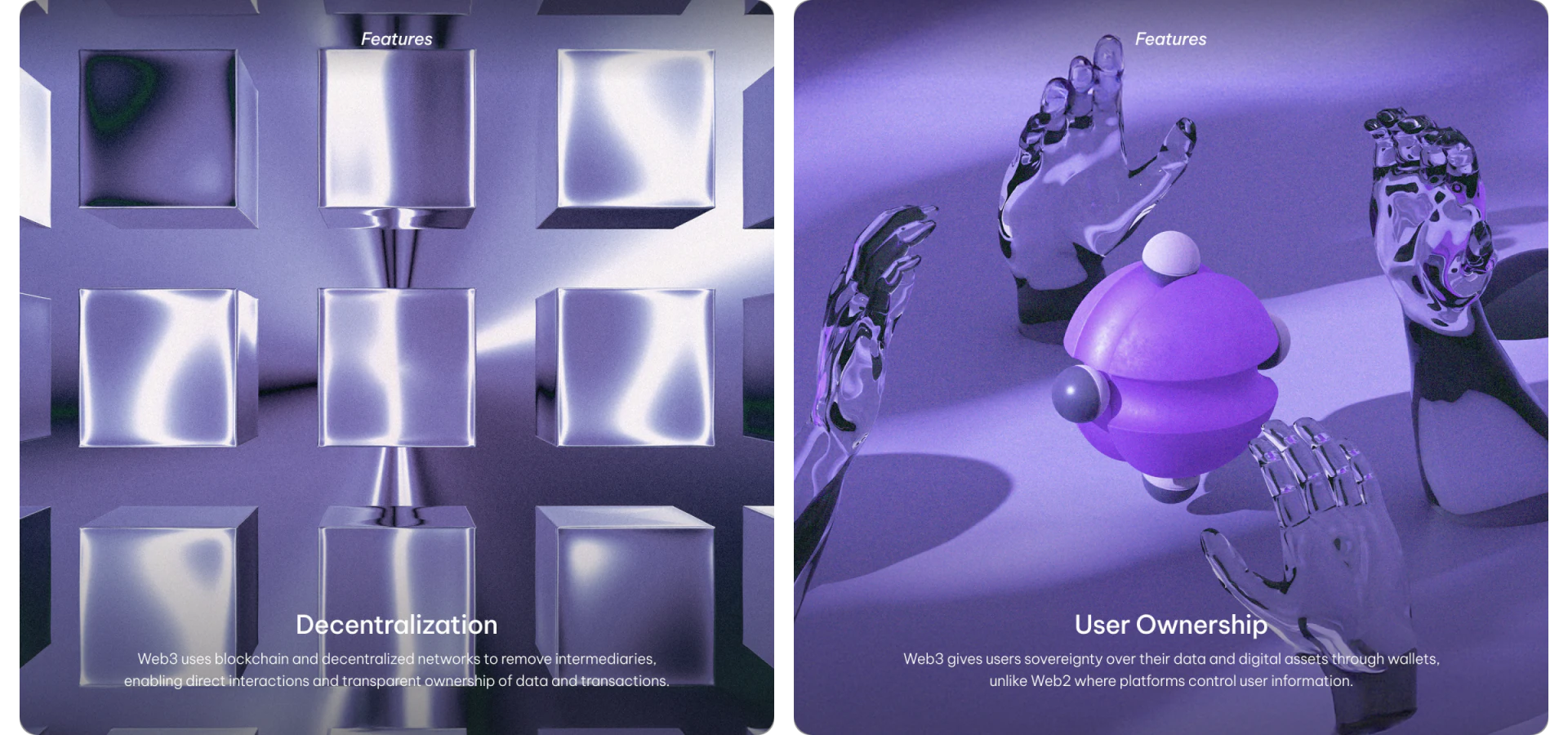
Features uses two large images: silver blocks titled Decentralization and transparent hands around a purple sphere titled User Ownership. Both continue reflective and transparent capsule materials, with white titles at the bottom and explanations beneath.
These images create mood and memory for abstract concepts but do not show content or permission management. To move from principles to functions, add a defined action state explaining who creates, subscribes, and controls which content. Concept imagery retains brand expression while rules become understandable. Illustrations alone cannot confirm technical or rights arrangements.
Frequently asked questions
Can capsule colors alone distinguish content categories?
Color offers a quick cue but should appear with category names. Similar materials, reduced size, reflections, or display changes make text important for confirming content type.
Design review checklist
- Explain brand terms plainly and check category, collection, and article levels.
- Explain subscription scope, updates, and necessary conditions near the action.
- Connect concepts to content or permission actions, and check small text readability.
Bring brand imagery into content organization
For a content platform, identify what users browse, save, and subscribe to before assigning brand graphics to suitable levels.
JVDS Design Studio provides UI/UX design, website design, and development services to connect brand expression with content interfaces.
 Link copied