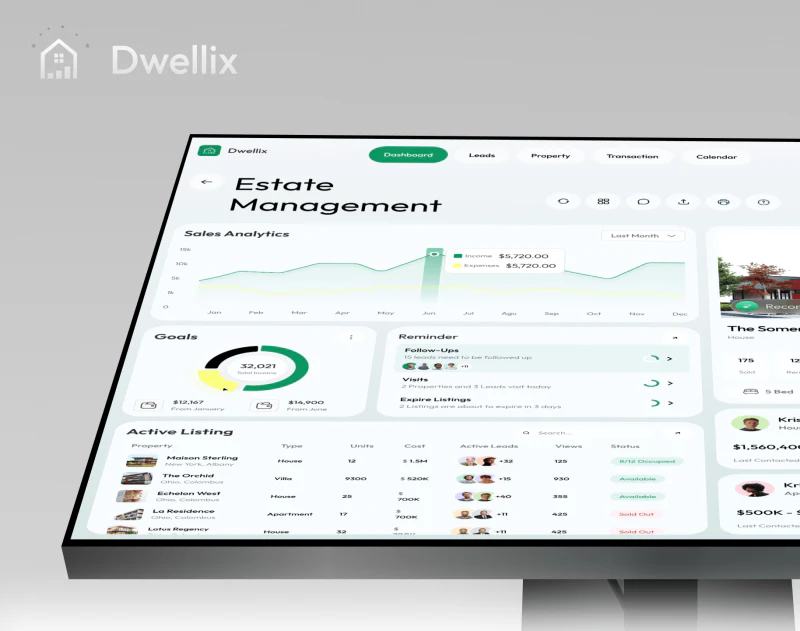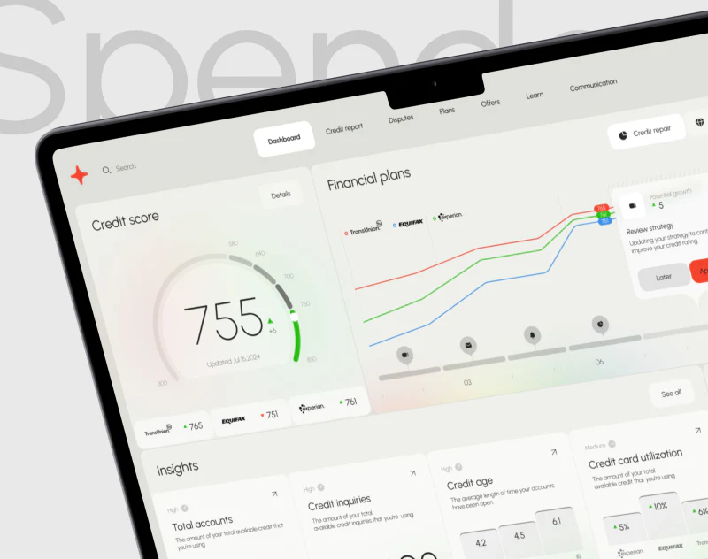
Spendex’s credit dashboard design places a large score inside a semicircle and retains three agency cards directly below. After the prominent number, readers can continue into differences between sources. Pale backgrounds, fine curves, and red-green indicators keep the overview light without reducing its information to a single gauge.
Key takeaways
- Update times beside scores and three agency cards provide references for continued checking.
- Three colored curves and timed events share a chart, supporting comparison of change positions.
- Factor cards use different graphics for counts and proportions, adding explanation after the overview.
The three cards beneath the gauge matter
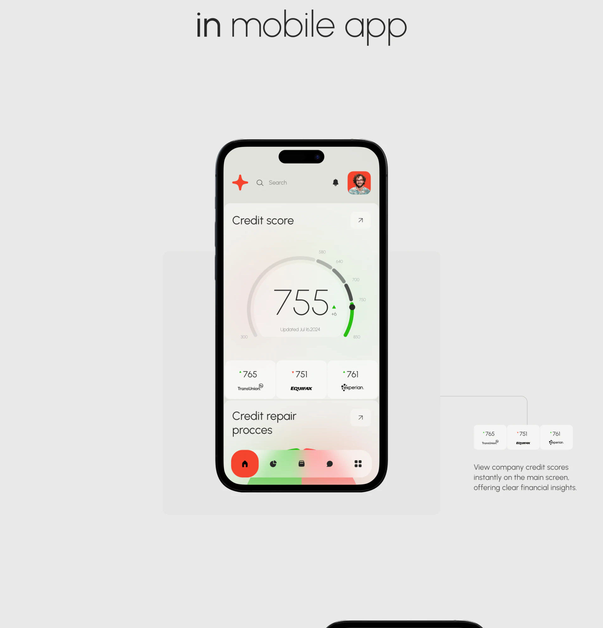
The mobile home uses large, light-weight score text. Its semicircle deepens from pale gray before turning green at the end. The value comes first, with scale marks and a small change indicator around it, avoiding a heavy instrument-panel appearance. An update time directly below adds an important reference.
TransUnion, Equifax, and Experian each have an equally wide card. Logos sit below, with numbers and direction markers above for horizontal comparison. Their proximity to the main score helps readers recognize multiple sources immediately after seeing the overview.
JVDS values this arrangement of a primary value with its origins nearby. The large figure supports quick reading; smaller cards explain differences. Further refinement should define the main score’s basis, identifying its source or aggregation method. A central position cannot replace that explanation.
Events beside curves make plans more concrete
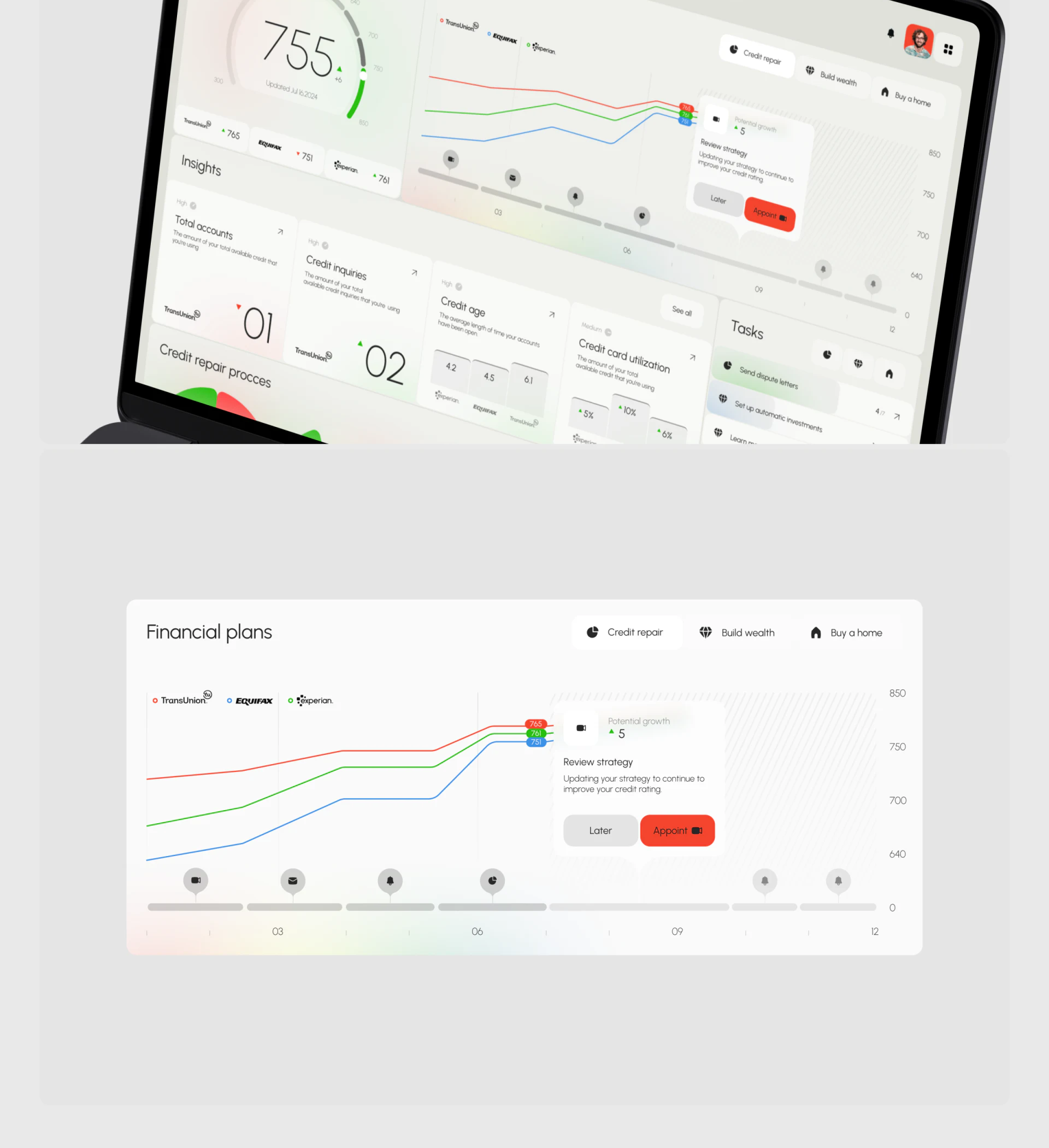
Financial plans uses red, blue, and green curves for the agencies, with their names in the legend. Fine, clear lines have end labels repeating current readings. Color helps follow a line and names confirm identity, making the combination more dependable than color memory alone.
Video, envelope, and reminder icons run beneath the time axis. A selected event opens Review strategy with Later and red Appoint. Events are not moved into a separate long list, so a plan can be read alongside its position in time.
Diagonal texture distinguishes the right half, suggesting a boundary. A real product still needs to explain which portion is recorded data and which represents plans or targets, as well as Potential growth in the overlay. This article discusses the example’s presentation, without treating upward curves or potential growth as actual results.
Factor cards need not use identical charts
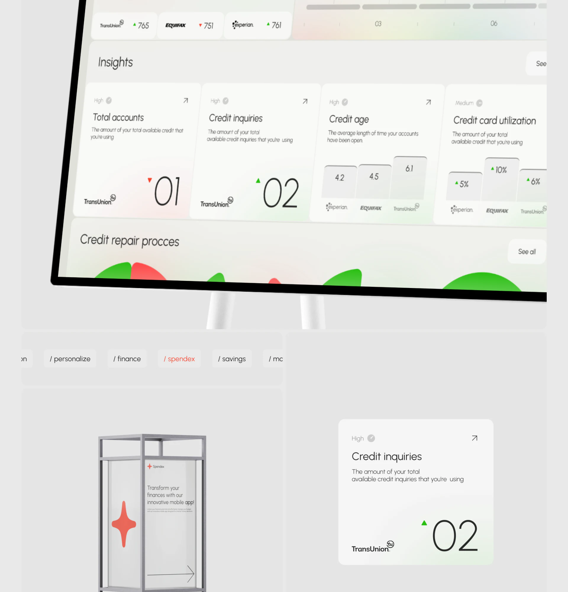
Four cards under Insights have similar heading and explanation positions, but different graphics below. Accounts and inquiries use large numbers; credit age and utilization use grouped bars. Agency logos stay with the individual values. Each card reads as part of a summary family while retaining its metric’s character.
Small High and Medium labels sit above headings, with arrows at the upper right. They suggest another level without expanding all records at once. A multi-source dashboard can let summaries answer “which item?” before details explain individual records and update times.
Copy checking remains important. Some different metrics use similar available credit descriptions. Definitions and units should be written separately for accounts, inquiries, age, and utilization. Accurate text enables these simple cards to explain information; refined bars cannot compensate for an unrelated description.
Frequently asked questions
Should scores from multiple sources become one number?
A page can highlight one value, but must explain its basis while retaining sources and update times. Spendex’s agency cards below the main gauge offer a useful proximity pattern; whether to aggregate remains a product definition.
How should planned curves differ from historical data?
Texture can help, but a time boundary and written explanation are also needed. Name targets, plans, and recorded values separately so a visually extended line is not understood as a promised result.
Design review checklist
- Confirm that every score has a source and update time.
- Follow a curve from its legend and check end labels and event positions.
- Check every factor card’s name, definition, unit, and denominator.
Need clearer information from multiple sources?
Scores, trends, and factors often come from different material. If you are planning an information tool or financial interface, bring the data structure and current dashboard for discussion, starting with sources and reading hierarchy.
JVDS Design Studio provides UI/UX design, website design, and development services, helping organize interfaces, content, and development needs.
 Link copied