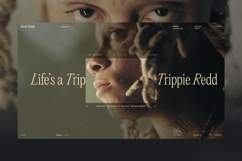
Jason Bergh’s film portfolio opens with a close-up that draws visitors into the work. Warm-yellow serif lettering sits on dark-green imagery, while lists and categories keep positions at the edges. Cinematic atmosphere and finding tools share a screen, making their relationship worth examining.
Layering related images clarifies the center
An extreme close-up of eyes and head fills the background, with a profile embedded centrally. Related imagery keeps color and texture continuous while changing viewing scale. The outer layer fills the screen; subtle corner marks frame the inner one as a selected part of the shot.
Large Life’s a Trip and Trippie Redd titles sit on either side, leaving the center to the face. Instead of a single line covering the person, image and titles create a horizontal composition. Smaller type, description and credits surround the inner image, maintaining scale relationships despite substantial information.
Warm yellow mostly serves the mark, headings and prompts rather than broad backgrounds. The dark-green image retains its lighting, while warm letterforms make it more approachable. This suits creative portfolios whose imagery already contains rich color and detail.
Navigation stays at the edges; Slider / List, categories and time text appear below. These are visible entries, not proof of automatic playback or transitions. The judgment concerns position and hierarchy, not a verified cinematic playback experience.
Lists provide another route for purposeful visits
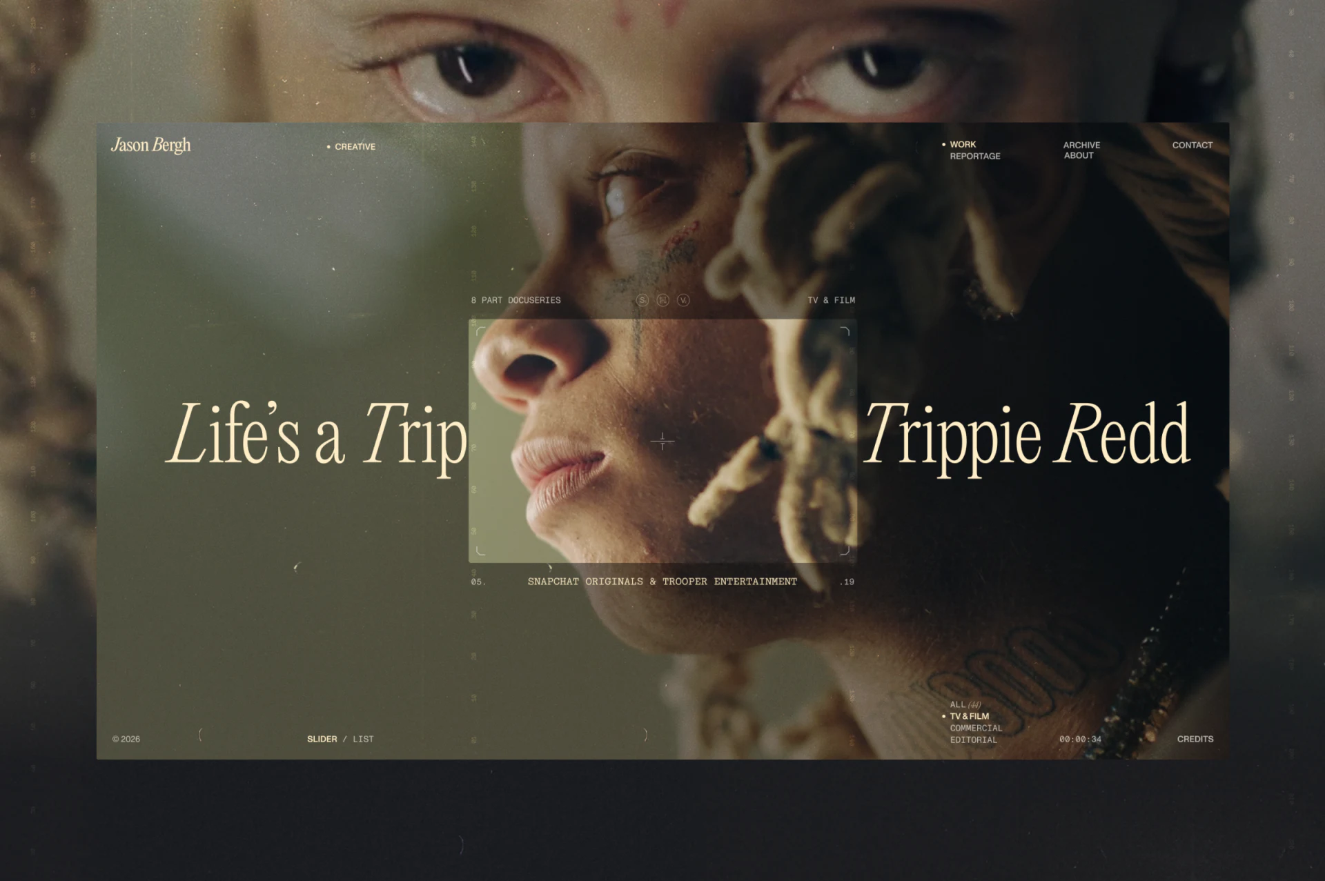
Mobile rows pair titles and short descriptions with right-hand thumbnails. Each item takes less height than the hero, allowing several projects to appear together. This suits name-based finding and quick visual comparison.
JVDS values the complement between views. First-time visitors may be drawn by imagery; returning visitors need a stable index. A prototype should check whether switching retains the current project and category alongside visual effects.
Several sample rows use similar titles and repeated numbers. They demonstrate row structure, but final content needs distinct real names and descriptions. Thumbnails identify images and words explain projects; neither should rely on near-identical placeholders.
The introduction keeps atmosphere and a separate text column
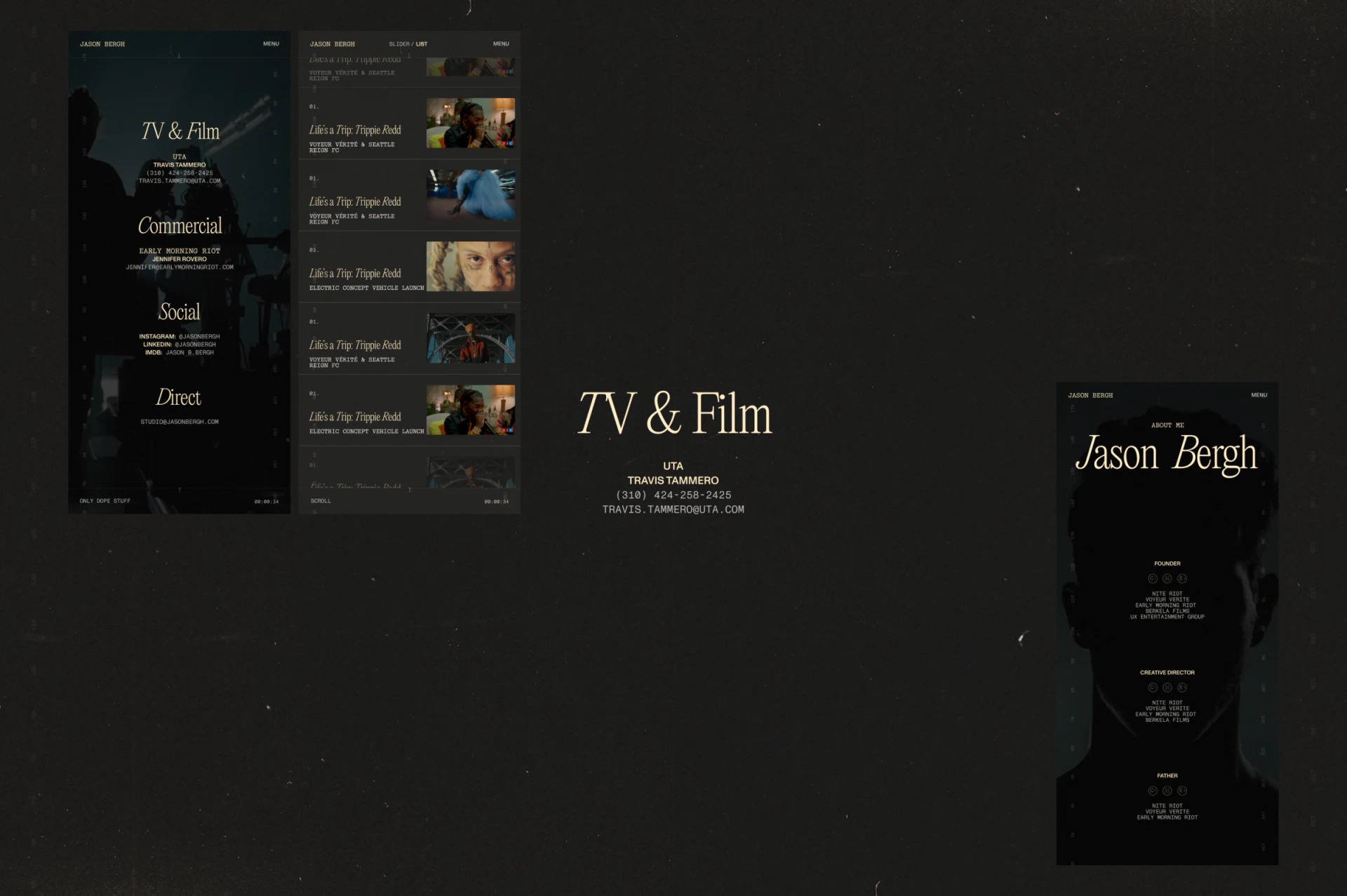
Reportage pairs a left portrait with diagonal light through the hair and face, and a warm-yellow title, subtitle and two paragraphs on the right. Dark backgrounds and serif type continue, while a steadier two-column arrangement supports moving from work to creative direction.
The title is large; body text uses capitals and tight leading. Short uppercase statements feel direct, but long passages require more reading effort. Shorter paragraphs separating direction, responsibilities and experience can explain what imagery cannot.
Portrait and text together make this more than a personal photograph. Retain the pairing without turning all prose into texture. Specific content better answers which collaborations suit this creator.
Contact categories continue the portfolio language
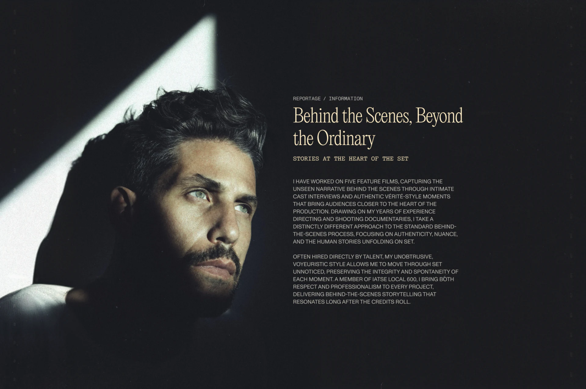
TV & Film, Commercial, Social and Direct use large headings with smaller information. Rather than suddenly introducing a complex form, the page keeps dark backgrounds, warm text and centered space, making contacts part of the same visual world.
Business collaboration, social information and direct inquiries need clear boundaries and nearby explanations. Contact details are observed as layout here and are not converted to external links.
A portfolio also needs a findable structure
Photography, film and creative teams balancing style with collaboration direction can plan large images, indexes and introductions together. JVDS Design Studio provides UI/UX design, website design and development; bring existing work and a content directory to discuss.
 Link copied