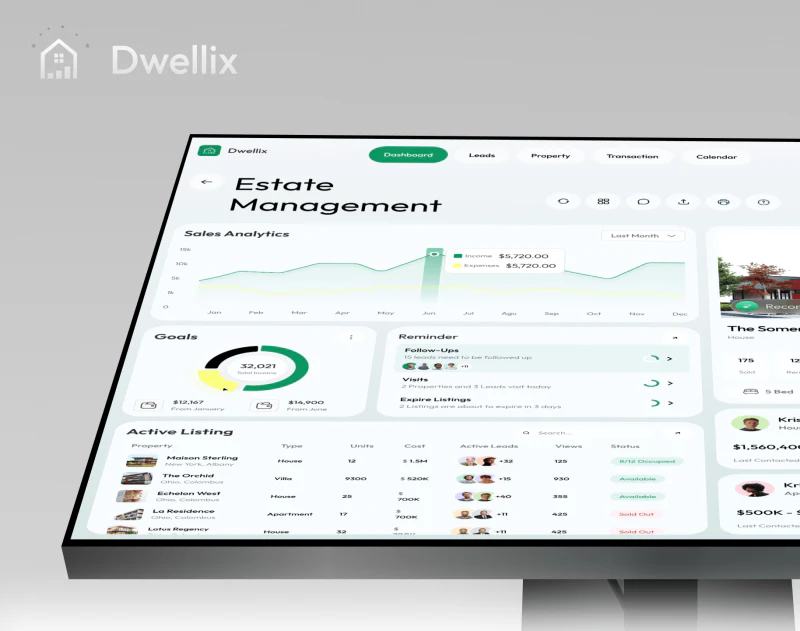
Dwellix’s real estate CRM interface places properties, customers, and follow-up reminders on one pale gray-green dashboard. Green buttons stand out, while house photographs and portraits help identify objects. The useful idea is giving everyday work a place alongside statistics; a closer review asks whether the cards connect around the same customer and property.
Key takeaways
- White cards and a pale gray-green base organize dense content, with reminders making room for daily actions.
- Contact buttons share an area with customer preferences, and both desktop and mobile retain specific identity cues.
Task cards are easy to find on the pale dashboard
Sales curves and figures occupy the top of the overview, followed by goals, reminders, and property photographs; denser lists and appointments sit below. Light white-card boundaries and a pale gray-green background bring them together. Limited green and yellow emphasis creates focus without making every block highly saturated.
Reminder lists Follow-Ups, Visits, and Expire Listings as entries, supporting a more direct search for work than a curve. Trends describe changes over time; reminders point to immediate actions, so both have a role on one screen. JVDS pays closer attention to objects and times beside reminders: counts alone make prioritization difficult.
Active Listing arranges small photographs, names, and fields as a table, with customer portraits grouped in relevant columns. Thumbnails soften dense records but cannot replace an explanation of relationships. A stable place for recommendation time and follow-up status could help determine whether an association remains current.
Contact actions stay beside customer preferences
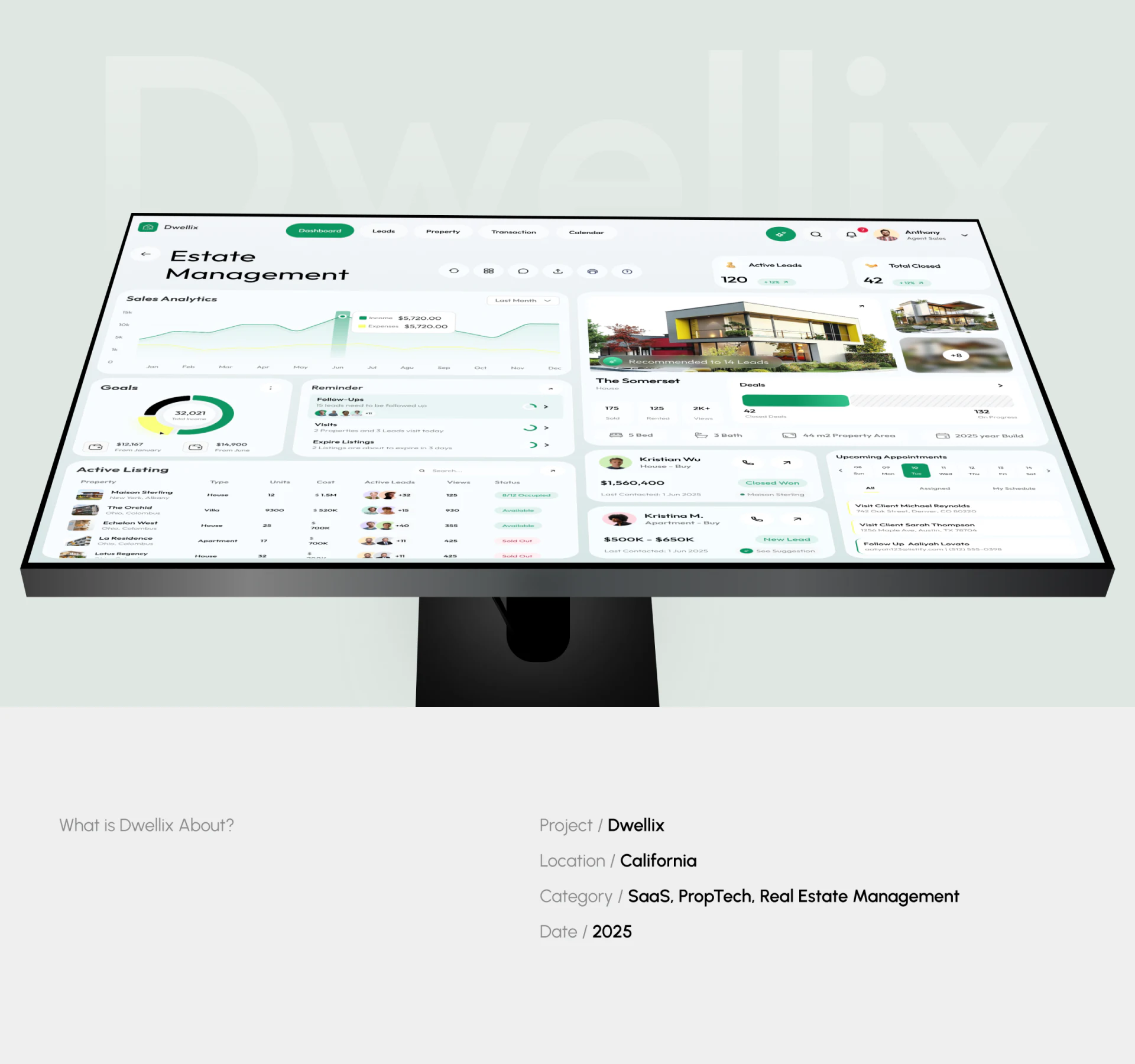
Customer Details groups a portrait, name, contact information, and Preference, with Call Us and Message at the upper right. Readers examining requirements can also find a contact entry without leaving the detail page for a separate address book.
A green transaction card and room image on the right add financial and property context, while customer information retains a complete area. A sales workspace can anchor the current object and extend related information around it. If photographs and transaction amounts outweigh customer identity, they can redirect the reading order.
The screenshot does not clearly state when preferences were updated. JVDS recommends considering their source, latest confirmation time, and a brief edit entry together so bedroom, transport, and other requirements can be reconfirmed. This concerns long-term maintenance and does not establish actual customer preferences or sales outcomes.
Mobile turns management and contact into vertical tasks
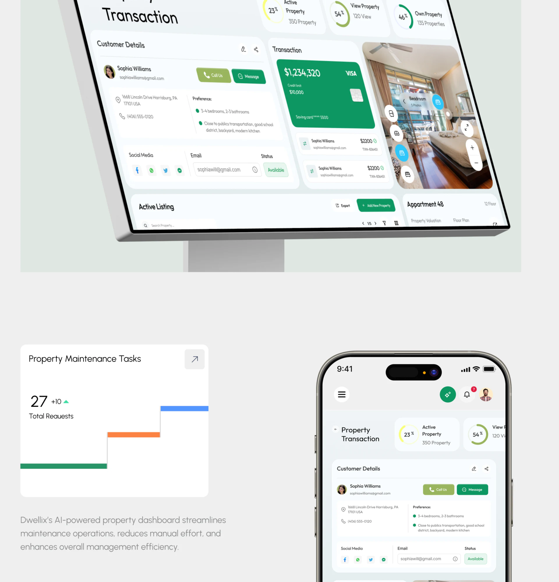
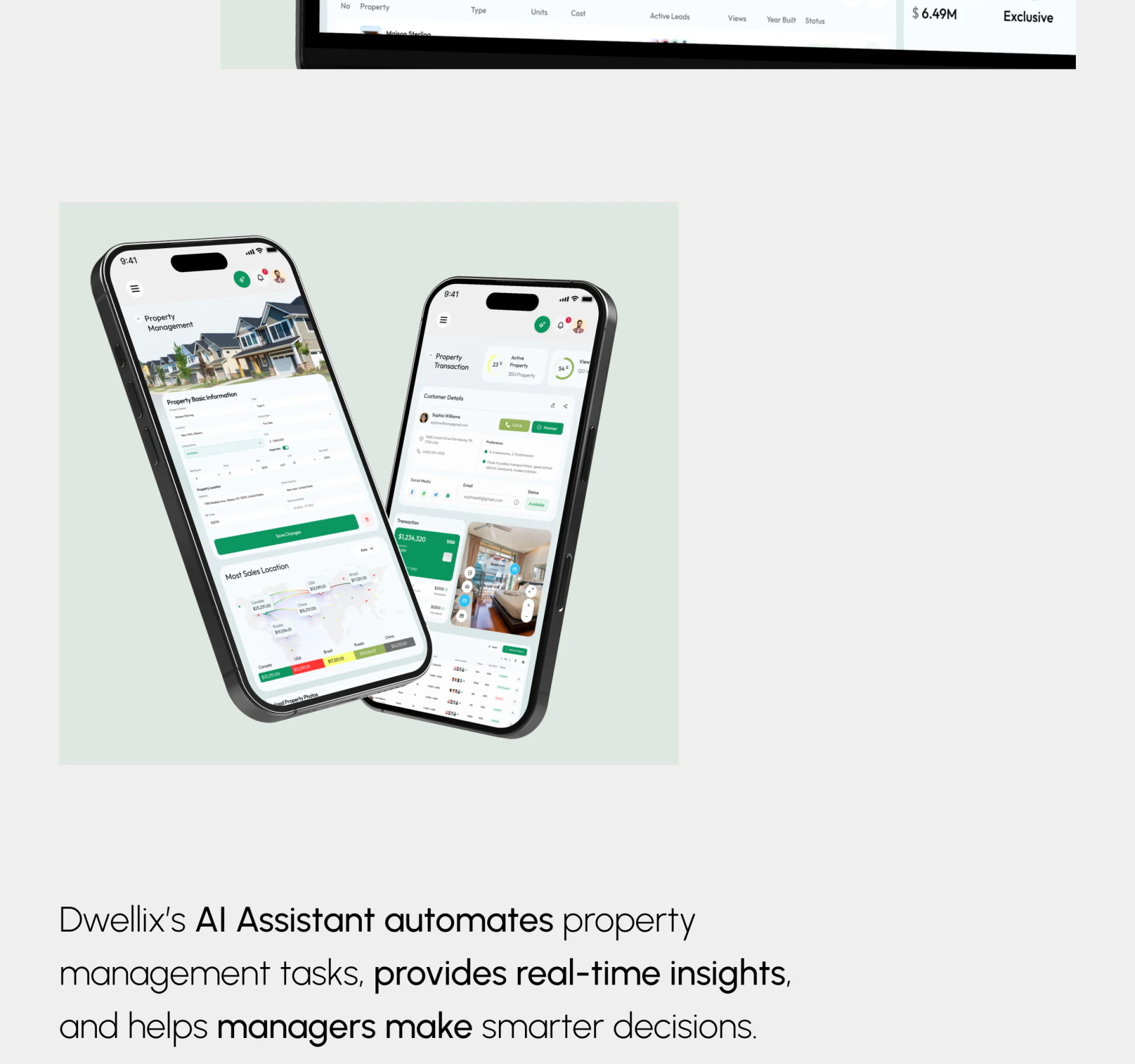
Two phones show a property management form and customer transaction content, with photographs, fields, and green actions arranged vertically. Save Changes and contact entries retain distinct color positions, continuing a cue from desktop components onto small screens.
Mobile supports quick checking and additional entry. First identify the current page’s main action—editing a property or contacting a customer—then sequence identity, location, and requirement summaries. Shrinking every overview statistics card into the phone generally does not answer this question.
The images show neither save feedback nor a return path to the original customer. Check these in the actual flow: is the edited property still clear after saving, and are recent records visible before contacting someone? The green style already provides consistency; relationships and states deserve more attention than added decoration.
Frequently asked questions
What should a real estate CRM homepage show first?
Statistics and tasks can coexist, but people frequently contacting customers should quickly find the object, time, and next step. Order should follow the work role.
Design review checklist
- Check whether reminders directly identify a customer or property.
- Add the latest confirmation time to customer preferences.
Clarify relationships between properties and customers
If your property management or sales system needs a clearer workspace, customer details, or mobile entry flow, start the discussion with one real follow-up task.
JVDS Design Studio provides UI/UX design, website design, and development services to help organize page content, interface structure, and implementation needs.
 Link copied