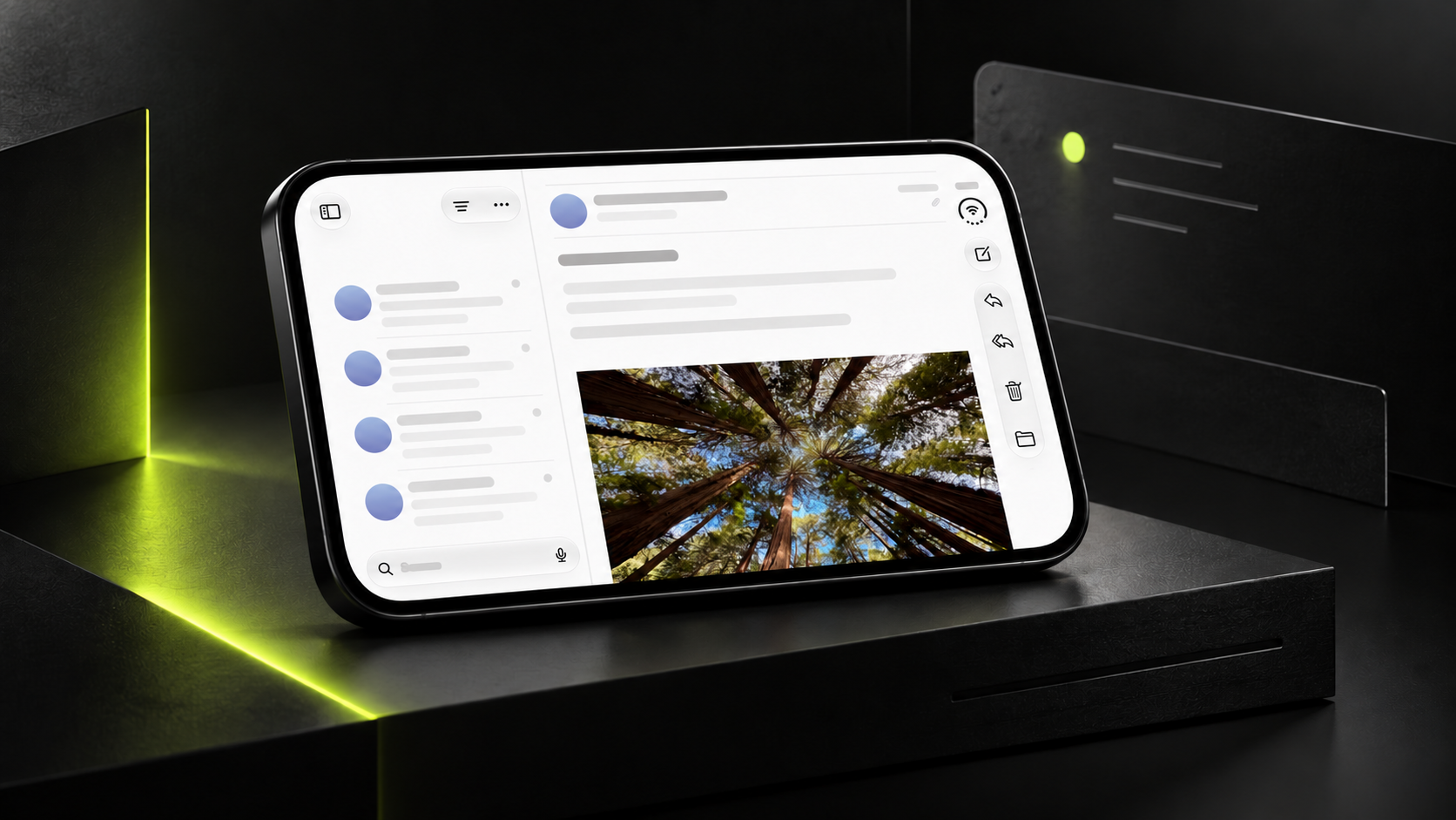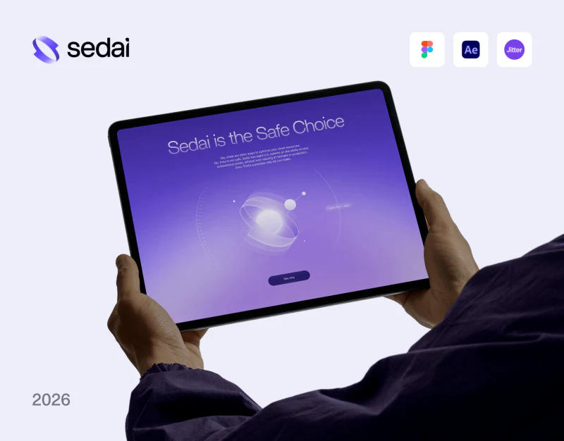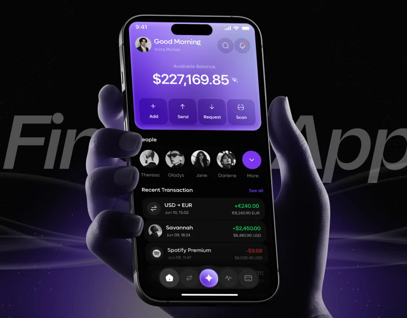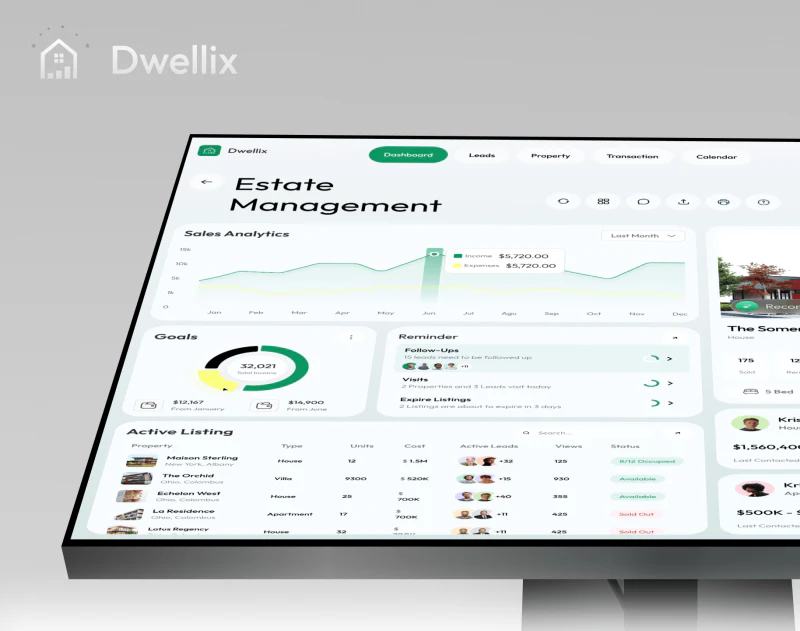
In these Sui technology brand website designs, blue is more than a shared background. Glows, ring fragments, and vertical textures recur, then recede within research summaries and rule pages. The value of a visual system lies in allowing different content densities within the same language.
Gradients can take several forms
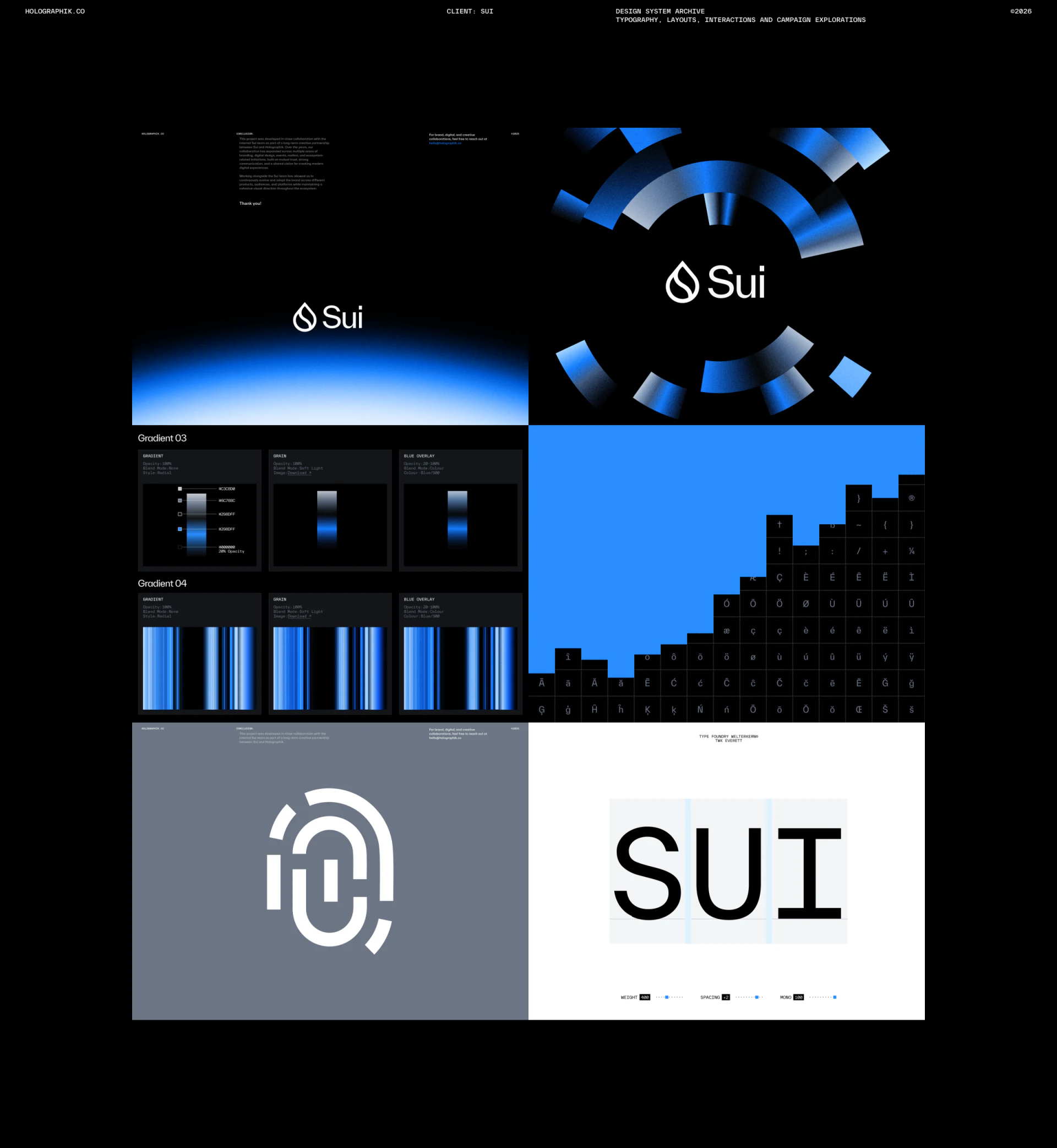
The visual archive places blue-white glows, ring fragments, vertical stripes, and typographic grids together. Glows are soft, rings have definite edges, and stripes suggest rhythm. They share blue, black, and white while creating different viewing experiences.
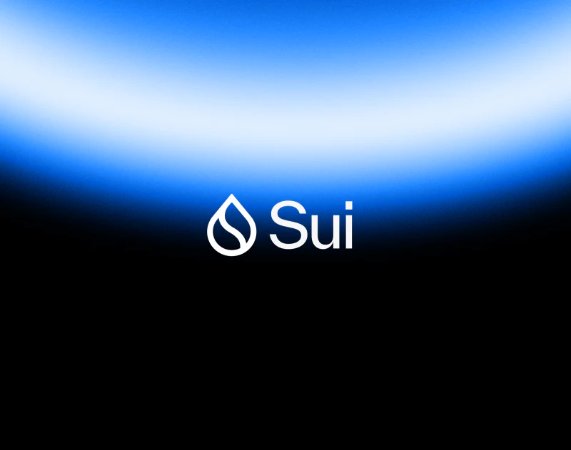
A Sui mark sits over a glow above, with another centered inside a ring nearby. Black space supports the bright areas and prevents every region from glowing at once. This suits technology brands needing recognition at different communication sizes: graphics can expand or shrink while the mark retains a stable position.
The type specimens below include grids and spacing diagrams, showing attention to how letterforms combine rather than only a poster effect. A static archive cannot confirm the final implemented design system, but it can reveal whether graphics, type, and color form a language capable of continuing across applications.
Questions give concept pages a starting point
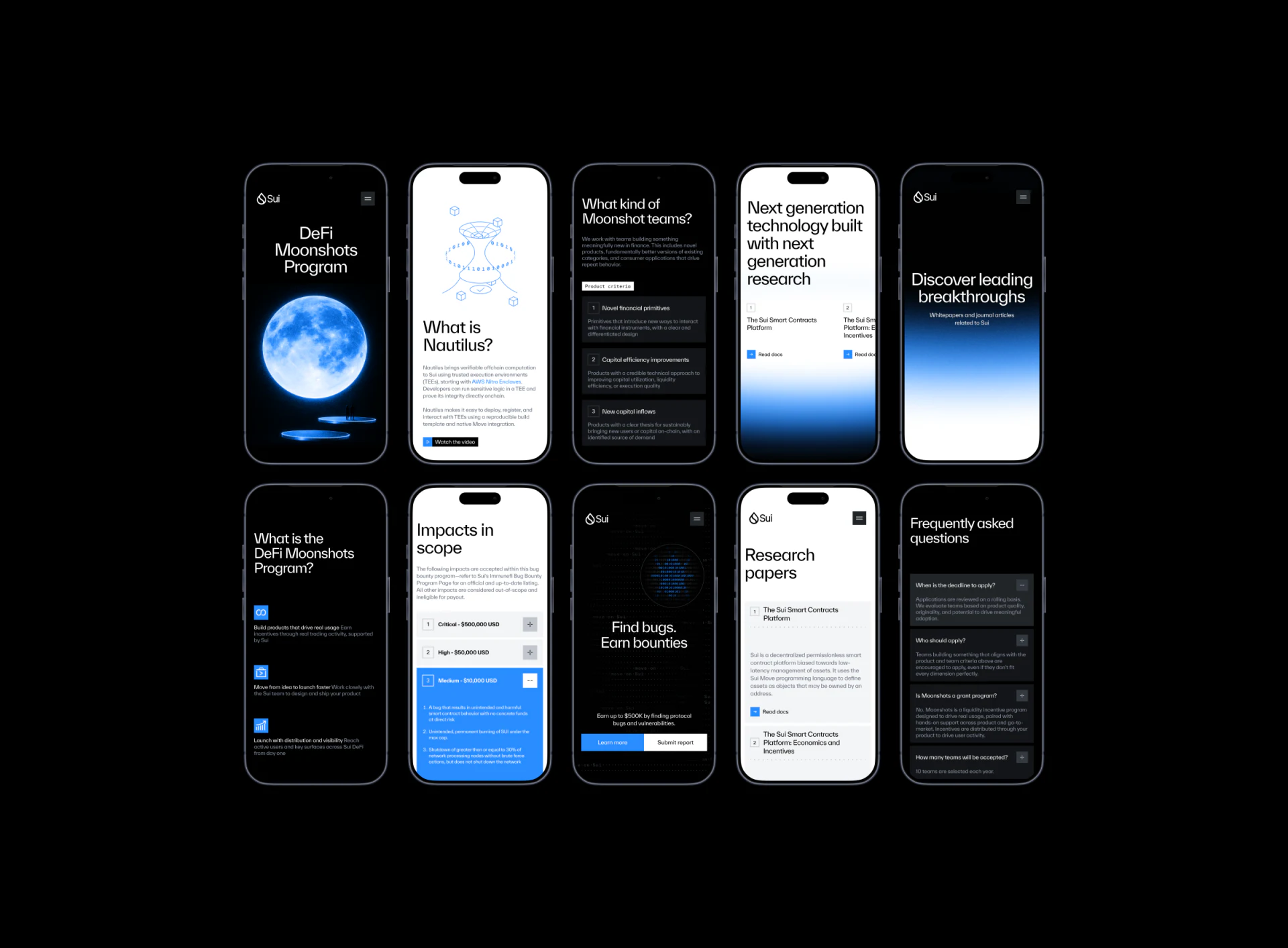
On mobile, What is Nautilus? starts with a linear graphic, then a heading, short paragraph, and viewing entry. Another page uses What kind of Moonshot teams? to introduce numbered criteria. The headings provide direction before readers finish the text.
These screens use both black and white backgrounds. Introductions and theme graphics emphasize visuals, while research and scope explanations use steadier white reading areas. The color change does not split the brand because typography, blue action marks, and fine graphics remain.
JVDS believes consistency across content pages should retain recognition cues while serving the reading task. Explaining a concept, checking a rule, and finding a paper require different densities; the same large hero graphic should not occupy every screen.
Research papers puts a resource title, summary, and Read docs in one card, with the entry beside its material. Production content could add intended readers and versions, helping people judge relevance before clicking. The illustrated summaries are not technical evidence for this article.
Blue marks expansion; long content needs detail
Scope information places levels and amounts in collapsed rows. The expanded item turns blue and reveals numbered paragraphs. Open and closed states differ clearly, so dense rules need not all appear at once.
This structure suits selective consultation, but closed rows still need enough summary. Levels and amounts alone may not tell readers where their situation belongs; scope, update dates, and next steps could be added nearby. This concerns information organization, not the amounts as current policy.
FAQ uses a similar structure. Learn more and Submit report appear together on another screen, representing understanding content and preparing an action. Labels and context should explain their differences. The static images do not show submission results and cannot establish the real flow.
Charts share the blue, but need their own explanation
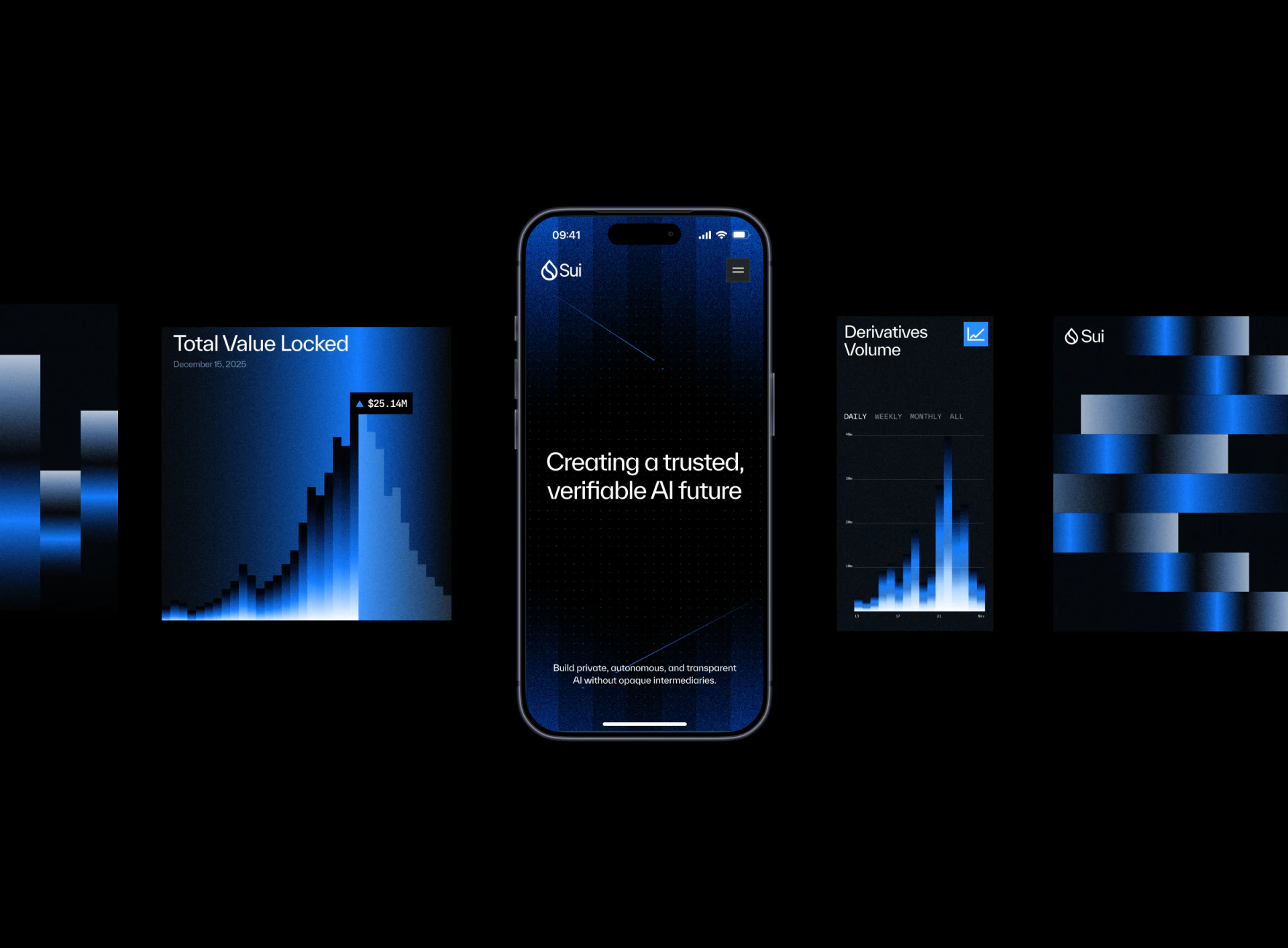
Total Value Locked and Derivatives Volume both use blue gradients. The former has a date beneath its heading; the latter offers period choices. Bars echo branded stripes, keeping the metric cards from becoming entirely separate white reports.
Headings and time text also give the graphics content identity. Gradients establish style, while units, sources, and periods still need clarity. When branded graphics resemble data displays, axes, legends, and explanations should help distinguish decoration from statistics.
These images support observation of a technology brand entering content pages, without verifying chart data or system features. A comparable layout could be checked with an actual summary, rule set, and data module before deciding how much space blue graphics should take.
Support both introductions and deeper reading
If your product website includes features, research, rules, or data, begin by organizing different visitors’ reading tasks. JVDS Design Studio provides UI/UX design, website design, and development services, carrying brand recognition into specific content interfaces.
 Link copied