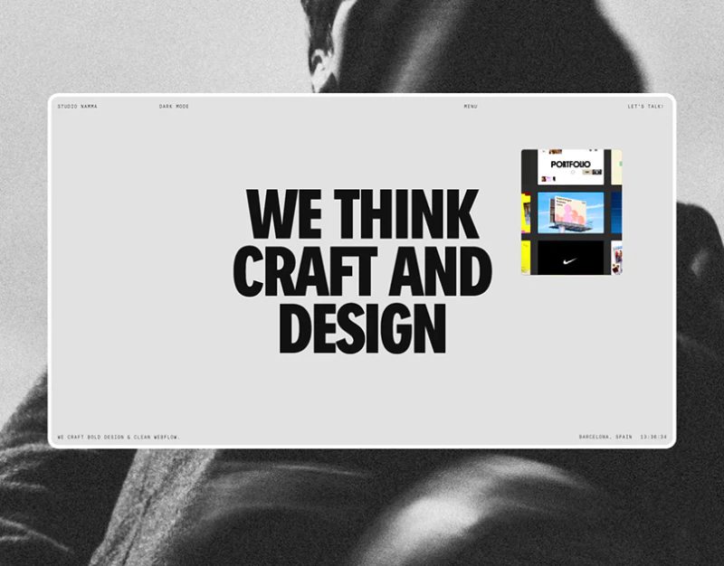
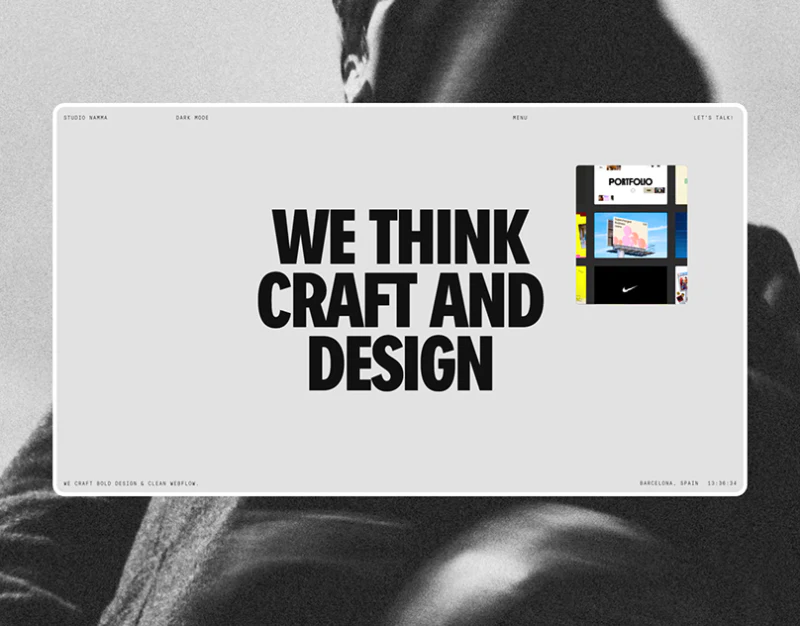
Studio Namma’s homepage places a bold black statement at the center of a pale-gray frame, with a small colored project preview at the upper right. Large text, small imagery, and monochrome surroundings make this difference in scale memorable, while giving work and introduction distinct reading rhythms.
Key takeaways
- The central statement and colored corner preview create a strong scale difference, presenting both identity and a cue to work.
- The about page separates oversized branding from narrow body text, adding readable capabilities after the statement.
- Footer thumbnails, contact information, and role lists have distinct positions, offering a basis for a clearer project index.
A statement in a pale frame catches attention first
The pale-gray hero frame has a fine white edge, with a grainy monochrome portrait outside it. No complex texture fills the frame, so three bold black lines stand out. Frame and background form separate layers, like an independent card placed over a portrait.
Colored images at the upper right do not compete with the central text for space. Blue, pink, and black project excerpts form a small window onto content beyond this page. This gives a studio website more direction than a statement alone.
Menu, Dark Mode, and Let’s Talk are spread along the upper edge, with short text below. They preserve the central space but are very small. JVDS would keep directory and contact entries clearly usable, especially on narrow screens, positioning key routes before preserving the restrained atmosphere.
The about page gives type three real scales
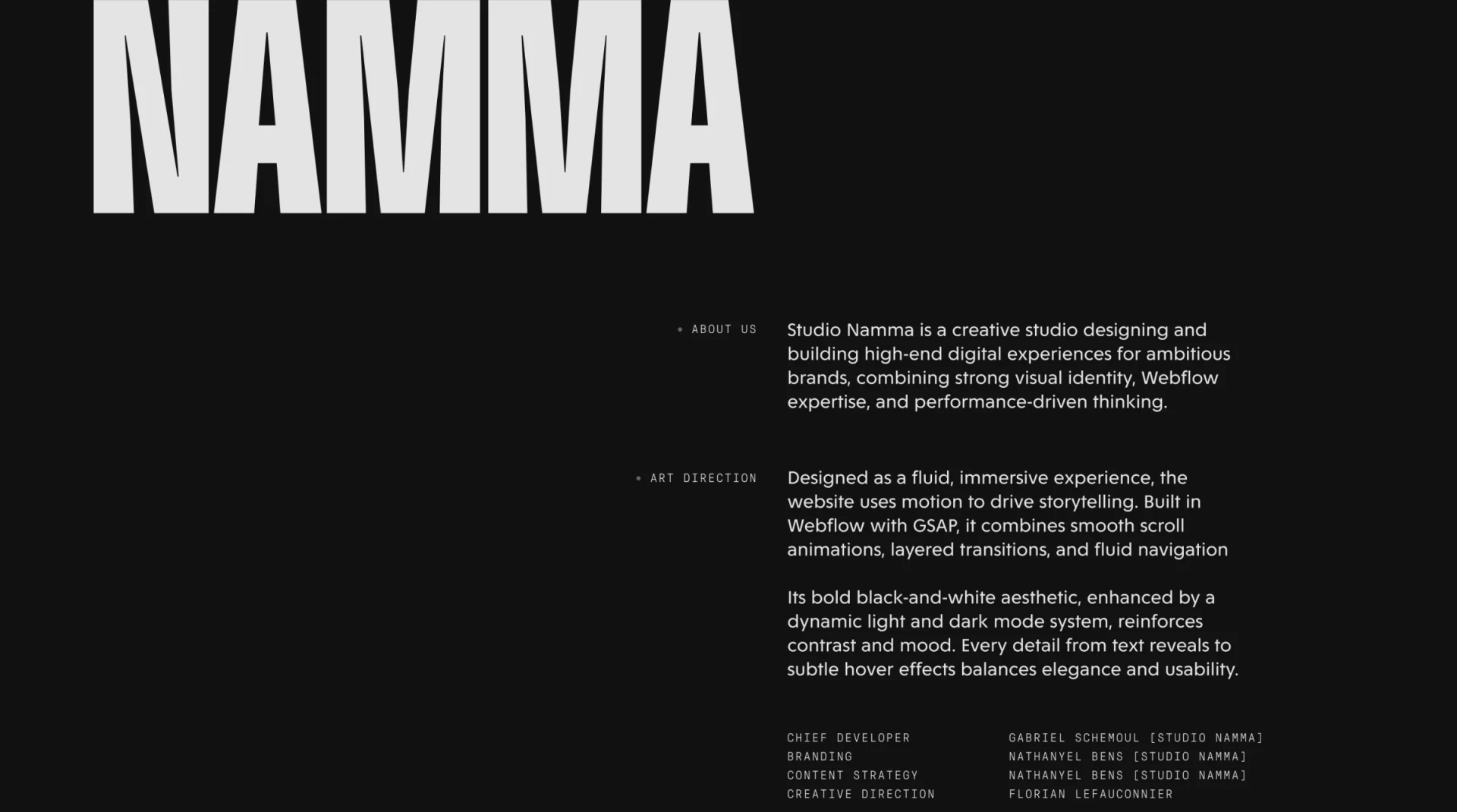
A huge NAMMA sits atop the black about page, with much of the left side empty below. Body text occupies the right, and small About Us and Art Direction labels sit to its left. Brand, section names, and body copy have different scales, preventing capability descriptions from reading as another slogan.
Body lines keep a stable width, with a clear gap between themes. Fine monospaced labels differ from ordinary text and support finding sections. A bold page can return to familiar paragraphs for specifics, making this combination suitable for brand and creative agencies.
The introduction mentions visual identity, digital experiences, and technical implementation as page descriptions. Each capability could connect to work and responsibility scope. Technical terms and motion descriptions should be supported by demonstrations; static images cannot establish implementation quality.
The footer resembles a horizontal work directory
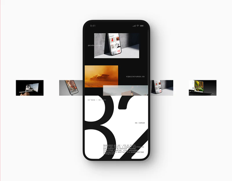
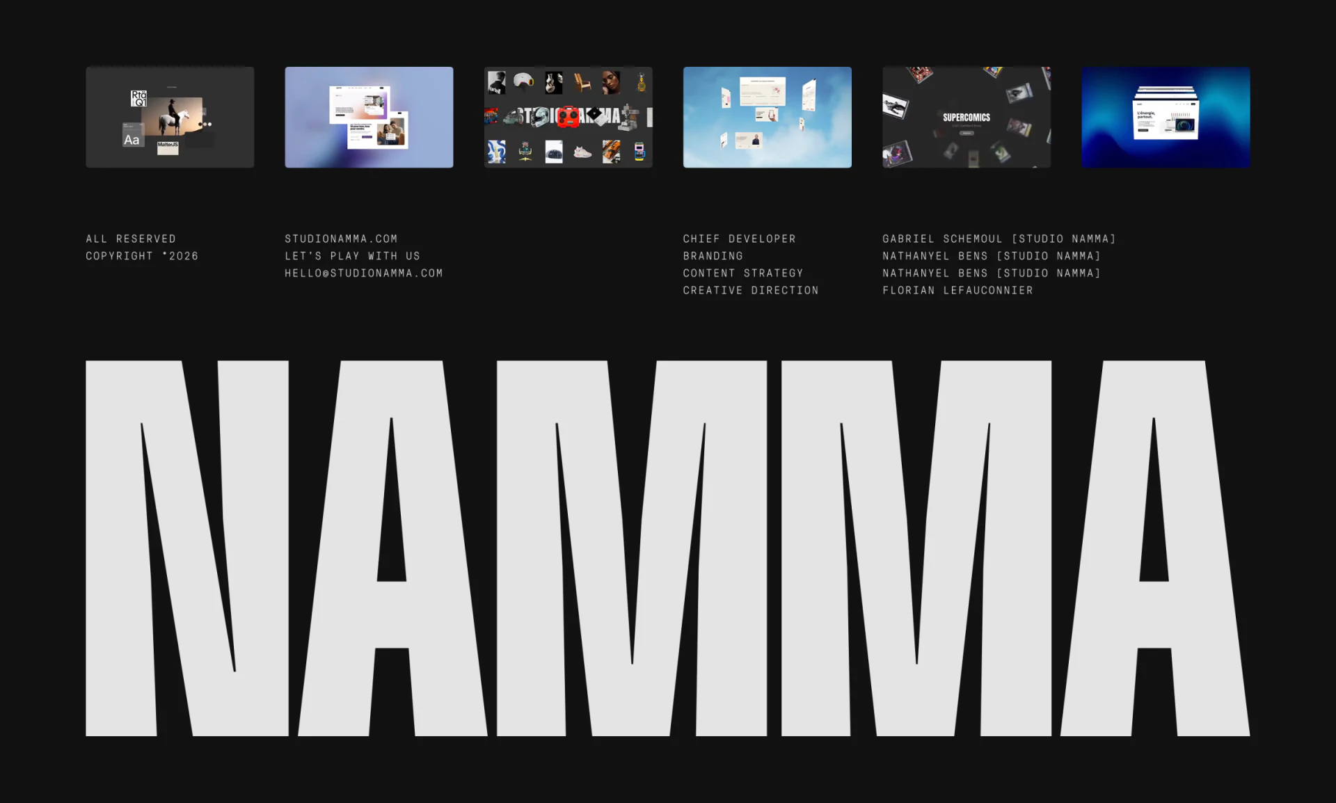
Six evenly spaced thumbnails above the footer include websites, collages, and dark branding images. Their frames share a background while project colors vary, showing visual range in one row without another series of large posters.
The next row separates copyright, contact, and contributors, ending with a huge NAMMA. The final lettering echoes the about page and unifies the brand impression. Contact text remains separately findable rather than embedded in the oversized letters.
Adding project names and types would make thumbnails more useful for selection. Images communicate style, while words explain topics; project pages can then state tasks and deliverables. This would preserve the monochrome page while clarifying which work to open next.
Frequently asked questions
Is one large statement enough for a studio homepage?
It can express a position but needs discoverable work and service entries. Namma’s colored previews point toward work; project names could help readers judge relevance.
Must all text be small on a minimalist page?
No. Large identity text, readable body copy, and clear navigation each have a task. Tiny entries can be hard for first-time visitors to discover.
Design review checklist
- Find the work directory and contact entry in the hero.
- Connect service descriptions with corresponding work that can be viewed.
- Give each footer thumbnail a readable name and type.
Want a brand website to express a position through type and work?
Start with brand information, project materials, and what collaborators most want to know, then arrange homepage scales and project records. JVDS Design Studio provides UI/UX design, website design, and development services; bring your website direction to the discussion.
JVDS Design Studio provides UI/UX design, website design, and development services to help organize interface, content, and implementation needs.
 Link copied