Can a WeChat Article Header, Portrait Cover and Exhibition Screen Share One Image? Building Brand Templates for Different Aspect Ratios
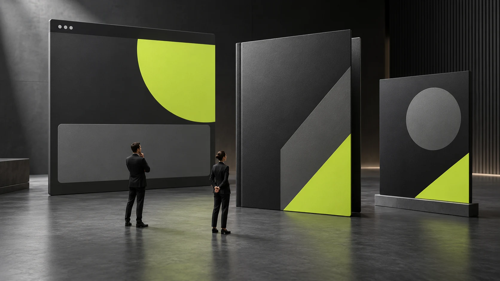
A WeChat article header, a portrait cover and an exhibition screen can use the same brand language, but may not be suited to sharing one image directly. Landscape containers work well for showing relationships across a composition, portrait containers need a clearer reading sequence, and large screens are also affected by viewing distance and event conditions. Building brand templates for multiple aspect ratios means deciding which information must remain and which content may be replaced, then arranging layouts for different reading tasks, rather than repeatedly stretching the same canvas.
First clarify the reading tasks for landscape, square and portrait formats
Before preparing templates, list the real usage locations and content tasks. A small cover in a list indicates the topic; the header after opening an article leads into the body; an on-site screen may only provide identification and directions from a distance. Even similar aspect ratios may not require the same amount of information. Do not assume that they need the same title, explanation and action entry point simply because they are all landscape.
For every touchpoint, record the actual display container rather than only the production file dimensions. Tool previews, published pages and on-site equipment may display images differently. Ask the person responsible for publishing to provide real samples and examine the full display area and possible crop locations. Mark unverified containers as pending checks; do not treat one size as a fixed long-term rule for every channel.
A landscape layout can place the subject and explanation in separate areas, while a portrait layout often needs to present information sequentially. A square layout at a small size also needs to consider whether core elements become crowded. These are only starting points for layout choices; the content task should ultimately decide. If portrait content requires detailed explanation, divide it into multiple pages. Cramming everything onto one page can make the template nominally complete but difficult to read.
Suppose a company needs an article header, mobile cover and on-site screen image for the same event. All three can share a topic, but article readers need to understand the content’s scope, mobile readers first need to identify the topic, and visitors at the venue first need to establish location and event identity. Using this hypothetical situation to discuss reading tasks does not imply that these scenarios have occurred, and requires no invented attendance or communication results.
After completing the task list, give each template a one-sentence purpose statement. Users who know clearly why to select it are less likely to choose the wrong file later because files look similar. This step is complete when template versions correspond to real touchpoints and the main amount of information has a basis, so the team no longer judges whether designs can be shared solely by canvas width and height. See Which Brand Applications Should Come First? Prioritizing Real Touchpoints for related checks.
Distinguish information that must remain from replaceable content
Templates for multiple aspect ratios first need to keep essential information stable. Confirm company identity, the content topic, conditions affecting understanding and partnership roles that need to appear, item by item according to the actual task. Not every image needs a complete company introduction, but if removing an item changes the reader’s understanding, lack of space alone is not a reason to omit it.
Replaceable content usually includes the title, main image, summary and selected highlights, but its limits still need agreement. Provide representative examples of permitted title length, suitable main-image subjects and whether the summary is required. One ideal short title and one image made specially for the template cannot demonstrate that staff can maintain it after inserting real material.
Separate fixed relationships from specific content. The relative prominence of the brand logo and title can remain stable while the title wording changes; the image focal point can follow the content, while cropping boundaries are constrained by the completeness of the subject. This lets the template retain identification without requiring a complete redesign every time the content changes.
When content has essential conditions, reserve a place for them in the template. For example, if the event’s intended audience, applicability or material status affects readers’ next decisions, a long title must not push those conditions out. The company needs to decide whether to shorten the title wording, add template pages or adjust the layout, rather than leaving users to remove key conditions temporarily to make the page fit.
Label each content block as fixed, required but replaceable, or optional, and explain the permitted changes. Users can then judge which fields to retain without understanding complex design theory. This step is complete when anyone receiving the template can identify essential information and knows which missing material makes immediate publication unsuitable.

Create different layout versions for the subject, text and logo
When changing a landscape layout to portrait, first rearrange the reading order. The subject, title and logo are not a single block that can be scaled as a whole. The subject should retain the parts needed to explain the content, the title should form a clear line sequence, and the logo should keep a relatively stable identifying relationship. Assess the elements individually, then combine them into a layout for the corresponding ratio.
The image subject determines whether a crop works. Cropping can alter a product’s key structure, a person’s complete pose or necessary relationships within a scene. If the subject does not suit a ratio, choose another image on the same topic, change the area occupied by the image or adjust the layout. Keeping the yellow-green framework and brand typeface does not mean every crop meets the template requirements.
Test the title area with different lengths and phrase relationships. A long technical name should not be broken arbitrarily so readers interpret one concept as two items; a very short title should not be enlarged without limit merely to fill the area. Prepare examples using real material in short, regular and longer forms, and specify what to do when the permitted range is exceeded, rather than asking staff to keep reducing the type size until it barely fits.
Logo combinations and partnership roles should follow the actual relationships. Different touchpoints may require different prominence, but one aspect ratio should not automatically elevate a partner into the organizer or turn a product logo into the company identity. Establish the necessary layout versions in advance and check new partnership roles separately when they arise, rather than adding them indefinitely by duplicating smaller logos.
After creating independent layouts for the main aspect ratios, check their shared colors, spacing relationships and element order. Brand consistency can come from these stable rules; it does not require identical coordinates in every version. This step is complete when the versions are recognizable as the same brand side by side and fulfill their own reading tasks separately, with no version relying solely on shrinking every element to remain complete. See What Should a Corporate VI Manual Include? for related checks.

Specify cropping boundaries and the areas staff may edit
Template handover should explain which content may be changed and which relationships should not be altered independently. Permission to replace titles and images does not imply permission to remove condition notes, change the relative prominence of roles or replace logo combinations at will. Specific operating rules are easier to follow and check than “maintain the brand tone.”
Cropping boundaries should follow the subject rather than being mechanically fixed at the image center. In some material, the subject sits to one side; in other material, necessary relationships span the frame. Note the parts that need to remain in the template and provide examples of suitable and unsuitable material. If the subject cannot fit completely, users should know when to stop applying that template or which layout to choose instead.
Editable areas do not mean every empty space needs filling. Empty space may help identify the subject or separate information; leaving an area empty can be reasonable when a title is short. If additional content is permitted, explain its task and length limits so staff do not gradually crowd contact information, slogans and extra conditions into every template.
Establish a process for new requirements. Clarify who decides whether a new template is needed when a new ratio, role or very long piece of content appears. Otherwise, staff may each create temporary versions and later keep copying them as formal standards. Template files, usable examples and rule explanations should have clear version correspondence.
During handover, have a user follow the instructions to replace real material once. Observe whether they choose the correct version, judge subject cropping, retain essential conditions and export a preview. Do not let the designer alone give the demonstration. This step is complete when staff can handle routine replacements within the agreed scope and know whom to contact for exceptions, rather than having to guess the designer’s intentions.
Test whether templates can be maintained using long content and real dimensions
Acceptance should at least cover content likely to cause problems, rather than only reviewing the most attractive sample. Choose a longer title, a shorter title, a complex main image and a case with optional fields missing, and check whether relationships remain clear. Test material should come from confirmed records. If suitable material is unavailable, use clearly labeled hypothetical content for preliminary checks, without presenting it as a published case.
Viewing at the real display size reveals more problems than enlarging the canvas. Explanations in small covers may be unreadable, and details on an on-site screen may lose their purpose. If the actual venue cannot be visited, first create previews using known equipment and viewing conditions and list the unverified items. Approval of a large design image cannot replace checks in all usage environments.
Testing also includes cropping after output. Publishing staff should examine the final page or actual playback container to confirm that essential information remains complete. For templates involving different tools, verify the version used in each tool separately; do not assume one tool’s editing and export method applies directly to another. Where differences arise, record the actual cause before adjusting the rules.
The final archive should retain templates, representative filled examples, editable limits and instructions for handling exceptions. When a touchpoint is added, first compare its reading task with the versions available, then decide whether to reuse or add a layout. Sound templates for multiple aspect ratios give content maintenance a basis while allowing necessary changes; they do not require every channel to use the same image forever.

Frequently Asked Questions
Can one key visual be cropped directly into every aspect ratio?
Only when the subject, essential information and reading task all remain complete. If cropping changes the meaning or pushes out key content, adjust the layout or choose different material on the same topic.
Does brand consistency require elements to occupy the same positions in every ratio?
No. Identifying relationships, colors and element order can remain consistent while specific positions serve the reading sequence in each container. Identical coordinates may actually constrain the content.
What if the title exceeds the template’s permitted length?
First see whether it can be simplified without changing its meaning, then select an existing layout for long titles. If it still does not fit, have the responsible person confirm a new version. Avoid arbitrary type reduction or removal of conditions.
Do staff need design expertise to replace images?
They need not master every area of design, but should use examples to check subject completeness, focus and essential relationships. Handover should provide specific usable limits and have staff actually perform one replacement.
Must all templates be rebuilt when a platform changes how it displays content?
First check which tasks and areas the change affects. Only one layout or output instruction may need adjustment. Without examining the actual display, neither assume every version is invalid nor keep applying templates blindly.
Need design or website development services?
JVDS Design Studio is a professional design studio focused on digital product experiences and brand identity. We work with businesses in China and overseas that want to strengthen their brand image, improve user experience and grow their business, providing clear, usable UI/UX design, high-quality website design and development, app and mini-program development, and cohesive, distinctive brand identity design.
Updating your brand identity or website? Tell us where the design will be used and which materials you need.
 Link copied