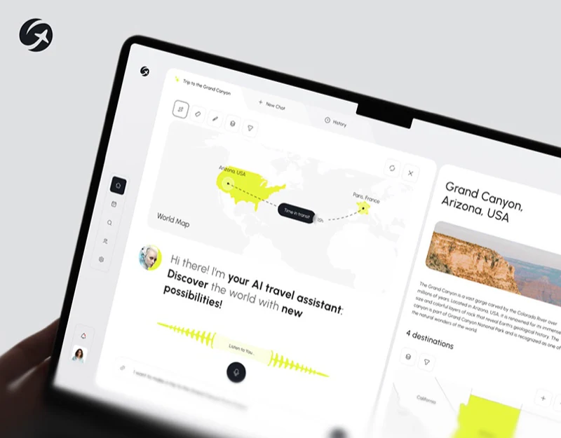
Geovea’s AI travel assistant interface design does not leave every result in chat paragraphs. Yellow waveforms indicate voice input, while results place a regional map beside four place photographs. Language gradually becomes location objects that users can view and identify individually.
Key takeaways
- Voice waveform and text input share a screen, making ways to begin expression clear.
- A yellow regional map establishes scope before photograph cards identify places.
- Mobile details retain destination names and maps; the basis of distance deserves explanation.
A bold waveform and a simple input area
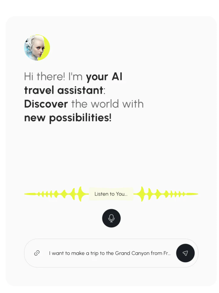
The assistant portrait sits upper left, with selected greeting words bolded and generous pale space below. A yellow waveform extends horizontally with Listen to You in the center; a separate black microphone button sits underneath. Clear visual cues identify who responds and the current input state.
An input bar at the bottom retains an attachment symbol, send button, and visible travel-request text. Voice and text entries stay close, putting both expression methods on one page rather than making switching a search for new navigation.
JVDS considers travel requests likely to contain several conditions, so an editable interpretation summary should follow the waveform. The request’s end is truncated here, without complete departure place, dates, and preferences. Checking them before viewing the map would make misunderstood names or conditions easier to notice.
The yellow map establishes the region
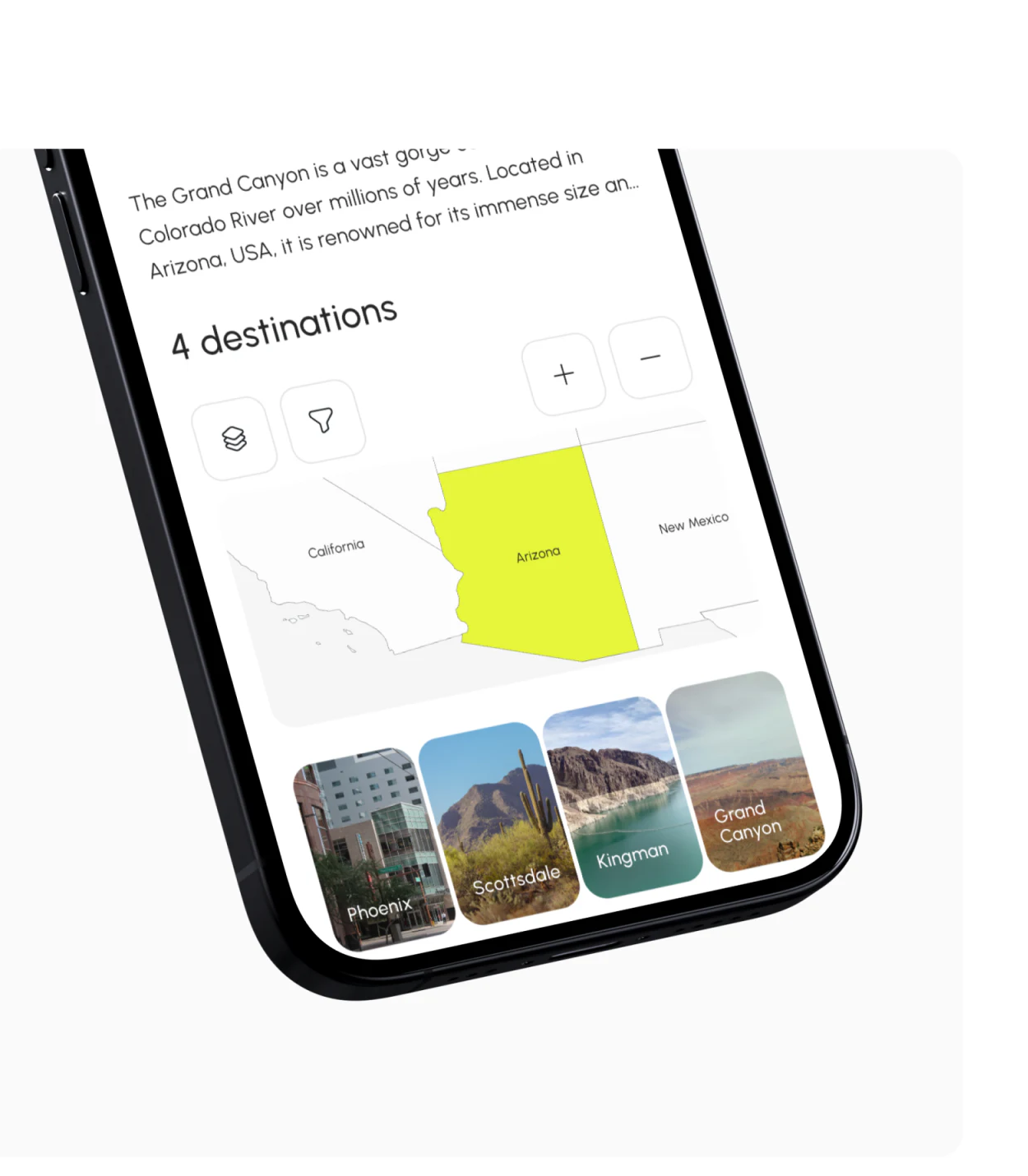
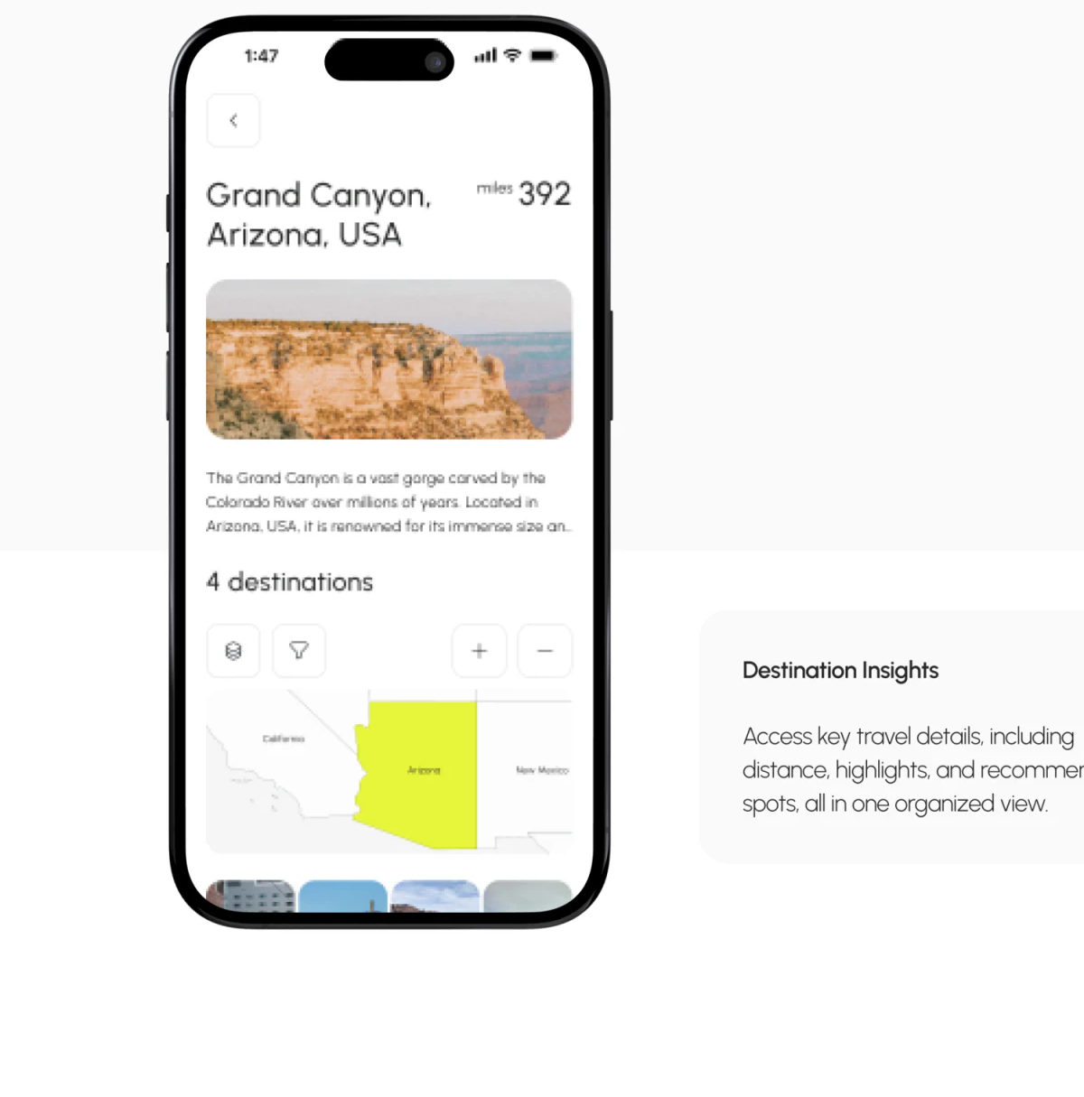
Arizona is filled yellow, with California and New Mexico in adjacent pale areas. Simple boundaries and names establish a regional scope before individual places below. A map can still be useful without complex route lines.
4 destinations appears above, layers and filters on the left, and zoom on the right, leaving place names clear. Phoenix, Scottsdale, Kingman, and Grand Canyon each have a rounded photograph card with a name across the bottom. Buildings, desert, and canyon create different impressions, while names give images stable identities.
This suits destination discovery. Scope and candidate places become browsable modules, avoiding a search for four names inside a long answer. Route planning should later distinguish candidates, added places, and sequence, separating four recommendations from a confirmed itinerary.
Mobile details return the place to the header
The mobile header names Grand Canyon, Arizona, and USA, with miles and a distance reading on the right. A large photograph, short introduction, destination count, and map follow. The name is not relegated to the image, so the location remains identifiable when opening the page independently.
Map and cards retain desktop yellow and rounded forms in a vertical sequence. White backgrounds give more text a stable area while keeping the page light. The task has shifted from expressing needs to checking place information.
Distance could name its origin and travel mode, and state whether it is estimated or based on a selected route. A prominent mileage without a calculation object can suggest a settled itinerary. Returning to edit the request could preserve place identity and identify updated information, making comparison clearer than an entirely new answer.
Frequently asked questions
Why do AI travel results need place cards?
Cards give each recommendation its own name and image for further viewing or selection. They suit discovery; adding to a plan and changing sequence still need clear states.
What should map distances explain?
State the origin, calculation mode, and whether the distance is estimated or based on a chosen route. Distance and planning conditions should stay close for checking.
Design review checklist
- Turn spoken requests into an editable place-and-date summary.
- Distinguish recommended places from those added to the itinerary.
- Check for origin and travel mode beside distance values.
Connect conversation with maps in a travel product
Organize input conditions, destination objects, and route states before deciding which content belongs in chat, cards, or maps. JVDS Design Studio provides UI/UX design, website design, and development services; discuss your product interface with us.
JVDS Design Studio provides UI/UX design, website design, and development services, helping organize interfaces, content, and development needs.
 Link copied