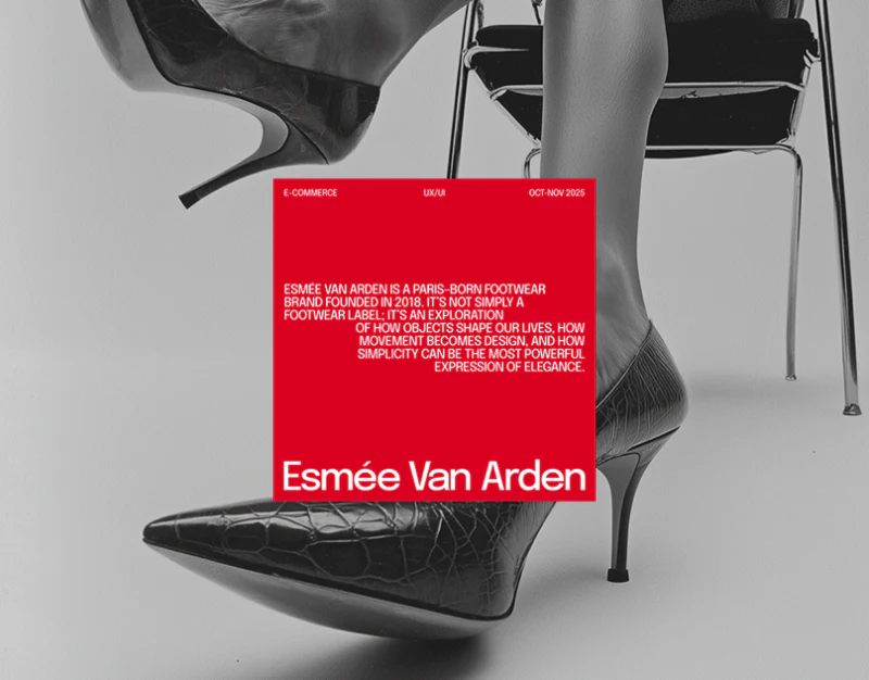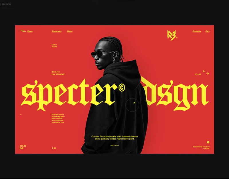
R3’s fashion store interface design arranges people photographs as a two-column outfit wall. Black makes orange, purple and gray photography more vivid; the store directory switches to alphabetical indexing, and product details mark selections in yellow. Style browsing and direct lookup gain different entries.
Two columns of people connect the clothing’s character
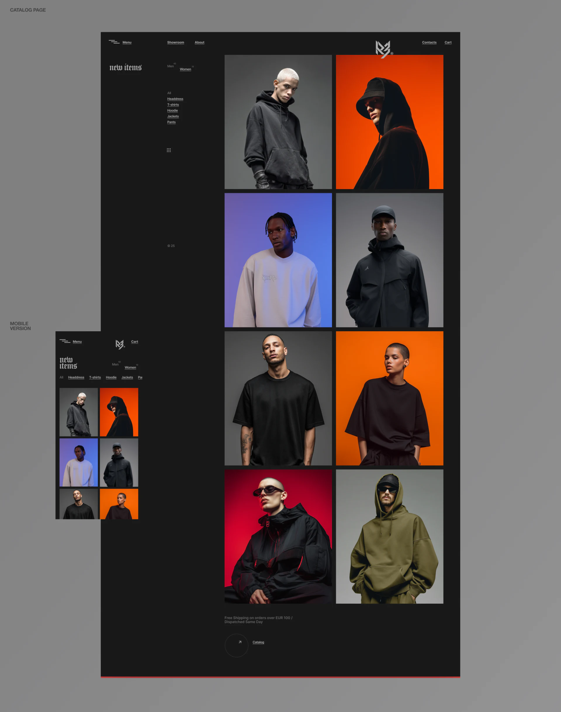
Black hoodies, jackets and T-shirts appear on people in a roughly two-column grid. Silhouettes, poses and background colors create a continuous rhythm, presenting clothing on bodies rather than as isolated objects.
Desktop leaves Men, Women and categories on the left, with Gothic new items lettering and photographs taking most of the right. Mobile keeps two photograph columns but moves categories into a horizontal row above. Brand voice and viewing remain while tool placement adapts to the screen.
This catalog suits a small curated selection focused on discovering style. Repeated price comparison may need light names, prices or expandable identity. Before clicking, people need cues as to whether an image represents a garment, an outfit or a store.
JVDS emphasizes coordination between photography and catalog content. Large people images are attractive, but preparing the page means matching every photograph to its product, preventing a complete outfit from automatically implying that every item is available.
The store index uses letters instead of more images
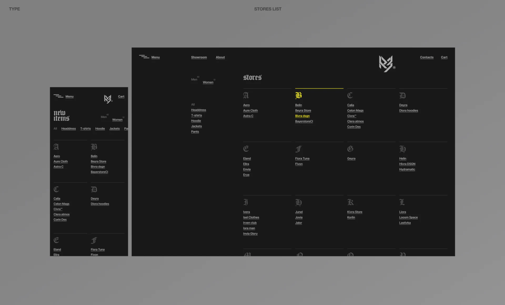
The store index groups scannable names under A, B, C and other letters. Gothic type remains in group headings, while the B group’s line and one store name turn yellow. Personality sits in the headings, with the lookup tool in ordinary words.
Desktop uses several columns and mobile two, with fine lines and generous space between groups. This aids lookup by name more than a long brand-logo column and avoids requiring identically sized images for every store.
Clothing categories remain on the left, meaning stores and categories can appear together. Production interaction should explain whether it filters stores or products within a store and expose current conditions. Clear scope matters more than making the two lists belong visually to one layout.
Yellow becomes a direct selection signal in details
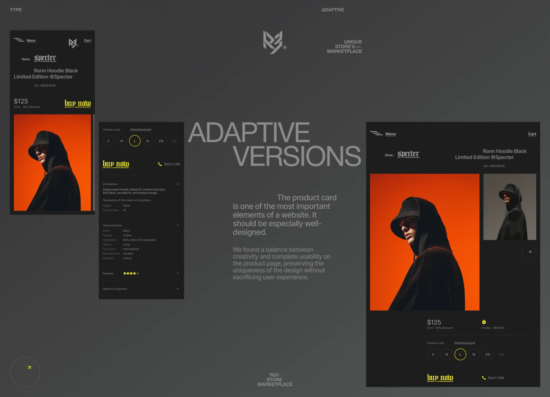
The detail page names the store and product before a large orange-background worn-product image. Size circles sit below price, with L circled in yellow and Dimensional grid nearby. Selection needs no extra large card; one bright ring separates clearly from the dark background.
buy now continues in yellow Gothic lettering, beside Buy in 1 click with a phone icon. Type and color are distinctive, but both actions need understandable results. If the phone means contacting someone to buy, say so; if these are different checkout routes, distinguish them clearly.
Collapsed sections separate description, features, reviews and delivery. The buying area stays compact while detailed information opens as needed. A prototype should check whether opening the size table retains L and how unavailable sizes appear.
The example’s model parameter gives Black as the value for Height, mismatching field and content. Correct real information before refining decorative details; height, color and material cannot substitute for each other merely to fill similarly sized fields.
Small text on dark needs checking at normal size
Photographs have strong color while navigation and parameters use quiet, small gray text. Shopping still requires readable product identity, size and conditions. Check these words at actual device sizes rather than only whole-page thumbnails.
R3’s transferable feature is task-specific content tools: outfits for style, letters for stores, and details for choosing a version. Clarify these three tasks before deciding where Gothic type and yellow belong, making brand character useful in the interface.
Organize browsing and selection for a multi-brand fashion store
If you are building a store with rich outfit photography, plan stores, categories and product versions together. JVDS provides UI/UX design and website design and development, helping brand visuals become clear shopping pages.
 Link copied