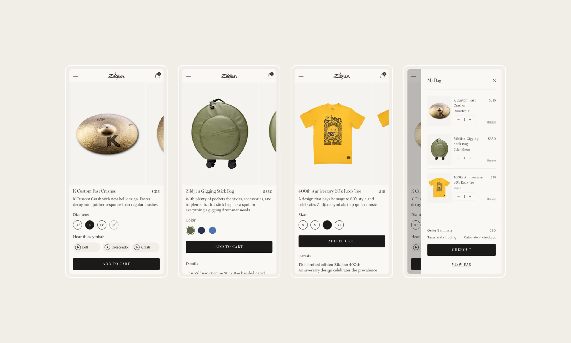
This musical instrument store presents gold cymbals, green bags, and yellow T-shirts on white. Selection areas occupy similar positions without forcing identical controls: diameters, colors, and clothing sizes use appropriate forms, and shopping-bag text retains the choices. This combination of consistency and difference is useful across categories.
Key takeaways
- The same selection position accommodates diameter, swatch, and clothing-size controls, combining consistency with category differences.
- Audio samples sit near specifications, and the shopping bag retains selected results in words.
Positions can match while selectors differ
Mobile details present image and name first, options below, and a black add button farther down. Cymbals use diameter circles, bags use color dots, and shirts use letter sizes. Readers know where to choose across categories without interpreting every specification as the same dropdown.
White and fine gray lines let metal, fabric, and clothing supply the colors, with black actions easy to find. Selection retains a shared rhythm and physical differences, making this a useful approach.
The shopping bag repeats Diameter, Color, and Size, with quantity and removal entries. It repeats order identity rather than promotion. JVDS values matching field names across pages: colors need words, diameters need units, and clothing sizes need the current value clearly stated.
Cymbal details offer both looking and listening
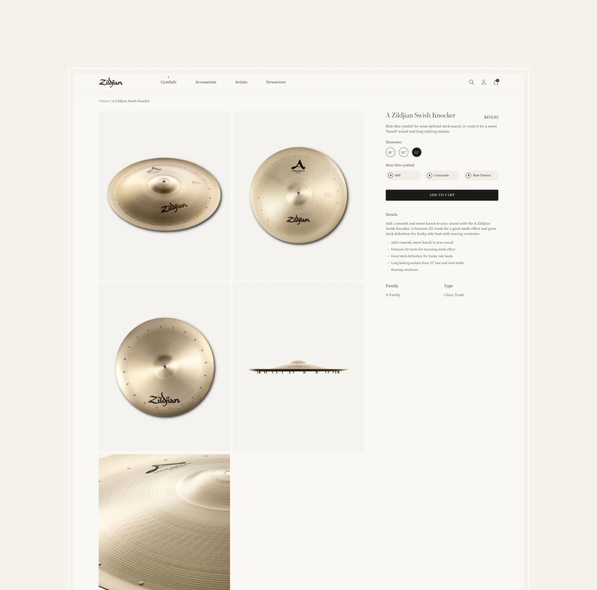
Desktop details arrange front, back, side, and close-up images in a large grid on the left. Name, diameter, and Hear this cymbal sit on the right, with individually named samples. Photos show form and material; listening offers another way to explore, close by without crowding.
This suits instrument categories with clear sensory differences. Named samples explain more than an unlabeled play key, identifying the performance style being heard. After a diameter change, the sample’s corresponding specification should remain clearly labeled.
JVDS would check current specification and playback state together. Neither actual audio nor switching is shown, so the image cannot prove sound quality. Explanations, images, and samples have distinct roles; no medium needs to explain every difference.
Checkout separates products from addresses
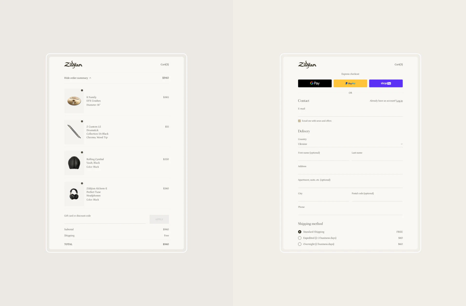
Two side-by-side page examples show cart and form, with product photographs, names, and short fields on one side and contact, delivery, and method choices on the other. Small images identify objects, and specifications remove reliance on memory.
One detail is worth pausing to check: the heading says Cart(3), while the left column shows four product rows—a cymbal, drumsticks, a bag and headphones. The item amounts add up to the displayed 940 total. The question is what the heading counts: product types, units or another object. Before launch, that basis should clearly correspond to the list; a tidy layout is not enough to establish the relationship.
Change one item’s quantity and specification, then check heading, subtotal, and total synchronization as well as retention of other items and addresses. Cross-category purchases depend on selected conditions continuing into the order. The white and black style is already consistent; category fields need not be removed for visual uniformity.
Frequently asked questions
Should a cross-category store standardize specification controls?
Positions, labels, and action rhythm can be shared, while controls follow data types. Swatches, diameters, and clothing sizes need not become one dropdown.
Design review checklist
- Check the explanation linking audio samples to current specifications.
- After editing the bag, check specifications, subtotals, and entered addresses.
Give different categories a clear shared purchase structure
If your brand store sells equipment, accessories, and merchandise and needs clearer specifications and order summaries, start with a list of category fields.
JVDS Design Studio provides UI/UX design, website design, and development services to help organize page content, interface structure, and implementation needs.
 Link copied