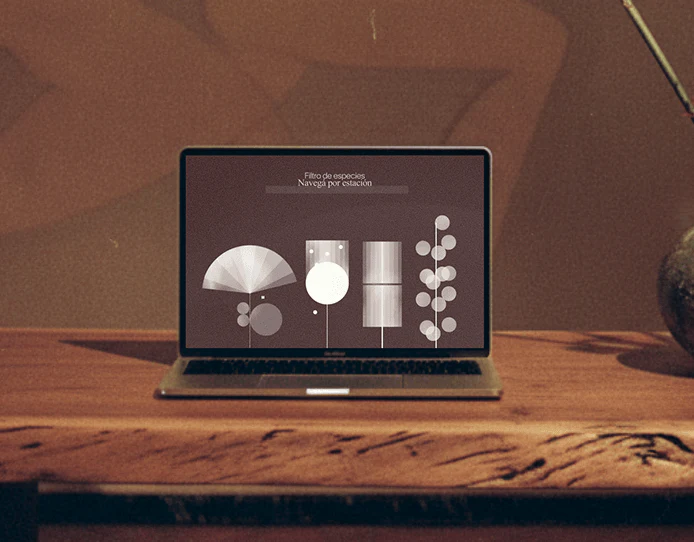
HANAMI arranges circles, squares, and diamonds into a branching course map, then uses fine lines to explain flower arrangements. Art course platform interfaces can turn themes into navigation, while maps, filters, and practice pages still need to help users find a course, understand a part, and identify the current task.
Shape legends establish rules for a themed catalog

Winter course nodes extend vertically like branches, with Nivel 1 Nyūmon on the left. The lower-right legend maps circles, squares, and diamonds to content types and colors to seasons. The catalog echoes flower arranging while a legend supplies reading rules.
Season, element, flower material, duration, and size filters on the right let exploration extend beyond the map. Removable text labels could identify current conditions and distinguish all courses from filtered content. Nodes also need readable names and explanations of whether lines mean sequence, dependence, or content relationships.
JVDS prefers a visual map and simple course list sharing conditions: the map shows overall relationships and the list supports quick finding. Switching should retain level, filters, and learning position, allowing thematic expression to support different browsing habits.
Line drawings and completed photographs offer different references
The course diagram spreads branches, container, and positions across white space, with Soe, Tai, and Shin above, a ruler on the left, and information categories and a small completed image on the right. Fine lines isolate parts; the photograph adds overall appearance, contrasting structure with result.
Several branch groups and circular position diagrams share the image, so a first reading needs a clear focus. Emphasize the current part, subdue other references, and connect names and numbers to explanations. Knowing which branch is under review helps transfer spatial relationships into practice.
Terminology entries should preserve return positions so looking up a word leads back to the original part. Rulers, names, and line styles have separate roles; explaining their relationship supports understanding more than adding further fine lines.

Preparation lessons should emphasize the current action and checks
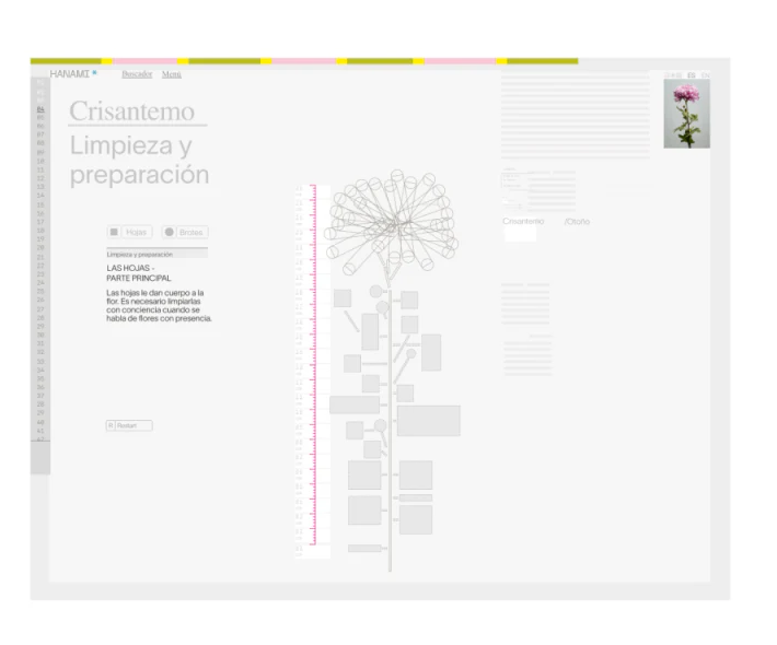
The chrysanthemum cleaning and preparation page places text, material drawings, a pink ruler, and a physical image at upper right together. Pale gray, fine lines, and small color strips maintain consistency, while practice becomes more concrete than the abstract map.
Headings and drawings are pale. Increase recognition of the current step and key part, then make room for materials, tools, and completion checks. When steps change, explanation, emphasized part, and photograph should stay aligned without asking learners to assemble three separate pieces.
The useful idea carries artistic composition through catalog and teaching. Catalogs support choice, diagrams support observation, and short lessons support execution. Beyond a shared style, each page needs its own priority to take a course from exploration into practice.
Let artistic expression support complete learning tasks
If your art or skills course combines maps, structural diagrams, and step-by-step practice, define content relationships and the current step before arranging filters and return routes.
JVDS Design Studio provides UI/UX design, website design, and development services for course platforms, instructional content, and practice interfaces.
 Link copied