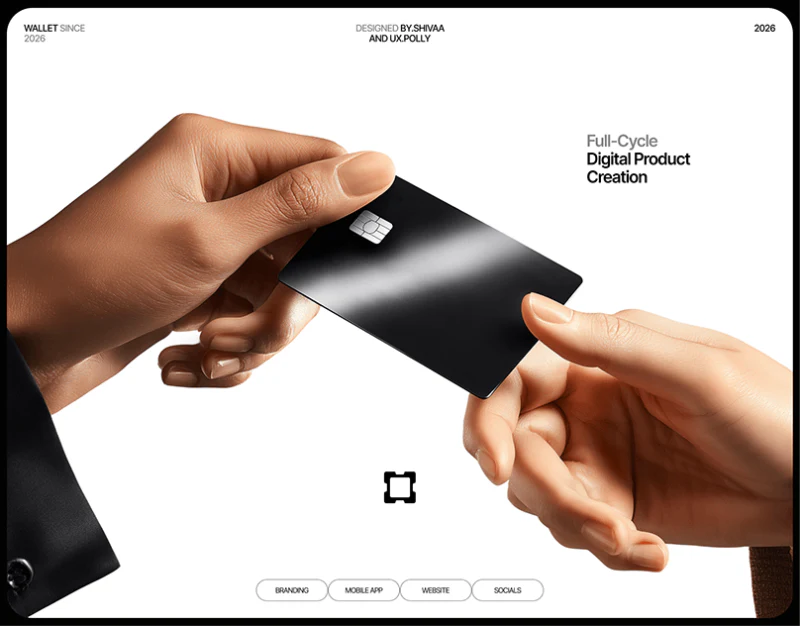
This digital wallet interface design uses black behind teal primary actions. Request and Send have full labels on the home screen, while amount input retains recipient and unit. Minimal styling does not reduce every task to an icon; it leaves room to check the object.
Key takeaways
- Request and Send explicitly name actions, while account and unit remain visible during amount entry.
- A dedicated credential page reduces interference; amount formatting and credential naming still need accuracy.
Two named buttons are more direct than arrows alone
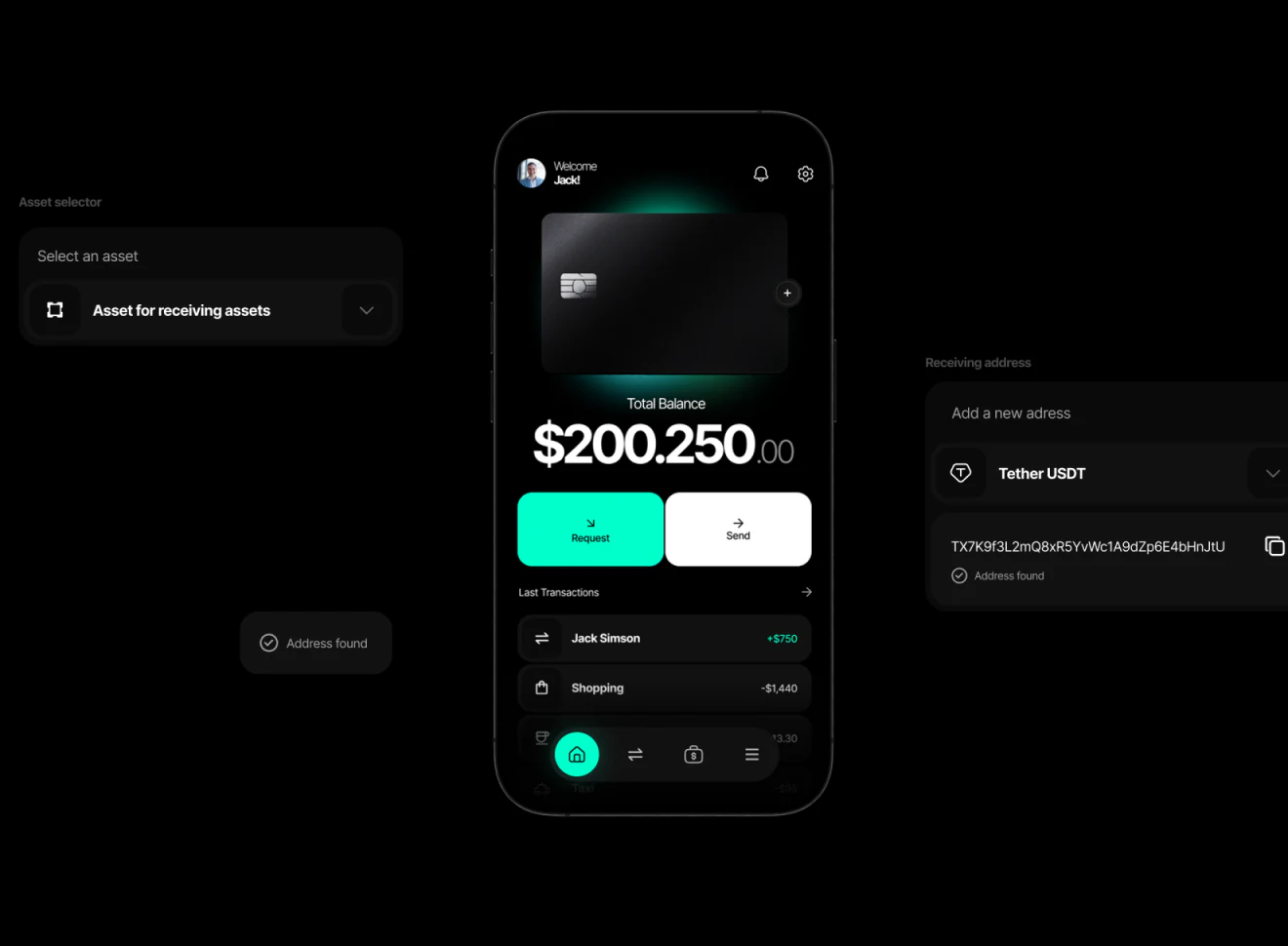
Total balance sits centrally above teal Request and white Send, with transactions below. Similar button areas have different color emphasis but equally complete action names. Bottom navigation mainly uses icons, while key operations do not require remembering their meanings.
Asset selection and receiving-address components continue dark gray cards, grouping names, addresses, and copy icons. The overview stays simple, but objects remain readable inside specific actions. This progression from overview to object is useful for wallet homepages.
Large amounts need careful checks of grouping and decimal symbols. The balance’s dots require clarification; centering or enlarging them cannot resolve meaning. JVDS would standardize formatting for the current language and unit before adjusting spacing or number animation.
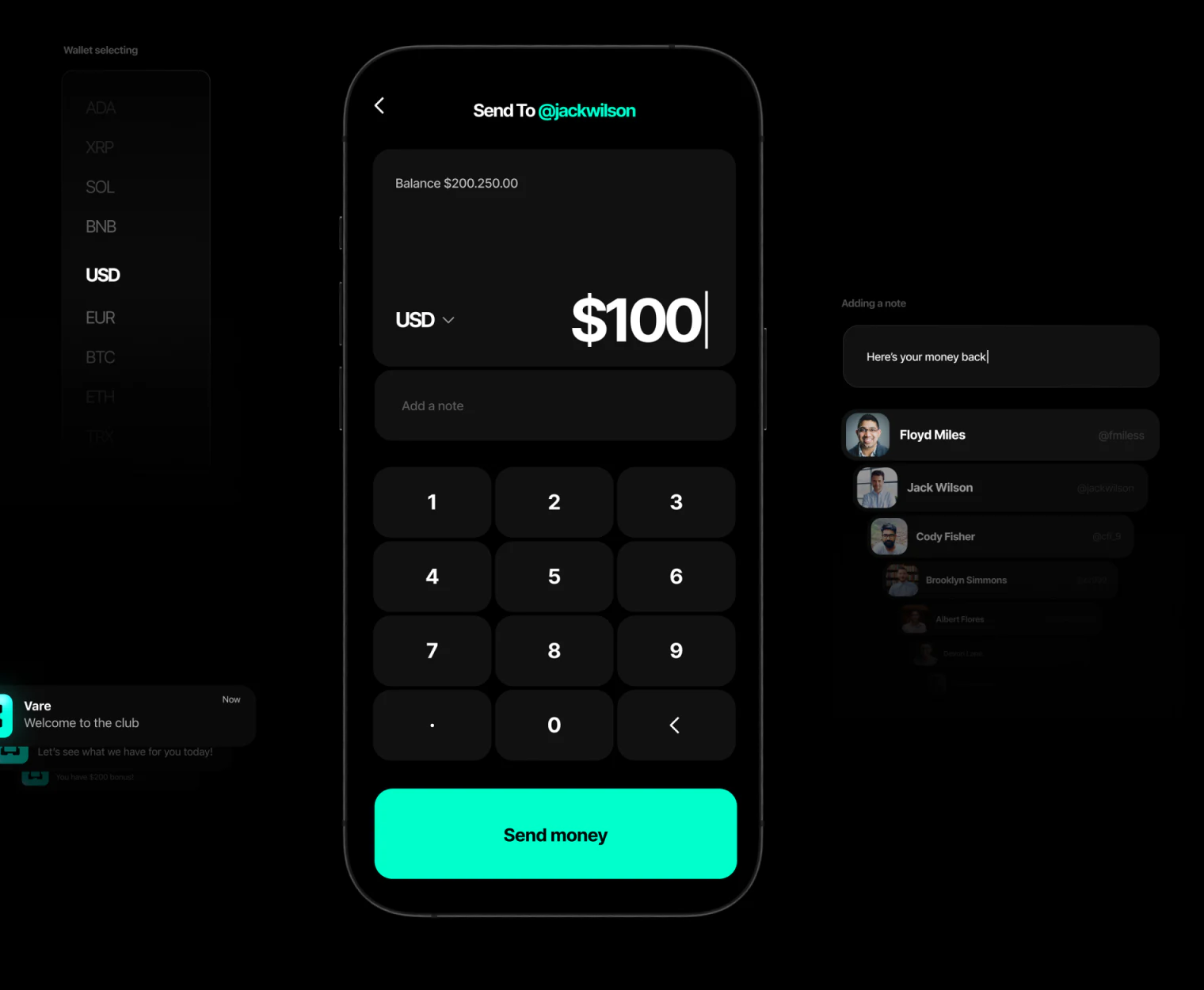
The account remains visible during amount entry
Send To and the account appear at the top, with teal standing out against the dark background. The input card places unit left and amount right, retaining balance above. Note, number pad, and Send money follow. Entering a value and checking its destination happen on one screen.
This is more useful than a page showing only a large number. Readers can confirm the recipient and current unit while typing. Adjacent contact and note components treat the object and explanation as part of the operation, beyond handling a value.
Further walkthroughs should change contact or unit, checking what happens to existing numbers and whether the object updates promptly. Before actual submission, recipient, amount, and fees should be summarized together. A complete confirmation page is not shown, so this remains a suggestion rather than an existing feature.
Credentials keep one task in focus
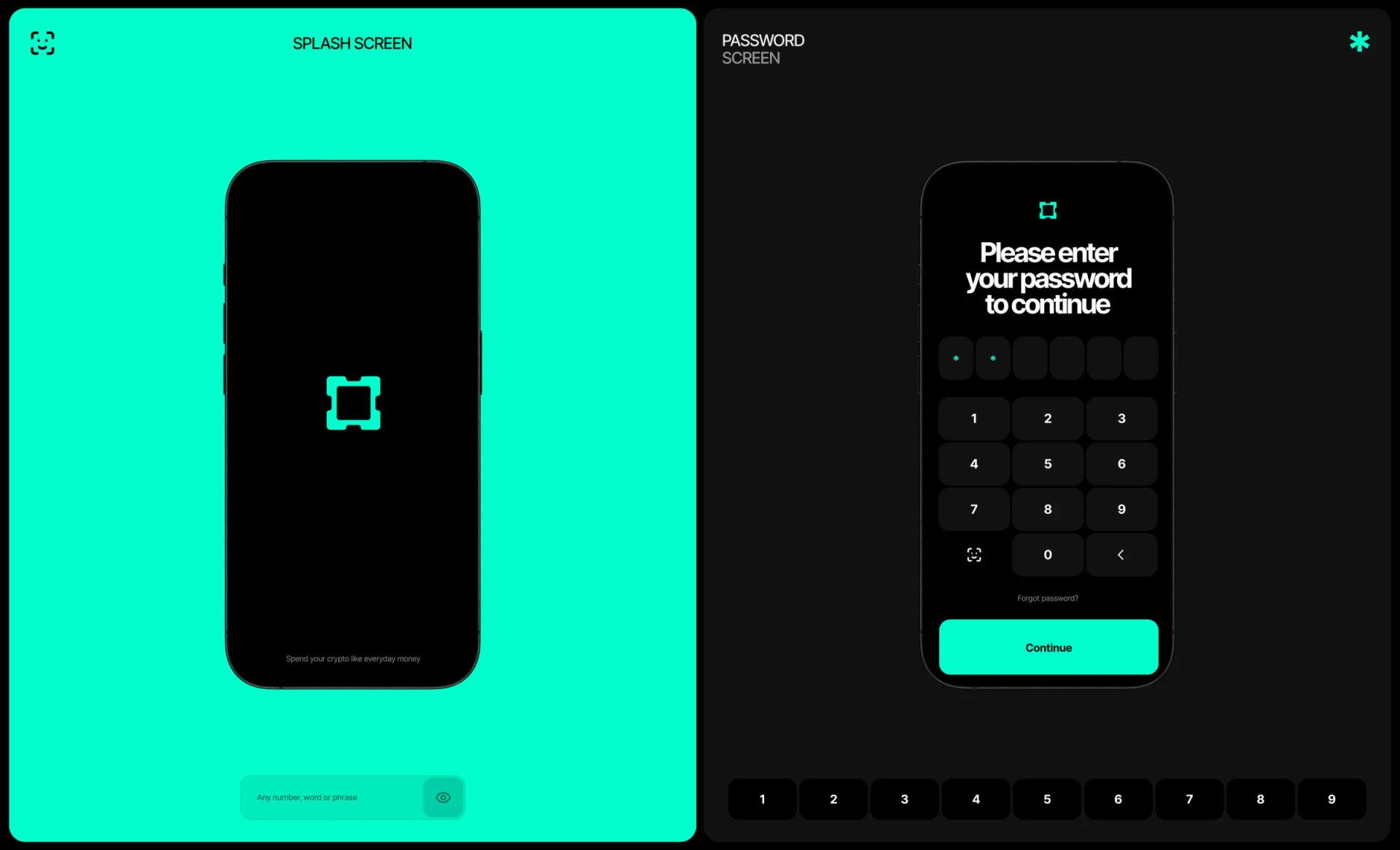
The password page retains black, with heading, six input boxes, number pad, and teal Continue arranged vertically. The adjacent launch screen is largely teal with a centered mark. Entering credentials increases visual density with the task.
A quiet credential interface is a strength: balances and records do not intrude. However, password and six numeric cells need an accurate credential name. Recovery positioning and failed-entry feedback also require actual checking.
JVDS considers precise actions, objects, units, and credential types more important to a simple wallet than removing another line. Recognition icons and a dark atmosphere are not evidence of security capability; this article evaluates visible task organization.
Frequently asked questions
Should a wallet amount page keep the recipient visible?
Yes. Contacts or units may change during input, so the object and current amount need checking together, then focused confirmation before submission.
Design review checklist
- Standardize grouping and decimals in balance and input summaries.
- Change the recipient and check updates to the old amount and account.
Give amount operations a clear object
If a payment or funds tool needs clearer send/receive entries, amount input, and confirmation, begin with objects, units, and state fields.
JVDS Design Studio provides UI/UX design, website design, and development services, helping organize page content, interface structure, and implementation needs.
 Link copied