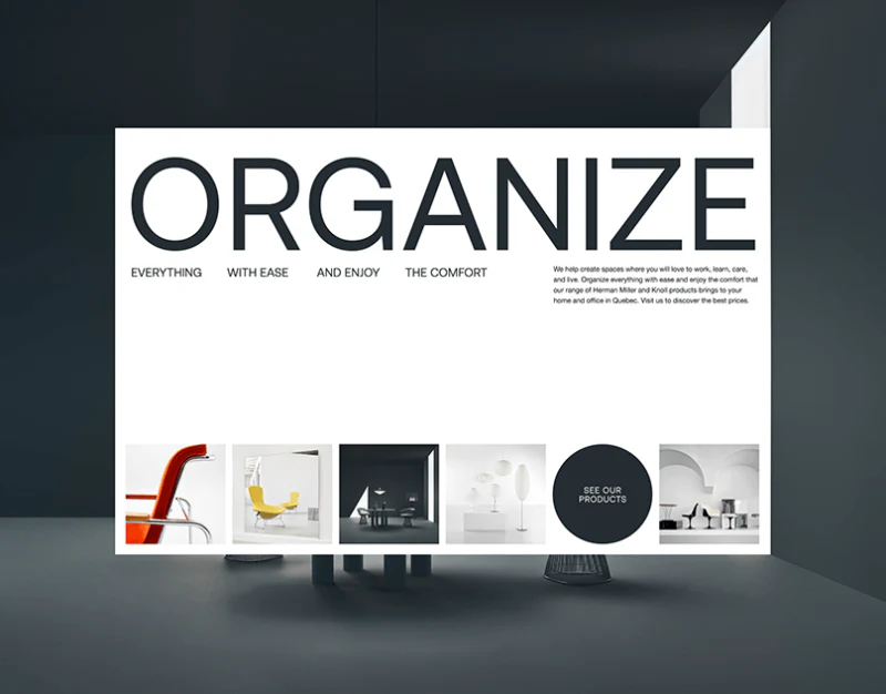
Möbel moves among viewing distances: furniture contributes to atmosphere in the hero, becomes a findable product in categories, and reveals material and form in close-ups. Furniture brand websites often serve all these tasks. Here, quiet typography lets changes in image scale carry the variation.
Images establish space beneath large type
ORGANIZE spans the hero, with smaller phrases and explanations dispersed below. Broad white space makes black type explicit and gives a bottom sequence of furniture and interior images its own viewing area. Large type establishes a theme, and imagery supplies its living context.
The lower grid combines a red-chair detail, bright room, dark dining table, and objects rather than one-angle product listings. A dark circular See Our Products sits among them, connecting brand mood to the catalog. Its shape helps locate it, but text and click area should remain clear instead of depending on shape discovery alone.
This suits spatially focused brands with manageable product ranges. Visitors seeking a particular model still need direct navigation or search; otherwise large type and atmosphere can lengthen their route.
Categories give free compositions a directory
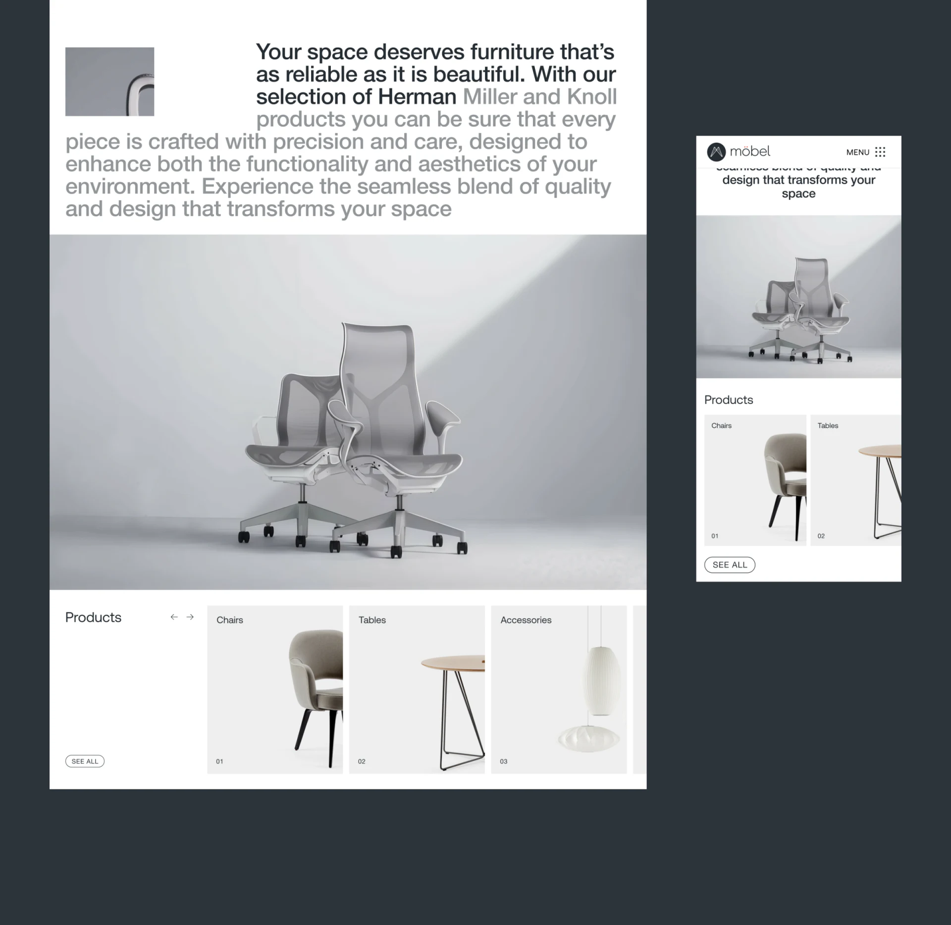
A large pale-gray office-chair image shows outline and light before Products. Chairs, Tables, and Accessories each use one object with numbers and category names in stable positions. The viewing task changes from appreciating a space to choosing a category, with a clear layout transition.
Headings, arrows, and See All group beside the images rather than crowding them. Products remain intact and tools become recognizable together. JVDS Design Studio considers this useful for catalogs preserving product shape: actions should be findable while images retain an unobscured area.
Mobile continues white backgrounds, wordmark, and large images, with horizontal cards revealing part of the next item. The edge suggests more content, but larger category sets also need a readable scroll position or complete directory entry rather than a track readers must guess through.
Close-ups explain texture; room views explain combinations
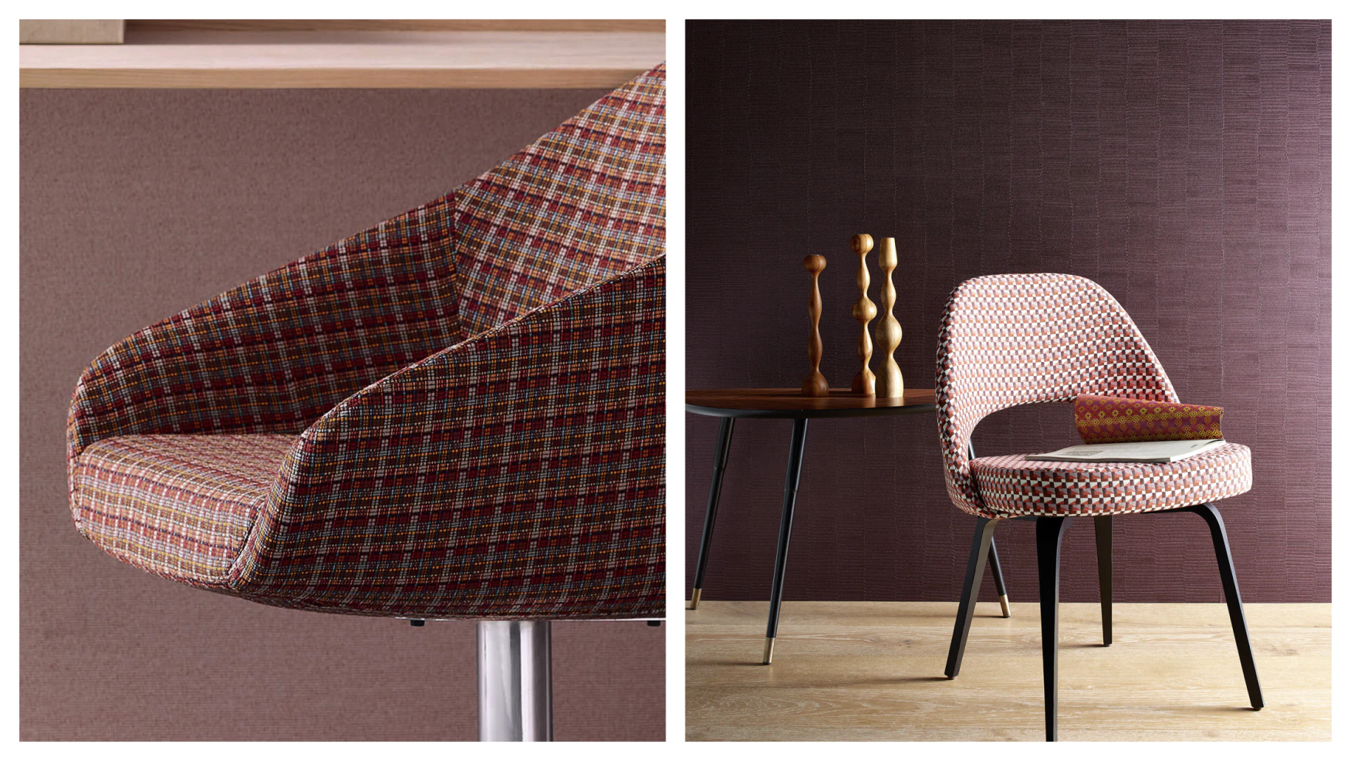
One chair image enlarges checked fabric, curved arms, and metal supports. Another places a four-legged chair in a room with a side table, wooden objects, books, and cushions. Their structures differ, so they cannot be called two angles of one product; they demonstrate two display tasks.
Close-ups emphasize texture and connections; room views show relationships with walls, tables, and accessories. Full scenes alone obscure fabric details, while fragments alone do not convey a furniture piece’s presence in a room. Their complementary scales are more valuable than many similar wide views.
Images can prompt judgments about texture but cannot prove comfort or durability. Product pages still need nearby model, dimensions, materials, and options. The useful sequence gives the object appeal, then uses categories and specifications to support choice.
Organize furniture presentation by level
Furniture, lighting, and home brands can arrange imagery for space, categories, and details, adding the finding and decision information needed at each step.
JVDS Design Studio provides UI/UX design, website design, and development services for product catalogs, brand pages, and product details.
 Link copied