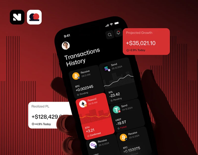
Paytech’s digital asset trading interface uses extensive red and black for recognition while retaining words such as Confirmed and Pending to explain status. When brand color is strong, status cannot be left to color-based guessing. Adjacent information also gives swap inputs and deposit cards conditions to check.
Key takeaways
- Brand red and trading status are separated, with text labels stabilizing record meanings.
- Swap inputs and deposit conditions sit near key actions, keeping checking information in view.
A red card can contain a confirmed record
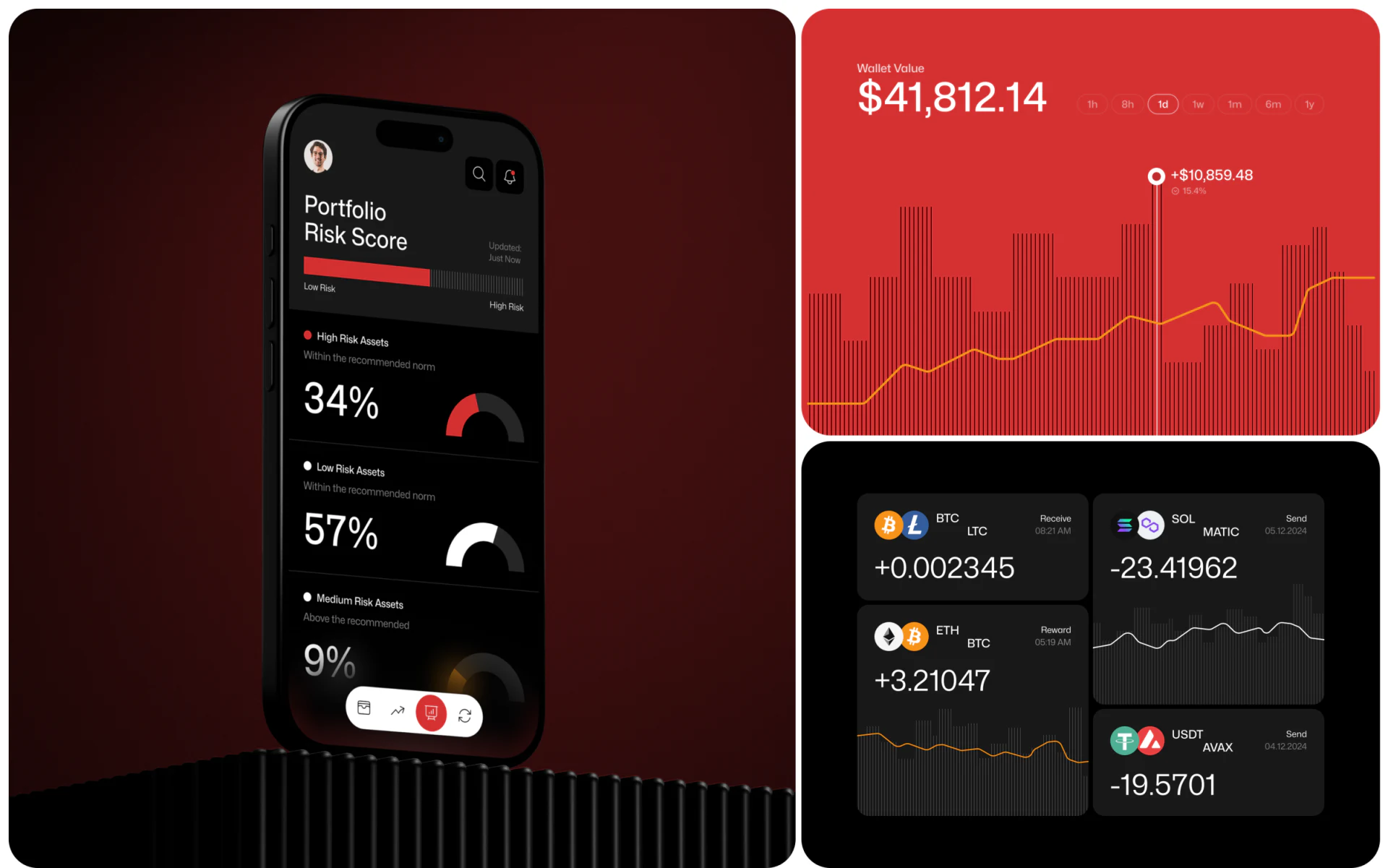
Black risk cards, red charts, and transaction components create strong contrast in the overview. Cards name Receive, Send, and Reward, surrounded by asset symbols, quantities, and times. Red appears beyond errors; the red record beside the swap page can also say Confirmed.
The valuable part of this status design is the role of words. Background color supplies style and emphasis, while Confirmed or Pending explains the record; these roles cannot merge. Keeping status in a fixed position avoids asking readers to memorize unintuitive color conventions.
Some cards contain two asset icons and abbreviations but only one quantity. Compact arrangement fits more records and calls for clearer field definitions. JVDS would first identify whether symbols mean assets, pairs, or direction, making action, object, and quantity independently understandable together.
Two input cards give direction a textual basis
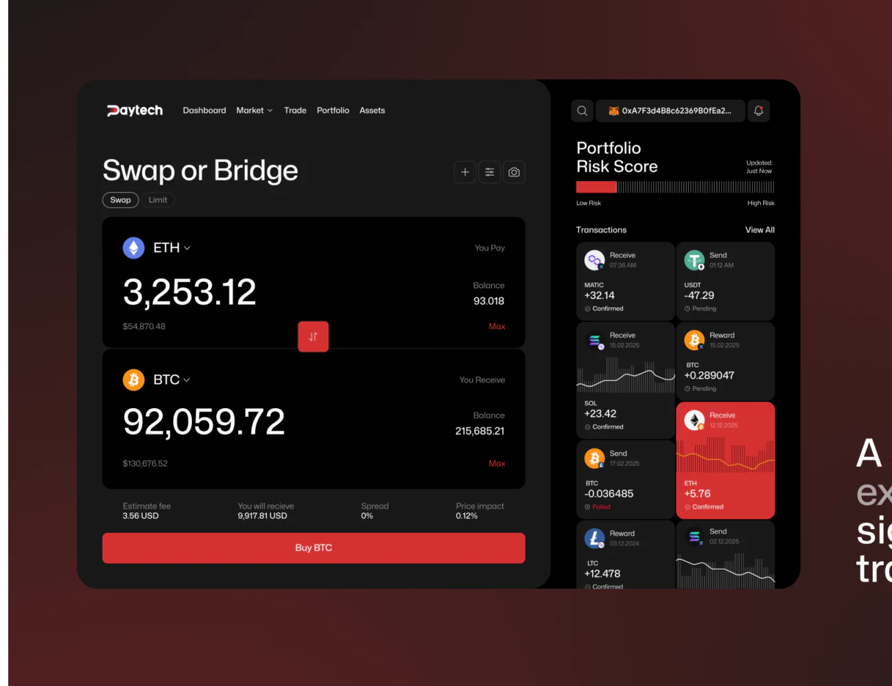
Swap or Bridge places You Pay above You Receive, with asset names on the left, balances and Max on the right, and large quantities. Fees, received amount, and other summaries follow, with a red button below. Input, summary, and action have a clear sequence.
Large numbers attract attention, but units and direction labels determine their meaning and should stay adjacent. Pictured conversions and ratios are design examples, not actual quotes or rules.
Review whether account, quote time, amount updates, and button name describe the same action. Buying, swapping, and connecting have different meanings, so heading and button should read coherently. Static information cannot establish actual calculation or submission behavior.
The black area below the QR code is deposit content too
The deposit card’s red upper half shows title, QR code, and quantity; its black lower half groups network, processing time, expiry, and copying. Background changes separate the code’s visual focus from explanation while retaining one card.
This is useful deposit information organization: conditions have a readable position beyond scanning. Network names should be complete, copy contents clear before copying, and expiry followed by a new state. Copy invoice cannot be interpreted fully from the image and could use more direct wording.
JVDS values how clearly such a card reads at rest. Prominent countdowns, QR codes, and amounts cannot replace objects and conditions; risk distribution charts likewise need category definitions. This article evaluates pictured information relationships without verifying assets, networks, or transaction performance.

Frequently asked questions
How can strongly red branding express transaction statuses?
Retain explicit words and stable positions, adding icons if needed. Users should not have to interpret every red area as failure.
Design review checklist
- Check action, asset, and quantity relationships on every card.
- Explain copied contents and available actions after expiry.
Make transaction objects and statuses clearer
If your data or trading product needs to organize inputs, summaries, and record statuses, bring field definitions and common states to discuss interface structure.
JVDS Design Studio provides UI/UX design, website design, and development services to help organize page content, interface structure, and implementation needs.
 Link copied