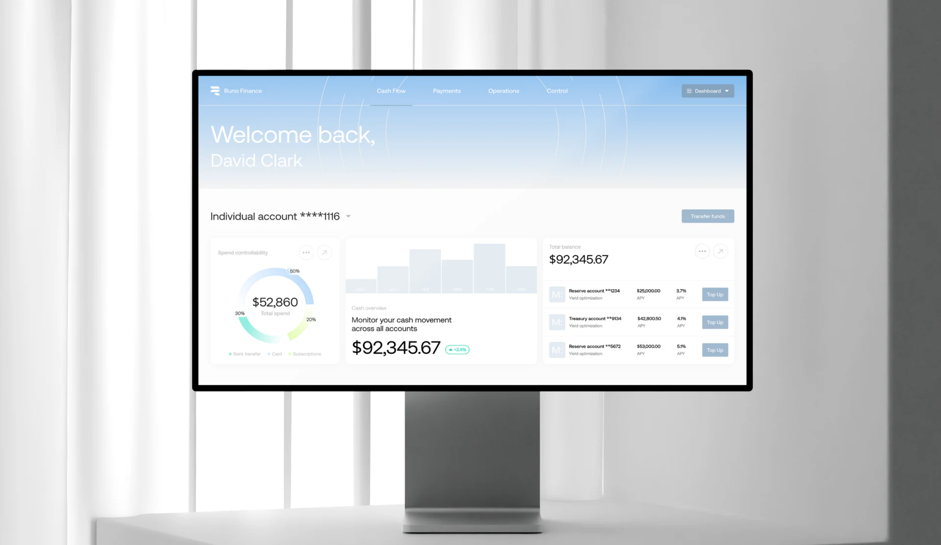
Runo presents its financial workspace with white backgrounds, a pale-blue header and low-saturation charts. Account selection precedes the overview, while cash flow brings forecasts, inputs and recent activity together. This light appearance suits repeated viewing, provided the account, period and currency behind the numbers remain clear.
Key takeaways
- Account selection establishes scope for numbers; cross-account summaries need separate labels.
- Forecast results retain connections to inputs, time and details.
Account identity establishes the viewing scope
Individual account remains beneath the greeting, followed by cards for spending, cash and account entries, with Transfer funds nearby at the same level. Choosing an identity before reading numbers suits verification in multi-account products.
Some cards summarize across accounts, requiring an explanation of which areas the selection above affects. Global and local views can coexist, but their headings should state scope directly. JVDS favors account, period and currency near the main number, so readers need not infer statistical definitions from module position.
Pale rings and bars reduce visual pressure, while explanatory words still need stable readability. Account suffixes identify specific sources. Opening details should retain the current identity before returning to the overview.
Purpose routes determine the workspace that follows
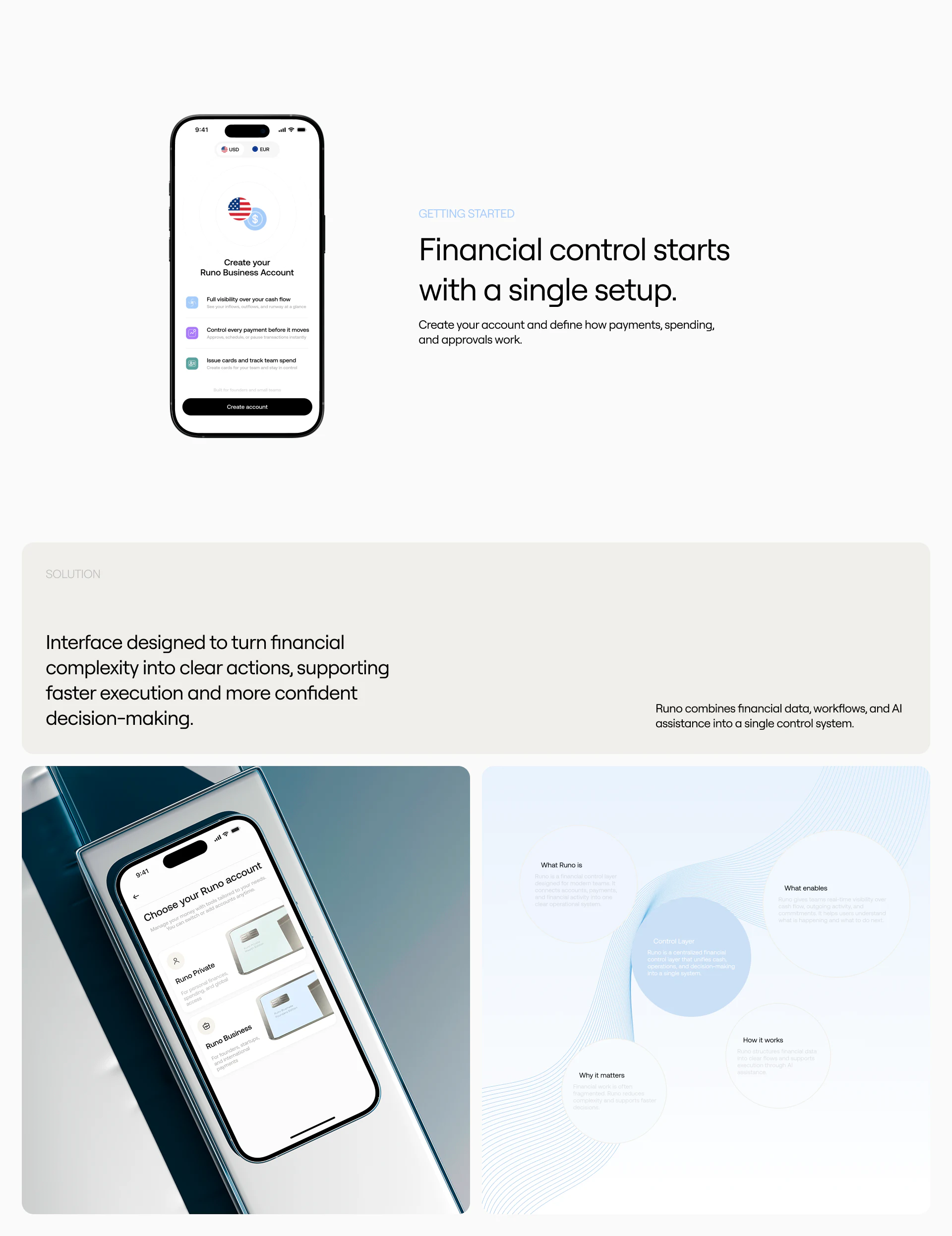
The setup presentation explains business accounts before offering Runo Private and Runo Business. Purpose selection belongs early because teams, approvals and individual operations may need different things.
The subsequent workspace should continue showing the current space and offer understandable switching. Transfers and other actions should repeat source account and identity, preventing onboarding choices from becoming the only reminder.
The explanatory page combines payments, spending and approvals into an overall introduction, helping new users orient themselves. Actual setup can progressively collect information needed for the selected purpose, aligning content scope with the current choice.
Forecasts retain links to inputs and activity
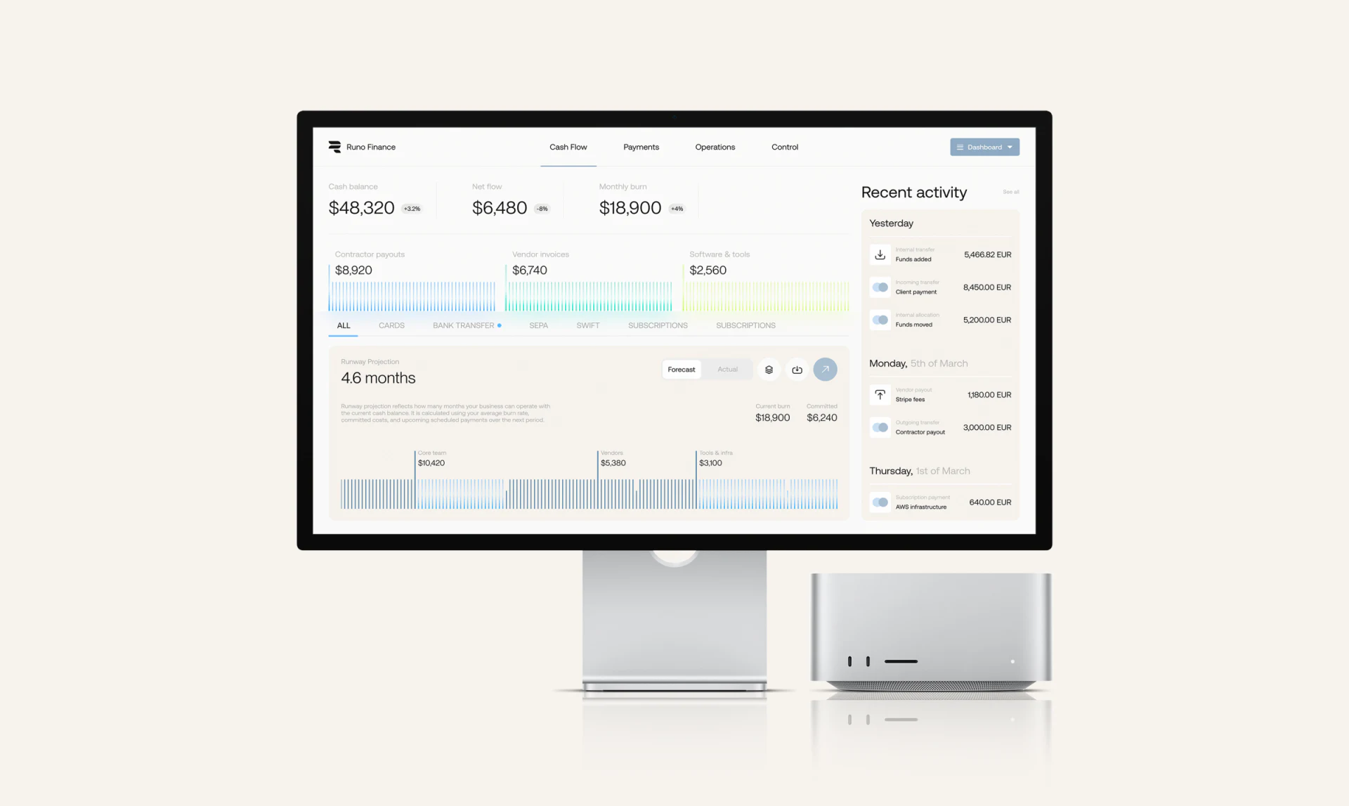
Below summary numbers, the cash flow page displays available months and a segmented chart; Recent activity keeps specific records on the right, while Forecast and Actual provide viewing categories. Results, key inputs and details sit close enough to ask where a number comes from.
Forecasts and recorded activity need separate names, periods, data update times and relevant assumptions. Switching to Actual should change the heading, legend and scope together rather than only the button style.
When summaries and activity use different currencies, state original currency, reporting currency and conversion time. Unsynchronized data should leave a visible gap. Readers can then check inputs against records instead of treating an attractive runway figure as a complete business conclusion.
Frequently asked questions
Is a large balance enough for a financial card?
The main figure also needs account, period, currency and a detail entry. Its scope should remain visible as the number becomes prominent.
Can forecasts and actuals share a panel?
Yes, through explicit switching or separate areas, with synchronized headings, legends and periods. Distinguish assumptions from recorded events.
Design review checklist
- Make local and global statistical scope explicit.
- Confirm workspace and source account before actions.
- Keep forecast time, currencies and inputs accessible.
Align scope across financial overviews
Business finance products can first organize accounts, currencies and periods, then connect cash flow overviews, forecasts and activity details.
JVDS provides UI/UX design and website design and development. We can work through page content, interface structure and implementation needs together.
 Link copied