Ulysses de Santi’s curatorial website design moves between a quiet black-and-white index and strong red features. The archive helps locate exhibitions, features introduce themes, and object and person descriptions unfold the images. Different content is not compressed into one uniform image stream.
The exhibition archive is an open index
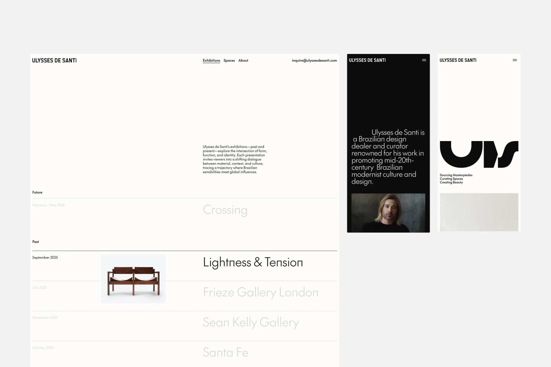
Exhibitions places dates on the left and names on the right, with a broad gap between them. Future and Past have separate group headings and fine rules, creating a clear reading basis: establish time, then identify content.
A pair of chairs appears beside the dark emphasized entry, while other project names are pale gray. Images are not added to every row; one accompanies the highlighted exhibition. The index stays simple and text-led while giving the current theme a concrete object.
This suits a small exhibition archive, with pale entries needing readability checks. Light color can imply unavailability. Previews, rules, or markers could distinguish the current item while keeping historical entries findable.
Future, Past, and dates belong to the depicted design state, not necessarily current exhibition arrangements. Site maintenance should group real content by updated timing. This article only analyzes how dates and headings form an index.
Red sets one exhibition apart
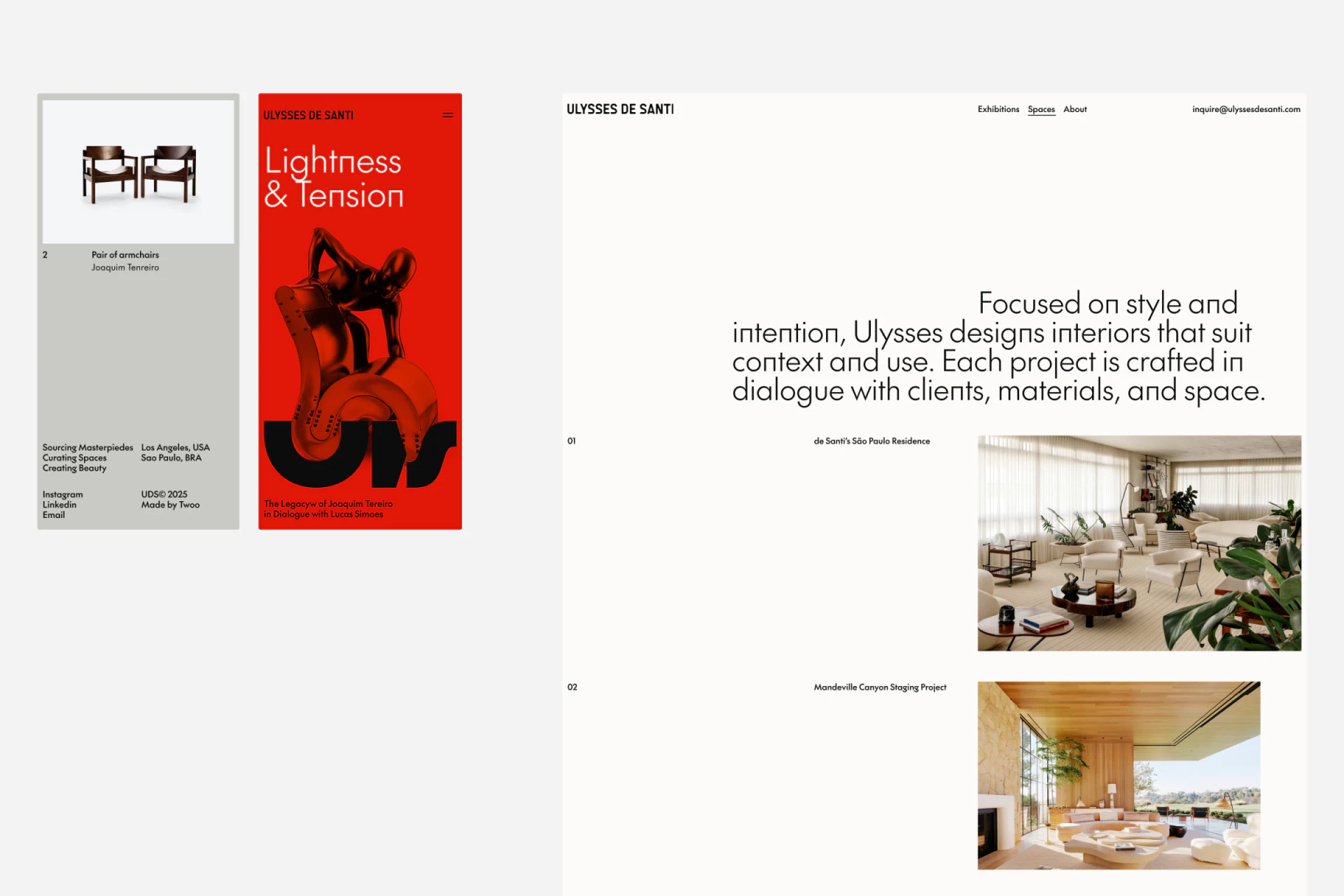
The mobile Lightness & Tension feature has a fully red background, a large white heading near the top, object imagery in the center, and a large black wordmark with a thematic phrase below. It differs clearly from ordinary pages, like an exhibition poster inserted into a catalog.
Brand name and menu remain in the header, preserving direction despite the visual change. A comparable site could give each exhibition an accent color or lead image while keeping navigation and information positions stable. Stronger thematic expression makes clear dates, locations, and object identities more important.
The adjacent pale gray object card pairs armchairs with type, maker, and number. Compared with the poster-like feature, it resembles an archive record. Appreciation and consultation can use different layouts in the same material without being forced into one page format.
People and objects have their own explanations
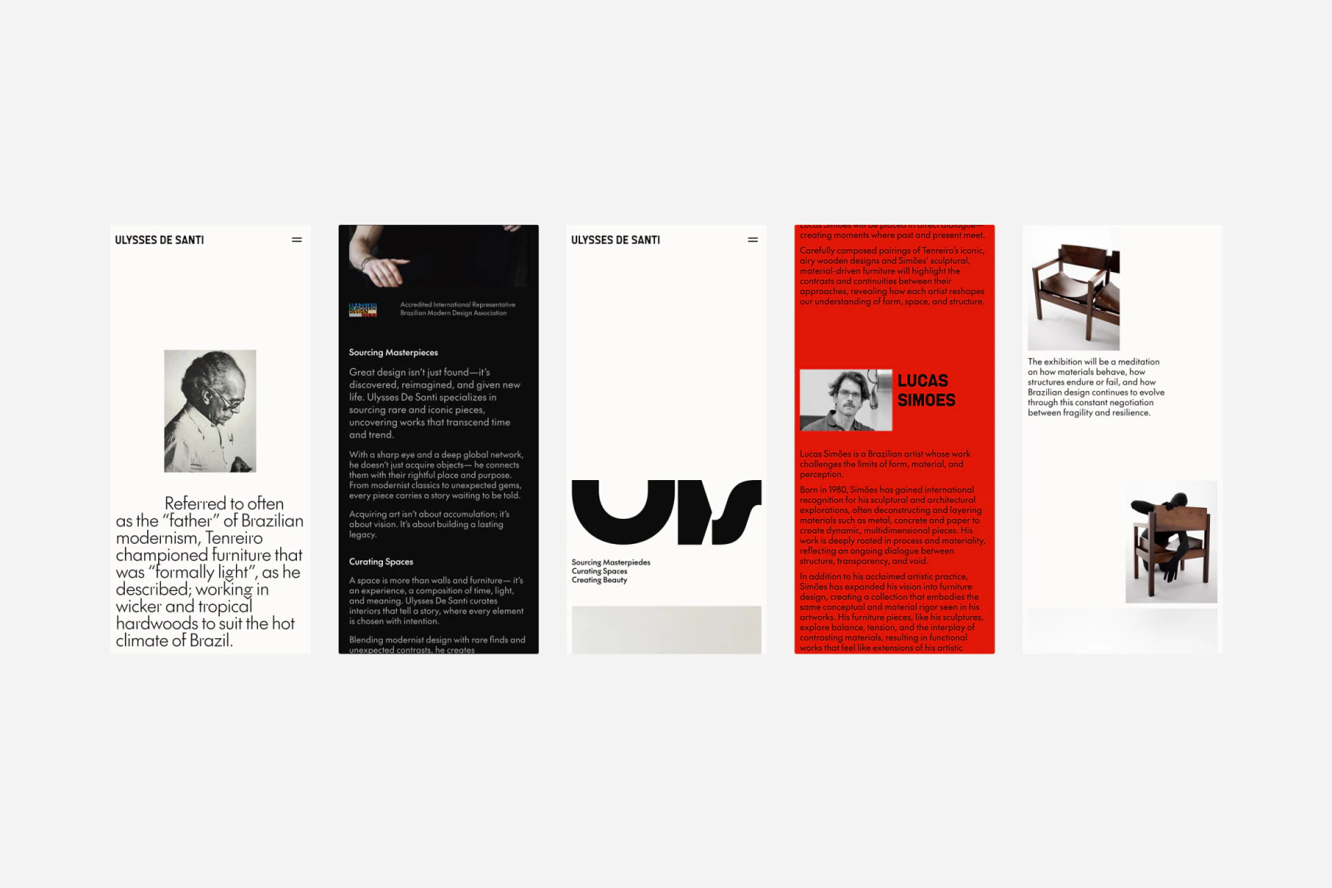
In mobile content, a black-and-white portrait precedes a long introduction. A red person page pairs a small portrait and name before a short paragraph. Different portrait scales work with text to identify the people within the narrative.
Object photographs return to white backgrounds, with explanatory text beside a chair and another angle continuing the viewing sequence. Personal information beside object forms can ground thematic discussion, but images do not automatically explain the relationship. Text still needs to say why the two belong together.
JVDS values correspondence between names, objects, and arguments. A sentence about a creator belongs near that person; one about materials or structure belongs near the relevant object. Partial scanning then need not mistake an author’s identity for an object’s entire background.
Biography, dates, and materials require independent verification; these images do not provide complete research evidence. Design commentary can examine hierarchy without inventing historical facts to complete a story.
Spaces uses a different index for a different question
Spaces begins with service direction, then organizes numbers, project names, and interior photographs. Exhibitions use time to find content; spaces use projects. Entry names and index fields change with the task.
Spatial images emphasize whole environments more than object cards, combining wood tones, planting, and furniture. White backgrounds and black text continue the ordinary-page character, with red reserved for features. Color relates to content type without forcing all images into one palette.
Simplicity in a curatorial website is more than removing fields. Retaining time, people’s names, object types, and project names, then placing images where useful, lets indexes and narratives serve their roles. Further review could check whether returning from a feature restores recognition of its archive entry.
Give exhibitions and spatial work clear entries
Curatorial, art, or spatial design teams organizing exhibition archives and portfolio content can begin with the relationships between time, people, and projects. JVDS Design Studio provides UI/UX design, website design, and development services, helping plan websites for both presentation and consultation.
 Link copied