Electric Bike Website Design: How Should a Product Page Present Features, Specifications and Services?
For a product with many features, a full-bike image can establish an initial understanding, followed by details and scenes that explain its selling points, with specifications, services and comparison links supporting the final choice. Information hierarchy helps users find different answers at different points: what kind of bike this is, how it fits into everyday life, which features matter to them, and what to explore next. The VanMoof S4 page design offers an example for electric-assist bicycle brands, ecommerce teams and website redesign leads to examine.
How can the first screen help users understand the product quickly?
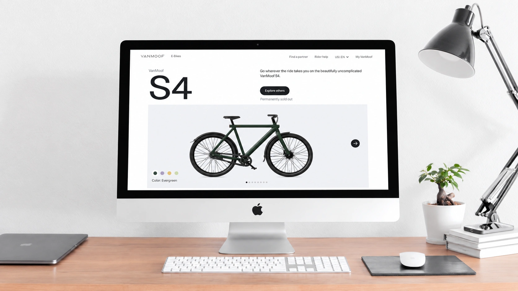
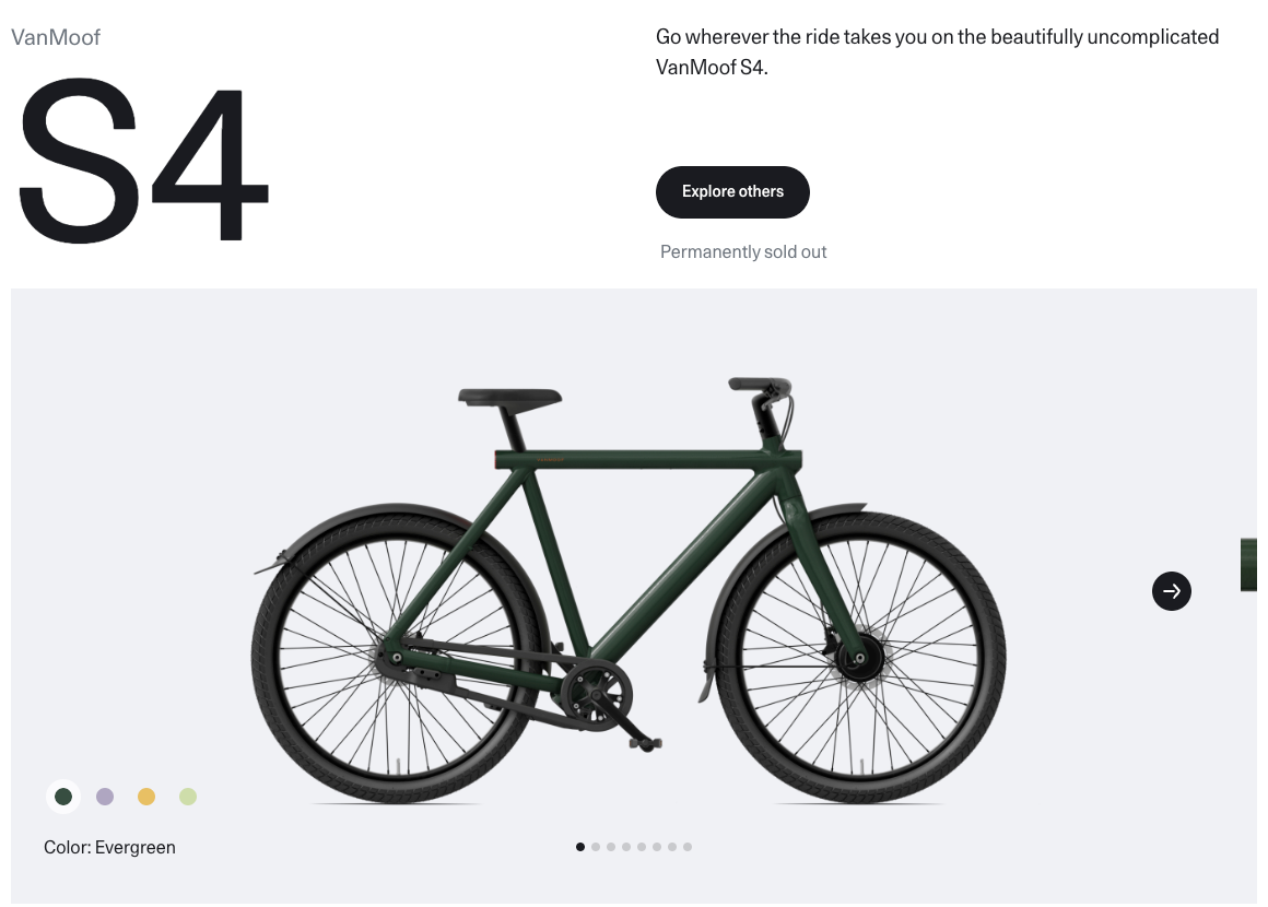
The first screen highlights the model with a large “S4” on the left, keeps a short introduction on the right, and gives most of the space below to a side view of the complete bike. The text names the product, while the image shows its outline, frame proportions and body color. They do not compete to perform the same task. Recognizing the model first makes it easier for users to understand its features next.
The full-bike image sits against a light gray background, with color options grouped at its lower left and the corresponding color name visible in the current view. Users can see the model, its appearance and the color selection in one view, without first reading a long introduction. Dots and arrows provide visual cues for viewing other content.
The brief copy on the right connects the product to the riding experience rather than laying out every specification on the first screen. This hierarchy can first draw attention to the bike’s appearance and positioning, then gradually add the information needed to make a decision. The first screen also shows “Permanently sold out” and an “Explore others” link, so the page needs to help users understand the product’s current availability and find an appropriate next destination.
What do full-bike images, details and riding scenes each explain?
The page does not repeatedly use the same type of product photograph. Side views of the full bike give users an overall impression; close-ups of the brake, rear wheel and frame direct attention to particular components; images of people riding put the product back into a context of use. These three image types respectively help users recognize its appearance, understand individual details and imagine the experience.
An overall view can explain the form, but makes small components harder to see. A close-up can highlight details, but needs text to explain their relevance to use. A scene can convey a feeling, but cannot replace evidence about configuration and performance. By alternating these image types, the page gives different levels of information different visual forms.
Judging from the riders, urban surroundings and travel-related copy, the page’s messaging leans toward everyday city riding. When preparing images, a brand can first define the question each image should answer, then decide what to photograph or select. This helps avoid a page full of images that still leaves users unsure what to focus on.
How can different bike colors maintain a coherent visual style?
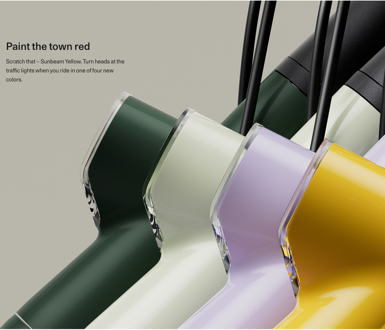
The page uses white as its main background, light gray in the full-bike area, and pale green surroundings in some large images. The restrained backgrounds give the dark green, light green, purple and yellow bikes room to stand out. Even as the product color changes, similar brightness levels, whitespace and layouts maintain continuity across the page.
The color display places several frame details side by side, making color an explicit point of comparison. Compared with the small dots on the first screen, this larger image gives a fuller sense of how each color looks on the bike. It provides a visual pause while also answering a question about appearance and choice.
Visual consistency does not mean using the same background in every section. What is more useful here is the shared rhythm of image tones, subject size and text density: a large image is followed by brief copy before the page moves to the next topic. When showing several colors, brands can let the bike provide the color variation while the background and layout provide order, reducing the distraction of decorative elements during product selection. When adjusting content density, consider the relationship between information density and user tasks to decide what each screen should retain.
How can product features connect to real situations of use?
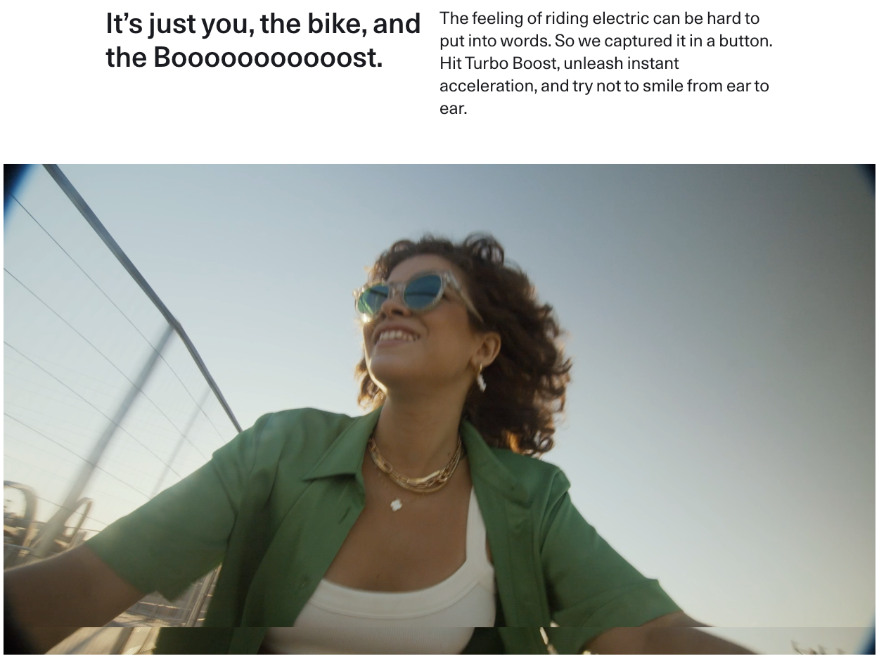
Acceleration, parking and theft prevention are three distinct feature topics on the page. The acceleration section uses a prominent heading and brief copy to connect Turbo Boost to the feeling of riding, followed by an image of a rider. It starts with the experience, helping users understand why the feature might matter before asking them to read technical details.
The Kick Lock section uses a close-up of the rear wheel, followed by short phrases such as “Kick, Lock, Go.” The copy in the design describes locking the rear wheel and activating the alarm through the integrated Kick Lock. The close-up lets users connect the feature name to a specific location on the bike. On similar product pages, a feature explanation needs to connect at least three things: what the user is doing, where the relevant component is, and what help the copy says it provides.
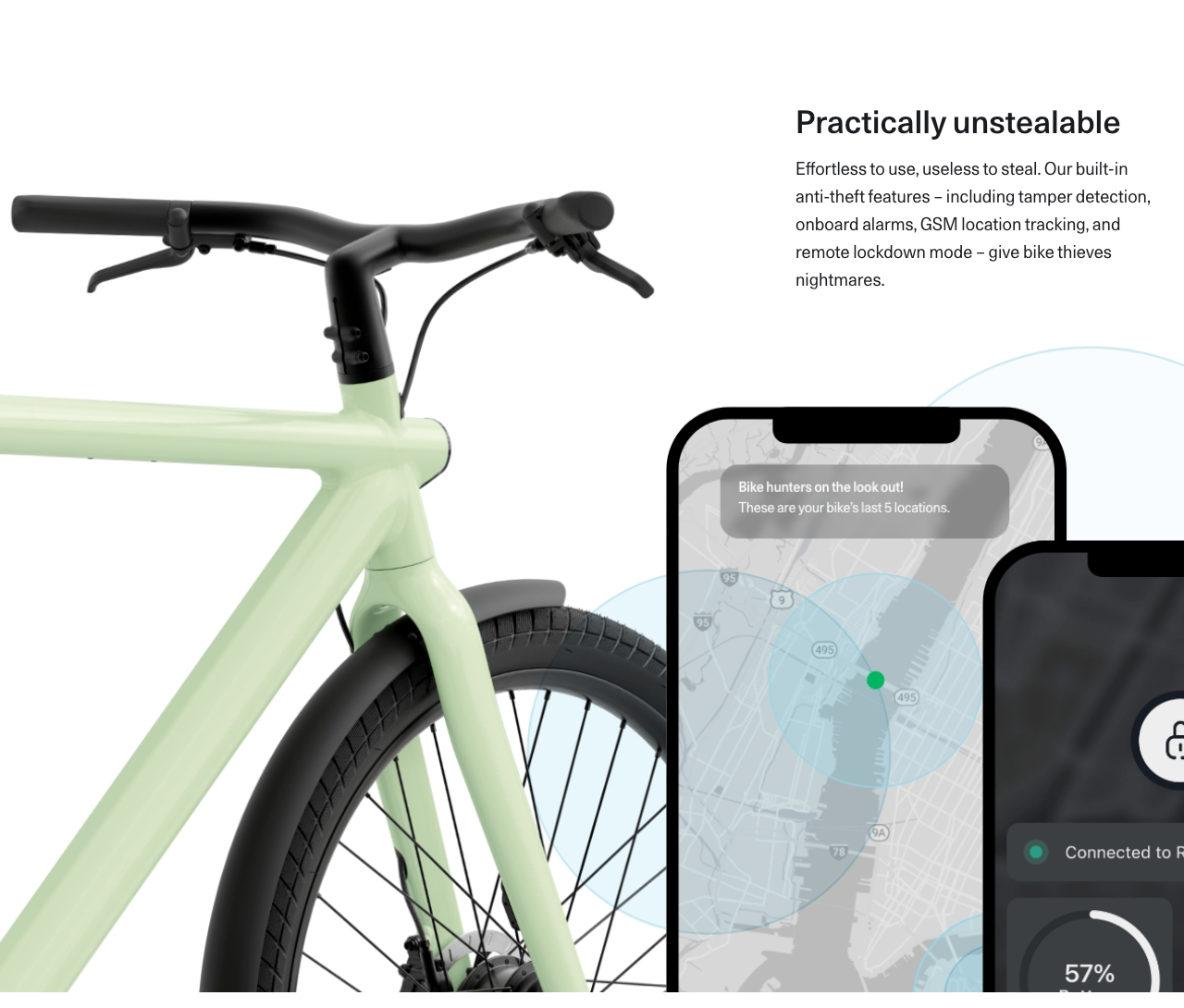
The theft-prevention section places the bike and a phone interface in the same area. A map and connection status are visible on the screen, while adjacent copy describes capabilities related to alarms, location tracking and remote locking. The phone interface adds information that a photograph of the bike alone would struggle to communicate, making the relationship between hardware and app easier to recognize.
The value of these sections lies in how they organize explanations. When building similar pages, brands still need to verify feature names, applicable conditions and service descriptions so that experiential language and confirmable information support each other. Theft prevention especially needs clear limits: strong headings or imagery should not replace an explanation of what the product can actually do.
How can services and accessories address concerns about use?
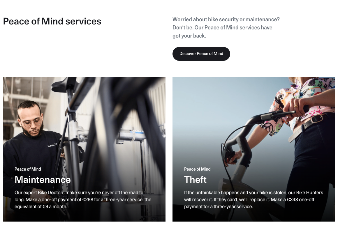
After the feature presentation, the page includes a “Peace of Mind services” section with Maintenance and Theft service cards side by side. One uses an image of a maintenance worker and a wheel, while the other shows a rider and handlebars. The two topics maintain a consistent visual treatment while addressing maintenance and support after theft respectively.
Users planning to keep a bike for a long time often want to know, after learning about its features, how routine maintenance is handled and what optional support is available if it is stolen. The service cards bring these questions into the decision process. Paid service information appears in the design, so this content should clearly distinguish the bike’s own features from optional services and explain fees, duration, coverage and where to learn more. Handling theft needs to be explained according to the specific terms; the card should not be understood as a guarantee of recovery.
The following accessories section lists the PowerBank, front carrier and rear carrier, with product images and brief introductions in the current view. Compared with the service cards, this section explains how users can supplement the bike to suit their needs. Placing accessories after users have become familiar with the complete bike establishes product understanding first, before discussing needs such as additional range or carrying items. It avoids mixing the bike and add-on options too early.
How do specifications, model comparisons and FAQs support a choice?
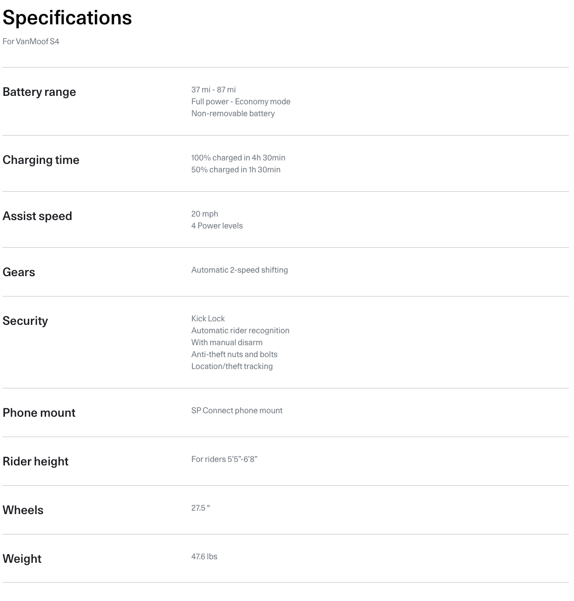
The specifications area uses clear rows and columns to list battery range, charging, assistance, gears, safety, suitable rider height, wheel size and weight separately. Users can look up the items that matter to them rather than extracting each detail from introductory paragraphs. The preceding images and text explain the significance of the features, while the specification table provides information that is easier to check.
Feature descriptions answer “What is it for?” Specifications answer “What exactly is included, and does it suit me?” During a redesign, check that item names are understandable, units are consistent and key compatibility information is complete, so users can connect their needs to the product’s requirements.
After the specifications, images of several bikes and the “Explore the X4” and “Compare all bikes” links extend the decision from a single product to a choice of models. Users may be considering more than color; they may also need to compare frame types or other configurations. The comparison link should explain what can be compared, reducing the effort needed to understand the next page.
In the design, the FAQ area is a link to a questions-and-answers page rather than a set of expanded answers. It provides a route to further information, but does not establish that common questions have already been answered on this page. If a question directly affects the decision, such as applicable conditions or service coverage, consider providing the necessary information in the relevant section first, with the FAQ offering more detailed explanations.
What needs checking on a long page and its action links?
This design uses large images and whitespace to establish a reading rhythm, creating a relatively long browsing path. For people willing to learn about the product gradually, the content has room to unfold. For those who already know what they need and only want to check the configuration, placing the specifications later in the page increases the distance they must travel to find the information. Based on user tasks, brands can consider clear links to specifications, services or comparisons nearer the beginning.
The “Get started” at the end of the page is worth examining alongside “Permanently sold out” on the first screen. They may serve different purposes, such as exploring other models or continuing the selection process, but button labels need to match their actual destinations. A static image is not enough to determine the destination page or to conclude that this is a purchase button. During a redesign, product availability, link wording and destination pages should form a coherent sequence of information.
When examining electric bike website design, JVDS Design Studio focuses on whether images, copy and links work together to help users make a decision. Brand managers, ecommerce teams and redesign leads can review their own product pages from three angles:
- Can the first screen help users quickly recognize the product, see its current availability and find the next action?
- Does each image answer a clear question, and do features, specifications and optional services relate to one another?
- Can users easily find compatibility information, compare models and continue their selection through clearly labeled links?
 Link copied