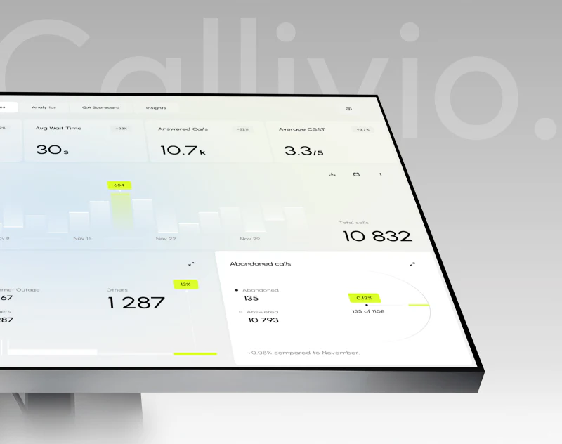
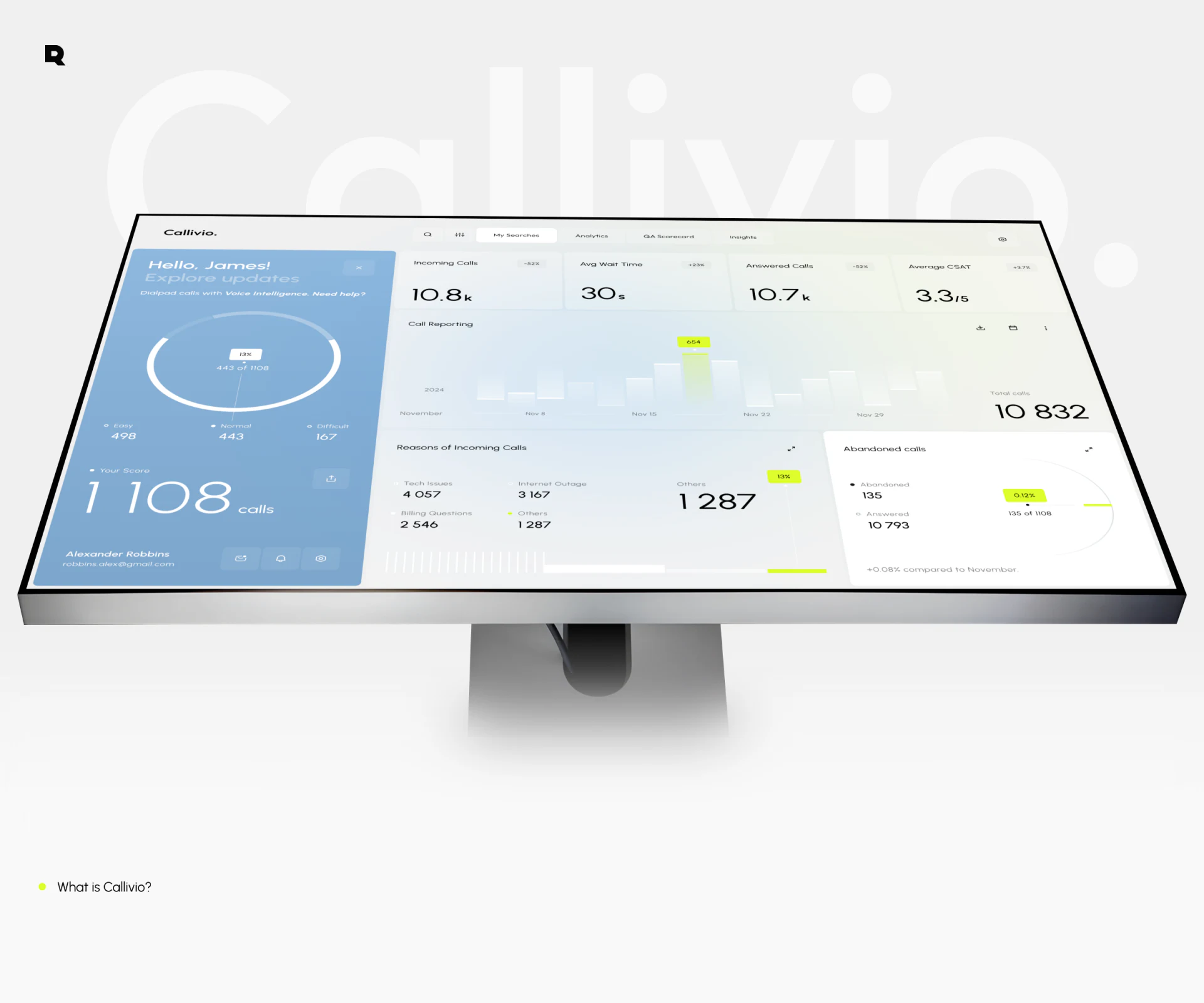
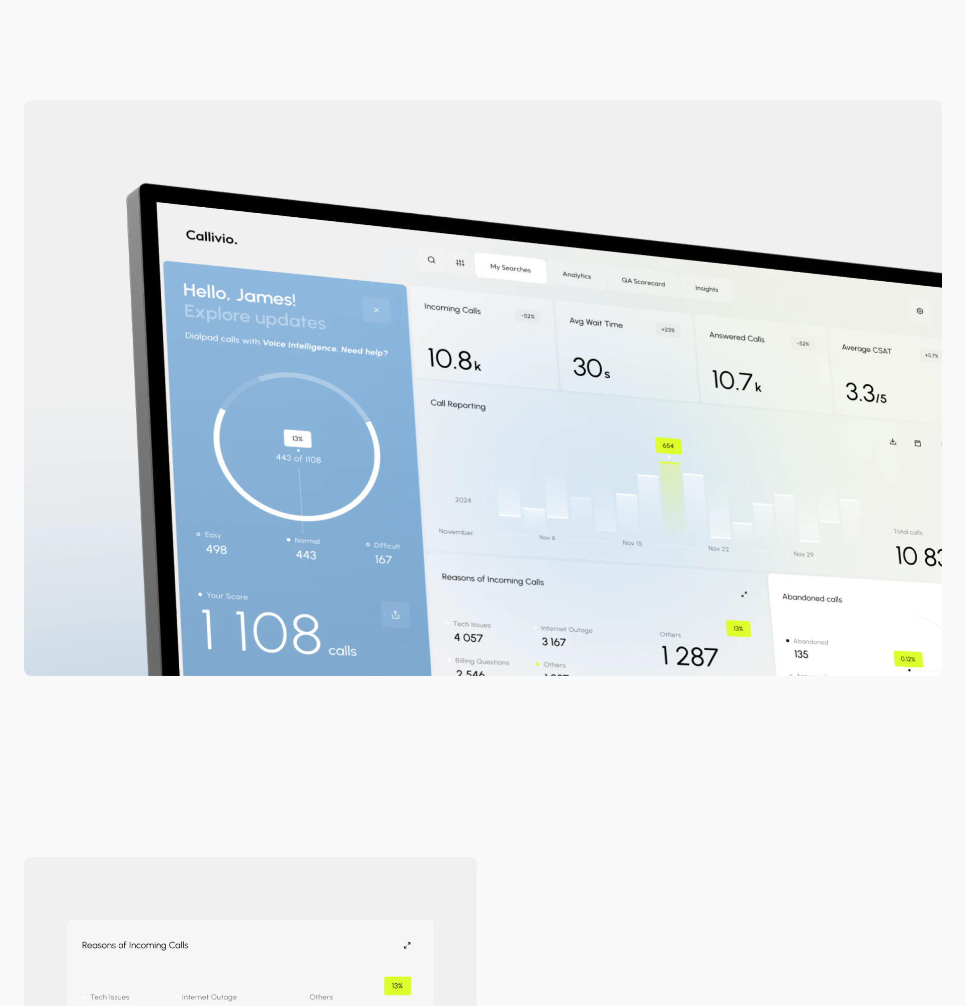
Callivio’s call center dashboard immediately presents two areas: a blue personal summary on the left and pale operational reports on the right. Yellow touches only the current bar and a few percentages. This palette gives dense data boundaries and highlights selected readings without requiring a large alert box.
Key takeaways
- A continuous blue background groups the greeting, call difficulty and personal summary into a distinct area.
- Pale trend charts use local yellow emphasis to locate readings; reason categories below add explanation.
- Mobile separates personal and reporting pages, preserving the zoning idea instead of shrinking the entire desktop.
The sidebar reads as one complete personal card
Blue runs from the greeting at the top to the name and small icons at the bottom, enclosing a ring chart, difficulty categories and a large call count. Both background and subject are continuous, so this feels like a complete summary rather than unrelated modules squeezed onto the left.
Four pale cards at the upper right show incoming calls, waiting, answered calls and satisfaction. Equal height and width, large numbers and smaller names support horizontal scanning. Personal information and operational metrics are visibly different groups; color and layout explain their roles together.
JVDS sees this zoning as suitable when personal and team data share a workspace. Color helps locate an area; wording explains its subject and statistical scope. A finished product should explicitly say personal or team, especially after filters change, rather than asking blue to preserve that distinction alone.
Yellow appears only where attention is useful
Most Call Reporting bars are pale; only the current bar has a yellow-green reading label above it. Selection is found before the value. Dates remain below and the chart retains its overall trend.
Reasons of Incoming Calls lists technical issues, network outages, billing and other causes in text. Yellow also emphasizes the current reason’s percentage, echoing the selected bar. The chart locates a moment and the categories offer another viewpoint; they need not look identical.
Abandoned calls has its own card with a name and ring chart in a white area, rather than being inserted into the reasons list. This is a useful distinction. Similar operations dashboards can keep these modules close while stating whether they share date filters; proximity does not establish that their data correspond.
Mobile separates topics while preserving emphasis
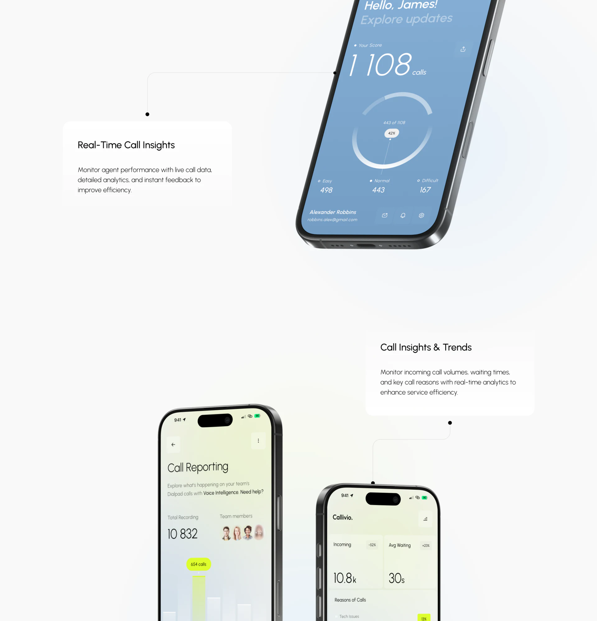
The phone designs do not force the desktop columns into one screen. The personal page remains blue, arranging call counts, a ring and three difficulty classes vertically. Reporting uses a pale background with totals and team avatars below the title. Visual identity continues while content responds to width.
Another reporting screen places calls and waiting in two columns at the top, with reasons below. This better suits checking one topic quickly. Clear titles and navigation can lead to other metrics instead of making every number tiny.
The personal ring’s counts and percentages differ across displays. Delivery needs value checks as well as attractive arcs. Use one sample set to reconcile counts, proportions and graphics, then check that mobile labels explain the denominator. This concerns sample consistency, not actual agent performance.
Frequently asked questions
Does every customer service metric need a different color?
Not necessarily. Callivio uses blue for the personal area, pale reports and yellow for current readings. With fewer colors, names, units and arrangement must be clear.
How should a desktop report become mobile?
Separate reading topics first, then preserve titles and color meanings. These personal and reporting pages offer a useful reference; transitions and filter states still need checking.
Design review checklist
- Identify the statistical subjects of personal and team areas in text.
- Check that a selected bar exposes its date, reading and unit.
- Reconcile ring proportions and counts using one sample data set.
Customer service reports becoming crowded?
When teams need call trends, answering status and personal performance, first divide by subject and decide what is most useful on desktop and mobile. Bring your dashboard to discuss content organization and an interface update.
JVDS Design Studio provides UI/UX design, website design and development, helping organize interfaces, content and development requirements.
 Link copied