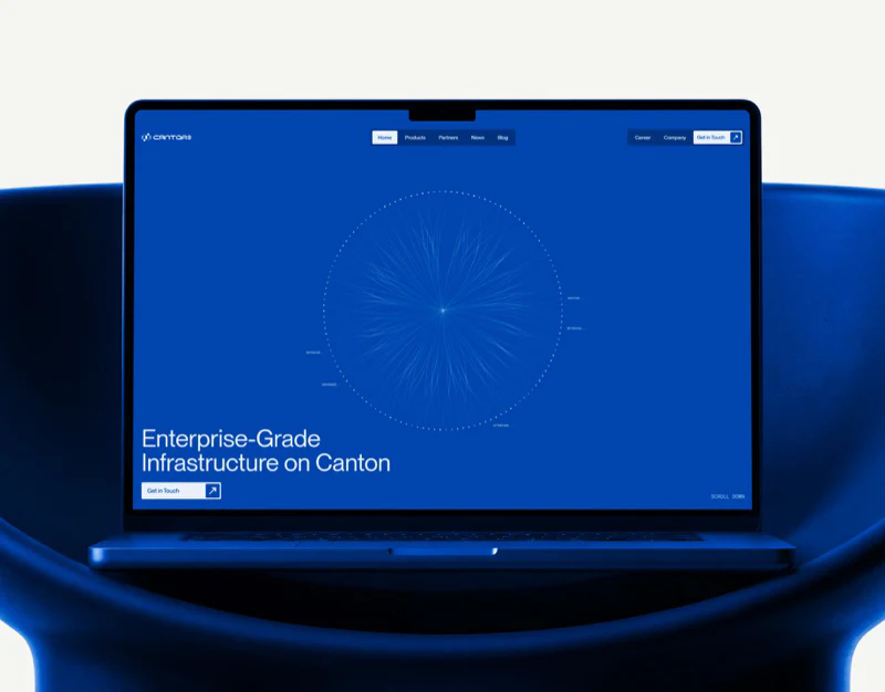
Cantor8’s financial infrastructure website uses vivid blue confidently without giving every page the same density. A circular network draws attention on the mobile homepage, the menu switches to white, and the business and inquiry pages each have clear arrangements. The useful question is how these changes give an abstract technology introduction concrete entry points.
Key takeaways
- Blue graphics establish recognition, while a white menu makes text links easier to find.
- Consistent business cards support comparison; choosing an inquiry purpose first makes the conversation more specific.
Actions remain visible beside the circular network
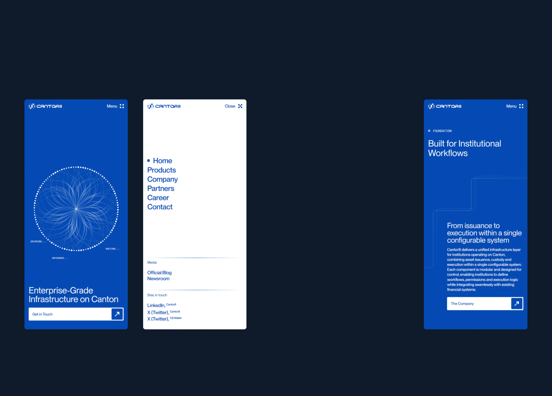
Fine white dots and arcs form a circle at the center of the mobile hero. Blue makes the pale lines feel light. The circle takes most of the space; positioning text and a white button bar appear below. Heading and graphic have separate areas, so readers can remember the image and find a next step.
A network graphic conveys connection but cannot explain what a financial system does. This layout leaves a short explanation below it, adding context to the abstract image. A separate arrow square at the button’s right end places direction and wording within the same white strip.
The adjacent menu changes to white with vertically arranged blue links. Space separates primary navigation from supplementary links at the bottom, making it a quiet directory. JVDS values this change: a hero can have visual character, while product, company and contact links should be easier to scan.
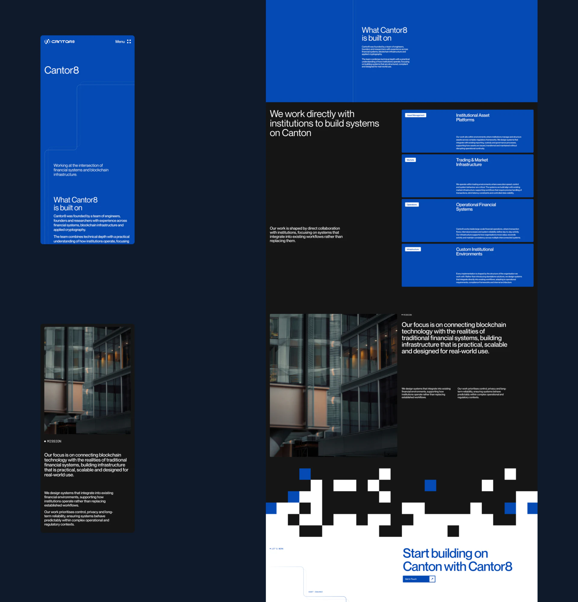
Blue cards divide the business scope on black
The middle of the company page pairs an overview on the left with four blue cards on a black background. Similar card sizes and repeated positions for labels, titles and descriptions let readers compare businesses without repeatedly searching a long introduction for keywords.
Professional service names can make corporate websites difficult to understand. Consistent cards help browsing, but comprehension still depends on each description identifying a different kind of work. A useful review is to read the titles and opening sentences together and check that they genuinely distinguish scope.
A building photograph beside mission text adds a physical setting and material quality to the technology theme. Further down, black, white and blue blocks create a distinct transition into a white inquiry area. This suits an institutional website with several content layers; frequent changes may feel fragmented when there are few articles or services.
An inquiry purpose before the name has a practical role
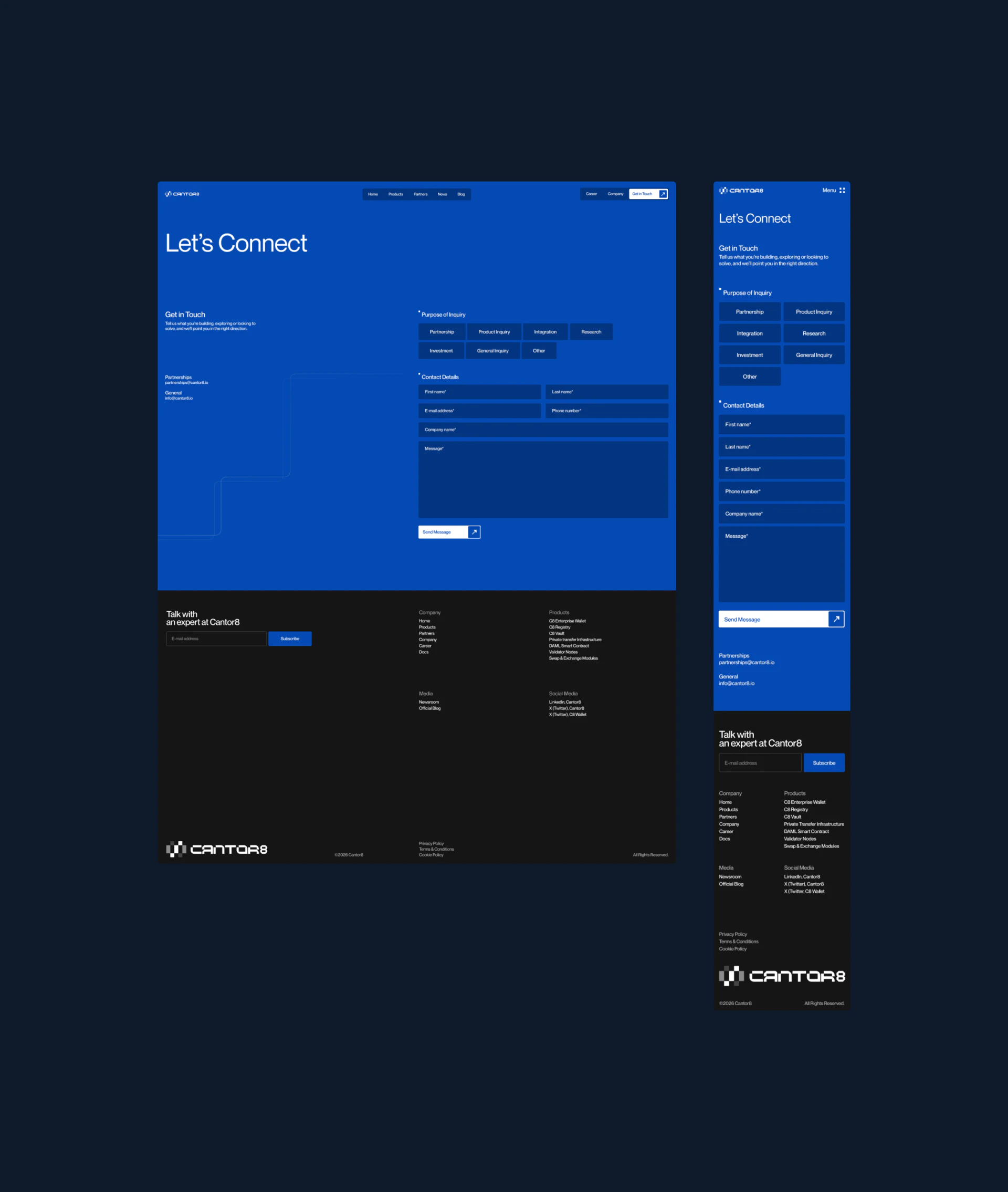
The inquiry page continues the blue background. A heading and explanation sit on the desktop left, while the right starts with inquiry purposes, followed by contact fields and a message box. Darker blue blocks separate purposes from the background; a white submit button remains at the bottom. Readers decide what to discuss before identifying themselves.
Mobile places the same content in one column, preserving the order of heading, purpose, contact information and message. The useful lesson is information order rather than shrinking two desktop columns. Label clarity and selected states still need checking through actual operation.
In JVDS’s view, service cards and inquiry categories should use corresponding language. Someone who understood an integration service should readily recognize its form option. Whether telephone and company fields are necessary for every purpose can be assessed against handling needs. A static image shows field placement, not completion rates.
Frequently asked questions
Do abstract graphics suit institutional technology websites?
They can establish a visual character, provided clear positioning text and business links sit nearby. A graphic cannot replace a description of product scope.
Why choose a purpose first in a business inquiry form?
It gives the remaining fields context. Options should match service language and leave a general inquiry route for people whose needs are not yet clear.
Design review checklist
- Read every business title and opening sentence together to check for repetition.
- Open purpose options on a phone and check labels and selection feedback.
Need to explain a technical business clearly?
If your institutional website needs to organize complex products, service cards or inquiry forms, bring the existing content to discuss a clearer reading order.
JVDS Design Studio provides UI/UX design, website design and development, helping organize page content, interface structure and implementation requirements.
 Link copied