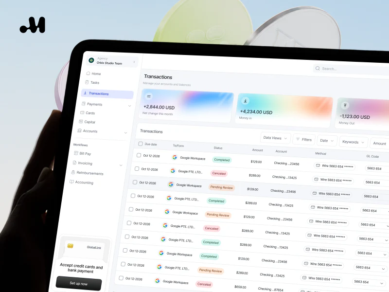
The appeal of Maven’s financial interface design lies in its restrained gradients. Orange, purple, and blue give account cards different appearances, while the amounts and cash-flow labels stay in stable positions. Further along, charts and payment requests carry that clarity into more specific tasks.
Key takeaways
- Maven uses gradients to distinguish account cards while keeping balance text in its own stable position.
- Cash-flow curves place the month and both amounts in one tooltip, giving the comparison a shared reference.
- The payment request presents filling, reviewing, and copying a link as three steps, making the process visible first.
Rich colors, stable amounts
Several gradient cards stand out in the component board. Orange fades into blue, with part of a purple card visible beside it; the amount and Total Balance sit at the lower left. Switching to a differently colored card still leaves the balance in the same place. This is more useful than giving every card a different layout.
Money in and Money Out below add textual explanation: one has a plus sign, the other a minus sign, and both have directional icons. Inflow and outflow remain distinguishable without relying on the background color. JVDS considers attractive financial palettes useful for locating information, while names and symbols that determine meaning should remain visible.
The red segmented spending bar is not an isolated decoration. The shopping label and proportion beneath connect the graphic to its category. A similar card should be reviewed with long amounts, decimals, and different currencies to see whether the same layout remains comfortable to read.
A tooltip explains both curves
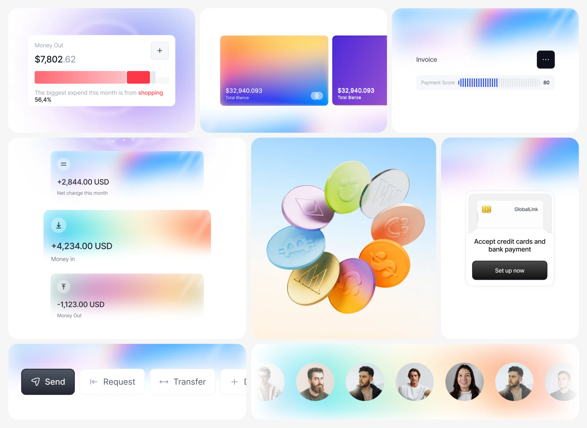
Placing months and values together in an income and expense chart is more direct than asking readers to estimate scales along two lines. Blue Income and green Expense share an axis here. A white tooltip near August lists both amounts for the same month, with colors matching the curves. Readers do not have to remember one line before locating the other.
The feature collage also separates information at different scales: curves show a period, Recent Transactions shows individual records, and Accounts shows accounts. Neighboring cards have their own headings and space, rather than crowding every figure into one block. This grouping is easier to organize than adding more metrics to a single overview card.
Advice appears above the curves, but the image does not explain its calculation. What is useful here is that advice and original amounts have their own places. In a real product, the advice should explain its underlying scope nearby, helping readers decide whether to investigate further.
The request form makes the current step visible
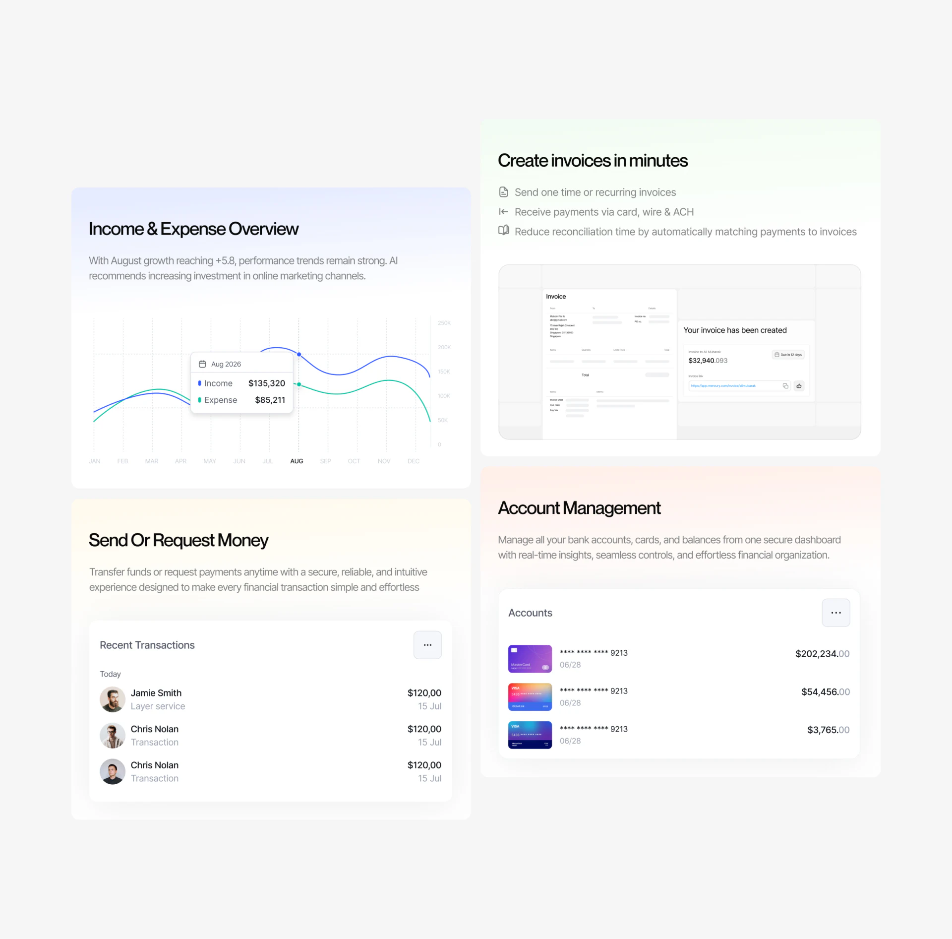
A clear feature of the payment request form is the list on the left: Create request, Review, and Copy link. While the main area collects contact, amount, date, and account information, the upcoming review and link-copying steps are already visible. The short step names explain the process without placing every future page’s content in the current form.
The account selector retains a card thumbnail, name, and last digits, echoing the earlier account cards. The thumbnail helps locate an account quickly; the name and digits help confirm it. For tools with several receiving accounts, the same identifiers should carry through to the review page.
The static image does not show the complete Review page, so it cannot establish the reliability of the whole flow. Still, naming that step is a definite interface choice. In further refinement, JVDS would prioritize whether the review shows contact, currency, amount, and due information together, rather than simply removing a click.
The copy deserves another check
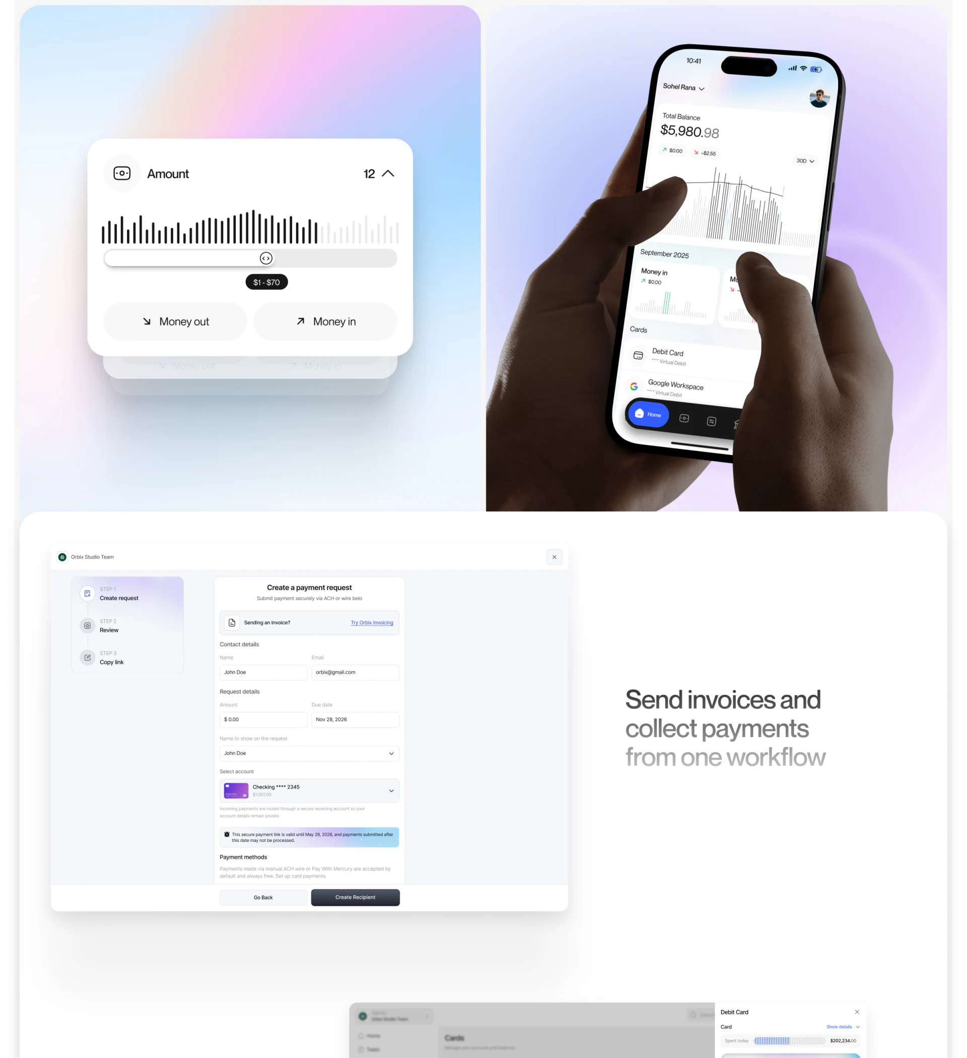
Two details in the form need alignment: the due field and validity note show different dates, and the bottom button says Create Recipient. Beside a payment request heading, they can make readers pause to check what is being created. This is a specific issue that can be addressed without overturning the visual style.
In JVDS’s experience, a form review should examine fields, hints, and the final button together. They explain the same task, but their wording may have come from different component drafts. Checking action names and date meanings individually helps carry the established clarity through the last step.
Frequently asked questions
Are gradient cards suitable for financial dashboards?
They can distinguish accounts or establish visual identity, provided amounts, currencies, and directional labels remain readable. Check cards with realistic content of different lengths, rather than reviewing only tidy demonstration numbers.
Are income and expense curves difficult to read together?
When both use the same period and clear color labels, placing them together supports comparison. Maven’s tooltip lists the month and both amounts, providing a more concrete reference than curve positions alone.
Why include a review step in a payment request?
Review gives users a focused opportunity to check the recipient and request details. The step list shows this stage; the actual page still needs to make the name, account, currency, amount, and date visible.
Design review checklist
- Replace demonstration values with long amounts and different currencies to check text on gradient cards.
- Confirm that tooltip colors and months correspond to the curves.
- Compare account names and last digits between selection and review.
- Check field dates, validity notes, and the final button together.
Planning a financial tool or business dashboard?
If your product includes account overviews, charts, or request forms, bring your existing screens and business flow to a discussion. JVDS Design Studio provides UI/UX design, website design, and development services, and can work with you from information organization through interface implementation.
 Link copied