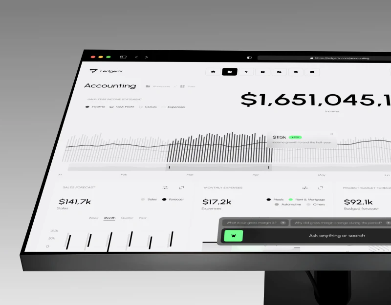
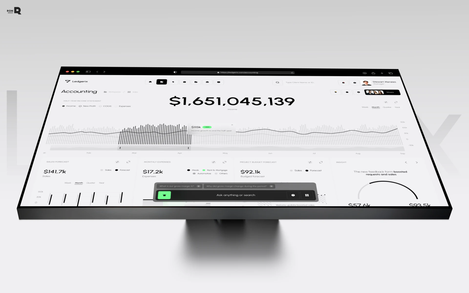
This Ledgerix finance SaaS dashboard reserves its most prominent position for the income amount. Gray and white charts surround it, while green appears only in change indicators and assistant entries. Its distinguishing feature is a clear center of attention, followed by trends, forecasts, and questions in sequence.
Key takeaways
- The large amount and horizontal trend share one reading center; smaller modules below add other financial topics.
- Forecast cards repeat gray and black legends, allowing the mobile interface to retain the same chart-reading rules.
- The AI entry starts with specific financial questions and fits naturally after reading the data.
The main amount holds its place among the cards
A very large black amount sits in the center of the desktop view, with the small label Income below. Income, New Profit, COGS, and Expenses run down the left; Week, Month, Quarter, and Year sit on the right. Type size, placement, and whitespace make income the current focus while keeping secondary options easy to find.
A horizontal chart unfolds immediately below the amount. Pale gray bars form the background, while a darker run of bars and a black line draw attention to a specific area. A floating tooltip sits close to that change. This visualization has a practical advantage: reading the total and locating changes do not require jumping between separate cards.
Sales forecasts, monthly expenses, and budget forecasts appear below. Each has its own title and a smaller amount, so the reading order remains clear despite the number of modules. JVDS values this relationship of scale: establish one topic that deserves a quick glance, then let other data support it, rather than making every metric compete for the first look.
Mobile legends are worth repeating
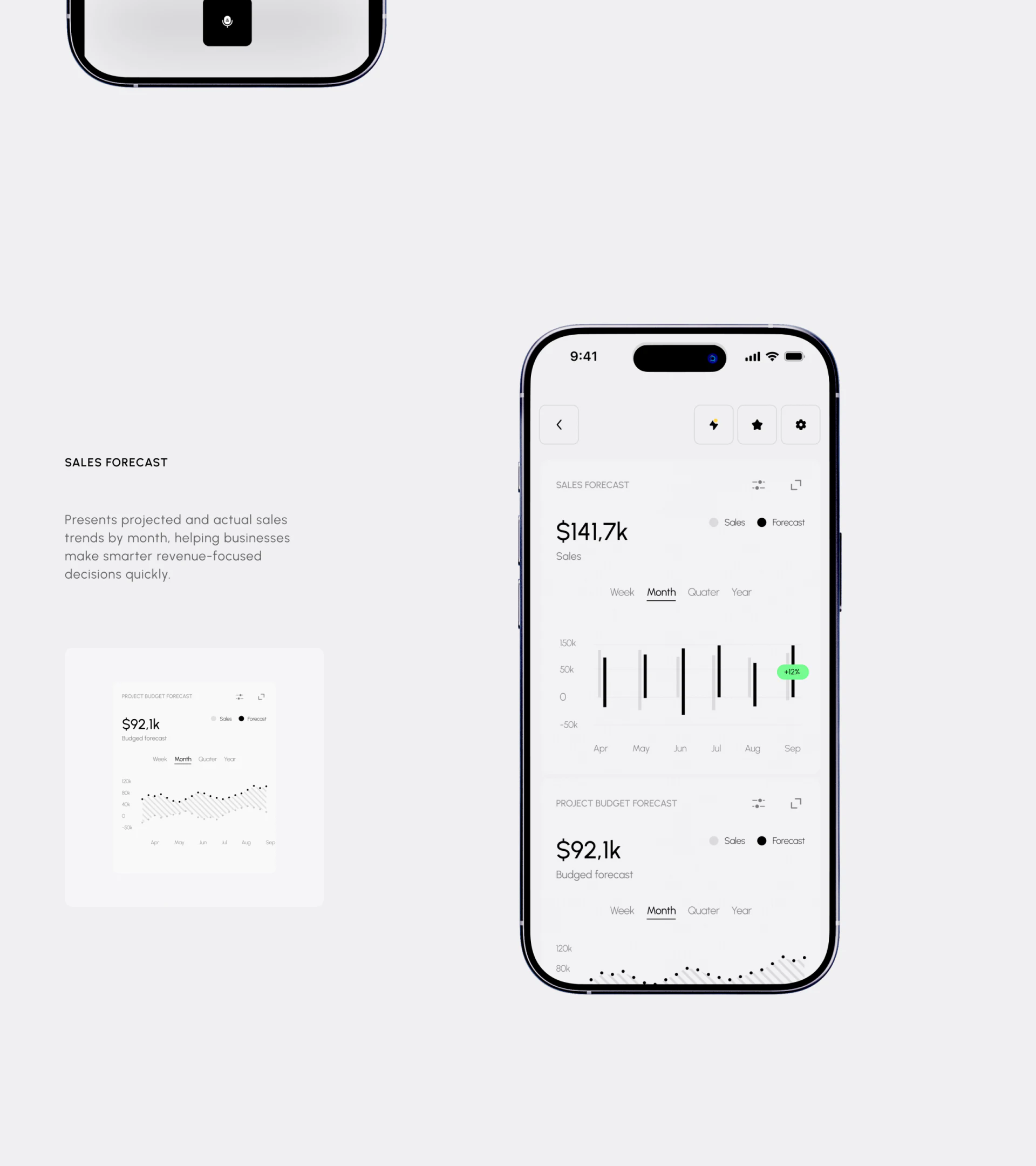
The mobile sales forecast card marks Sales with a gray dot and Forecast with a black dot. The budget card below retains the same legend. This small repetition matters: readers scrolling to another card do not need to return to the top to check which color means forecast.
The mostly monochrome palette also leaves room for green. A green change label appears near one bar without covering the card; it points out a reading worth investigating while the background, axes, and other bars remain quiet. Giving every card a different theme color would make this local signal harder to distinguish.
Forecast is a predictive label, however, and the visual weight of dark bars does not imply greater certainty. Similar finance interfaces can identify the forecast range on the chart and place the reporting period near the title. The desktop view shows a half-year description alongside Month; readers should be able to distinguish the data period from the monthly display setting.
The question entry offers a specific starting point
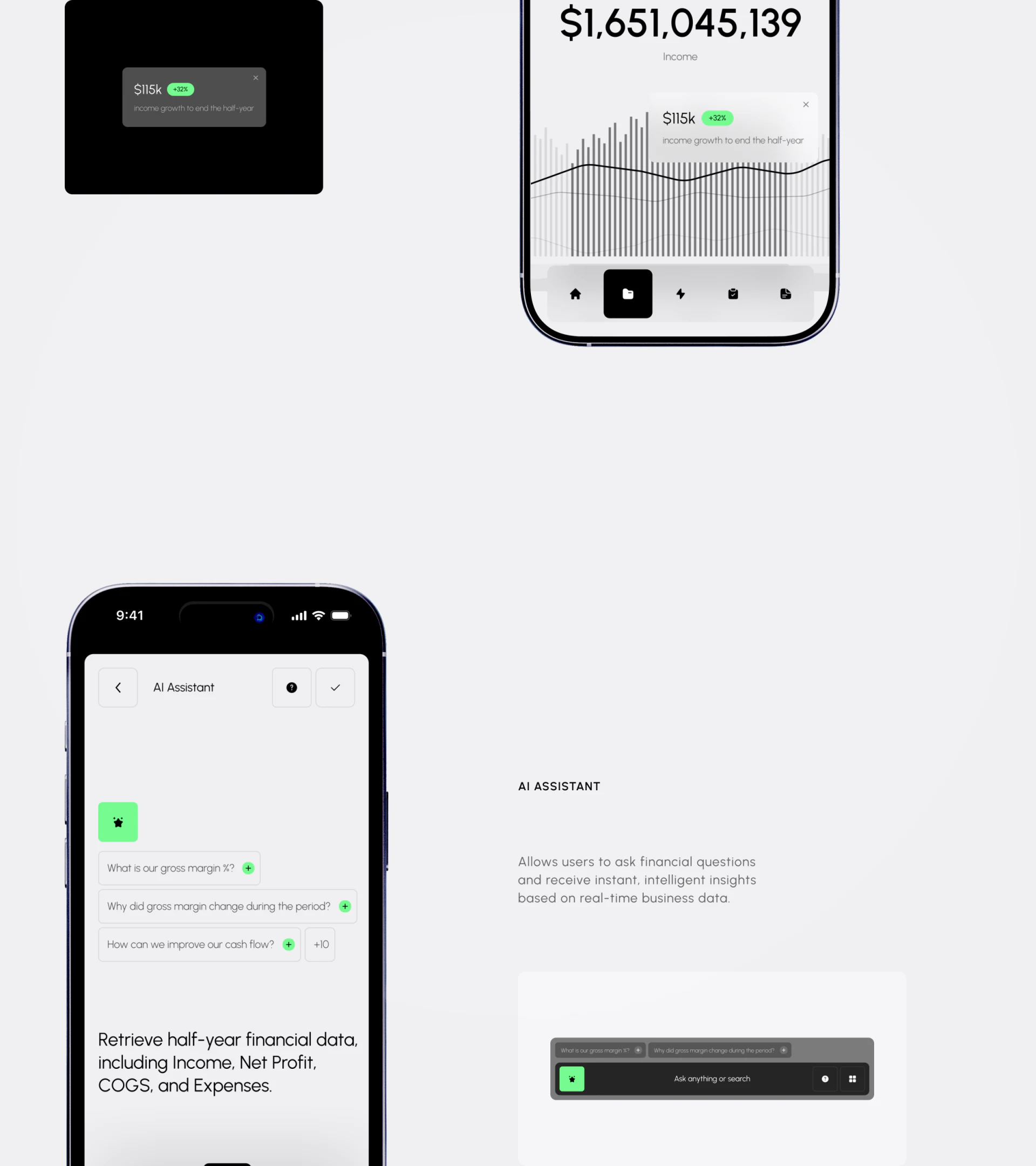
The AI assistant page lists questions about gross profit, changes over a period, and cash flow, with a green plus at the end of each question box. Instead of a broad invitation to “get started,” these tell users what they can ask here. For finance software, the clarity of those questions often matters more than the assistant icon’s shape.
A black input bar at the bottom of the desktop view also includes a preset question and contrasts with the pale charts. A green icon marks the entry, while the long input area leaves space for an original question. The two devices use different forms but place suggested questions beside input, making it easy to start without restricting what can be asked.
The view also shows text about retrieving half-year financial materials. The screenshot does not establish whether chart filters carry over. Further design should attach the current metric, period, and a verifiable source to the answer. The closer a question gets to a business task, the more clearly its scope should be stated.
Frequently asked questions
Should a finance dashboard use only black and white?
Black and white can emphasize numeric scale and chart relationships, but statuses still need textual support. Here, green marks local changes and assistant entries. Define color meanings first, then check that the legends are clear enough.
Where should an AI finance assistant sit?
It can sit near the data being read and offer specific questions to begin. Answers should still show the metric and date range; the input bar in a static image does not itself prove that context has been passed through.
Design review checklist
- Name the overview’s main metric first, then check whether its type size and position give it enough emphasis.
- Inspect each forecast card independently and confirm its legend is understandable without the previous screen.
- Check that period controls, reporting scope, and dates in assistant answers agree.
Planning a dashboard for financial software?
If your product needs to show income, budgets, forecasts, and assistant questions together, start by organizing the main metric and date range. Once the information order is clear, decide what belongs on mobile.
JVDS Design Studio provides UI/UX design, website design, and development services. We can help organize interface, content, and implementation needs.
 Link copied