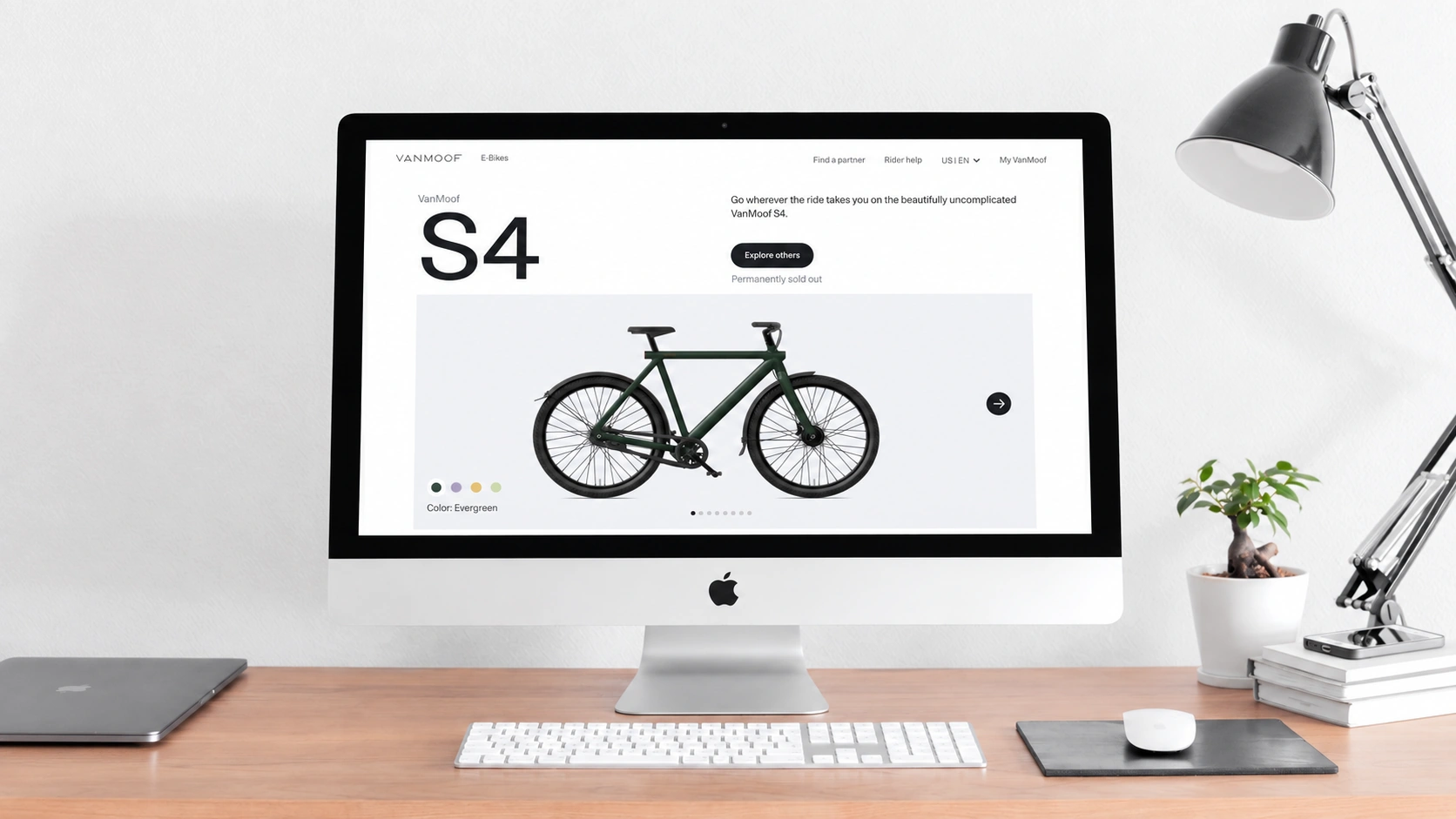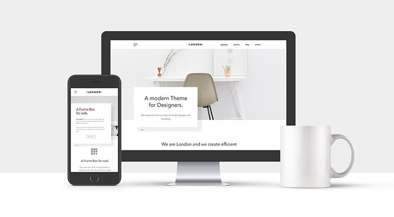
When we discussed web design in 2019, we were effectively discussing responsive website design. In just over seven years, “responsive” had become a ubiquitous industry standard. Responsive website design is the process of designing a website or web application so that its content adapts appropriately to the viewing device. Several years earlier, I attended an inspiring conference talk by Ethan Marcotte, who coined the term “responsive website design.” He compared it to Utah's Pando tree: an organism with an interconnected root system that emerges in different places, environments, and sizes while sharing the same underlying genetics.
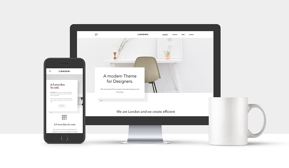
It is fair to say that the adoption of responsive design helped drive the future of the mobile web. Without it, the cost of developing a mobile site alongside a PC version would have led many companies to retain only the latter.
Responsive design is not without problems. By definition, it responds to viewport size rather than content. Variations based on container CSS media queries have been proposed as a solution, but at the time described by the source they remained little more than a note on someone's whiteboard.
Design is largely about relationships between elements, and those relationships are constrained on small screens. Because markup has semantic structure, relationships designed for mobile devices are often carried into larger views.
One of the most criticized UI decisions of the preceding year was the growing use of hamburger menus on PC interfaces. Yet far fewer people noticed mobile layouts—horizontal bands that divide content into a twelve-column grid—being scaled up to PC screens.
Asking whether responsive website design is killing creativity may be unfair. The question assumes that variety and innovation are the lifeblood of the design process, and it blames a concept when responsibility, if any, lies in implementation. Design often develops under the strictest constraints. I know a designer who adds personal constraints to client briefs because challenges make the work stronger.
Responsive design works well with brand design, but it is not ideal for every creative context. A better approach may be to create different designs for different classes of views and rely on responsive techniques only for similar screens. We may not know every screen's exact dimensions, but we know a phone must fit in a pocket and a laptop cannot be narrower than its keyboard.
Responsive design may simply have arrived ahead of its supporting tools. If CSS variables and container queries are implemented, website design can become more diverse again.
Need design or website development services?
JVDS Design Studio is a professional design studio focused on digital product experiences and brand identity. We work with businesses in China and overseas that want to strengthen their brand image, improve user experience and grow their business, providing clear, usable UI/UX design, high-quality website design and development, app and mini-program development, and cohesive, distinctive brand identity design.
Planning a corporate website, a multilingual site or a redesign? Tell us about your audience, existing website and the work you need.
 Link copied