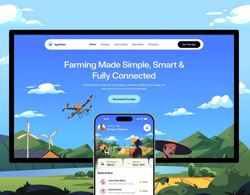
AgroPulse’s agricultural app design places a phone among sky, fields, greenhouses, and livestock. Drones and tractors appear within farm scenes rather than as isolated icons. The website illustrates product scope first, then the app narrows into specific work through farm and task names.
Key takeaways
- Greenhouse, drone, and tractor each match a feature card, with clear image-to-text relationships.
- Task pages retain farm and area names, identifying work beyond illustrations alone.
- The mobile website turns horizontal features into vertical cards while continuing the branded farm scene.
Each equipment image enters its own feature card
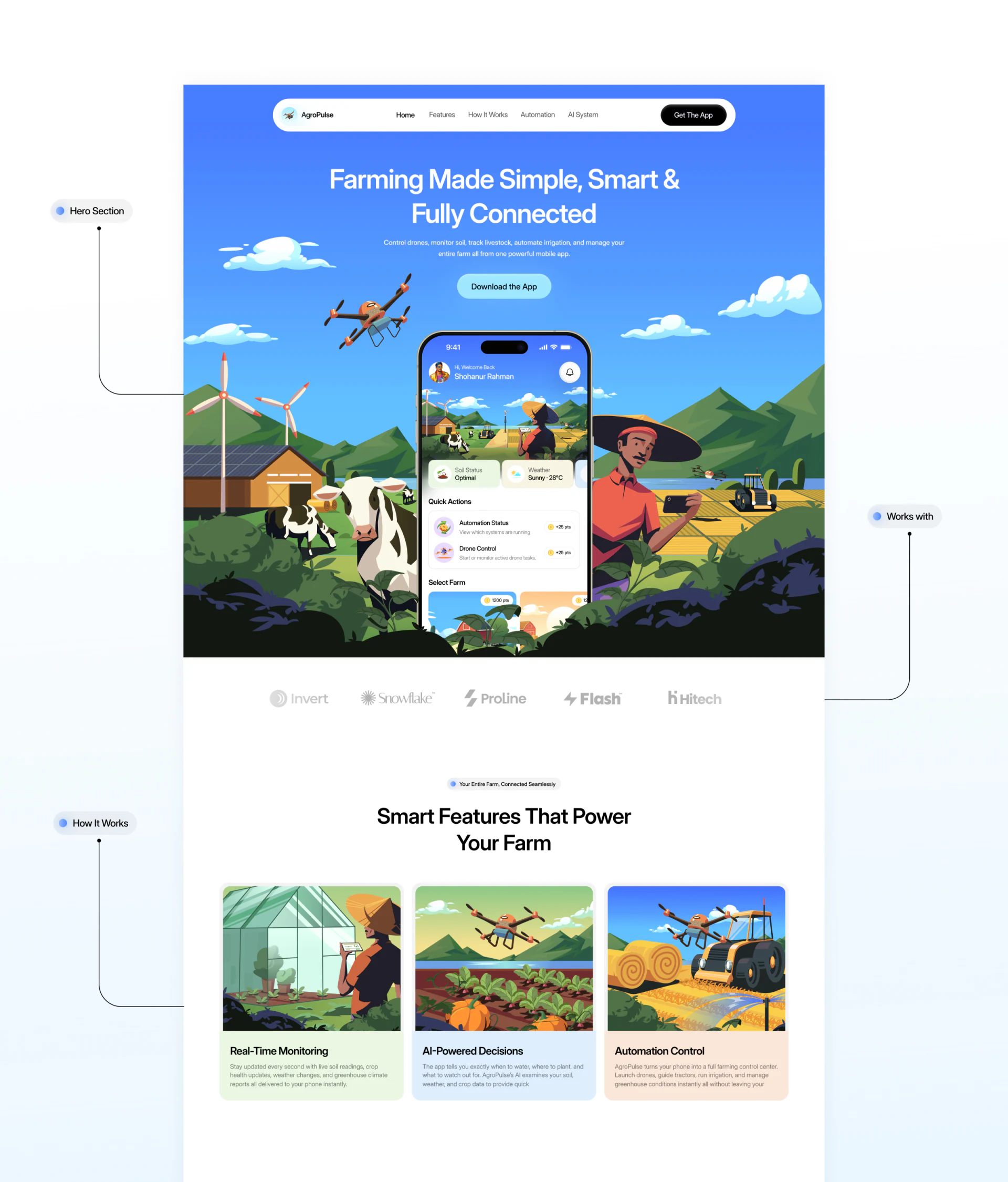
The blue-sky hero surrounds a central phone with a windmill, cow, farmhouse, and people, keeping download buttons below the heading. Despite the many elements, the phone’s white feature area remains visible rather than being submerged in scenery.
Three cards below show greenhouse inspection, a drone above fields, and a tractor during harvest, corresponding to monitoring, AI decisions, and automated control. Different equipment and actions provide initial distinctions before readers reach feature names.
JVDS sees the advantage in placing abstract capabilities back into their environment. Choose images around each topic rather than merely swapping attractive farm scenes. Text still needs to distinguish observation, advice, and control; promotional illustrations do not prove equipment behavior occurred.
A task name narrows the scene to one area
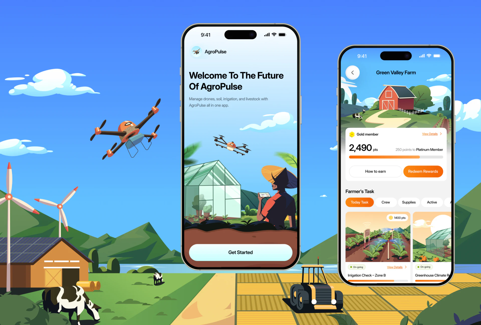
Green Valley Farm retains sky and a red farmhouse in its header, with the farm name independently above. Today Task, Crew, and Supplies appear as tabs in Farmer’s Task below. Specific work begins to take the form of browsable cards.
Irrigation Check – Zone B combines an irrigation scene, On-going, and View Details. The area name identifies which work is being viewed, rather than merely suggesting an irrigation task exists. Photographic-style illustration identifies type; words provide stable location.
Orange unifies task selection, progress, and rewards, but progress and points should have different names and units. The membership card above has larger numbers; a work-inspection product could show ongoing tasks earlier. This is a hierarchy recommendation, not evidence that points or example progress reflect actual work outcomes.
On mobile, feature explanations retain pale backgrounds
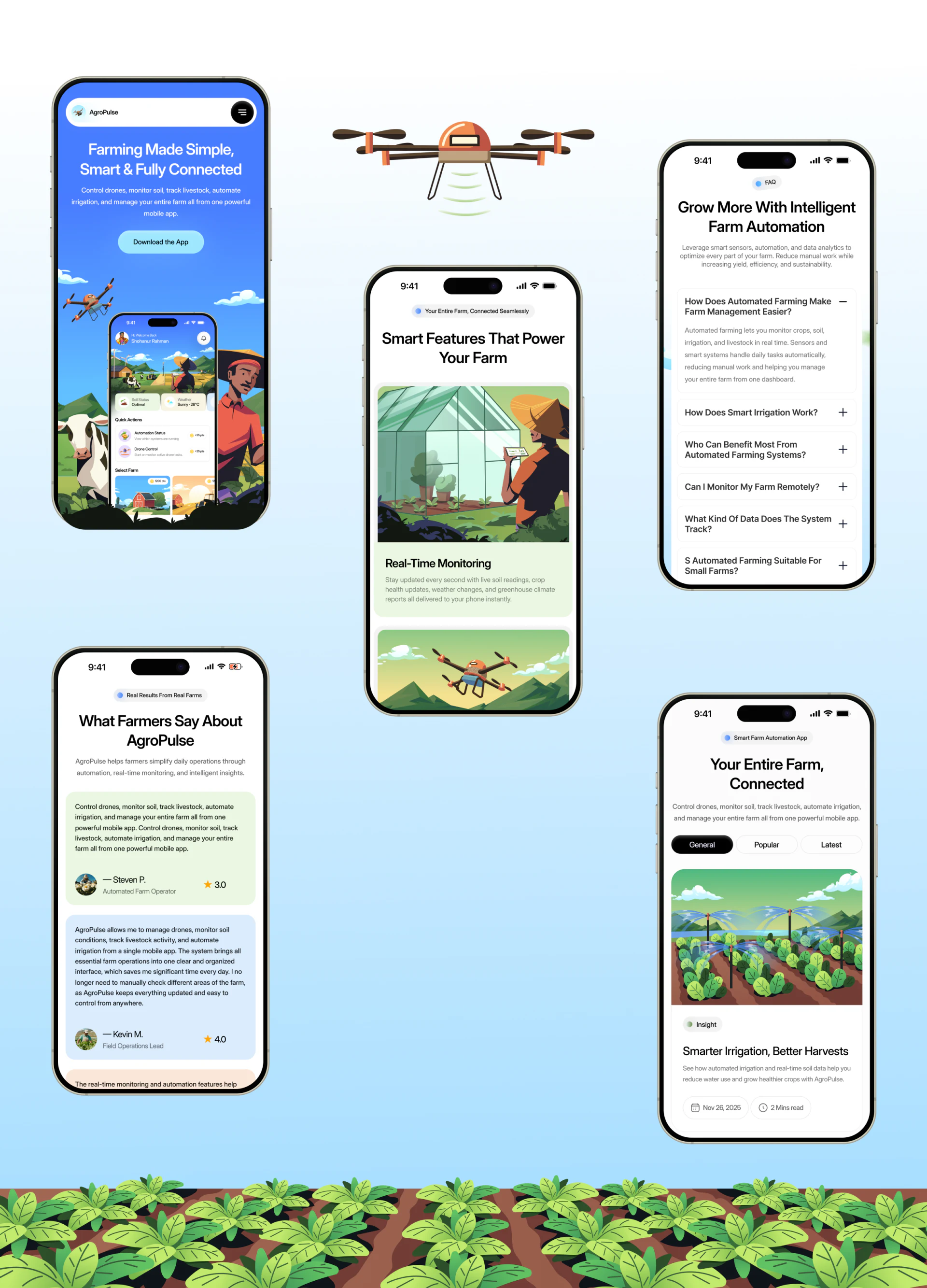
The mobile website keeps sky and farm-phone imagery, with compact navigation and download buttons near the heading. Horizontal features become vertical cards, and titles and descriptions retain their own pale areas below images.
The FAQ returns to white, covering irrigation, remote monitoring, data, and suitability. Illustrations establish an impression above, while questions explain conditions in words. These are different and necessary reading modes.
Reviews and articles use separate cards with recurring green, blue, and orange, while titles, names, or dates remain independent. Further content could answer specific questions: available data, update times, and confirmation after actions. Precise wording would make the farm imagery more useful.
Frequently asked questions
Does an agricultural app need realistic equipment photographs?
Illustrations and photographs can both work when they correspond to specific tasks. AgroPulse places different equipment in separate feature cards, offering a useful example of contextual explanation.
How can work cards be easier to locate?
Retain farm, area, and task names, with nearby status and details. Progress, points, and equipment states need their own explanations rather than sharing orange alone.
Design review checklist
- Match every equipment image to its feature text.
- Check that task cards name the farm, area, and work.
- Define progress and points separately, with units.
Need to explain equipment and work in an agricultural product?
Across product website and work app, organize farm, area, equipment, and task relationships before scene images and action cards. JVDS provides UI/UX design, website design, and development services; bring your agricultural product’s interface needs to the discussion.
JVDS Design Studio provides UI/UX design, website design, and development services to help organize interface, content, and implementation needs.
 Link copied