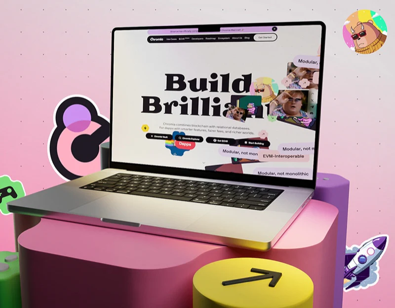
Chromia’s blockchain website design resembles a sticker poster: heavy serif type sits on pale pink, surrounded by colorful word blocks around Build Brilliant. Beneath this playful identity, four black entries name specific tasks; roadmap and data pages switch to structures better suited to information.
Key takeaways
- Colorful stickers build recognition, while black task buttons give different purposes explicit destinations.
- Roadmaps and charts retain the style, but time, status and legends need separate explanations.
Four black entries give the headline a practical destination
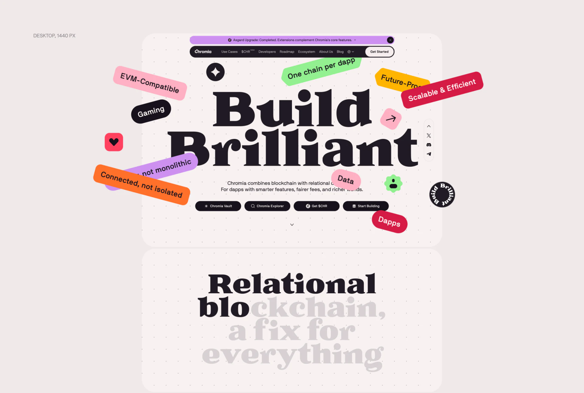
Tilted green, red, orange and pink word blocks surround the black headline. There are no photographs here: text and simple symbols form the hero, while a small dot background adds texture without competing for the center.
Chromia Vault, Chromia Explorer, Get $CHR and Start Building sit side by side below the heading, all in black with white type. Unlike the freely scattered stickers, these entries occupy stable positions and let readers choose by task. Development, browsing and other purposes need not all pass through a broad learn-more entry.
JVDS sees word blocks as impression makers, while task buttons should identify destinations. When technical terms, application fields and brand statements share one sticker style, nearby explanation becomes especially useful. Short descriptions can separate application areas from specific capabilities, avoiding the implication that adjacent stickers have a direct technical relationship.
A purple curve gives the roadmap continuity
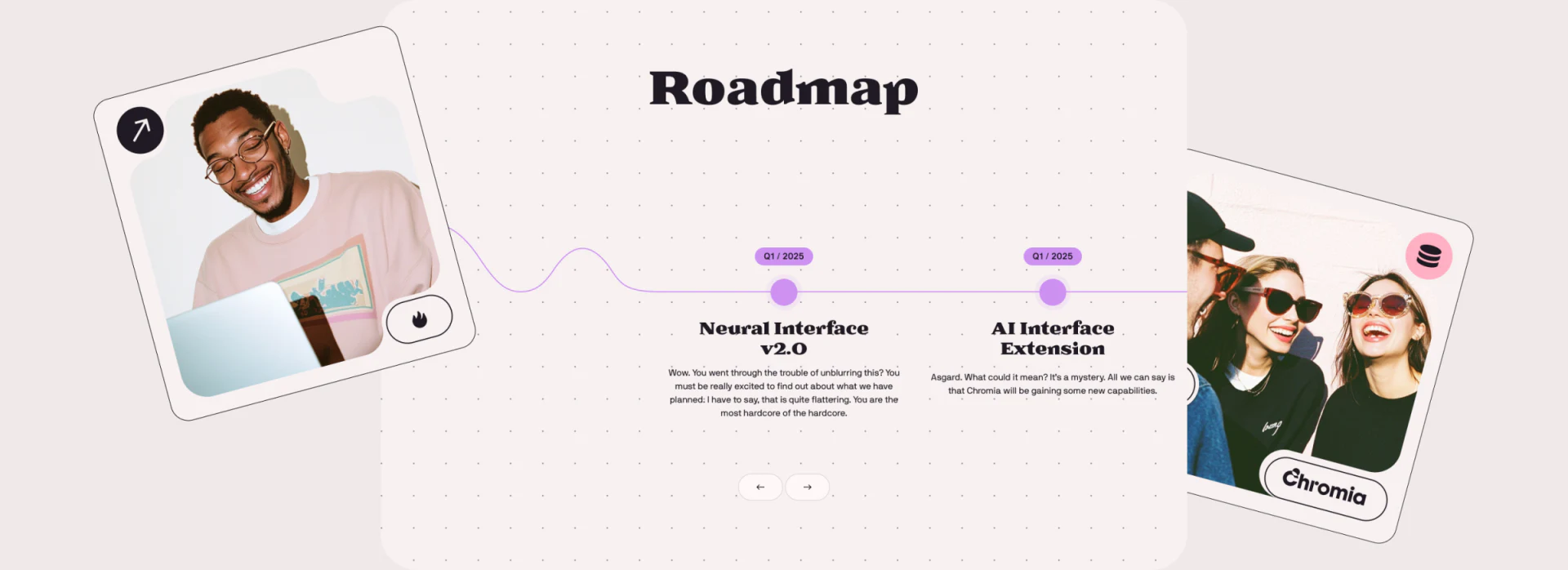
Roadmap uses a pale dot background and a purple curve connecting nodes, with quarter labels and item titles nearby. Tilted people photographs act as independent cards on either side. The timeline stays central; photographs add atmosphere while nodes retain reading positions.
This roadmap suits introductory pages with few items and a need to show sequence quickly. The curve is friendlier than a plain table, and proximity between items and dates reduces searching. Maintained roadmaps still need each item’s status and update time; curve position cannot explain progress.
Several items in one quarter are normal, but time and completion are separate questions. Write brief quarter, item and status records before deciding how to draw the line. The displayed plans are not cited as completed achievements.
Deep-purple data pages need textual legends
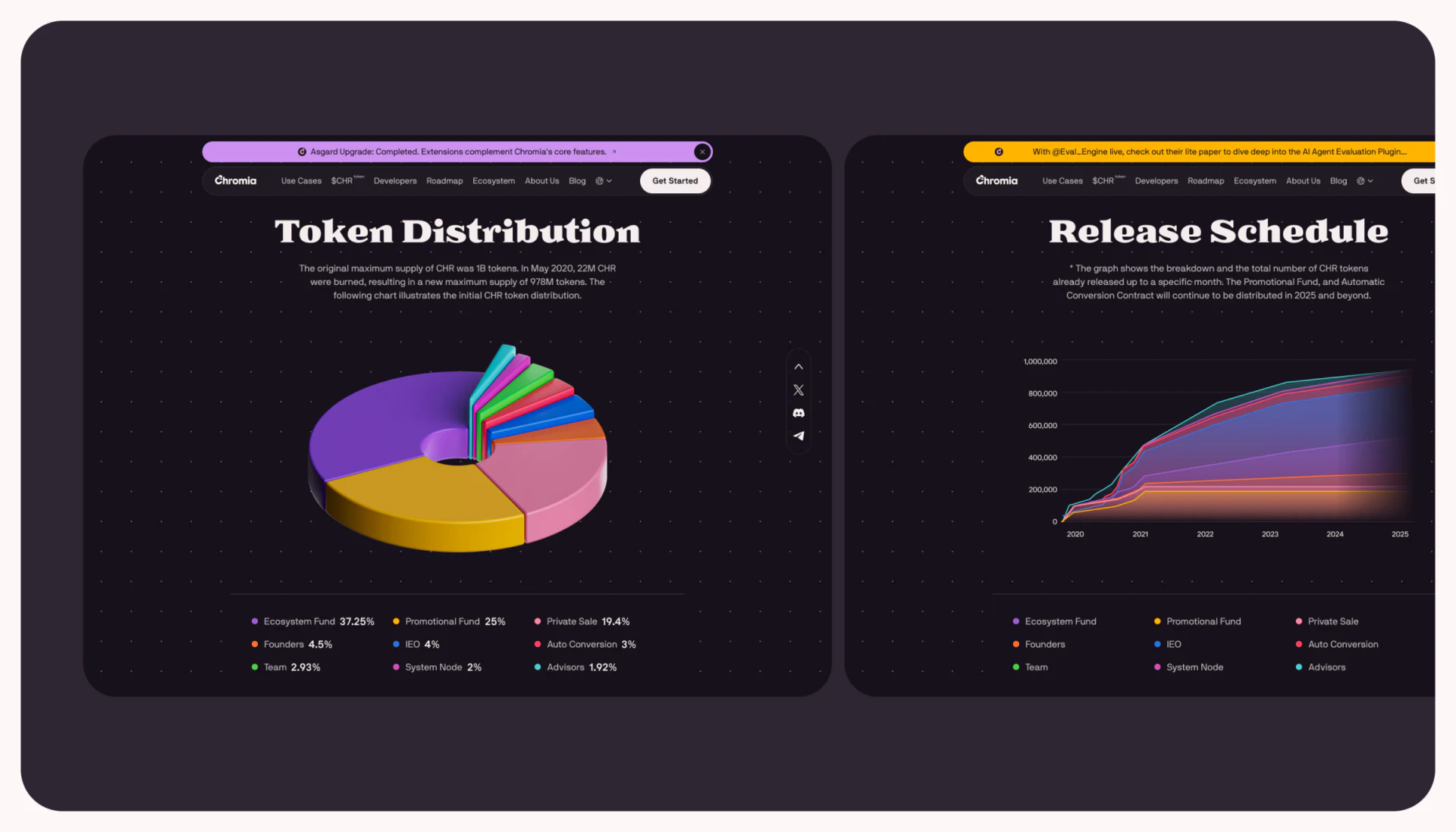
The allocation page switches to deep purple, with yellow, pink, green and purple ring-chart segments and a colored Release Schedule area chart beside it. The shared style represents two things—category proportions and a process over time—whose distinction depends on headings and axes.
The dimensional ring is expressive, but height and perspective can distort small segments. Its textual legend is therefore important as a place to check each item. JVDS would preserve the overall form while stating comparison values clearly, rather than ask readers to estimate from apparent sector areas.
The area chart also needs years, units and a cumulative definition. Matching colors do not automatically establish one-to-one correspondence between charts; each needs nearby explanation. Readers can move from a bold hero to a quiet information page without stickers accumulating at every level.
Frequently asked questions
Can a technical website use a sticker style?
Yes, for recognition, with explanations for technical terms and application areas. Clear task buttons help readers continue.
Design review checklist
- Check each task button against the next page’s heading.
- Explain time and status separately in the roadmap.
Connect technical explanations and task paths
If your technical product website needs brand personality, developer entries and information pages, bring its main visitor tasks to discuss content order.
JVDS provides UI/UX design and website design and development. We can work through page content, interface structure and implementation needs together.
 Link copied