DocVisit offers two starting points: people with a direction can search doctors or specialties, while those less certain can contact support. Its doctor appointment app design does not require everyone to learn one way of finding a doctor. Instead, different levels of understanding connect to the same doctor details and time selection.
Keep help available beside search
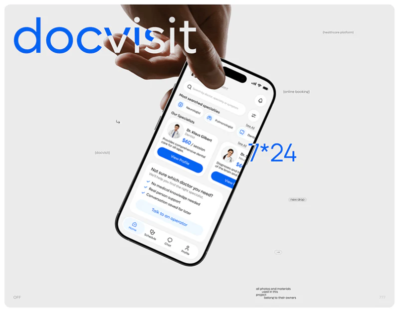
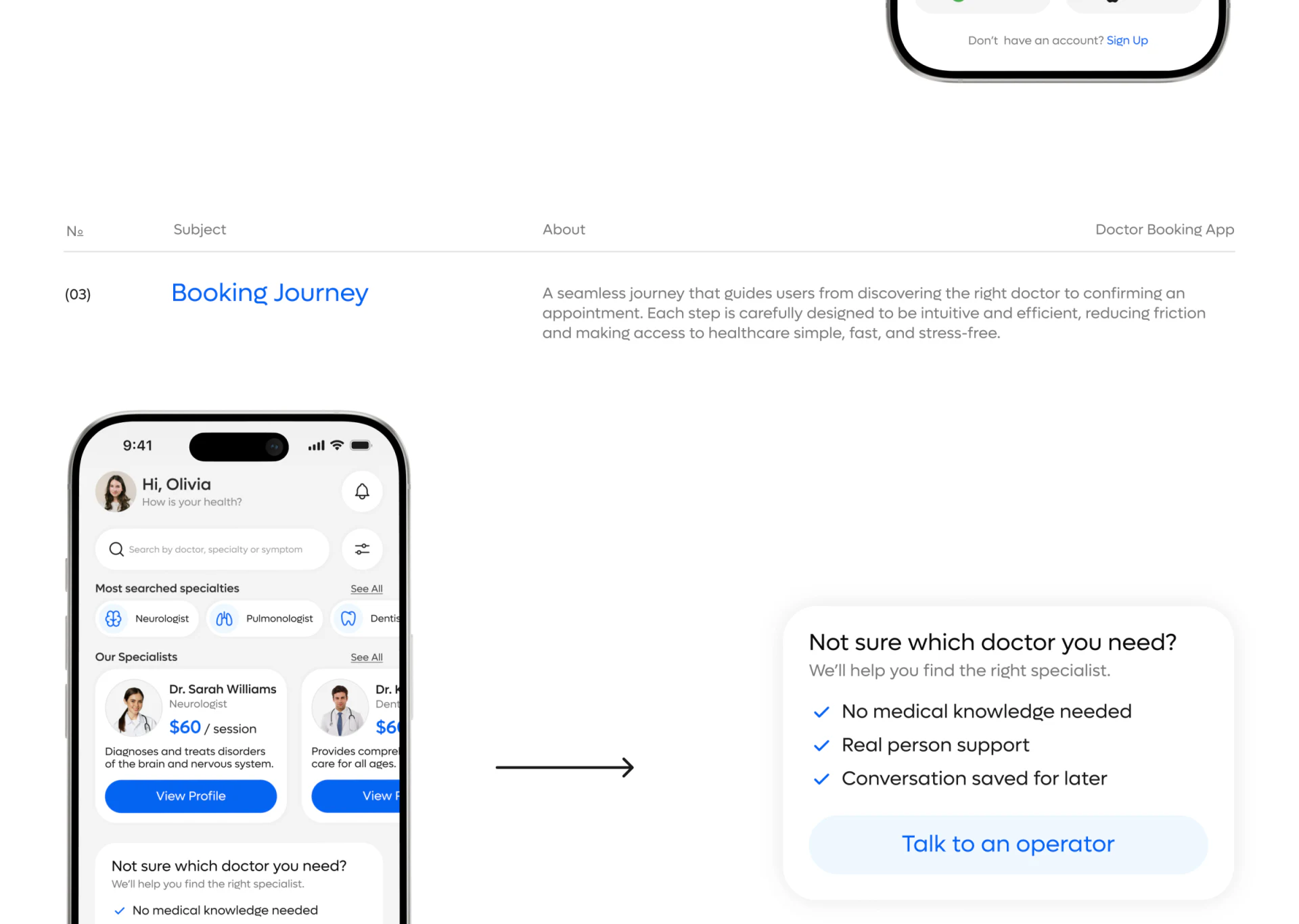
The homepage starts with search by doctor, specialty, or symptom, followed by common specialties and doctor cards. Blue outline icons sit beside specialty names: graphics help scanning, while words identify them. Unfamiliar icons do not require guessing from shape alone.
Doctor cards group portrait, name, specialty, an example fee, and a profile button. They support initial filtering, leaving fuller information for the next level. JVDS Design Studio considers this useful for services with many results: a list should establish whether to continue, without squeezing every detail into the first screen.
An enlarged help card guides readers toward a suitable specialty, using blue checked items and a pale blue button. It shares the list’s palette but uses a solid area to express another task. If the real service involves waiting, it should explain contact methods and expected response times, giving help clear boundaries.
Keep doctor details close to available times
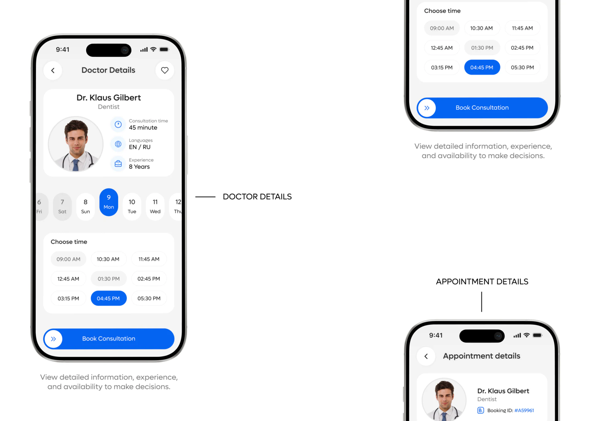
A circular portrait establishes identity above fields for consultation duration, language, and experience. A horizontal date strip and time grid follow, with booking below. This connects whom to see and when in a short route, reducing the distance between profile and calendar information.
Selected dates and times both use solid blue, while ordinary options stay white or pale gray. The two choices share a state language, but pale gray time slots need a clear meaning: unavailable or ordinary. Users should not have to infer availability from faded color alone.
Only day numbers and weekdays are visible in part of the date strip. If scrolling crosses months, month and year need stable positions. Book Consultation could also retain the selected doctor and full time summary so the final click rests on explicit information.
Actions change with appointment status
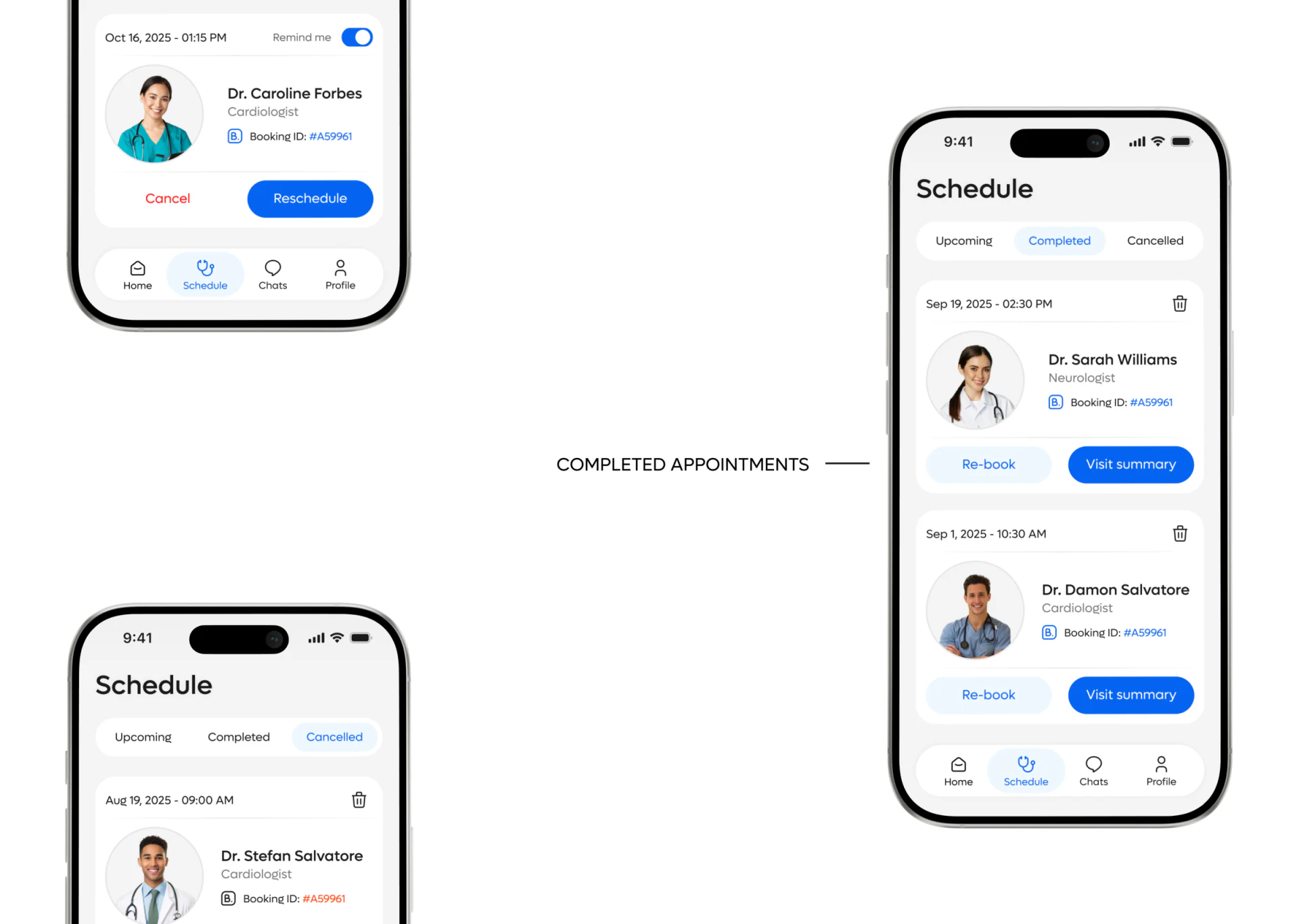
Appointments are grouped under Upcoming, Completed, and Cancelled. Upcoming cards offer cancellation and rescheduling; completed cards offer booking again and visit summaries; cancelled cards retain the original information. This fits each state better than giving every card the same buttons.
Blue supports proceeding and red marks cancellation. A reminder switch stays near the date, tying it to the appointment. Repeated example identifiers across pages should not be treated as real records. Production content needs dates, doctors, and distinct identifiers together, especially for repeated appointments with one doctor.
The focus is task continuity: assistance addresses uncertainty, details confirm identity and time, and lists manage later changes. If service states, waiting information, and action results maintain the same correspondence, visual simplicity can become an understandable appointment experience.
Connect different starts to one flow
Doctor appointment, consultation, and expert platforms serving both experienced and unfamiliar users can begin with the relationships between search, help, and status management.
JVDS Design Studio provides UI/UX design, website design, and development services, helping organize service entries, booking flows, and information hierarchy.
 Link copied