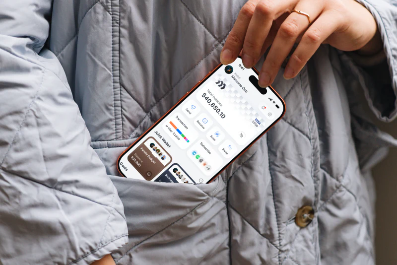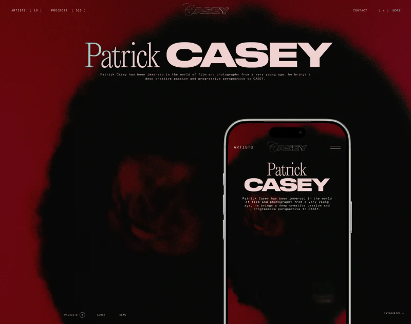
CASEY’s creative agency website gives author and project names large scale. Pale-pink lettering stands out against black, followed by project photographs; news uses smaller, denser entries. This scale contrast creates a poster-like impression while keeping clues for finding creators.
Key takeaways
- A fine-serif author name and bold project name form a clear identity heading.
- Staggered thumbnails add editorial rhythm, while rules and two filter groups maintain entry and finding relationships.
Two typefaces establish two identities
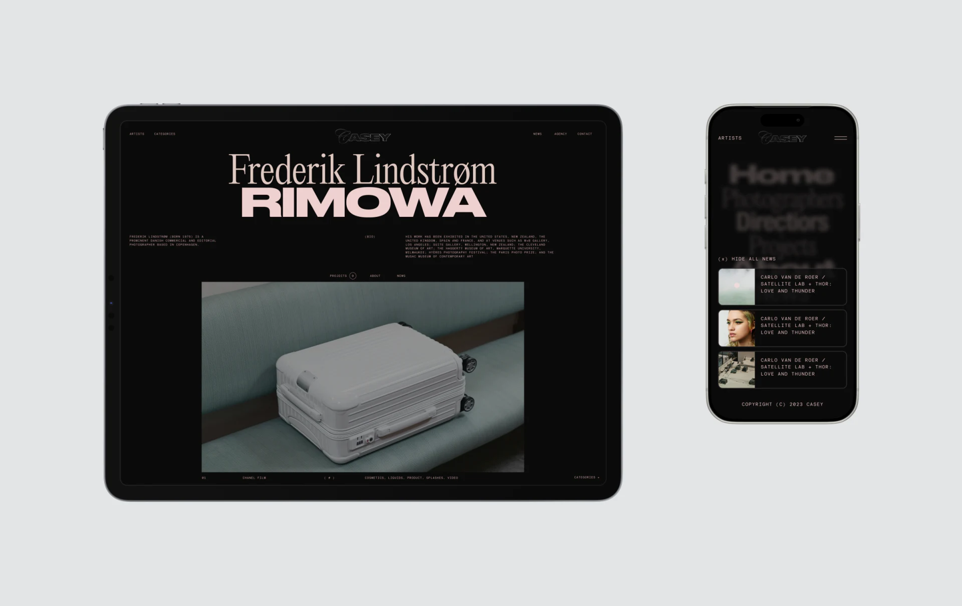
Frederik Lindstrøm uses a fine serif above bold RIMOWA, both pale pink. Typeface difference separates person and project; color groups them. The large luggage photograph below does not obscure this information first.
The agency mark is centered at the top, with navigation distributed to either side. Project titles have more weight than the agency identity, so visitors first see who and what this page concerns. For an agency representing several creators, this relationship helps identify collaborators beyond attractive pictures.
An introduction and small category information sit above the photograph, light in scale and spaced from the heading. JVDS appreciates the hierarchy, but important responsibilities should not disappear into small text. Check the author name and then the project category for clarity on smaller screens.
Staggered news has rhythm and boundaries
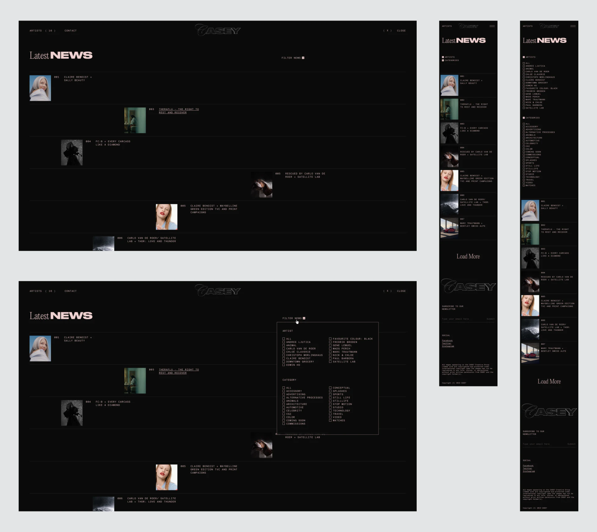
Latest News uses fine horizontal rules to separate entries. Thumbnails occupy different horizontal positions, followed by short titles. Instead of a regular picture wall, each entry resembles an editorial item, with black gaps participating in the rhythm.
This suits varied imagery and a magazine-like portfolio. Thumbnails may shift, but their title relationship must remain stable: after a portrait, the next title should not be mistaken for its entry. Rules provide important separation here.
Mobile uses one column with pictures and wording continuing downward, rather than forcing desktop offsets into narrow space. News images and names remain identifiable. Dense small text warrants checks for enlarged reading, touch areas and long-title wrapping.
Authors and categories offer different finding routes
Expanded filters list Artist and Category separately with checkboxes. One suits visitors who remember a creator; the other supports finding by discipline. Grouping clarifies conditions better than one long collection of tags.
News filters should also show active conditions after closing, and offer clearing or broadening when nothing matches. The image shows the expanded state, not whether these responses are implemented.
JVDS considers relationships between names, categories and work especially important here. Large pink headings attract attention; entries and filters continue the search. Connecting news accurately to its author and work before adding more visual variation better serves finding tasks.
Frequently asked questions
Can creative website news use staggered layouts?
Yes, where imagery dominates and entry relationships remain clear. Thumbnail, title and author must belong to one record; mobile can use a steadier single column.
Design review checklist
- Check that each news image, title and author form a group.
- Check active conditions and clearing after filters close.
Make creators and work easier to find
Creative agencies, photography and artist portfolios balancing visual style with creator information can start with work attribution and directory structure.
JVDS Design Studio provides UI/UX design, website design and development, helping organize page content, interface structure and implementation requirements.
 Link copied