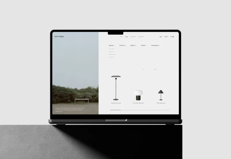
New Works’ furniture ecommerce website design is quiet: fine grid rules, pale backgrounds, and generous space let the silhouettes of lamps and chairs come forward. More interestingly, lifestyle photographs do not start a separate visual system. They enter the catalog directly, then connect to individual products on room pages.
A white catalog reveals lamp silhouettes
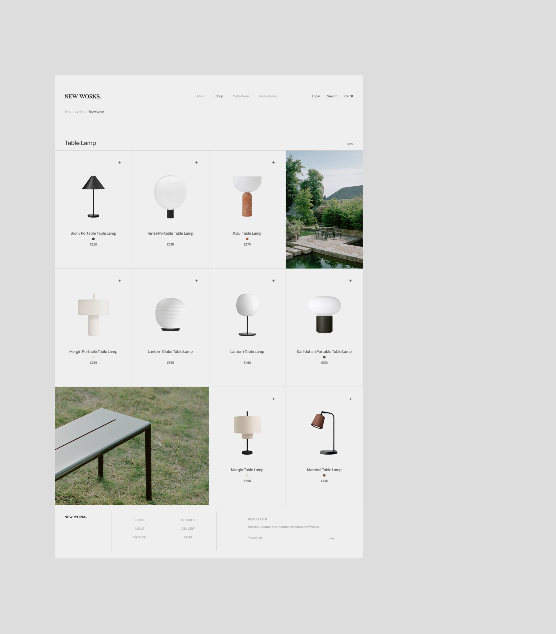
The lamp catalog displays products in four columns with fine grid rules. Cones, spheres, bowls, and cylinders are clearly different against the shared background. Without heavy cards or exaggerated shadows, product materials and shapes become the main content.
Names, color dots, and prices sit beneath each lamp, with a small plus at the upper right. Repeated field positions offer a quiet cue: after liking a shape, readers can confirm its identity. Shopping does not require passing through elaborate decoration first.
Two lifestyle photos interrupt the product grid: a courtyard and an outdoor tabletop detail. They follow the existing rules instead of becoming abrupt banners. This rhythm suits a curated catalog, but the image cells need clear destinations so readers do not have to guess whether they open a scene article or a product.
A room image connects to individual pieces
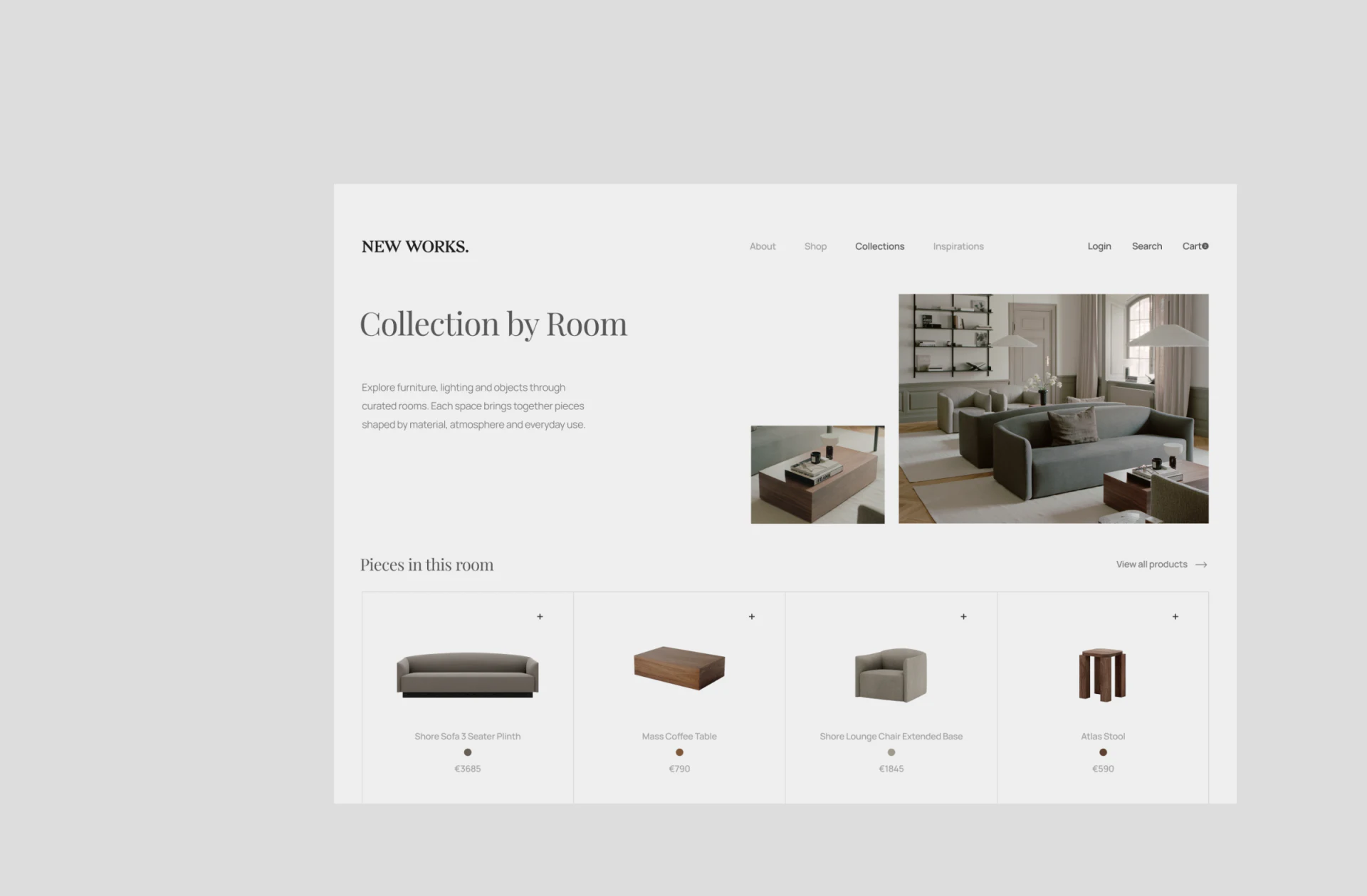
Collection by Room places its heading and short explanation on the left, a full living-room image on the right, and a coffee-table detail nearby. The large photo shows arrangement; the smaller one shows materials and placement. These two scales help explain relationships between the furniture.
Pieces in this room below lists a sofa, table, chair, and stool. Product images return to white backgrounds, with the catalog’s names, color dots, and prices. After viewing the room, readers can identify its pieces directly rather than search the entire site for similar models.
JVDS sees this correspondence as central to linking furniture scenes with products. The scene suggests a combination; the list supplies searchable identities. Content maintenance should check that photographed versions match the list, explaining different colors or sizes nearby.
The heading uses a serif face, while product names are plainer. One conveys the room’s atmosphere; the other supports repeated model lookup. Each typeface has a role, with the fine grid connecting them. For a homeware website driven by photography and editorial content, this limited typographic variation is more restrained than continually adding colors.
Room product cards reuse the four-column catalog rather than becoming a new recommendation banner. Readers moving from photograph to product need not learn another card style. Shared fields also support checks for missing names, prices, or versions, grounding visual consistency in content consistency.
Chair details give the shape room to register
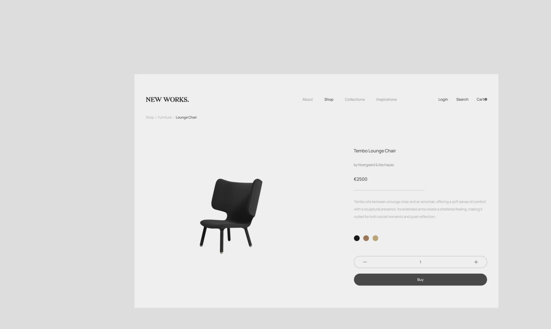
A large Tembo Lounge Chair image sits on the left with broad space around the black chair. The back, arms, and legs remain fully readable without text covering them. This suits furniture with a distinctive form, allowing the silhouette to make the first impression.
The right column runs from name, designer, and price to a short description, three color dots, quantity, and Buy. Its width stays consistent, with purchasing controls in the same view. Pale gray text and the black product create different visual weights within a restrained reading sequence.
The dots do not yet show color names or a strong selected boundary. Furniture color selection can retain the small circles while naming the current color nearby, so the choice can also be described in words. Materials, dimensions, and delivery information also need clear subsequent entries.
Build simplicity on consistent fields
The plus signs, fine rules, and color dots are small; visual order mainly comes from repeating them in the same places. When adopting minimal styling, aligning names, prices, and actions is often more useful than shrinking type further.
If the catalog plus enables quick purchase, products requiring a version choice still need explicit confirmation. If it opens details, interaction should provide the corresponding response. Its purpose should be clear in the control’s explanation or click feedback, carrying forward the product identity already established.
Space can encourage slower appreciation of furniture, but mobile layouts still need timely visibility of names and purchase conditions. A review can follow one specific lamp through catalog, room, and details, checking whether its identity remains clear throughout.
Give product photography a clear ecommerce structure
If you are planning a furniture, lighting, or homeware website, bring product photos, room images, and product information to the discussion. JVDS Design Studio provides UI/UX design, website design, and development services, helping plan catalogs, content pages, and purchasing interfaces.
 Link copied