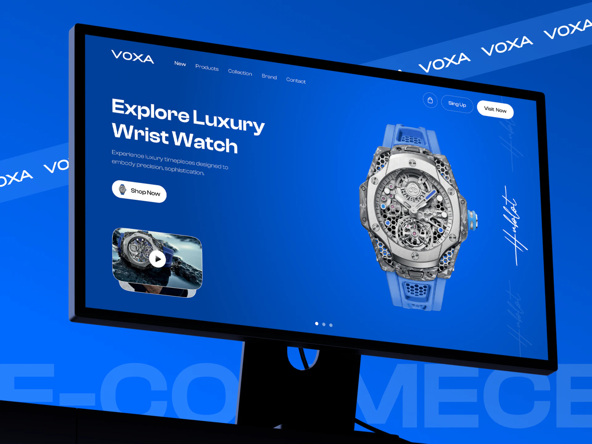
VOXA’s watch ecommerce website uses a broad blue field to frame a mechanical watch. A large dial sits on the right, while text and a white shopping button stand separately on the left. The product content then returns to white. This sequence gives both expressive imagery and specific purchase choices a place.
Key takeaways
- Matching blue in the background and strap helps reveal the silver dial’s structure.
- A white product area gives names, prices, colors, and purchase actions stable positions.
- Style browsing and service questions offer different reading paths that can support the detail page.
A full blue background still leaves text clear
The large watch on the right reveals an openwork dial, metal frame, and blue strap against a blue background. The shared palette connects strap and setting, while light, shade, and material differences bring out the metal details. The product is already complex; generous surrounding space lets readers examine it.
The heading on the left spans two lines, followed by smaller explanatory text and a white rounded Shop Now button. A video thumbnail below has a clear play symbol. Copy stays off the dial, and shopping and viewing remain separate entries. These positional relationships are more useful to borrow than a broad description such as “luxury.”
Navigation runs across the top, with dots at the bottom of the hero. These suggest several content groups, but the static image does not establish how switching works. For a similar ecommerce hero, first check whether one frame identifies the product category and next step. A richer carousel should build on a clear individual frame.
White makes products available for comparison again
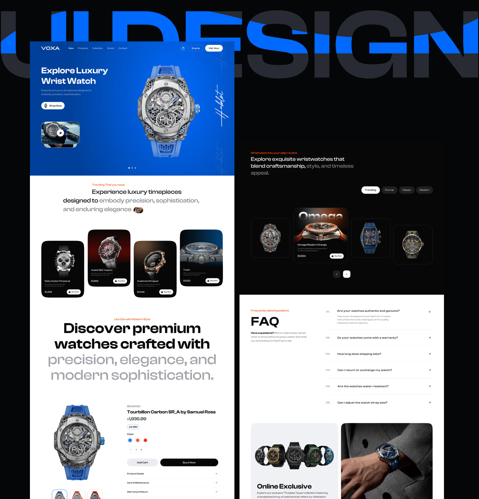
White sections receive the blue hero on the long page. Product cards use dark photographs for different watches, with names and prices lower down. The background change signals another content layer. Once the appearance attracts attention, individual products acquire identities.
Style browsing on the right uses Trending, Formal, Classic, and Modern labels, a larger central card, smaller neighboring cards, and arrows below. This favors discovery and slower exploration. Readers comparing diameter or material would also need a more direct list or filter; style names cannot explain specifications.
JVDS finds the useful distinction here to be between display and checking areas. Photographs can vary, while names and prices should stay in stable positions. When basic information remains easy to find, changes in card size need not make users learn the layout again for each watch.
Options stay near purchasing, with service information nearby
The detail view keeps the watch on the left and groups its name, price, 44MM, color dots, and quantity on the right. Add Cart is light and Buy It Now is dark, using fill to distinguish their prominence. The appealing appearance and the version being submitted share one area, without requiring readers to remember details while searching for a button at the bottom.
Three color dots are immediate visual cues, but should have names and repeat the current specification in the selection summary. A short explanation would also clarify which dimension 44MM describes. On a watch detail page, the shorter the dot or number, the more valuable its supporting explanation.
Product Details, Care & Maintenance, and Warranty & Return appear as collapsible rows. The adjacent FAQ lists authenticity, warranty, shipping, returns, and water-resistance questions. Headings are easy to scan, but answers still need to identify applicable products and conditions. Including a question does not establish that a watch has the corresponding performance or commitment.
Frequently asked questions
Does a watch hero need complete specifications?
The hero can introduce appearance and category, with full conditions in a clear detail area. Product names should connect the two layers so readers know which watch to inspect next.
How can color dots be easier to understand?
Retain the visual dots and add color names and selected states. The pre-submission summary should correspond to the same model, size, and quantity, rather than relying only on an image change.
Design review checklist
- Find the product category and shopping entry in the hero first.
- Inspect individual product cards and check that names and prices stay readable and consistent.
- After choosing a color, confirm the specification and both purchase actions through text.
Connect product imagery and shopping pages more smoothly
Watches, jewelry, and other visually focused products need imagery and specifications in suitable positions. JVDS can discuss ecommerce content hierarchy, interface presentation, and website development needs with you.
JVDS Design Studio provides UI/UX design, website design, and development services.
 Link copied