This wallet app interface uses a light white and gray base, with balances, quick actions, and shared wallets in separate rounded cards. Its focus is giving different funds and actions their own places. Analytics and transfer confirmation continue this division, providing a clear visual thread across the images.
Key takeaways
- The homepage separates personal balances, shared wallets, and quick actions through position and card color.
- Analytics retains the connection between category colors and labels, while confirmation gathers essential transfer details again.
The homepage separates balances from shared wallets
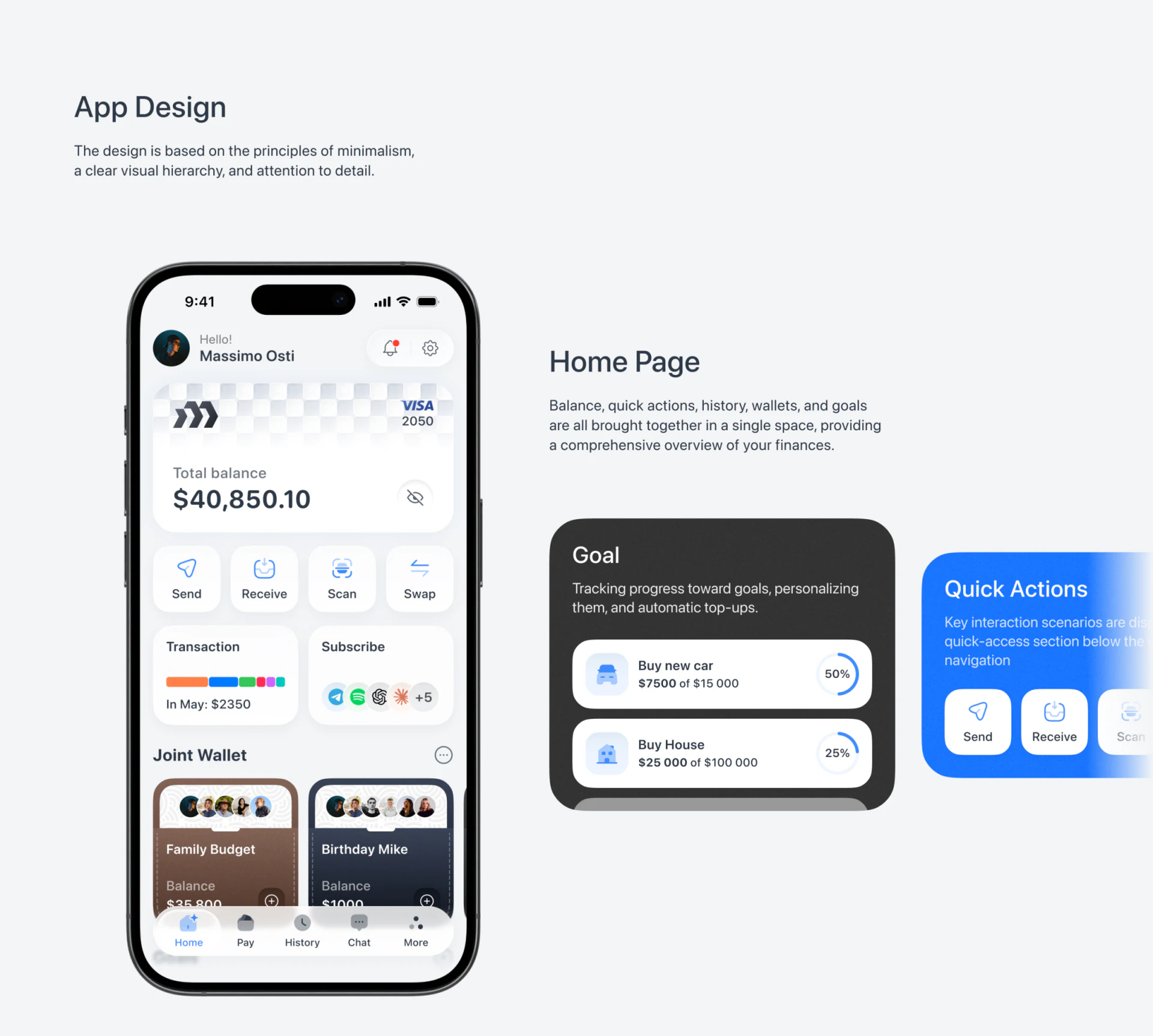
The personal total balance sits near the top of the homepage in large type, with an eye icon alongside. Send, Receive, Scan, and Swap form a row below, each in a pale icon card. Readers encounter the overview before direct actions, giving the page a natural hierarchy.
Shared wallets appear farther down in brown and dark cards, with a row of portraits clearly suggesting multiple participants. These cards offer richer identity cues than the white balance area above. Faces, wallet names, and amounts share one card, identifying a specific set of funds rather than an isolated total.
An enlarged goal card beside the phone includes a progress ring, while quick actions have a separate blue presentation block. This component breakdown helps examine each category, but does not imply that all the enlarged blocks belong on the homepage. JVDS is more interested in the actual phone’s sequence: balance, actions, transaction summary, then shared wallets.
The chart changes, but the categories stay consistent
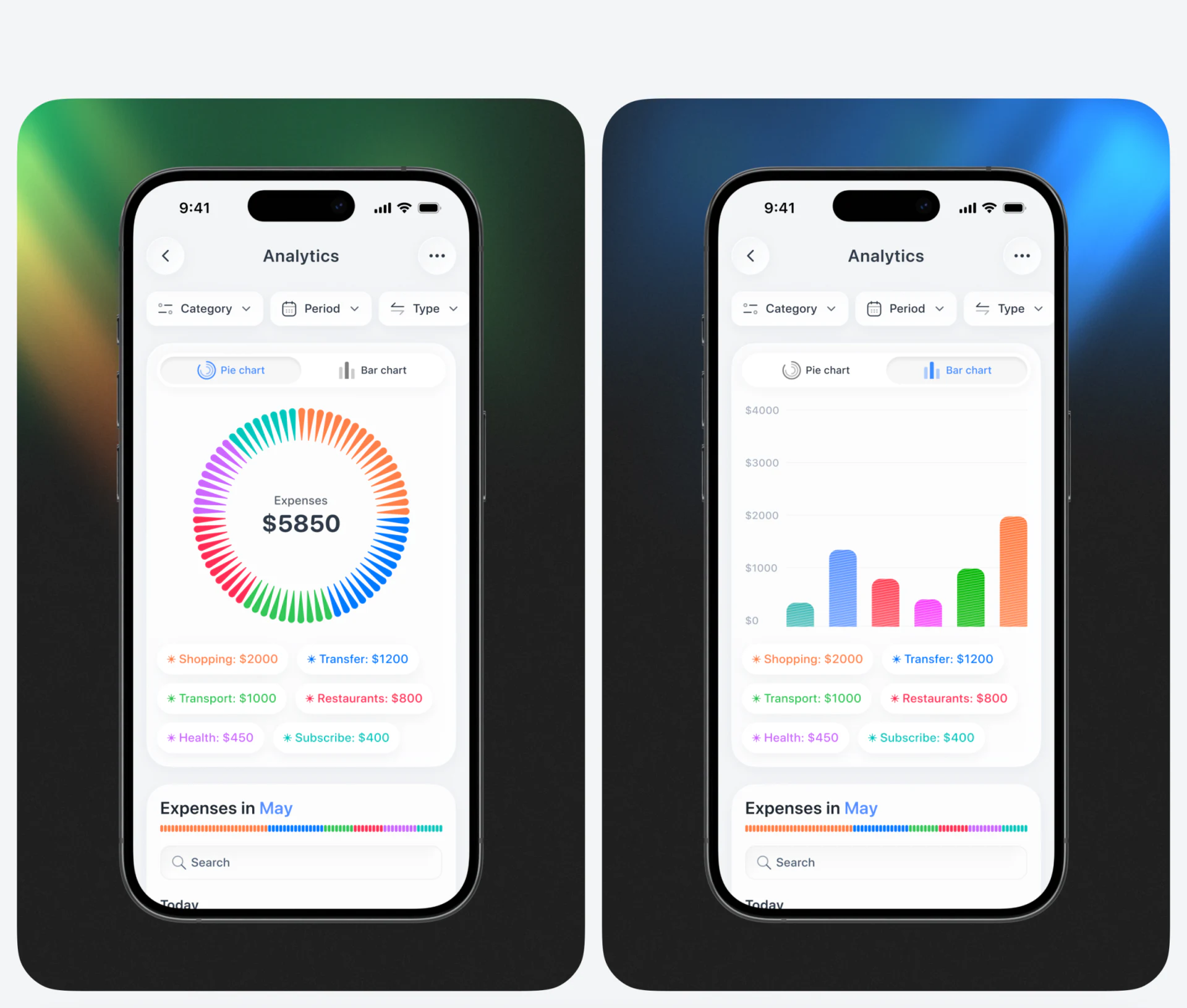
Analytics places Category, Period, and Type filters in a row above donut and bar charts. Across the two screens, category labels retain the same colors: blue, orange, green, pink, and others appear in both charts and amount labels. These connections help readers continue comparing when the chart format changes.
The donut offers an initial view of composition; bars are easier to compare along one baseline. The design does not rely on color alone: categories and amounts also appear below. Text matters in bill analysis, since similar colors may be hard to distinguish on a small screen; names and values supply another cue.
These amounts are examples in a design image, not product usage data. A review can substitute extreme cases—one very large category and several very small ones—to check labels, bar heights, and thin donut segments. A neatly balanced static example cannot represent every billing situation.
Transfer confirmation brings the recipient and amount together
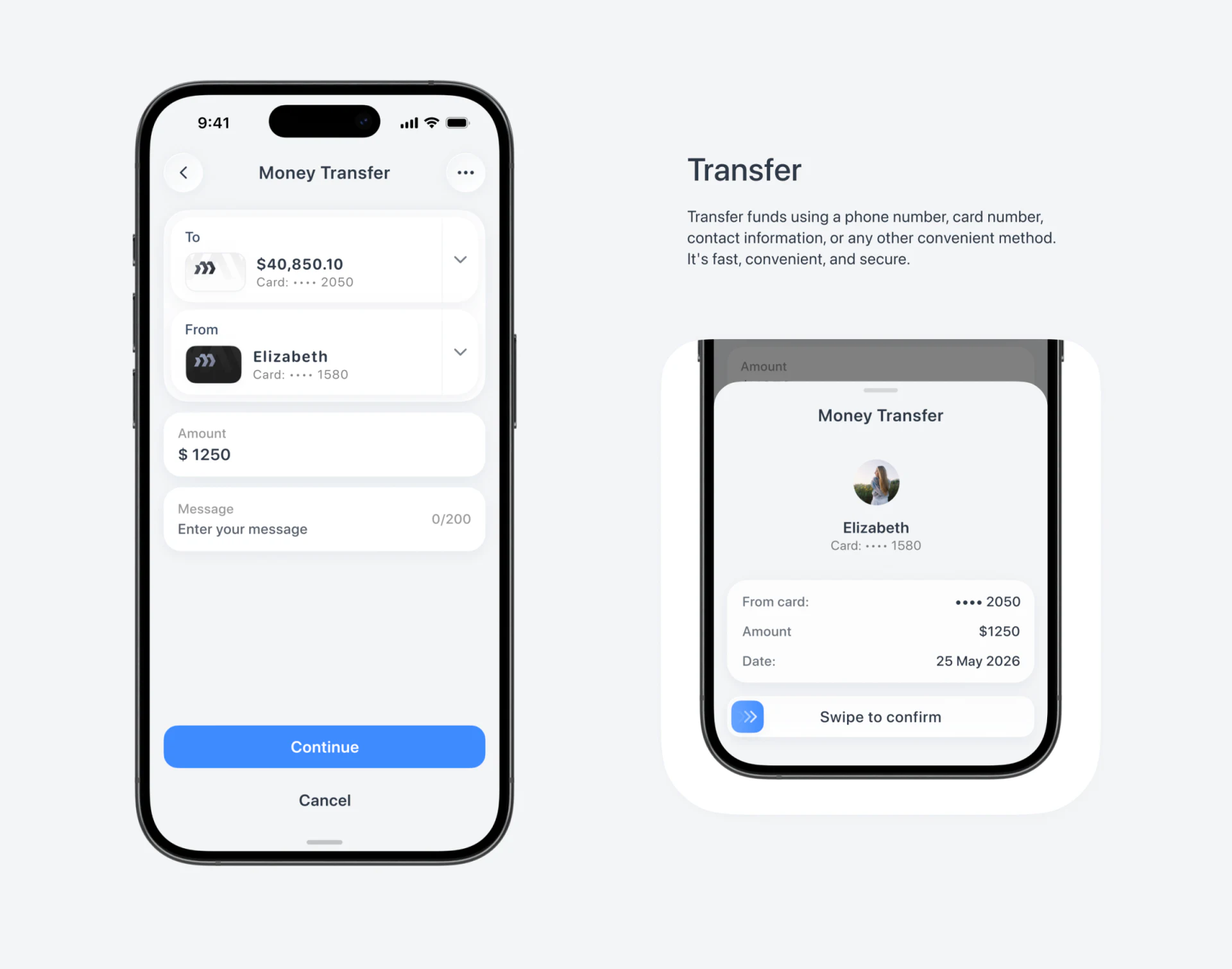
The entry page stacks To, From, Amount, and Message vertically, with Continue as a blue primary button. The confirmation drawer on the right gathers a portrait, recipient, source card, amount, and date, ending with Swipe to confirm. Its tighter layout shifts attention from editing to checking.
The useful principle is to show the essential parties again before the action. An amount should be read alongside the recipient and funding source, not merely displayed as a prominent number. The relationship between To and From on the entry page and the parties in the drawer is not immediately clear; these labels should be aligned before further refinement.
JVDS recommends a stable checking sequence for card ending, party name, and amount, followed by a review of the swipe instructions and alternatives. The screenshot shows no swipe process, failure, or cancellation feedback, so it supports evaluation of visible information organization rather than transfer security or the actual completion experience.
Frequently asked questions
Can bill charts distinguish categories by color alone?
Category names and values should also be shown. Color aids quick recognition, while text provides a way to check similar colors and small charts.
What should a transfer confirmation page prioritize?
The recipient, funding source, and amount should be adjacent and use the same labels as the entry page. The confirmation action’s usability still needs practical checking.
Design review checklist
- Align party names item by item across entry and confirmation pages.
- Use extreme amount examples to check donut and bar-chart labels.
Organizing actions in a financial app?
If your wallet, bookkeeping, or funds management product needs a clearer homepage, analytics charts, or confirmation flow, bring the existing interface to discuss how information can be recognized more easily.
JVDS Design Studio provides UI/UX design, website design, and development services to help organize page content, interface structure, and implementation needs.
 Link copied