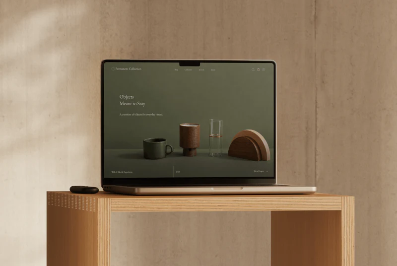
Permanent Collection places objects and their makers within the same gentle layout. Cream backgrounds, delicate serif headings, and black-and-white working photographs do not compete with product colors. More useful is the direct connection from a maker introduction to their work, while individual details give appreciation and purchasing clear areas.
Key takeaways
- Products beneath maker profiles clearly connect stories and shopping.
- Standalone images, usage photographs, and specifications should each explain different information.
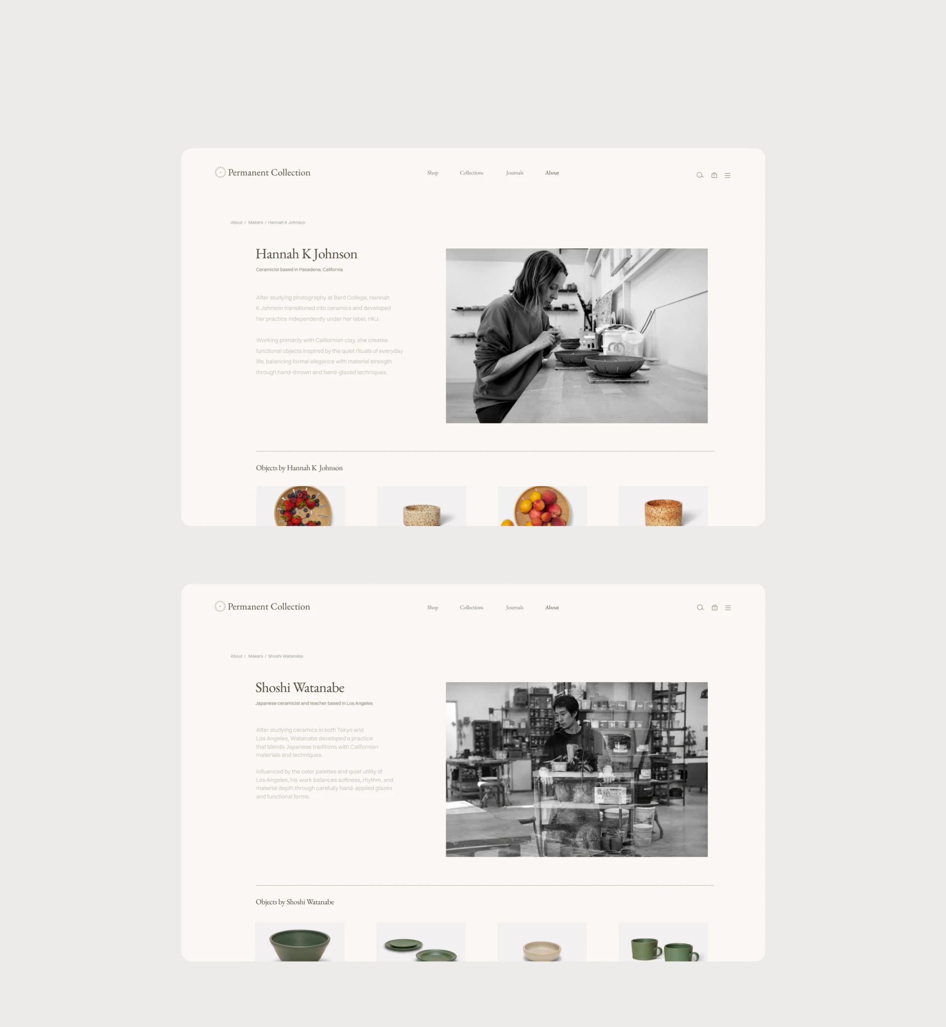
Working photographs make the profile concrete
Two maker profiles share a structure: name and short text on the left, a working scene on the right, then a fine rule separating Objects by and the products below. The person is not isolated on a promotional page but becomes an entry into the objects. Hands, workbenches, and materials in the photographs also relate more closely to this product category than a portrait alone.
Black-and-white photography creates a subtle distinction from colored objects. Restrained text leaves product thumbnails visible. Linking makers and products this way suits categories where production background influences choice; a large collection would also need a clear indication of the displayed range and where to see more.
Maker names identify these sections, but working photographs cannot establish production processes or certification. When reviewing such pages, JVDS focuses on whether the maker name remains visible after moving to a product and whether returning restores the previous reading position.
Product and lifestyle images answer different questions
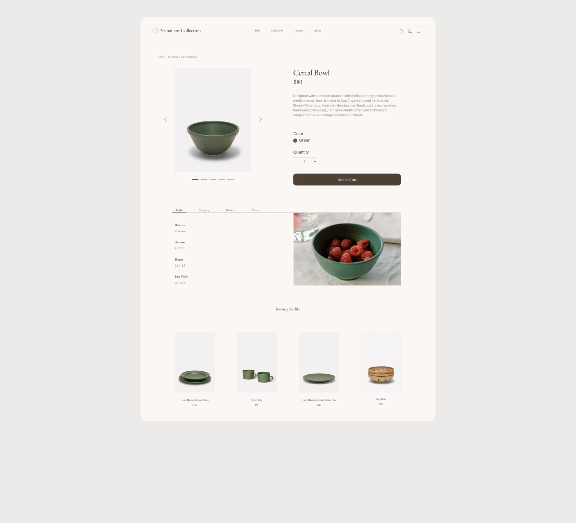
The Cereal Bowl detail page places a green bowl inside a pale rectangle. Name, price, color, quantity, and a brown Add to Cart button run down the right. The standalone image supports reading the silhouette, while grouped selection fields prevent purchasing from becoming mixed with image-navigation arrows.
A fruit-filled photograph below adds use context, while tabs such as Details organize further information. A scene can suggest how an object fits into daily life, but cannot reliably replace diameter, capacity, or material specifications. Important specifications should have a summary near purchasing controls, with fuller details available below.
Recommended products form a horizontal row at the end and resemble the current object. They can continue browsing interest, but You may also like does not explain the relationship. An accurate basis such as the same maker, collection, or purpose would give selection more direction.
Mobile retains the selection sequence
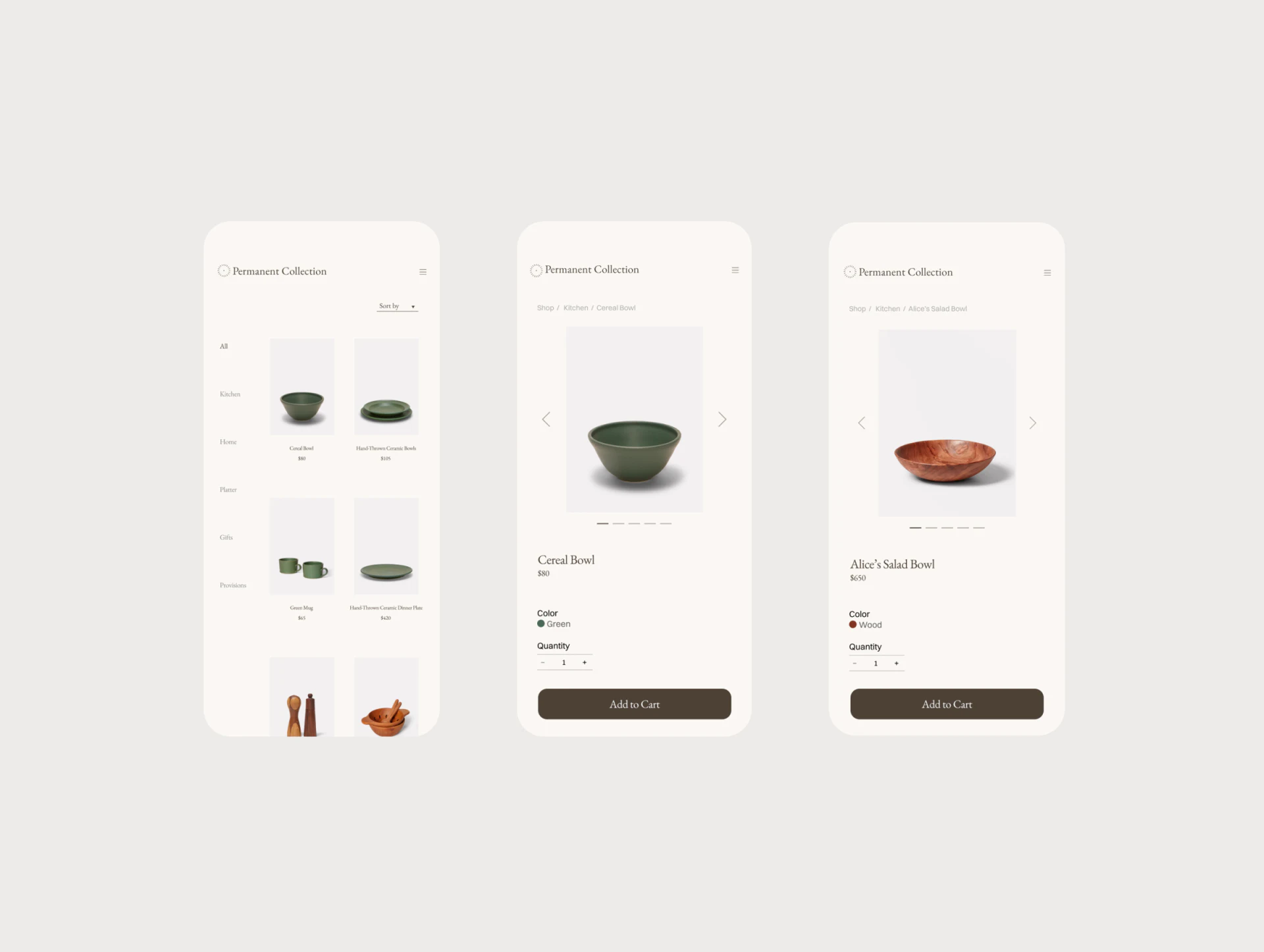
The mobile list uses two columns, while details move the image above the name and options. The two products retain color words such as Green or Wood, avoiding reliance on small dots alone. A wide bottom button echoes desktop and provides a recognizable purchasing exit.
Quantity controls sit near the color field for checking before adding to the cart. Actual interaction still needs review of quantity-change feedback, unavailable options, and the add result. A static button does not establish a complete purchasing flow.
These images do not show the full mobile specification expansion. Further design should make key dimensions recoverable near the purchase button, especially for similarly shaped objects with different capacities. Space keeps the page light, but essential fields also need to be discoverable within a short view.
Frequently asked questions
Must handmade homeware tell a maker’s story?
It is worth showing when production background affects choice, provided the story leads to corresponding products. Key specifications, price, and delivery conditions still need to follow purchasing tasks.
Can a lifestyle photograph explain size?
It can help convey use, but is not a reliable measurement. Provide explicit dimensions, capacity, and units, explaining any necessary range of variation.
Design review checklist
- Keep maker names continuous between profiles and product details.
- Provide clear feedback for image navigation and quantity adjustment.
- Make key specifications discoverable near mobile purchase controls.
Connect the story with purchasing
A homeware brand with rich maker content can first check how that content connects to product selection, then refine details and mobile purchase areas.
JVDS Design Studio provides UI/UX design, website design, and development services, helping organize page content, interface structure, and implementation needs.
 Link copied