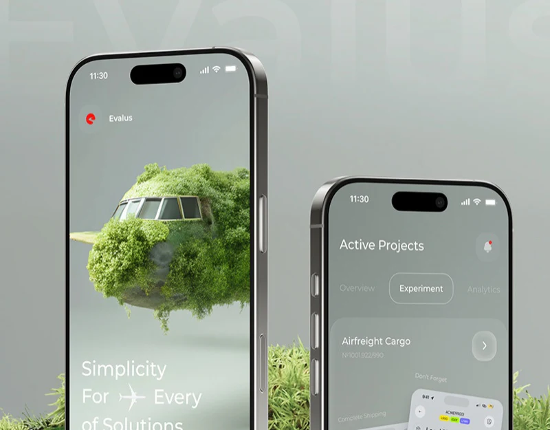
This experiment platform interface places phones, moss, and wood in one gray-green scene, giving the analysis tool a distinct character. Screen content follows another order: winner summary, variants, then a scale locating a rating. As third-party design commentary, the question is how soft visuals support precise information, particularly when large numbers dominate and explanations are faint.
Key takeaways
- Summary values, variants, and dimension labels create a route from conclusions to details.
- Gray-green and translucent materials unify the presentation while reducing secondary text/background contrast.
- The scale combines position, numbers, and names to give results comparable ranges.
Two figures establish the summary
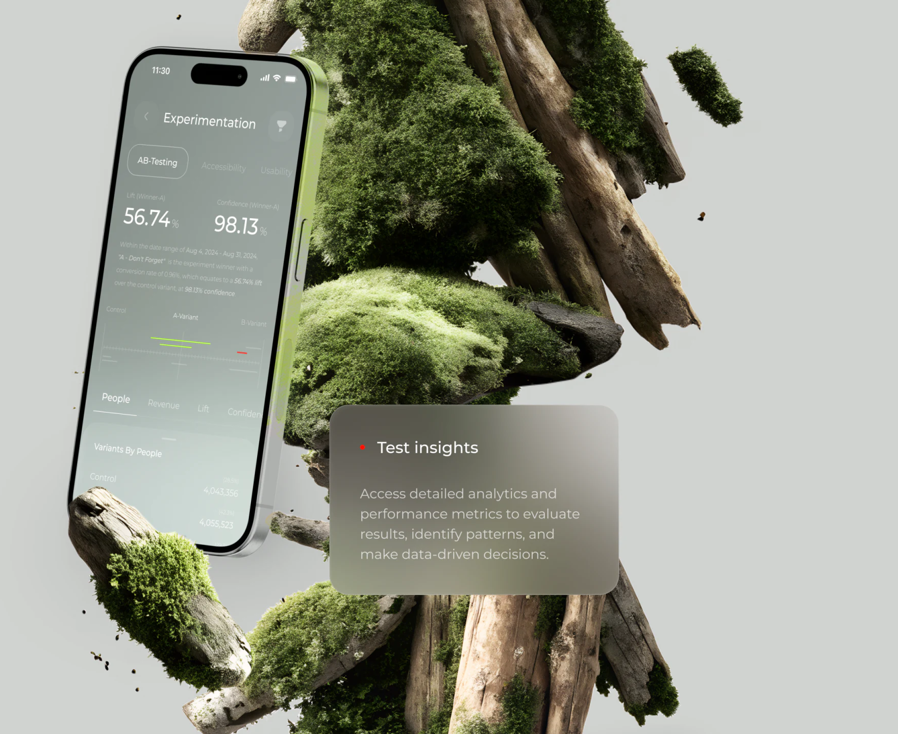
Below Experimentation, AB-Testing, Accessibility, and Usability appear as labels, with AB-Testing in an outlined rounded container. Lift and Confidence then occupy separate columns; white 56.74% and 98.13% are the screen’s most prominent information. Heading, category, and summary establish order even without reading the paragraph.
The explanation below includes dates, variant names, and conversion rates, contextualizing the large values. It is close to the gray-green background and weak in size and weight. Isolated percentages can appear to measure the same thing. A real tool needs readable metric names and definitions, with dates and comparisons easy to locate. This is a hierarchy requirement, not verification of the example experiment results.

Variant comparison follows the summary
Another view places Control, A-Variant, and B-Variant beneath the summary. Short green and red lines create differences, followed by People, Revenue, Lift, and Confidence labels, with People brighter and underlined. Summary, variants, and changing dimensions follow one vertical route.
The angled phone and foreground wood obscure some lower content, emphasizing concept visuals but limiting full data checks. Test insights beside it explains the analysis purpose with a similarly translucent card. Reviewing the working tool would require a front-facing, unobstructed state to check stable relationships between variant names, units, and current dimensions.
Fluorescent green connects moss and chart marks, while red creates local contrast. The screenshot does not sufficiently define what the line segments represent. Length cannot be assigned a statistical meaning directly; legends or definitions need to explain these symbols in actual use.
The rating scale provides three references
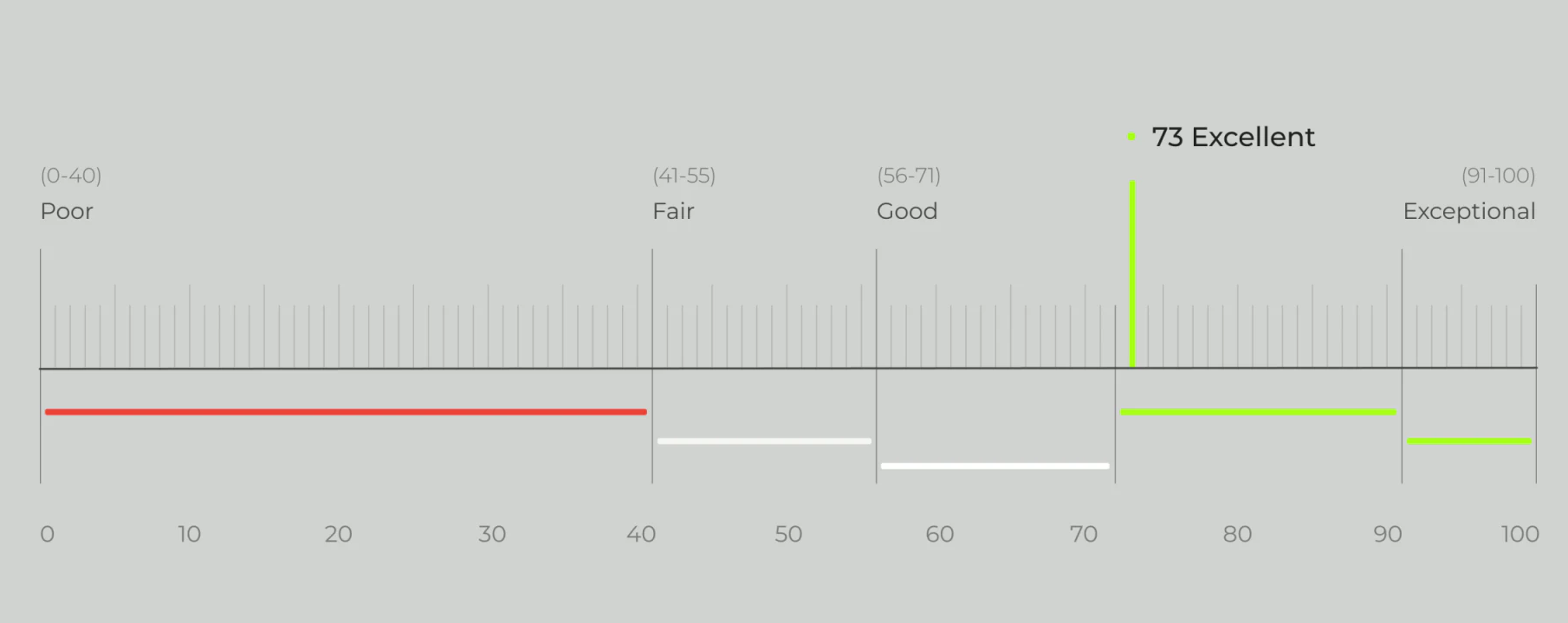
A horizontal scale runs from 0 to 100, with Poor, Fair, Good, and Exceptional marking regions. Black 73 Excellent appears with a fluorescent green vertical line. Value, evaluation name, and position explain the display together. Red, white, and green short lines and divisions beneath establish a continuous scale.
The image shows rating presentation but not its object or calculation rules. Used independently, it could name the object, measurement time, and rating explanation beside the scale, making 73 answer a definite question. Position provides a relative reference; words explain levels. Together they offer more explanation than a vivid score alone.
Frequently asked questions
Can gray-green styling suit analytics tools?
It can contribute to product identity, but readability needs checking at actual type sizes and screen brightness. Dates, definitions, and the current dimension may look secondary while determining what large numbers mean.
Design review checklist
- Retain metric name, comparison object, and period for each result.
- Add an unobstructed working state to check variant/dimension correspondence.
- Give the scale an object and explanation, checking words and positions beyond color.
Keep analysis results explainable
When designing experiment or analytics interfaces, connect summaries, details, and metric explanations before arranging scenes, materials, and accent colors.
JVDS Design Studio provides UI/UX design, website design, and development services, helping organize data-interface hierarchy and visual expression.
 Link copied