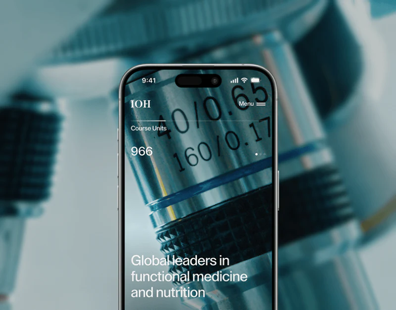
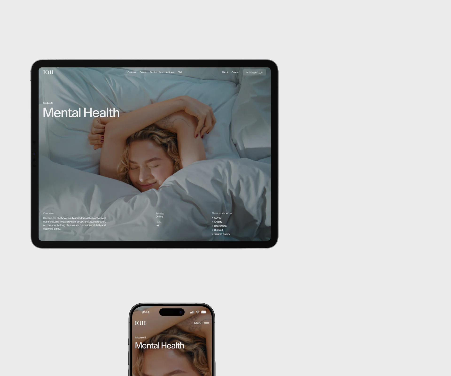
IOH’s Mental Health page fills its hero with a people photograph, then uses simple headings for learning value, intended learners and getting started. The imagery creates a gentle educational atmosphere; course identity, learning format and application steps support decisions. The contact page handles unresolved questions about conditions.
Key takeaways
- Photography expresses the subject; course conditions support learning decisions.
- Application, acceptance and starting modules are explained in stages, with inquiries covering unresolved questions.
Topic photography needs a course context
Mental Health overlays the photograph in large type. Overview, Format, Units and Recommended for divide the lower content, while Courses and Student Login appear in the top bar. Topic and course navigation establish educational context; photography does not explain learning conditions.
What is covered and who should learn need separate names. A health issue can be a course topic without implying diagnosis or treatment for those concerned. Format, time commitment and entry requirements should sit near the topic.
JVDS favors conditions that determine whether to continue reading near the first screen. Gentle photography can remain, while gray type and key course information need sufficient contrast.
Grouped headings answer different questions
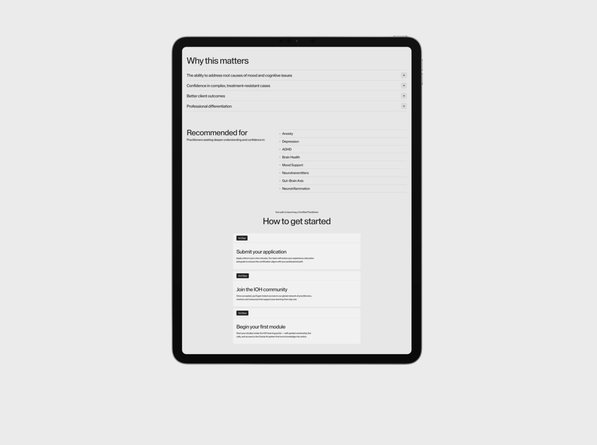
Why this matters uses expandable rows, Recommended for another group, and How to get started step cards for applying, joining a community and starting modules. Reasons, audience and process appear separately, letting visitors read according to their questions.
Expandable rows suit elaboration, while eligibility and application conditions should be directly visible. Promising headings need concrete learning objectives, content and support formats rather than positive statements without a basis for judgment.
Submitting and being accepted are different stages, needing explicit step names and statuses. Required material, post-review steps and status lookup can share one route, making starting study a predictable process.
Contact makes questions about conditions easier to ask
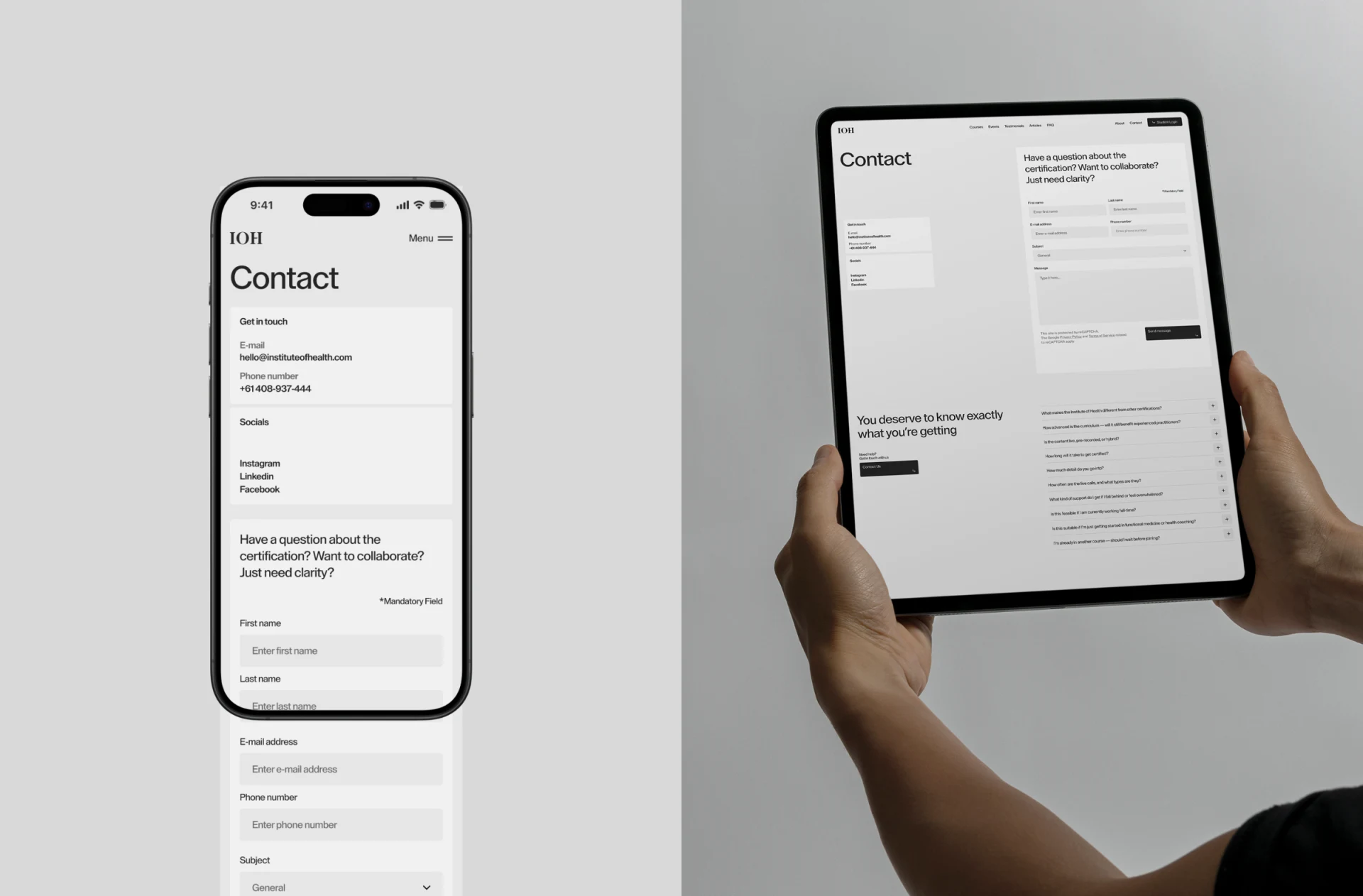
Contact offers direct details alongside a form for questions about accreditation, course requirements or collaboration. Name, email, subject and message are separate, so general inquiries need not enter a full application first.
Subject choices should match the actual response scope, with required fields collecting necessary information only and feedback explaining submission and response methods. Common questions can address general conditions before specific circumstances go through an inquiry.
Phone and tablet examples retain contact identity and the form. Anchors or clear subheadings can improve orientation in longer pages. When an inquiry leads to application, retain course name and clarified conditions to reduce repeated searching.
Frequently asked questions
Can a health topic replace the intended course audience?
State learners and covered content separately to avoid implying clinical suitability. Eligibility and learning requirements need clarity.
Does submitting an application mean enrollment?
Distinguish submitted, under review and accepted, explaining subsequent login, course selection or module-start steps.
Design review checklist
- Keep course format and requirements accessible near the topic.
- Describe learners and covered issues separately.
- Clarify application statuses and inquiry feedback.
Organize course decisions and application flows
Education websites can align course conditions, application stages and inquiry subjects before planning topic pages and mobile forms.
JVDS provides UI/UX design and website design and development. We can work through page content, interface structure and implementation needs together.
 Link copied