Nova Post’s delivery app design places delivery status close to things that can be adjusted. The parcel page shows redirection, time selection, and nearby pickup, while the map retains a courier contact card. It answers “where is it?” and also offers a direction for handling that parcel next.
Key takeaways
- Horizontal delivery cards name actions through icons and short text, supporting a next step around the current parcel.
- Map, contact, and tracking events separately explain location, whom to contact, and progress.
- Pickup cards combine type, opening information, weight conditions, and routes for planning an offline visit.
Notifications explain status; cards explain choices
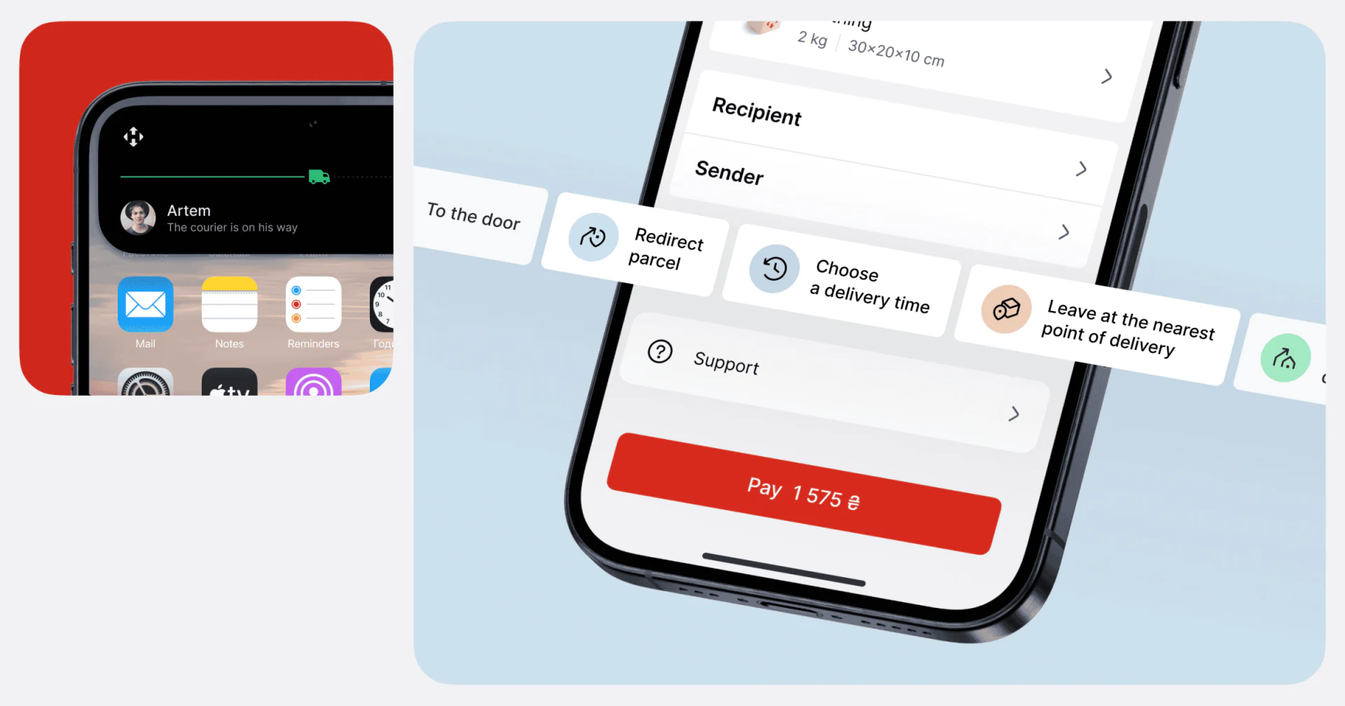
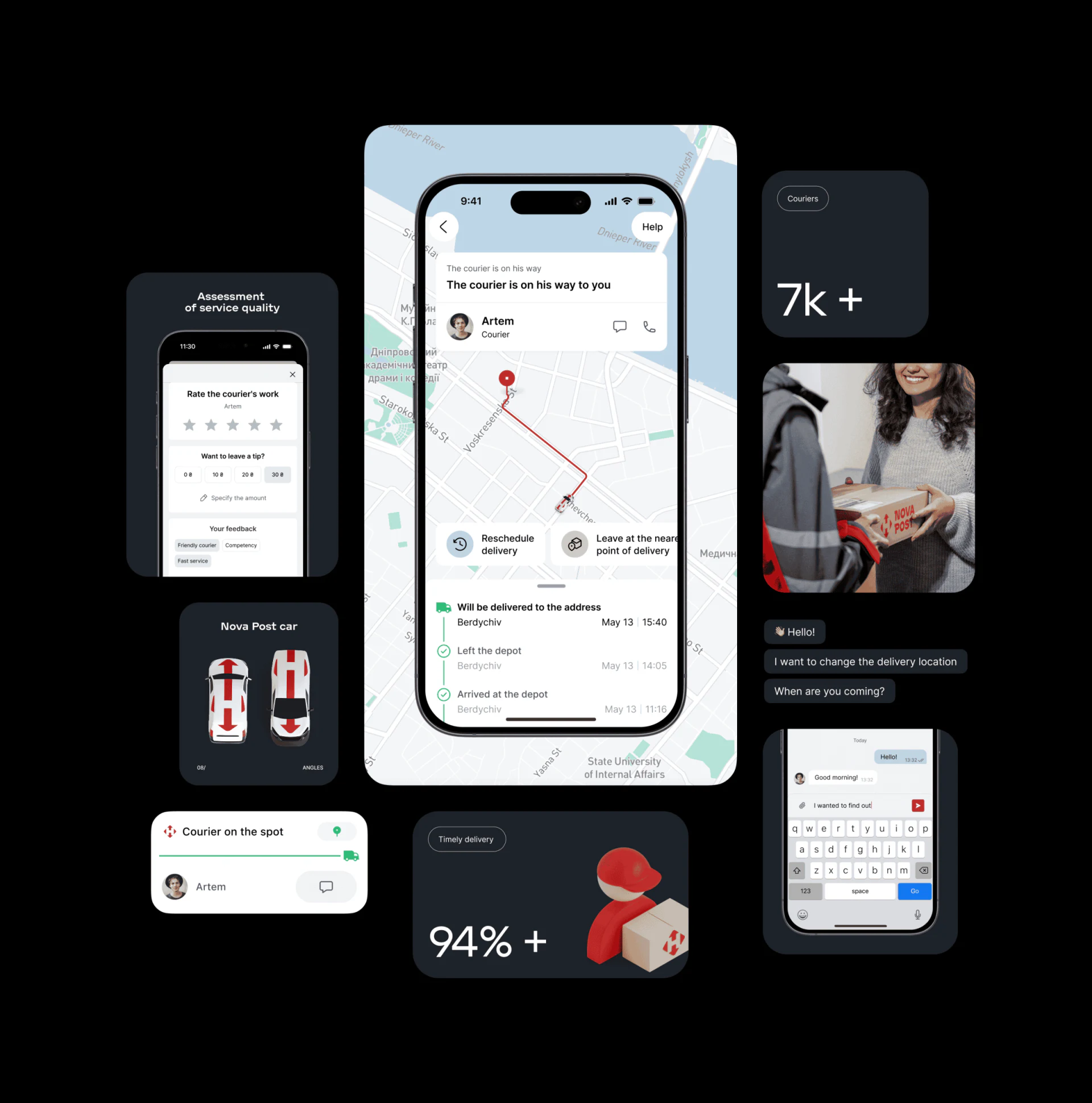
The notification on the left uses a courier portrait, name, and progress line with a vehicle to communicate an approaching delivery. The parcel page on the right retains recipient and sender information before presenting horizontal cards for redirection, choosing delivery time, and leaving the parcel at a pickup point. Person, parcel, and actions remain close because they concern the same task.
Icons sit on small pale blue or orange circles with clear short labels. Redirection uses a direction symbol, time uses a clock, and pickup uses a parcel. Text explains each action while icons help locate its category; unfamiliar symbols do not leave readers guessing from a circle alone.
The large red payment button at the bottom forms a different level from the white cards. It can emphasize the current task, although a real product should check whether payment or rescheduling is more urgent. JVDS would retain parcel identity and add availability conditions to changes, making “what can I do now?” more dependable.
The contact stays with the route
The map first displays text about the approaching delivery, followed by the courier portrait, name, chat, and phone icons. The red route is easy to distinguish on pale streets, while the contact sits in a white card. Communication does not require leaving the map to find another page.
A green line connects tracking events at the bottom, with dates and times alongside. The map explains space and the timeline explains sequence, answering different questions. Rescheduling and nearby-pickup cards remain visible between them, so the map does not completely displace available actions.
Expected events and completed records could be distinguished more explicitly. The image includes an upcoming address delivery alongside departures and station arrivals; a green connecting line can make them look equally certain. Clear “expected” wording and update times would be easier to understand than another color alone. The static route also cannot establish actual arrival minutes.
Classify nearby places, then check conditions
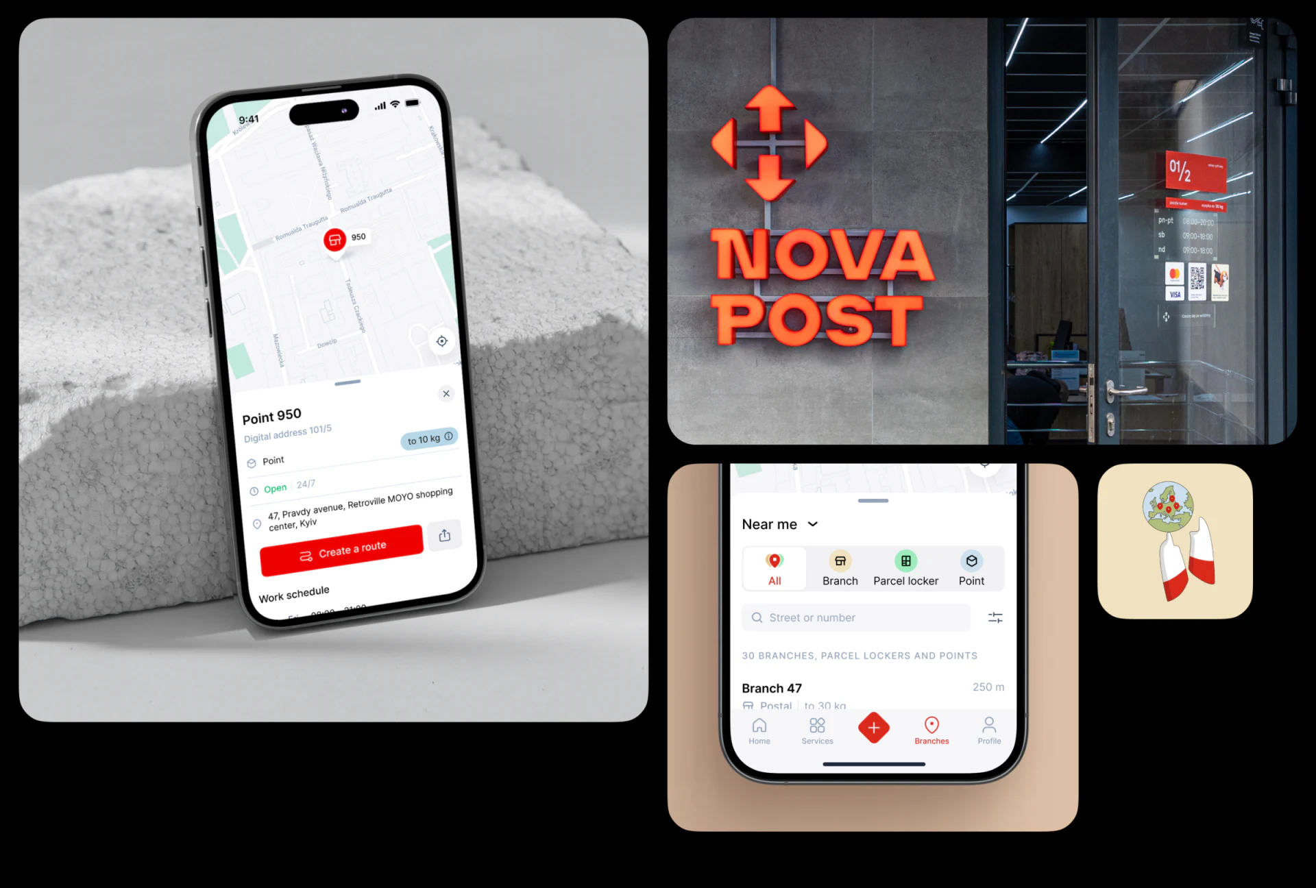
Near me presents All, Branch, Parcel locker, and Point as labeled categories. Different shapes and pale backgrounds distinguish types, with street or number search below. This gives more direction than a long undifferentiated list: choose a service type first, then narrow the location.
Location details retain the map. A bottom drawer shows name, type, opening status, address, and weight conditions, followed by the red Create a route button. Reading leads naturally into travel planning. An adjacent storefront photo provides a real-world reference and gives the map point a more concrete identity.
The useful feature of this pickup-point map design is the proximity of conditions and route planning. A nearby location may not suit every parcel, so weight and opening information should be visible before departure. If redirection is later available, the selected location and change status need separate confirmation; creating a route cannot substitute for confirming redirection.
Frequently asked questions
Which actions belong on a delivery map page?
Prioritize contact and adjustment entries relevant to the current delivery, while keeping parcel identity visible. These images place the contact and rescheduling cards near the map; costs, available time slots, and submission results still need explanation in subsequent screens.
Design review checklist
- Locate phone, chat, and delivery adjustment actions on the map.
- Check whether text alone distinguishes expected events from completed records.
- Open a location card and review hours and parcel conditions before the route button.
Organizing tracking and changes in a logistics app?
Across parcel details, delivery maps, and pickup locations, users need to recognize the same parcel and current arrangement. If you are building a delivery product or refining a logistics interface, bring the flow and screens for discussion.
JVDS Design Studio provides UI/UX design, website design, and development services, helping organize interfaces, content, and development needs.
 Link copied