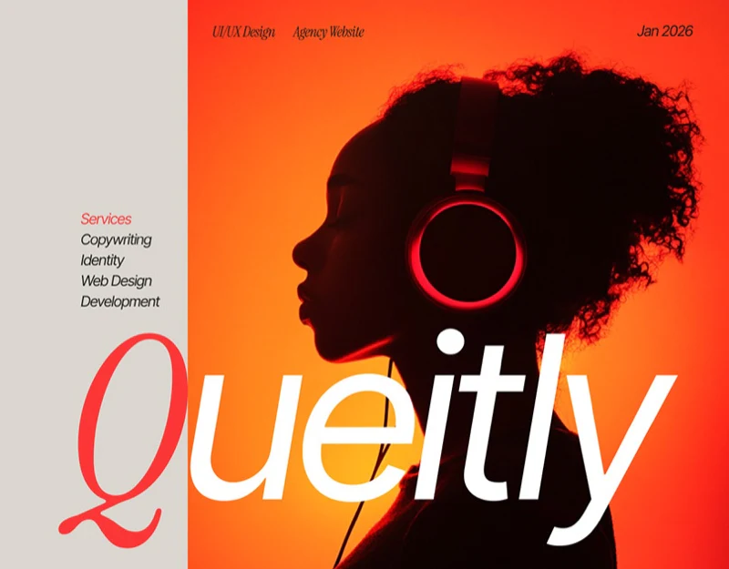
This creative agency website design uses vivid red and gray-cream, with warm portraits and white service text. Paired entries, individual service cards, and contact forms offer several ways to continue. Strong visual expression still needs specific differences between services.
Key takeaways
- Red-white actions separate collaboration and learning; individual service cards support comparison.
- The contact form has shared boundaries; brand names and service scopes need alignment first.
Large text left, photographs right, two ways forward
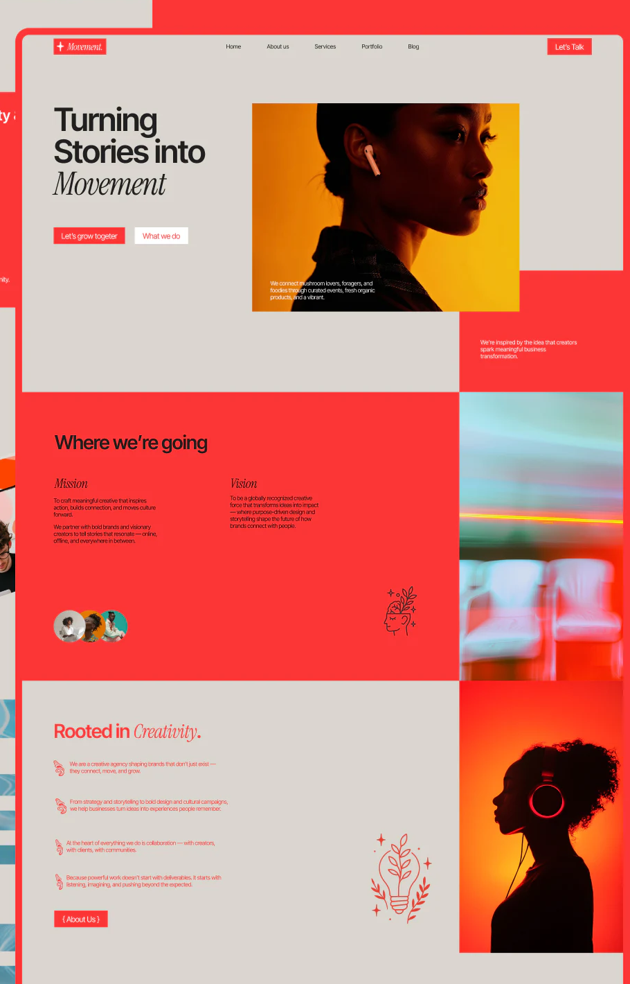
Turning Stories into Movement sits left, with its final word in italic serif, opposite a warm orange portrait. Red collaboration and white What we do offer starting a discussion or first exploring scope.
Gray-cream text areas and a red frame have clear boundaries; photographs do not cover buttons. Large color blocks, people, and line illustrations below continue the philosophy with varied visual rhythm.
JVDS sees value in paired buttons when their destinations genuinely differ. Services should explain scope and collaboration explain inquiry methods. If both lead to one general introduction, color differences remain only styling.
Service names keep a stable position
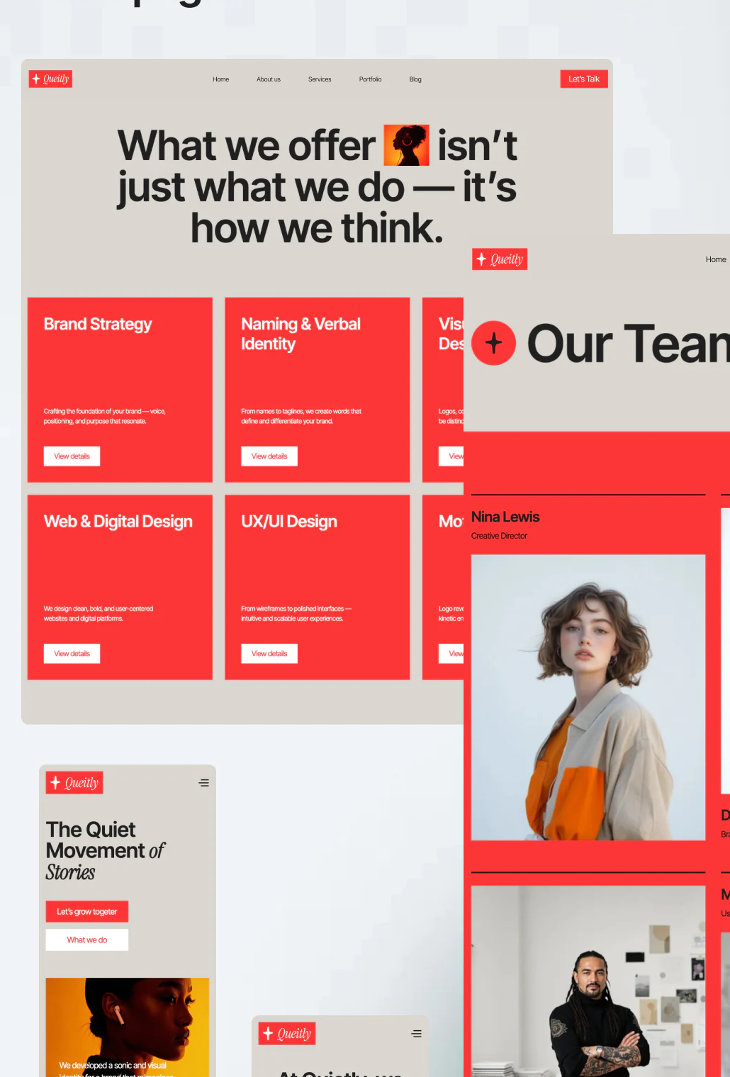
Brand Strategy, Naming & Verbal Identity, Web & Digital Design, and UX/UI Design each use a red card, with name above and short explanation and View details below. Shared positions support comparison, and small white buttons give expansion a definite action.
Creative service names are often similar, so cards should explain the problems each addresses. Website and product interface services particularly need existing-material requirements, deliverables, and tasks rather than extra terminology. Team photographs create atmosphere without replacing those answers.
The hero says Movement, while services and phones say Quietly, without explaining the relationship. Confirm brand identity before aligning page copy. JVDS would retain red recognition without expecting color to resolve different names automatically.
One frame gathers fields over water
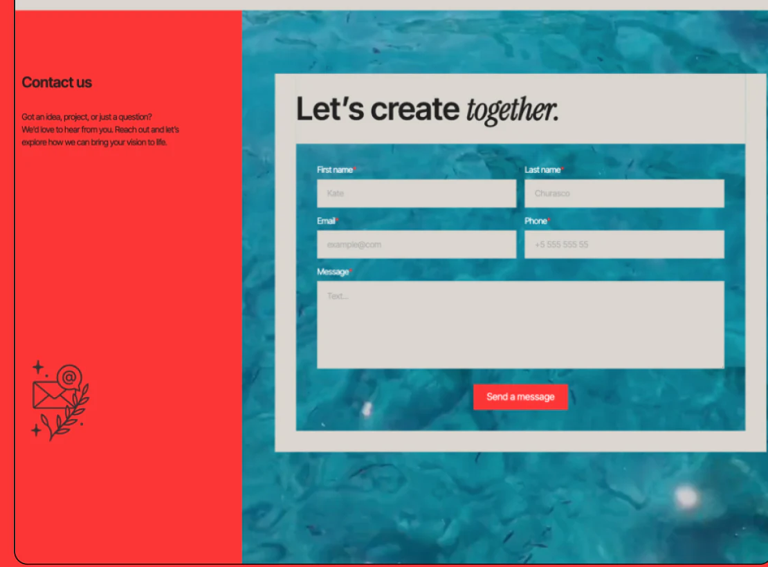
The contact page has red explanatory text and an email-flower line drawing left, with a gray-cream form over a water-blue photograph right. Name, email, and phone use two columns; Message spans the row and Send a message is red. Fields have a common boundary.
This frame helps keep forms readable over complex photographs. Message’s Text hint remains broad; a short example of goals and existing material could help first contact. Required phone input should also reflect its use in an initial reply.
Further checks could cover sending, preserving content after failure, response confirmation, and whether inquiries retain the earlier service topic. JVDS prioritizes continuity between names, scope, and message destination while allowing the mood to stay vivid.
Frequently asked questions
What makes creative-service cards useful?
Explain the relevant problem, existing materials, and deliverable boundaries. Similar services need recognizable differences, continued by their detail pages.
Design review checklist
- Confirm the relationship between Movement and Quietly.
- Add a short goal-and-material hint to the message field.
Give creative services a discussable scope
If an agency website needs expressive style alongside understandable services and inquiries, start with the service list and deliverable boundaries.
JVDS Design Studio provides UI/UX design, website design, and development services, helping organize page content, interface structure, and implementation needs.
 Link copied