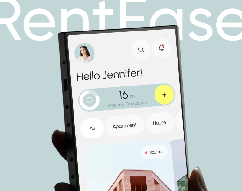
RentEase gives property management app design a light touch: pale-blue expense cards, bright-yellow bars, and rounded labels make the data page feel less like a traditional report. The useful details are filters exposed above charts and property photographs explaining expense cards on the introduction website.
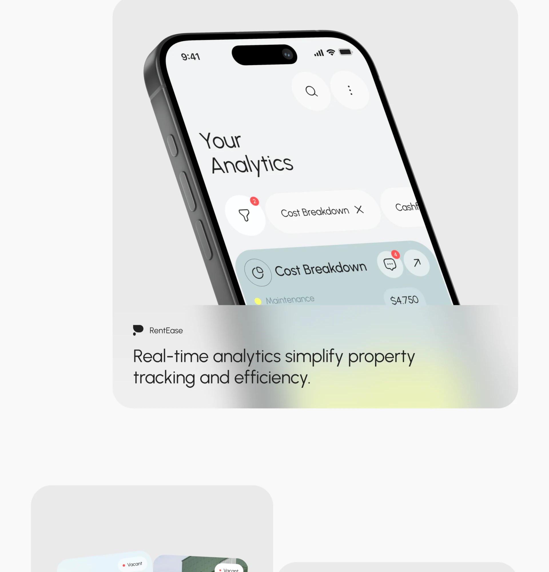
The analytics page keeps conditions below the heading
A row of labels sits below the large Your Analytics heading. The filter icon has a small red count, and Cost Breakdown ends with a close symbol. Even without opening the filter panel, readers can tell that cost analysis is the current view.
White labels sit above pale-blue expense cards in the hierarchy: the former identify the current content, and the latter show results. Comment and diagonal-arrow icons at the card’s upper right have circular backgrounds and some distance from the heading, keeping them out of the chart legend.
JVDS values the visibility of conditions on the page. This suits management tools where readers repeatedly return to data. Further refinement could give property and period stable positions, making it clear whose expense is shown and what time it covers.
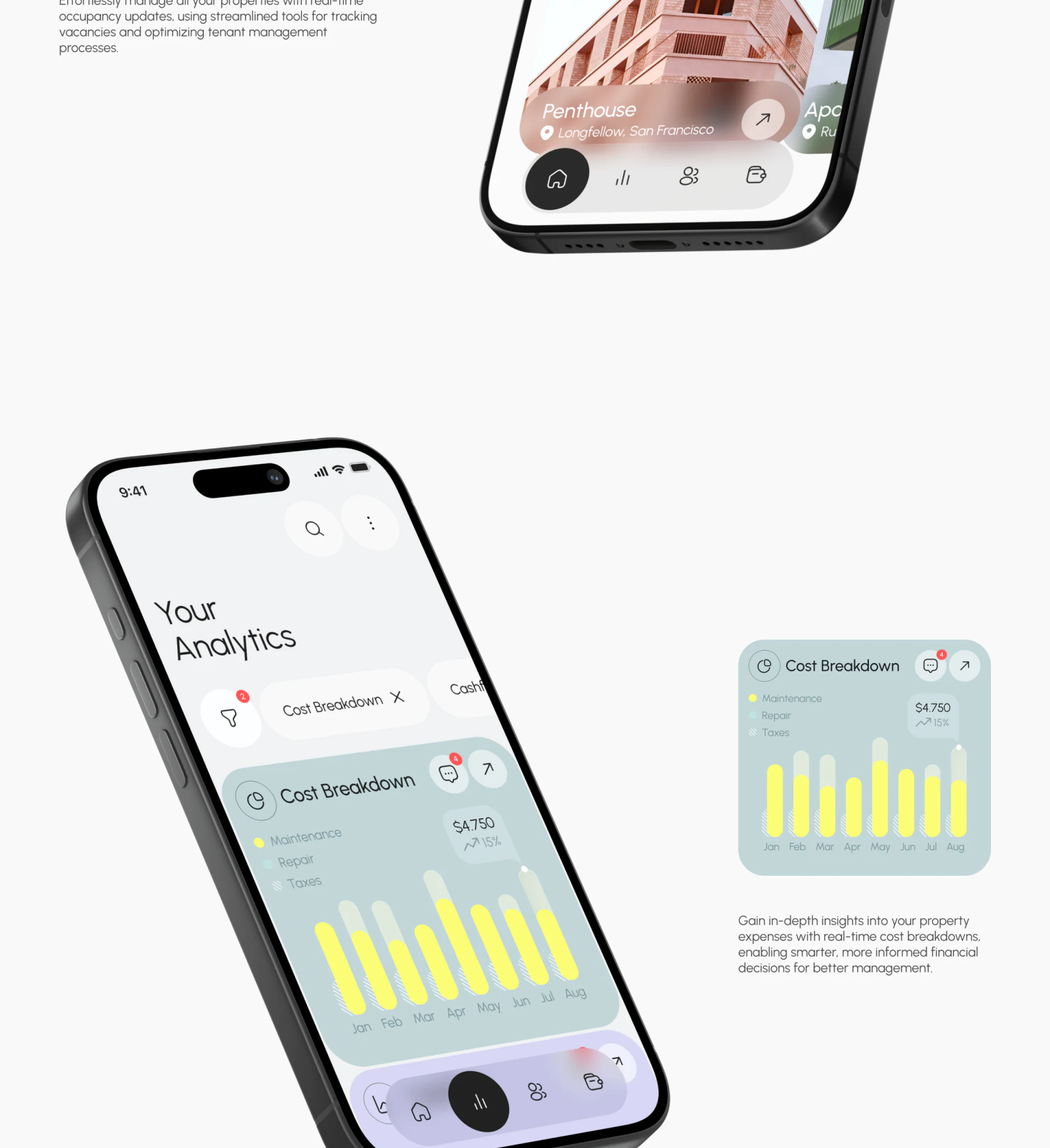
Bright yellow makes monthly bars the card’s focus
The monthly expense card places three cost names at the upper left, amounts and changes on the right, and consecutive months below. Bright-yellow bars draw the eye first, while pale green and a fine texture supplement other categories. The overall effect is soft, with a clear data focus.
The legend uses texture for Taxes as well as color. This offers another way to recognize expense categories without depending entirely on similar pale colors. Texture and small gray text still need a separate readability check at actual phone size.
Bar heights support comparison across months, while the amount area provides an overview. Property cost charts should define the basis of both graphics and numbers, ideally stating year, currency, and the total’s scope nearby. The pictured values are interface examples, not verified property expenses.
A comment count also appears at the upper right. If comments concern expenses, opening them should retain the same property and month; if they concern the whole analytics card, that scope should be stated. No expanded comments are shown, so a complete collaboration workflow cannot be inferred.
Property photographs give management objects more than numbers
Property cards on the introduction website use building photographs with names, locations, and Vacant text. All, Apartment, and House categories appear above. Different appearances help identify properties, while status text adds another layer of management information.
Vacancy uses a small white label and red dot rather than turning the whole house into a warning-colored area. The photograph keeps its realistic appearance while status remains findable. This suits tools used repeatedly over time; color signals need not occupy the largest area every time.
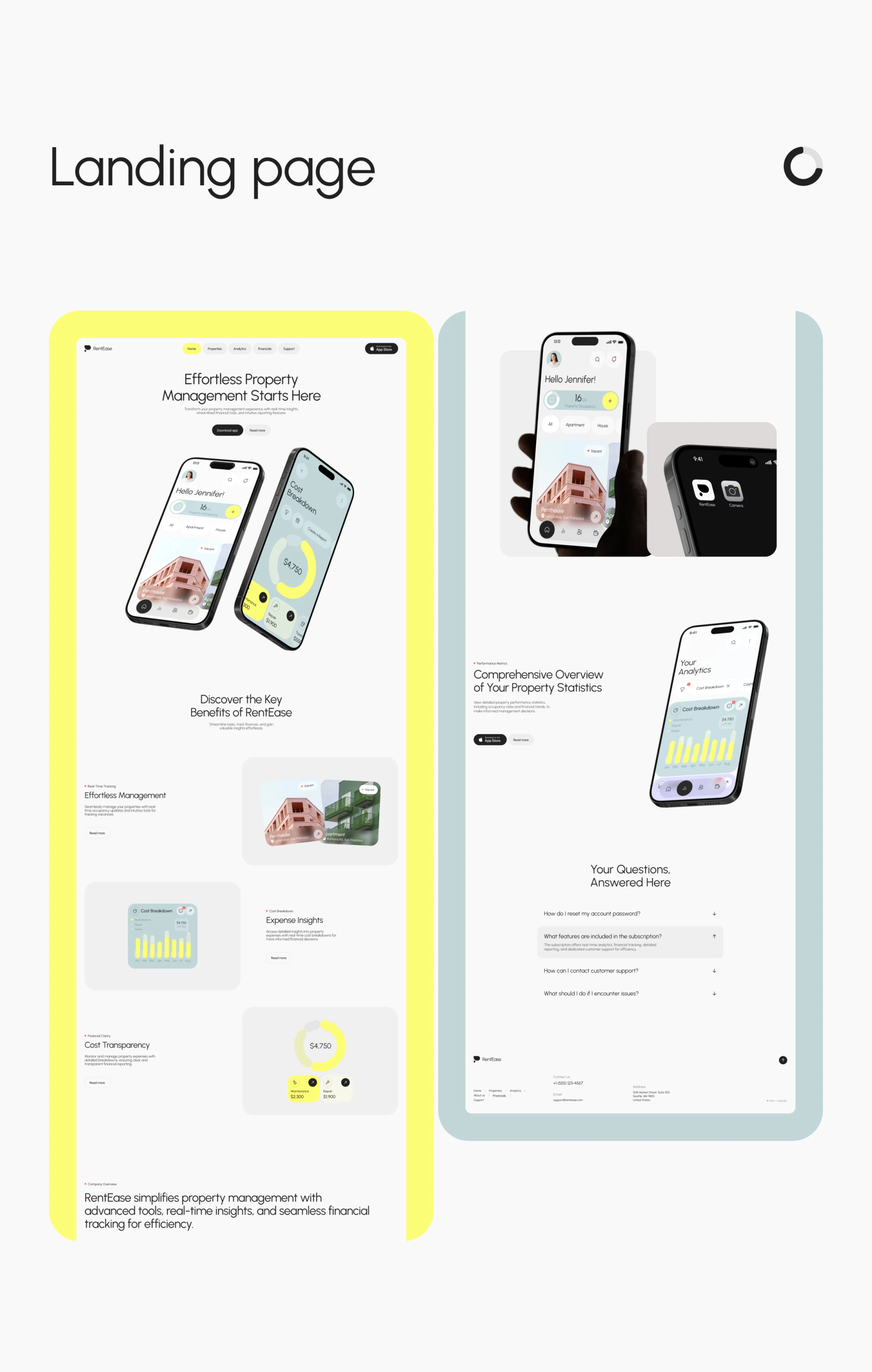
The same website separates property cards, expense bars, and cost donuts into feature modules, alternating images with short explanations. It carries over the app’s pale blue and bright yellow, letting readers see interfaces and understand their purposes rather than only reading abstract efficiency claims.
The website hero places a property overview beside a cost donut, then expands individual uses below. Showing two actual screens before explaining features suits visitors unfamiliar with the product. Copy does not crowd every capability into the hero; properties and expenses make the managed objects concrete.
The FAQ near the bottom also uses rounded pale backgrounds, with expanded and collapsed items visually distinct. It can make space for subscription scope and account support. The pictured questions do not confirm actual service policies; the article discusses only their placement and reading hierarchy.
A soft style still needs text that can be checked
Large corners and fine type create a relaxed feeling, while headings, labels, and charts have their own areas. A management tool can feel approachable provided its objects, statuses, and scope remain readable.
Start with one property, one period, and one expense as a complete content example, checking that filters, cards, and details use the same names. Then try long property names, empty months, and large amounts. This reveals the space real information needs more effectively than adjusting corners around a polished example alone.
Planning a property or operations management tool?
Data spanning multiple objects and periods needs a clear scope before charts and record entries are arranged. JVDS Design Studio provides UI/UX design, website design, and development services for management apps and supporting product websites.
 Link copied